文章目录
3. 按钮的使用
本章节主要介绍利用按钮控件实现更多交互功能的方法,以及利用按钮的高级属性进一步美化按钮的方法。主要知识点包括:
- 按钮控件的基本使用方法
- 让图标以不同方式显示在按钮上
- 按钮的内联
- 按钮的组合
3.1 简单按钮的使用
按钮是页面上非常重要的元素,利用按钮实现的界面如下:
<!DOCTYPE html>

<head>
<meta http-equiv="Content-Type" content="text/html; charset=utf-8" />
<title>Fixed Positioning Example</title>
<meta name="viewport" content="width=device-width, initial-scale=1"/>
<link rel="stylesheet" href="../css/jquery.mobile-1.4.5.min.css" />
<script src="../script/jquery-2.1.4.min.js"></script>
<script src="../script/jquery.mobile-1.4.5.min.js"></script>
</head>
<body>
	<div data-role="page" data-theme="a">
    	<div data-role="header">
        	<h1 >DOTA资料大全</h1>
    	</div>
		<div data-role="content">
			<a href="#" data-role="button">英雄简介</a>
            <a href="#" data-role="button">物品资料</a>
            <a href="#" data-role="button">经典出装</a>
            <a href="#" data-role="button">野怪资料</a>
            <a href="#" data-role="button">教学视频</a>
            <a href="#" data-role="button">经典解说</a>
            <a href="#" data-role="button">明星专访</a>
            <a href="#" data-role="button">关于作者</a>
		</div>
    </div>
</body>
</html>
结果如下: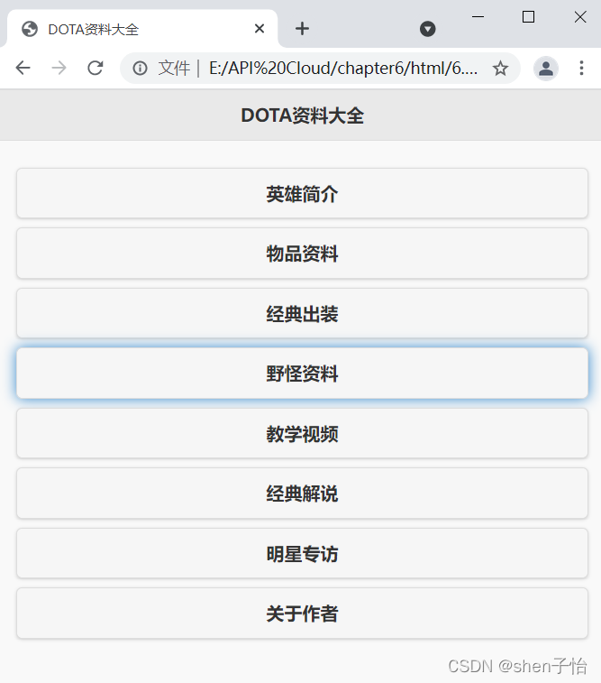
除了使用标签< a >之外还要为按钮加入属性data-role=“button”,只有这样才能将元素渲染为按钮的样式。在标签之间的内容会显示为按钮的标题。另外默认情况下一个按钮会单独占用一行,所以按钮看上去很长。
图中“野怪资料”的按钮样式与其他不同,是因为截图时截取了按钮按下的样式。JQuery Mobile默认为按钮加入被按下时的阴影效果。
3.2 为按钮加入图标
在之前的案例中已经为按钮加入了图标的样式,图标是通过属性data-icon=""来决定的。
为尾部栏的按钮加入图标:
<!DOCTYPE html>

<head>
<meta http-equiv="Content-Type" content="text/html; charset=utf-8" />
<title>Fixed Positioning Example</title>
<meta name="viewport" content="width=device-width, initial-scale=1"/>
<link rel="stylesheet" href="../css/jquery.mobile-1.4.5.min.css" />
<script src="../script/jquery-2.1.4.min.js"></script>
<script src="../script/jquery.mobile-1.4.5.min.js"></script>
</head>
<body>
	<div data-role="page">
    	<div data-role="header" data-position="fixed" data-fullscreen="true">
        	<a href="#">返回</a>
            <h1>头部栏</h1>
            <a href="#">设置</a>
        </div>
		<div data-role="content">
			<a href="#" data-role="button" data-icon>这是一个按钮</a>
			<a href="#" data-role="button">这是一个按钮</a>
			<a href="#" data-role="button">这是一个按钮</a>
			<a href="#" data-role="button">这是一个按钮</a>
			<a href="#" data-role="button">这是一个按钮</a>
			<a href="#" data-role="button">这是一个按钮</a>
			<a href="#" data-role="button">这是一个按钮</a>
			<a href="#" data-role="button">这是一个按钮</a>
			<a href="#" data-role="button">这是一个按钮</a>
			<a href="#" data-role="button">这是一个按钮</a>
			<a href="#" data-role="button">这是一个按钮</a>
			<a href="#" data-role="button">这是一个按钮</a>
			<a href="#" data-role="button">这是一个按钮</a>
			<a href="#" data-role="button">这是一个按钮</a>
		</div>
        <div data-role="footer" data-position="fixed" data-fullscreen="true">
			<div data-role="navbar">
				<ul>
					<li><a id="chat" href="#" data-icon="info">微信</a></li>
					<li><a id="email" href="#" data-icon="home">通讯录</a></li>
					<li><a id="skull" href="#" data-icon="star">找朋友</a></li>
					<li><a id="beer" href="#" data-icon="gear">设置</a></li>
				</ul>
			</div><!-- /navbar -->
		</div><!-- /footer -->
    </div>
</body>
</html>
运行结果如下: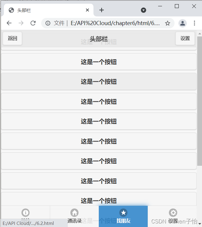
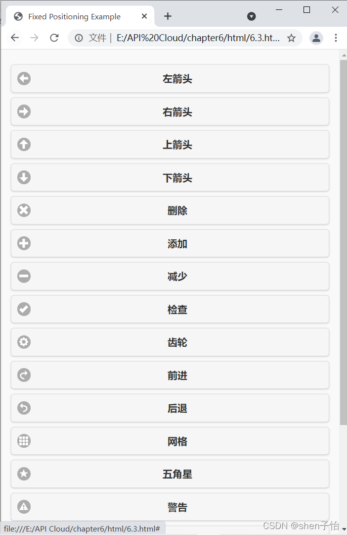
JQuery Mobile为开发者准备了其他图标样式:
| 属性值 | 描述 |
|---|---|
| data-icon="arrow-l" | 左箭头 |
| data-icon="arrow-r" | 右箭头 |
| data-icon="arrow-u" | 上箭头 |
| data-icon="arrow-d" | 下箭头 |
| data-icon="plus" | 加 |
| data-icon="minus" | 减 |
| data-icon="delete" | 删除 |
| data-icon="check" | 检查 |
| data-icon="home" | 首页 |
| data-icon="info" | 信息 |
| data-icon="grid" | 网格 |
| data-icon="gear" | 齿轮 |
| data-icon="search" | 搜索 |
| data-icon="back" | 后退 |
| data-icon="forward" | 向前 |
| data-icon="refresh" | 刷新 |
| data-icon="star" | 星 |
| data-icon="alert" | 提醒 |
3.3 更加个性化地显示图标
上一节展示了怎样在按钮中显示图标,虽然链接在尾部栏中可以默认显示为按钮,但并不是真正的按钮。
默认图标的显示:
<!DOCTYPE html>

<head>
<meta http-equiv="Content-Type" content="text/html; charset=utf-8" />
<title>Fixed Positioning Example</title>
<meta name="viewport" content="width=device-width, initial-scale=1"/>
<link rel="stylesheet" href="../css/jquery.mobile-1.4.5.min.css" />
<script src="../script/jquery-2.1.4.min.js"></script>
<script src="../script/jquery.mobile-1.4.5.min.js"></script>
</head>
<body>
	<div data-role="page" data-theme="a">
		<div data-role="content">
			<a href="#" data-role="button" data-iconpos="left" data-icon="arrow-l">左箭头</a>
			<a href="#" data-role="button" data-iconpos="left" data-icon="arrow-r">右箭头</a>
			<a href="#" data-role="button" data-iconpos="left" data-icon="arrow-u">上箭头</a>
			<a href="#" data-role="button" data-iconpos="left" data-icon="arrow-d">下箭头</a>
			<a href="#" data-role="button" data-iconpos="left" data-icon="delete">删除</a>
			<a href="#" data-role="button" data-iconpos="left" data-icon="plus">添加</a>
			<a href="#" data-role="button" data-iconpos="left" data-icon="minus">减少</a>
			<a href="#" data-role="button" data-iconpos="left" data-icon="check">检查</a>
			<a href="#" data-role="button" data-iconpos="left" data-icon="gear">齿轮</a>
			<a href="#" data-role="button" data-iconpos="left" data-icon="forward">前进</a>
			<a href="#" data-role="button" data-iconpos="left" data-icon="back">后退</a>
			<a href="#" data-role="button" data-iconpos="left" data-icon="grid">网格</a>
			<a href="#" data-role="button" data-iconpos="left" data-icon="star">五角星</a>
			<a href="#" data-role="button" data-iconpos="left" data-icon="alert">警告</a>
			<a href="#" data-role="button" data-iconpos="left" data-icon="info">信息</a>
			<a href="#" data-role="button" data-iconpos="left" data-icon="home">首页</a>
			<a href="#" data-role="button" data-iconpos="left" data-icon="search">搜索</a>
            <a href="#" data-role="button" data-iconpos="left" data-icon="refresh">刷新</a>
		</div>
    </div>
</body>
</html>
效果如下: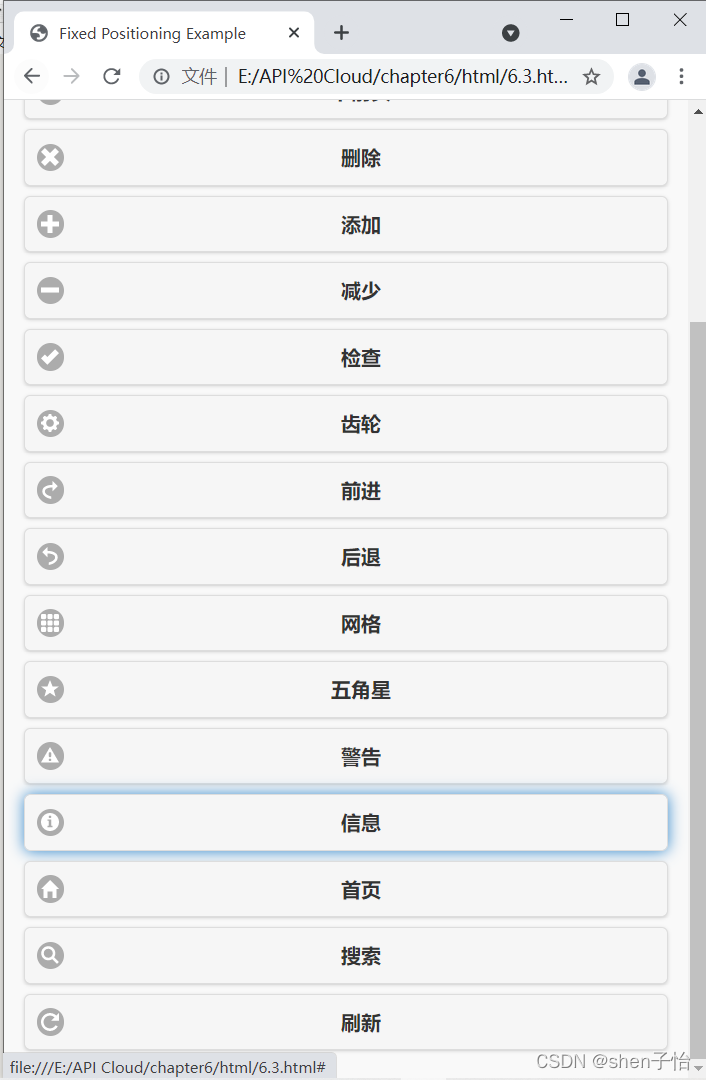
data-iconpos="left"属性设置了图标的位置。默认为左侧,可为right、top、bottom。除了这几种显示方式外,很多时候开发者想要以图标的方式显示按钮,可以将data-iconpos属性的值设为notext来达到想要的效果。
尽管设置了notext后按钮宽度变得很小,但是它仍然独自占用页面中的一行,这时就需要配合有效的布局或分组来实现屏幕空间的有效利用。
3.4 自定义按钮的图标
相对于默认图标而言,自定义图标使用会比较复杂。首先要把图片准备好,为了达到更好的效果,尽量使用png格式的图片。
自定义按钮的图标:
<!DOCTYPE html>

<head>
<meta http-equiv="Content-Type" content="text/html; charset=utf-8" />
<title>Fixed Positioning Example</title>
<meta name="viewport" content="width=device-width, initial-scale=1"/>
<link rel="stylesheet" href="../css/jquery.mobile-1.4.5.min.css" />
<script src="../script/jquery-2.1.4.min.js"></script>
<script src="../script/jquery.mobile-1.4.5.min.js"></script>
<style type="text/css">
.ui-icon-round{ background-image:url(round.png);}
.ui-icon{ background-size:18px 26px;}
</style>
</head>
<body>
	<div data-role="page">
    	<div data-role="header" data-position="fixed">
        	<a href="#">返回</a>
            <h1>头部栏</h1>
            <a href="#">设置</a>
        </div>
		<div data-role="content">
			<a href="#" data-role="button"  style="margin-top:60px;" data-iconpos="left" data-icon="round">自定义图标在左侧显示</a>
			<a href="#" data-role="button" data-iconpos="right" data-icon="round">自定义图标在右侧显示</a>
			<a href="#" data-role="button" data-iconpos="top" data-icon="round">自定义图标在上方显示</a>
			<a href="#" data-role="button" data-iconpos="bottom" data-icon="round">自定义图标在下方显示</a>
			<a href="#" data-role="button" data-iconpos="notext" data-icon="round">不显示自定义图标</a>
		</div>
        <div data-role="footer" data-position="fixed">
			<div data-role="navbar">
				<ul>
					<li><a id="chat" href="#" data-icon="round">微信</a></li>
					<li><a id="email" href="#" data-icon="round">通讯录</a></li>
					<li><a id="skull" href="#" data-icon="round">找朋友</a></li>
					<li><a id="beer" href="#" data-icon="round">设置</a></li>
				</ul>
			</div><!-- /navbar -->
		</div><!-- /footer -->
    </div>
</body>
</html>
观察可以发现在data-icon属性中引用了一个之前没有接触过的名称round。因为在页面中加入了新的样式,样式名称由图标名和ui-icon组合而成:
<style type="text/css">
.ui-icon-round{ background-image:url(round.png);}
.ui-icon{ background-size:18px 26px;}
</style>
效果如下:
自定义图标样式时,一定要注意图标尺寸为18×18像素,否则JQuery Mobile将只截取图片左上方18×18像素的部分进行显示。
3.5 播放器的面板设计
前面介绍了一些按钮控件的用法,但是在JQuery Mobile中按钮只能以占满一行的形式平铺,显得过于单调。JQuery Mobile为开发者准备了按钮的内联功能。
利用按钮分组制作的播放器界面:
<!DOCTYPE html>

<head>
<meta http-equiv="Content-Type" content="text/html; charset=utf-8" />
<title>简单的播放器</title>
<meta name="viewport" content="width=device-width, initial-scale=1"/>

<link rel="stylesheet" href="../css/jquery.mobile-1.4.5.min.css" />
<script src="../script/jquery-2.1.4.min.js"></script>
<script src="../script/jquery.mobile-1.4.5.min.js"></script>
</head>
<body>
	<div data-role="page" data-theme="a">
		<div data-role="header" data-position="fixed">
			<a href="#">返回</a>
			<h1>音乐播放器</h1>
		</div>
		<div data-role="content">
			<div data-role="controlgroup">
				<a href="#" data-role="button">no air </a>
				<a href="#" data-role="button">
					<img src="1.jpg" style="width:80%;"/>
				</a>
				<a href="#" data-role="button">jordin sparks</a>
				<a href="#" data-role="button">No Air </a>
			</div>
			<div data-role="controlgroup" data-type="horizontal">
				<a href="#" data-role="button">后退</a>
				<a href="#" data-role="button">播放</a>
				<a href="#" data-role="button">暂停</a>
				<a href="#" data-role="button">后退</a>
			</div>
		</div>
		<div data-role="footer" data-position="fixed">
			<h1>暂无歌词</h1>
		</div>
    </div>
</body>
</html>
效果如下: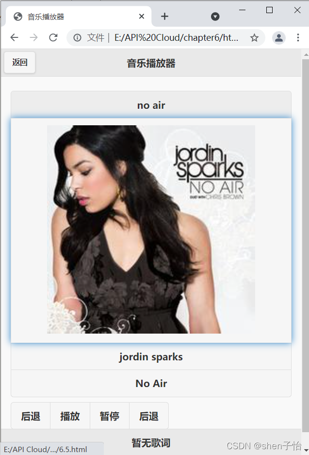
除了操作面板外,利用按钮的分组功能又设计了一个简单的音乐内容面板,其中包括正在播放的音乐名称、作者来源等消息。
首先是偏上部分的音乐内容面板,简单地将四个按钮分在一组,在这一组外包一个div标签,将属性data-role设置为controlgroup。在页面上可以清楚看到四个按钮紧紧链接在一起。接下来是操作面板,依然是将四个按钮分在一组,不同的是给外面的div标签多设置一组属性data-type为horizontal,将排列方式设置为横向。
tip:这里还可以给某个按钮设置主题,比如播放键加上不同颜色,使之更为醒目,更易于用户操作。
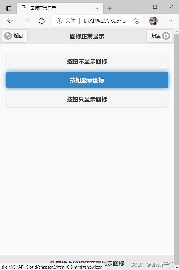
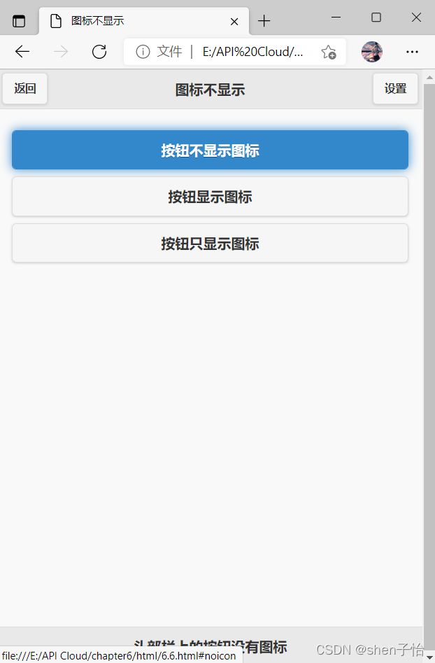
3.6 头部栏的按钮图标
头部栏的按钮中加入图标:
<!DOCTYPE html>     				          <!--声明HTML 5-->

<head>
<meta http-equiv="Content-Type" content="text/html; charset=utf-8" />
<meta name="viewport" content="width=device-width, initial-scale=1"/>
<link rel="stylesheet" href="../css/jquery.mobile-1.4.5.min.css" />
<script src="../script/jquery-2.1.4.min.js"></script>
<script src="../script/jquery.mobile-1.4.5.min.js"></script>
</head>
<body>
	<div data-role="page" id="noicon" data-position="fixed">
		<div data-role="header">
			<a href="#">返回</a>
			<h1>图标不显示</h1>
			<a href="#">设置</a>
		</div>
		<div data-role="content">
			<a href="#noicon" data-role="button">按钮不显示图标</a>
			<a href="#showicon" data-role="button">按钮显示图标</a>
			<a href="#notext" data-role="button">按钮只显示图标</a>
		</div>
		<div data-role="footer" data-position="fixed">
			<h1>头部栏上的按钮没有图标</h1>
		</div>
    </div>
	<!---->
	<div data-role="page" id="showicon">
		<div data-role="header" data-position="fixed">
			<a href="#" data-icon="back">返回</a>
			<h1>图标正常显示</h1>
			<a href="#" data-icon="gear" data-iconpos="right">设置</a>
		</div>
		<div data-role="content">
			<a href="#noicon" data-role="button">按钮不显示图标</a>		<!--按钮不显示图标-->
			<a href="#showicon" data-role="button">按钮显示图标</a>		<!--按钮显示图标-->
			<a href="#notext" data-role="button">按钮只显示图标</a>			<!--按钮只显示图标-->
		</div>
		<div data-role="footer" data-position="fixed">
			<h1>头部栏上的按钮正常显示图标</h1>
		</div>
    </div>
	<!---->
	<div data-role="page" id="notext">
		<div data-role="header" data-position="fixed">
			<a href="#" data-icon="back" data-iconpos="notext">返回</a>
			<h1>只显示图标</h1>
			<a href="#" data-icon="gear" data-iconpos="notext">设置</a>
		</div>
		<div data-role="content">
			<a href="#noicon" data-role="button">按钮不显示图标</a>
			<a href="#showicon" data-role="button">按钮显示图标</a>
			<a href="#notext" data-role="button">按钮只显示图标</a>
		</div>
		<div data-role="footer" data-position="fixed">
			<h1>头部栏上的按钮只显示图标</h1>
		</div>
    </div>
</body>
</html>
效果如下: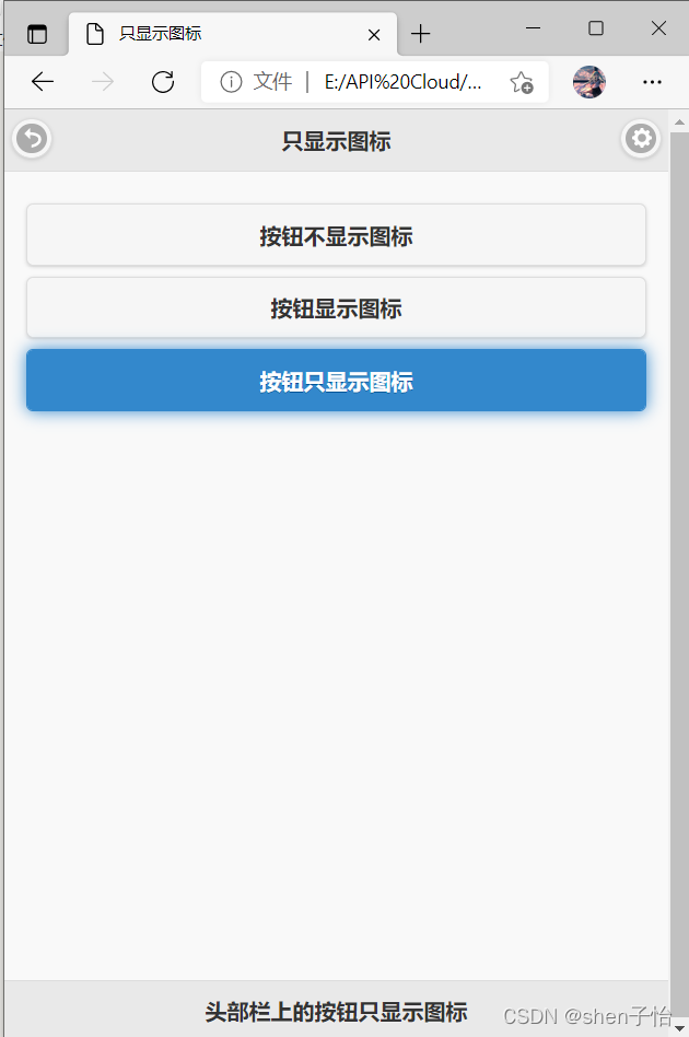
3.7 一个按钮也可以很开心
很多用户习惯使用右手操作,因此将仅有的一个按钮放在头部栏的右侧很人性化。
示例:
<!DOCTYPE html>

<head>
<meta http-equiv="Content-Type" content="text/html; charset=utf-8" />
<meta name="viewport" content="width=device-width, initial-scale=1"/>
<link rel="stylesheet" href="../css/jquery.mobile-1.4.5.min.css" />
<script src="../script/jquery-2.1.4.min.js"></script>
<script src="../script/jquery.mobile-1.4.5.min.js"></script>
</head>
<body>
	<div data-role="page">
		<div data-role="header">
			<h1>在头部栏右侧显示按钮</h1>
			<a href="#" class="ui-btn-right">设置</a>
		</div>
		<div data-role="content">
			<h4>由于大多数的用户比较习惯于使用右手进行操作,因此当头部栏中仅有一个按钮时可以考虑尽量将这一个按钮放置在头部栏的右侧。</h4>
		</div>
		<div data-role="footer">
			<h1>但是按钮依然显示在头部栏的左侧</h1>
		</div>
    </div>
</body>
</html>
<a href="#" class="ui-btn-right">设置</a>
效果如下: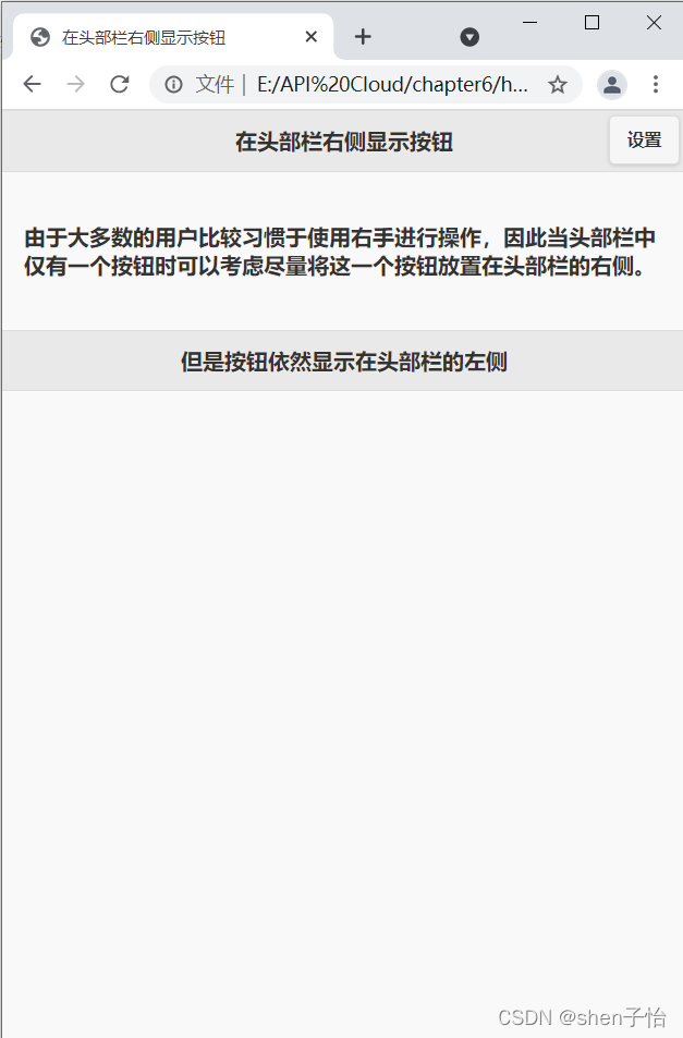
3.8 简单的QWER键盘
上一节可以发现头部栏的按钮没有占据一整行,也没有与多个按钮一起成组存在,那么在页面的其他部分是否也可以。
简单QWER键盘:
<!DOCTYPE html>

<head>
<meta http-equiv="Content-Type" content="text/html; charset=utf-8" />
<meta name="viewport" content="width=device-width, initial-scale=1"/>
<link rel="stylesheet" href="../css/jquery.mobile-1.4.5.min.css" />
<script src="../script/jquery-2.1.4.min.js"></script>
<script src="../script/jquery.mobile-1.4.5.min.js"></script>
</head>
<body>
	<div data-role="page">
		<div data-role="header">
			<h1>简单的QWER键盘</h1>
		</div>
		<div data-role="content">
			<a href="#" data-role="button" data-corners="false" data-inline="true">Tab</a>
			<a href="#" data-role="button" data-corners="false" data-inline="true">Q</a>
			<a href="#" data-role="button" data-corners="false" data-inline="true">W</a>
			<a href="#" data-role="button" data-corners="false" data-inline="true">E</a>
			<a href="#" data-role="button" data-corners="false" data-inline="true">R</a>
			<a href="#" data-role="button" data-corners="false" data-inline="true">T</a>
			<a href="#" data-role="button" data-corners="false" data-inline="true">Y</a>
			<a href="#" data-role="button" data-corners="false" data-inline="true">U</a>
			<a href="#" data-role="button" data-corners="false" data-inline="true">I</a>
			<a href="#" data-role="button" data-corners="false" data-inline="true">O</a>
			<a href="#" data-role="button" data-corners="false" data-inline="true">P</a>
			<br/>
			<a href="#" data-role="button" data-corners="false" data-inline="true">Caps Lock</a>
			<a href="#" data-role="button" data-corners="false" data-inline="true">A</a>
			<a href="#" data-role="button" data-corners="false" data-inline="true">S</a>
			<a href="#" data-role="button" data-corners="false" data-inline="true">D</a>
			<a href="#" data-role="button" data-corners="false" data-inline="true">F</a>
			<a href="#" data-role="button" data-corners="false" data-inline="true">G</a>
			<a href="#" data-role="button" data-corners="false" data-inline="true">H</a>
			<a href="#" data-role="button" data-corners="false" data-inline="true">J</a>
			<a href="#" data-role="button" data-corners="false" data-inline="true">K</a>
			<a href="#" data-role="button" data-corners="false" data-inline="true">L</a>
			<a href="#" data-role="button" data-corners="false" data-inline="true">;</a>
			<br/>
			<a href="#" data-role="button" data-corners="false" data-inline="true">Shift</a>
			<a href="#" data-role="button" data-corners="false" data-inline="true">Z</a>
			<a href="#" data-role="button" data-corners="false" data-inline="true">X</a>
			<a href="#" data-role="button" data-corners="false" data-inline="true">C</a>
			<a href="#" data-role="button" data-corners="false" data-inline="true">V</a>
			<a href="#" data-role="button" data-corners="false" data-inline="true">B</a>
			<a href="#" data-role="button" data-corners="false" data-inline="true">N</a>
			<a href="#" data-role="button" data-corners="false" data-inline="true">M</a>
			<a href="#" data-role="button" data-corners="false" data-inline="true"><</a>
			<a href="#" data-role="button" data-corners="false" data-inline="true">></a>
			<a href="#" data-role="button" data-corners="false" data-inline="true">/</a>
		</div>
		<div data-role="footer">
			<h1>排列的非常整齐</h1>
		</div>
    </div>
</body>
</html>
效果如下: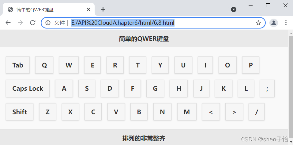
观察代码可以发现,每个按钮增加了属性data-inline=“true”,它可以使按钮的宽度变得仅包含按钮中标题的内容,而不是占据整整一行。这时JQuery Mobile不知道在何处换行,所以就需要< br/ >标签。
使用了该属性之后按钮将不再适应屏幕的宽度。其实用JQuery Mobile中的分栏布局功能比这种方式好得多,但是由于分栏布局只能产生规整的布局,所以在实际布局中还要根据实际情况来决定具体使用哪种方案比较合适。
3.9 方形按钮
方形的按钮:只要在按钮中加入属性data-corners="false"就可以使按钮变成方形了。
3.10 对话框中的按钮
带有按钮的对话框:
<!DOCTYPE html>

<head>
<meta http-equiv="Content-Type" content="text/html; charset=utf-8" />
<title>对话框中的按钮</title>
<meta name="viewport" content="width=device-width, initial-scale=1"/>
<link rel="stylesheet" href="../css/jquery.mobile-1.4.5.min.css" />
<script src="../script/jquery-2.1.4.min.js"></script>
<script src="../script/jquery.mobile-1.4.5.min.js"></script>
</head>
<body>
	<div data-role="page">
		<div data-role="header">
			<h1>请点击按钮</h1>
		</div>
		<div data-role="content" style="height:430px;">
			<a href="#popupDialog" data-rel="popup" data-role="button">弹出对话框</a>
			<div data-role="popup" id="popupDialog" data-overlay-theme="a" data-theme="c" data-dismissible="false" style="max-width:400px;" class="ui-corner-all">
				<div data-role="header" data-theme="a" class="ui-corner-top">
					<h1>QQ</h1>
				</div>
				<div data-role="content" data-theme="b" class="ui-corner-bottom ui-content">
					<h4>Evils:在么?</h4>
					<a href="#" data-role="button" data-inline="true" data-rel="back" data-theme="a">回复</a>
					<a href="#" data-role="button" data-inline="true" data-rel="back" data-theme="b">忽略</a>
				</div>
			</div>
		</div>
	</div>
</body>
</html>
效果如下: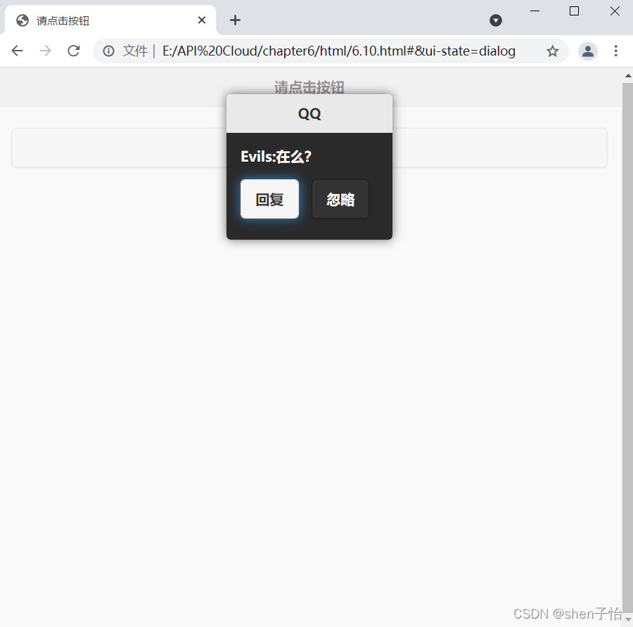
只要把按钮写在标志对话框的div标签中就可以了。