CSS
- CSS:用于渲染HTML元素标签的样式。
一:行间样式
示例代码:
<div style="
      width: 100px;
      height: 100px;
      background-color: red;
"></div>
页面级css
在head标签里引用的标签。
示例代码:
<head>
   <meta charset="UTF-8">
   <meta name="viewport" content="width=device-width, initial-scale=1.0">
   <title>Document</title>
   <style type="text/css">
       div{
           width:100px;
           height:100px;
           background-color: green;
         }
   </style>
</head>
外部css文件
示例代码:
<link rel="stylesheet" type="text/css" href="style.css">
二:选择器
选择器:如何选择html元素
1.id
示例代码:
<div id="only">123</div>
2.class
示例代码:
<div class="demo">123</div>
3.标签选择器
示例代码:
<div>123</div>
<div>
    <span>234</span>
</div>
4.通配符:所有标签。
示例代码:
<strong>789</strong>
父子选择器/派生选择器
div下的所有元素都是div的儿子
示例代码:
<div>
  <em>1</em>
  <strong>
      <em>2</em>
  </strong>
</div>
直接子元素选择器
示例代码:
div > em{
    background-color: seagreen;
}
| 标签 | 描述 |
|---|---|
| link | 定义资源引用地址 |
| style | 定义文本样式 |
并列选择器:用多个限制条件选中一个元素并且不加空格
示例代码:
div.demo{
    background-color: red;
}
分组选择器
示例代码:
em,strong,span{
   background-color: red;
}
对齐方式
text-align:right,left,center.
示例代码:
div{
    border:1px solid black;
    text-align:center;/*对齐方式*/
}
css里取消del删除线
示例代码:
*/del{
    text-decoration:none;
}*/
伪类选择器
示例代码:
a:hover{

    background-color:orange;
}
展示: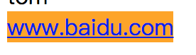
盒子模型
盒子的组成部分
盒子壁 border
内边距 padding
盒子内容 width + height
示例代码:
div{
    width:100px;
    height:100px;
    background-color: red;
    border: 10px solid black;
    padding:100px;
}
absolute,relative
1.脱离原来位置进行定位
2.保留原来位置进行定位
示例代码:
.demo{
    position:absolute;
    left:100px;
    top:100px;
    width:100px;
    height:100px;
    background-color: red;
    opacity:0.5;
.wrapper{
    height:200px;
    width:200px;
    background-color: red;
}
.content{
    width:100px;
    height:100px;
    background-color: black;

}
.box{
    width:50px;
    height:50px;
    background-color: green;
}
居中五环小练习
示例代码:
*{
 margin:0;
 padding:0;
}

.plat{
  position: absolute;
  left: 50%;
  top:50%;
  margin-left:-190px;
  margin-top:-93px;
  height:186px;
  width:380px;
}

.circle1,
.circle2,
.circle3,
.circle4,
.circle5{
  position: absolute;
  width: 100px;
  height: 100px;
  border:10px solid black;
  border-radius:50%;
}
.circle1{
  border-color: red;
  left:0;
  top:0;
}
.circle2{
  border-color: green;
  left: 130px;
  top: 0;
}
.circle3{
  border-color: yellow;
  left:260px;
  top:0;
}
.circle4{
  border-color: blue;
  left:65px;
  top: 70px;
}
.circle5{
  border-color:purple;
  left:195px;
  top: 70px;
}
展示: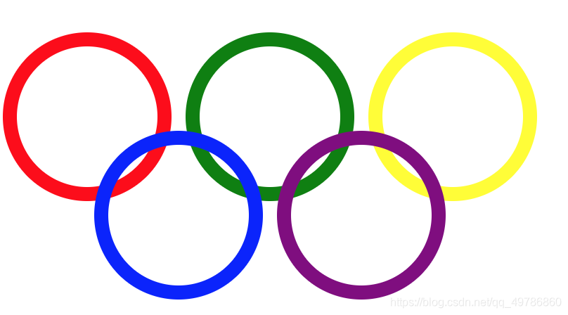
两栏布局
opacity:透明度
示例代码:
.right{
    position: absolute;
    right: 0;
    width: 100px;
    height: 100px;
    background-color: #fcc;
    opacity: 0.5;
}
.left{
    margin-right: 100px;
    height:100px;
    background-color: #123;
}
展示;
两个bug
示例代码:
.wrapper{
    margin-left: 100px;
    margin-top: 100px;
    width: 100px;
    height: 100px;
    background-color: black;
    }
 .content{
    margin-left: 50px;
    margin-top: 150px;
    width: 50px;
    height: 50px;
    background-color: green;
}
bfc:
block format context:块级格式化上下文
| 标签 | 描述 |
|---|---|
| overflow:hidden | 溢出部分隐藏 |
| position:absolute | 绝对定位 |
| display:inline-block | 处理行内非替代元素高度 |
| float:left/right | 向左/向右浮动 |
示例代码:
.wrapper{
   overflow: hidden;
  }
展示:

浮动元素产生了浮动流 所有产生了浮动流的元素,块级元素看不到他们
产生了bfc的元素和文本类型属性的元素以及文本都能看到浮动元素。
补充
权重排序:important,行间样式,id,class|属性|伪类,标签|伪元素,通配符。
伪元素
示例代码:
span::before{
    content: "junge";
}
span::after{
    content: "shide";
}
淘宝页面综合练习:
示例代码:
*{
    margin: 0;
    padding: 0;
    color:black;
    font-family: Arial;
    }
a{
    text-decoration: none;
}
.nav::after{
    content: "";
    display: block;
    clear:both;
}
.nav{
    list-style:none;
}
.nav .list-item{
    float: left;
    margin:0 10px;
    height:30px;
    line-height: 30px;
}
.nav .list-item a{
    padding: 0 5px;
    color:#f40;
    font-weight:bold;
    height:30px;
    display: inline-block;
    border-radius:15px;
}
.nav .list-item a:hover{
    background-color: #f40;
    color:#fff;
}
展示: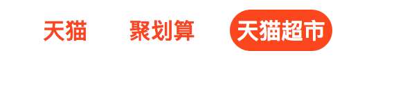
文字溢出处理
溢出容器,要打点展示
1.单行文本
2.多行文本
ellipsis:…
示例代码:
单行文本
*{
   margin:0;
   padding:0;
}
p{
   width:300px;
   height:20px;
   line-height: 20px;
   white-space: nowrap;
   overflow: hidden;
   text-overflow:ellipsis;
}
多行文本
*{
    margin:0;
    padding:0;
}
p{
    width:300px;
    height:40px;
    line-height: 20px;
    border: 1px solid black;
    overflow:hidden;
背景图片处理
示例代码:
div{
    width:200px;
    height:200px;
    border:1px solid black;
    background-image: url('../img/zgr.jpg');
    background-size: 100px 100px;
    background-repeat: no-repeat;
}
版权声明:本文为qq_49786860原创文章,遵循CC 4.0 BY-SA版权协议,转载请附上原文出处链接和本声明。