<template>
  <div class="sm-dropdown-bg">
    <div class="sm-dropdown-select" tabindex="-1" ref="smSelectRef" @click="smSelect" @blur="smSelectBlur">
        <span>{{ valueType }}</span>
        <span class="sm-dropdown-title" :class="{'sm-dropdown-title1': showType}"></span>
    </div>
    <ul class="sm-dropdown-ul" :class="{'sm-dropdown-ul-show': showType}">
      <li v-for="(item, index) in options1"
      :key="index"
      :value="item.value"
      :class="{'sm-dropdown-li': item.value == useValue}"
      @click.stop="liclick(item)">{{ item.text }}</li>
    </ul>
  </div>
</template>


<style scoped lang="less">
.sm-dropdown-bg{
  display: inline-block;
  position: relative;
  .sm-dropdown-select{
    min-width: 2.2rem;
    display: inline-block;
    text-align: center;
    background-color: white;
    padding: 6px 15px;
    // box-shadow: 0 0.001rem 0.03rem #eee;
    // border: 1px solid #efefef;
    font-size: .37rem;
    display: flex;
    justify-content: center;
    align-items: center;
  }
  .sm-dropdown-ul{
    width: 100%;
    max-height: 5rem;
    border: 1px solid #eee;
    line-height: 30px;
    font-size: .35rem;
    padding: 8px;
    box-sizing: border-box;
    text-align: center;
    background-color: #fff;
    position: absolute;
    z-index: 2002;
    overflow-y: auto;
    display: none;
  }
  .sm-dropdown-ul::-webkit-scrollbar{
    width: 0;
    height: 0;
  }
  .sm-dropdown-ul-show{
    display: block;
  }
  .sm-dropdown-li{
    color: red;
  }
  .sm-dropdown-title {
      margin-top: -0.133rem;
      margin-left: .1rem;
      border: 0.08rem solid;
      border-color: transparent transparent #dcdee0 #dcdee0;
      -webkit-transform: rotate(-45deg);
      transform: rotate(-45deg);
      opacity: .8;
      content: "";
  }
  .sm-dropdown-title1{
      margin-top: -0.027rem;
      -webkit-transform: rotate(135deg);
      transform: rotate(135deg);
  }
  .sm-dropdown-input{
    display: inline;
    padding: 0;
    border: 0px;
  }
}
</style>
<script>
// 调取接口 封装方法 (不需要可以拿掉)
import { getListUrl } from '../../api/demo'
export default {
  name: 'MpDropdownMenu',
  model: {
    prop: 'value',
    event: 'change'
  },
  props: {
    value: { // 绑定值
      type: String,
      default: () => {
        return '0'
      }
    },
    options: { // 数据源
      type: Array,
      default: () => {
        return [
          { text: '全部商品', value: '0' },
          { text: '新款商品', value: '1' },
          { text: '活动商品', value: '2' }
        ]
      }
    },
    urlOptions: { // 动态数据源
      type: Object,
      default: () => {
        return {
          url: '',
          labelKey: '',
          valueKey: ''
        }
      }
    }
  },
  watch: {
    options: { // 数据源
      handler (val) {
        this.options1 = val
        if (!val || val.length == 0) {
          this.options1 = [{ text: '默认数据', value: '0' }]
        }
        if (this.options1.find(v => v.value == this.useValue)) {
          this.valueType = this.options1.find(v => v.value == this.useValue).text
        }
      },
      immediate: true,
      deep: true
    },
    value: { // 绑定的值
      handler(val){
        this.useValue = val
      },
      immediate: true,
      deep: true
    },
    useValue: { // 数据改变时使用的值
      handler(val){
        if (this.options1.find(v => v.value == val)) {
          this.valueType = this.options1.find(v => v.value == val).text
        }
      },
      immediate: true,
      deep: true
    },
  },
  data(){
    return {
      showType: false, // 下拉显示隐藏
      valueType: '', // title 显示文字
      useValue: '', // 改变时使用的值
      options1: [] // 数据源
    }
  },
  mounted(){
    this.getList()
  },
  methods: {
    // 动态数据源时请求接口
     async getList(){
      if (!this.urlOptions.url) return
      const data = await getListUrl({}, this.urlOptions.url)
      const arr = data.data.data
      arr.map(v => {
        if (this.urlOptions.labelKey) {
          v.text = v[this.urlOptions.labelKey]
        }
        if (this.urlOptions.valueKey) {
          v.value = v[this.urlOptions.valueKey]
        }
      })
      this.options1 = arr
    },
    // 点击事件 控制显示隐藏
    smSelect(){
      this.showType = !this.showType
      /**
       * 给div增加focus
       * 必须添加属性 tabindex="-1"
       * 通过@blur 事件 让下拉显示框隐藏
       * */
      this.$refs.smSelectRef.focus()
    },
    // div失去焦点事件
    smSelectBlur(){
      setTimeout(()=>{
        this.showType = false
      },100)
    },
    // 下拉列表点击事件
    liclick(item){
      this.useValue = item.value
      this.showType = false
      this.$emit('change', item.value)
    }
  }
}
</script>
这里边 特别重要的就是通过ref给div添加focus
/**
       * 给div增加focus
       * 必须添加属性 tabindex="-1"
       * 通过@blur 事件 让下拉显示框隐藏
       * */
      this.$refs.smSelectRef.focus()
这样就可以通过@blur事件实现失去焦点的时候 让下拉框也可以隐藏掉
// div失去焦点事件
    smSelectBlur(){
      setTimeout(()=>{
        this.showType = false
      },100)
    },
值得注意的是,上边延时器是为了可以实现 下拉列表每一项可以选择 否则 点击每一项的时候事件不执行
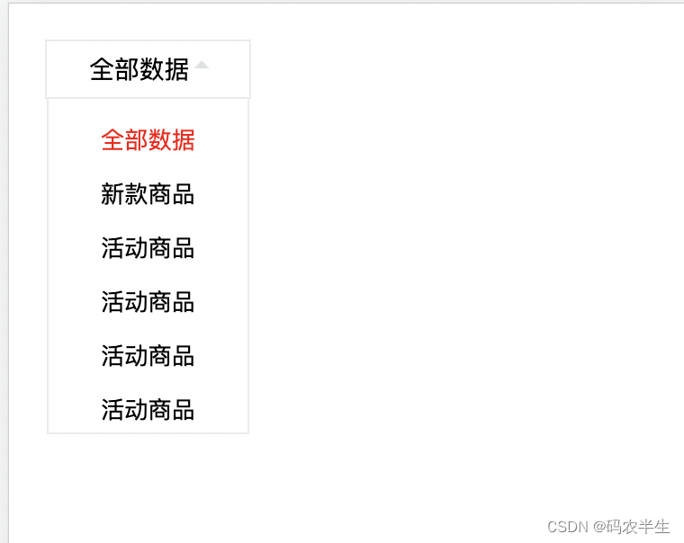
*这个下拉菜单 是移动端 仿vant UI组件的,并没有封装多选功能
版权声明:本文为qq_41169990原创文章,遵循CC 4.0 BY-SA版权协议,转载请附上原文出处链接和本声明。