折线图适合二维的大数据集,尤其是那些趋势比单个数据点更重要的场合
markArea
//标注空间 (xAxis的值要与xdata值中取出)
                markArea: {
                    data: [
                        [{
                            xAxis: '1月'
                        }, {
                            xAxis: '2月'
                        }],
                        [{
                            xAxis: '7月'
                        }, {
                            xAxis: '8月'
                        }]
                    ]
                }
smooth
//平滑效果
                smooth: true,
lineStyle
lineStyle: {
                    color: 'yellow',
                    type: 'dashed' //虚线  dotted 点线 solid 实线
                }
areaStyle
//填充风格
                areaStyle: {
                    color: 'yellow'
                }
boundaryGap
 xAxis: {
                type: 'category',
                //紧挨边缘
                boundaryGap: false, //配置给类目轴
                data: xdata
            }
scale
 yAxis: {
                type: 'value',
                //缩放:脱离0值比例
                scale: true
            }
可得下图: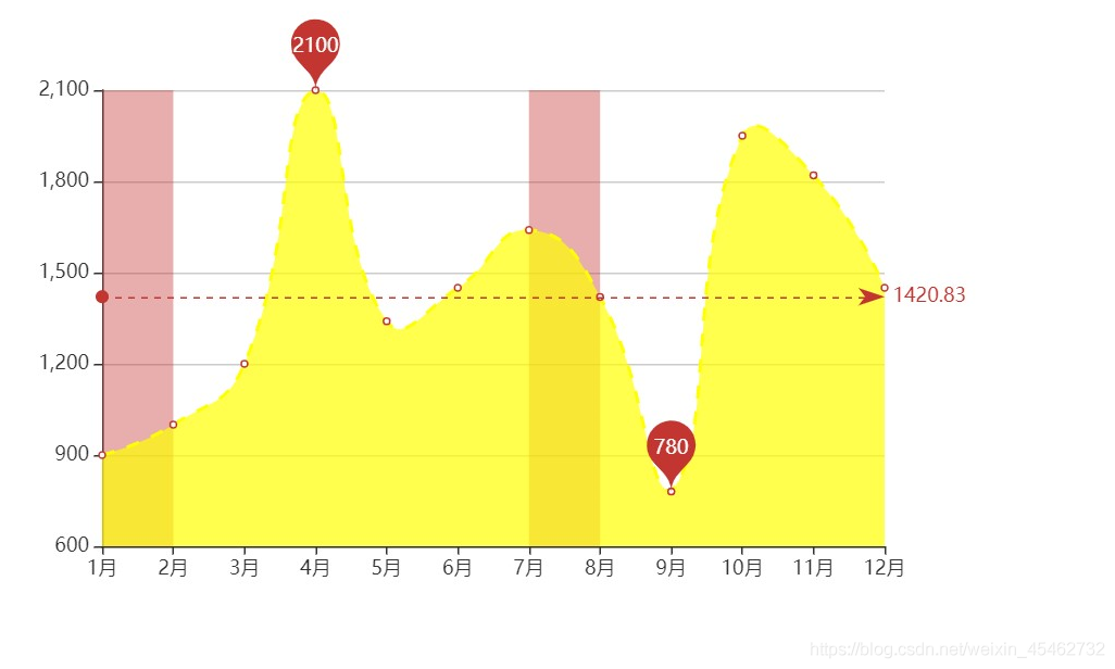
代码:
var xdata = ['1月', '2月', '3月', '4月', '5月', '6月', '7月', '8月', '9月', '10月', '11月', '12月', ]
        var ydata = [900, 1000, 1200, 2100, 1340, 1450, 1640, 1420, 780, 1950, 1820, 1450]
        var option = {
            xAxis: {
                type: 'category',
                //紧挨边缘
                boundaryGap: false, //配置给类目轴
                data: xdata
            },
            yAxis: {
                type: 'value',
                //缩放:脱离0值比例
                scale: true
            },
            series: [{
                name: '销量',
                type: 'line',
                markPoint: {
                    data: [{
                        type: 'max',
                    }, {
                        type: 'min',
                    }]
                },
                markLine: {
                    data: [{
                        type: 'average',
                    }]
                },
                //标注空间
                markArea: {
                    data: [
                        [{
                            xAxis: '1月'
                        }, {
                            xAxis: '2月'
                        }],
                        [{
                            xAxis: '7月'
                        }, {
                            xAxis: '8月'
                        }]
                    ]
                },
                //平滑效果
                smooth: true,
                //线条样式
                lineStyle: {
                    color: 'yellow',
                    type: 'dashed' //虚线  dotted 点线 solid 实线
                },
                //填充风格
                areaStyle: {
                    color: 'yellow'
                },

                data: ydata
            }]
        }
堆叠图
series: [{
                name: '销量',
                type: 'line',
                data: ydata,
                //stack属性
                stack: 'all',
                areaStyle: {}
            }, {
                name: '游戏',
                type: 'line',
                data: ydata1,
                stack: 'all',
                areaStyle: {}
            }]
运行得下图: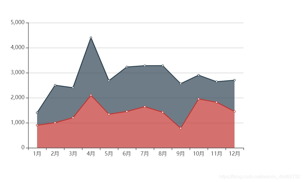
代码:
 var xdata = ['1月', '2月', '3月', '4月', '5月', '6月', '7月', '8月', '9月', '10月', '11月', '12月', ]
        var ydata = [900, 1000, 1200, 2100, 1340, 1450, 1640, 1420, 780, 1950, 1820, 1450]
        var ydata1 = [500, 1500, 1200, 2300, 1340, 1780, 1640, 1862, 1780, 950, 820, 1250]
        var option = {
            xAxis: {
                type: 'category',
                data: xdata
            },
            yAxis: {
                type: 'value',
            },
            //堆叠图
            series: [{
                name: '销量',
                type: 'line',
                data: ydata,
                //stack属性
                stack: 'all',
                areaStyle: {}
            }, {
                name: '游戏',
                type: 'line',
                data: ydata1,
                stack: 'all',
                areaStyle: {}
            }]
        }
更多的echarts配置项学习可以在echarts官网查看 echarts官网配置项
版权声明:本文为weixin_45462732原创文章,遵循CC 4.0 BY-SA版权协议,转载请附上原文出处链接和本声明。