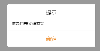
 this.$qxPop.show({
  	  message: '这是自定义模态窗',
      title: '提示',
  })
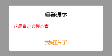
   this.$qxPop.show({
         message: `<div style="color: #ff0000">这是自定义模态窗</div>`,
         title: '温馨提示',
         confirmButtonText: '我知道了',
    })
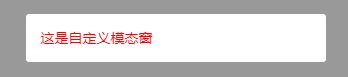
  this.$qxPop.show({
     message: `<div style="color: #ff0000">这是自定义模态窗</div>`,
        showTitle: false,
        showConfirmButton: false,
        duration: 3000,
    })
qxPop Attributes
| 参数 | 说明 | 类型 | 默认值 |
|---|---|---|---|
| message | 消息内容(支持富文本) | String | —— |
| title | 弹窗标题 | String | 提示 |
| showTitle | 是否显示标题 | Boolean | true |
| showConfirmButton | 是否显示确认按钮 | Boolean | true |
| confirmButtonText | 自定义确认按钮文字 | String | —— |
| duration | 显示时间, 毫秒。设为0或者不传参则不会自动关闭 | Number | 0 |
| success | 确认按钮回调方法 | Object | —— |
| modalStyle | 自定义样式(fix小程序里面无法控制子组件样式) | Object | —— |
源码实现
【!!!当时写Demo是在TS的环境下,使用时需要注意转换成JS的写法】
qxPop.vue
<!--
 * @Description:
 * @version:
 * @Author: lilyzhouou@gmail.com
 * @LastAuthor:
 * @Date: 2020-09-29 15:29:36
 * @LastEditTime: 2020-09-29 17:29:38
-->
<template>
    <view class="qx-pop" v-show="isVisible">
        <view class="modal-mask"></view>
        <view :class="{ active: isVisible }" class="modal-body">
            <view class="modal-wrapper-box" :style="opts.modalStyle">
                <view class="modal-hd" v-if="opts.showTitle">{{ opts.title }}</view>
                <view class="modal-bd" v-html="opts.message"> </view>
                <view class="modal-ft" v-if="opts.showConfirmButton" @click="handleConfirm">{{ opts.confirmButtonText || '确定' }}</view>
            </view>
        </view>
    </view>
</template>

<script lang='ts'>
import { Component, Vue, Prop } from 'vue-property-decorator'

/**
 * 模态框
 * @property {String} message 消息内容(支持富文本)
 * @property {String} title 弹窗标题
 * @property {Boolean} showTitle 是否显示标题
 * @property {Boolean} showConfirmButton 是否显示确认按钮
 * @property {String} confirmButtonText 自定义确认按钮文字
 * @property {Number} duration 显示时间, 毫秒。设为0或者不传参则不会自动关闭
 * @property {Object} success 确认按钮回调
 * @property {Object} modalStyle 自定义样式
 * @example
 */
@Component({
    name: 'qxPop',
})
export default class extends Vue {
    isVisible: boolean = false
    defaultOptions: any = {
        message: '',
        title: '提示',
        showTitle: true,
        showConfirmButton: true,
        confirmButtonText: '确定',
        duration: 0,
    }
    opts: any = {}
    timer: any = null

    show(options?: any) {
        this.opts = Object.assign(this.defaultOptions, options)
        this.isVisible = true
        if (this.opts.duration !== 0) {
            this.timer = setTimeout(() => {
                this.hide()
            }, this.opts.duration)
        }
    }

    hide() {
        if (this.timer) clearTimeout(this.timer)
        this.isVisible = false
    }

    handleConfirm() {
        this.opts.success && this.opts.success()
        this.hide()
    }
}
</script>

<style lang='scss'>
.qx-pop {
    position: relative;
    z-index: 999;
    transition: all 0.3s ease-in-out;
}

.modal-mask {
    position: fixed;
    top: 0;
    left: 0;
    bottom: 0;
    right: 0;
    background: rgba(0, 0, 0, 0.4);
}

.modal-body {
    display: flex;
    opacity: 0;
    position: fixed;
    top: 0;
    left: 0;
    right: 0;
    bottom: 0;
    justify-content: center;
    align-items: center;
    transition-timing-function: ease;
    transition-duration: 0.3s;
    transition-property: opacity;
}

.modal-body.active {
    opacity: 1;
}

.modal-wrapper-box {
    width: 80%;
    background-color: #ffffff;
    text-align: center;
    border-radius: 6rpx;
    .modal-hd,
    .modal-ft {
        padding: 36rpx 60rpx 12rpx;
        font-size: 36rpx;
    }

    .modal-bd {
        font-size: 28rpx;
        padding: 30rpx;
        max-height: 50vh;
        overflow: scroll;
        text-align: left;
        line-height: 1.3;
    }

    .modal-ft {
        padding-bottom: 36rpx;
        border-top: 1px solid #efefef;
        color: $uni-text-color-high;
    }
}
</style>
定义vue插件对象
import QxPop from '@components/qxPop.vue'
// 定义插件对象
const qxPop: any = {}

// vue的install方法,用于定义vue插件
qxPop.install = function(Vue: any, options: any) {
  const MessageTipInstance = Vue.extend(QxPop)
  let currentPop: any
  const initInstance = () => {
    // 实例化vue实例
    currentPop = new MessageTipInstance()
    let msgBoxEl = currentPop.$mount().$el
    document.body.appendChild(msgBoxEl)
  }

  // 在Vue的原型上添加实例方法,以全局调用
  Vue.prototype.$qxPop = {
    show(options: any) {
      if (!currentPop) {
        initInstance()
      }
      currentPop.show(options)
    },
    hide() {
      currentPop.hide()
    },
  }
}
export default qxPop
main.ts中引用
import QxPop from '@global/utils/qxPop'
Vue.use(QxPop)
使用
this.$qxPop.show({
     message: '这是自定义模态窗',
     title: '提示',
 })
版权声明:本文为qq_41595903原创文章,遵循CC 4.0 BY-SA版权协议,转载请附上原文出处链接和本声明。