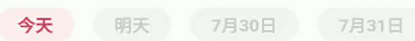
主要是顶部TabBar+TabView的实现,左右滑动或者点击切换。先上效果图
给每个Tab有个初始的背景颜色,Indicator是粉色的框
首先初始Tab数据,构建初始背景颜色的时候,用到了颜色混合BlendMode,详情可以百度,为了选择时indicator能上色
//用于监听Tab菜单切换
  TabController _tabController;
  //Tab 标签
  List<Widget> _tabs;

_getTabData(){
    _tabs = [];
    int day = serverTime.day;
    int month = serverTime.month;

    for(int i = 0;i<7;i++){
      tabs.add(_getTabText(month, day++));
    }
  }

  //获取tab控件
  Widget _getTabText(int month,int day){
    String tag = "";
    if(( month == DateTime.now().month )&& (day == DateTime.now().day)){
      tag = "今天";
    }else if(( month == DateTime.now().month )&&(day-1) == DateTime.now().day){
      tag = "明天";
    }else{
      tag = "${month.toString()}月${day.toString()}日";
    }
    return  Container(
      child: Text(tag),
      decoration: BoxDecoration(
          color: white_fff4f4f4,
          backgroundBlendMode: BlendMode.luminosity,
          borderRadius: BorderRadius.all(Radius.circular(14.75)),
      ),
      padding: EdgeInsets.only(top: 4,bottom: 4, left: 18,right: 18),
    );
  }
构建TabBar
_buildTabBar(){
 return Container(
      margin: EdgeInsets.only(left: 12),
      child: TabBar(
        isScrollable: true,
        labelPadding: EdgeInsets.only(left:8,right: 8),
        indicator: CustomRRecTabIndicator(
            radius: 14.75,
            color: Color(0xffffe7e7),
        ),
        indicatorSize: TabBarIndicatorSize.label,
        indicatorWeight: 0,
        labelColor: Color(0xffef3454),
        labelStyle: TextStyle(fontSize:15,color: Color(0xffef3454),fontWeight: FontWeight.w700
       ),
        unselectedLabelColor:Color(0xffcccccc),
        tabs: _tabs,
        controller: _tabController,
      ),
    );
}
自定义的Indicator,主要是复制官方的Indicator代码,然后稍稍修改,为了修改宽度,圆角
import 'package:flutter/cupertino.dart';
import 'package:flutter/material.dart';

class CustomRRecTabIndicator extends Decoration{
  /// Create an underline style selected tab indicator.
  ///
  /// The [borderSide] and [insets] arguments must not be null.
  const CustomRRecTabIndicator({
    this.borderSide = const BorderSide(width: 2.0, color: Colors.white),
    this.insets = EdgeInsets.zero,
    this.width,
    this.radius,
    this.color
  }) : assert(borderSide != null),
        assert(insets != null);

  /// The color and weight of the horizontal line drawn below the selected tab.
  final BorderSide borderSide;

  final double radius;

  final double width;

  final Color color;
  /// Locates the selected tab's underline relative to the tab's boundary.
  ///
  /// The [TabBar.indicatorSize] property can be used to define the
  /// tab indicator's bounds in terms of its (centered) tab widget with
  /// [TabIndicatorSize.label], or the entire tab with [TabIndicatorSize.tab].
  final EdgeInsetsGeometry insets;

  @override
  Decoration lerpFrom(Decoration a, double t) {
    if (a is CustomRRecTabIndicator) {
      return CustomRRecTabIndicator(
        borderSide: BorderSide.lerp(a.borderSide, borderSide, t),
        insets: EdgeInsetsGeometry.lerp(a.insets, insets, t),
      );
    }
    return super.lerpFrom(a, t);
  }

  @override
  Decoration lerpTo(Decoration b, double t) {
    if (b is CustomRRecTabIndicator) {
      return CustomRRecTabIndicator(
        borderSide: BorderSide.lerp(borderSide, b.borderSide, t),
        insets: EdgeInsetsGeometry.lerp(insets, b.insets, t),
      );
    }
    return super.lerpTo(b, t);
  }

  @override
  _UnderlinePainter createBoxPainter([ VoidCallback onChanged ]) {
    return _UnderlinePainter(this, onChanged);
  }
}

class _UnderlinePainter extends BoxPainter {
  _UnderlinePainter(this.decoration, VoidCallback onChanged)
      : assert(decoration != null),
        super(onChanged);

  final CustomRRecTabIndicator decoration;

  BorderSide get borderSide => decoration.borderSide;
  EdgeInsetsGeometry get insets => decoration.insets;

  Rect _indicatorRectFor(Rect rect, TextDirection textDirection) {
    assert(rect != null);
    assert(textDirection != null);
    final Rect indicator = insets.resolve(textDirection).deflateRect(rect);


    //取中间坐标
    double cw = (indicator.left + indicator.right) / 2;
    return Rect.fromLTWH(cw - decoration.width / 2,
        indicator.bottom - borderSide.width, decoration.width, borderSide.width);
  }

  @override
  void paint(Canvas canvas, Offset offset, ImageConfiguration configuration) {
    assert(configuration != null);
    assert(configuration.size != null);
    final Rect rect = offset & configuration.size;
    final RRect rRect = RRect.fromRectAndRadius(rect,Radius.circular(decoration.radius));
    canvas.drawRRect(rRect,Paint()..style =PaintingStyle.fill
                                  ..color = decoration.color);


  }

}
TabViewBody就略了,毕竟主要是想讲自定义TabBar
版权声明:本文为BFELFISH原创文章,遵循CC 4.0 BY-SA版权协议,转载请附上原文出处链接和本声明。