最近接触了不少echarts的项目,所以就参照echarts官网变动了一下图表联动。附上代码
<template>
  <div class="mxgjEchart-item1" ref="mxgjEchart"></div>
</template>
<script>
const echarts = require("echarts");
export default {
  data() {
    return {

    };
  },
  methods: {
    initCharts() {
      let myChart = echarts.init(this.$refs.mxgjEchart);
      // 绘制图表
      myChart.setOption({
        legend: {},
        tooltip: {
          trigger: "axis",
          showContent: false, //显示内容,
        },
        // 数据集
        dataset: {
          source: [
            [
              "product",
              "2021-11",
              "2021-12",
              "2022-01",
              "2022-02",
              "2022-03",
              "2022-04",
            ],
            ["黄总", 10, 2, 69, 38, 3, 20],
            ["马总", 21, 84, 64, 40, 32, 76],
            ["宋总", 40, 50, 85, 62, 88, 46],
            ["龚总", 31, 28, 85, 55, 41, 70],
            ["帆总", 69, 24, 7, 45, 38, 55],
          ],
        },
        xAxis: { type: "category" },
        yAxis: {
          gridIndex: 0,
          type: "value",
          name: "月收入(万元)",
        },
        grid: { top: "55%", left: "20%" },
        series: [
          {
            type: "line",
            smooth: true, // 是否显示平滑曲线
            seriesLayoutBy: "row",
            emphasis: { focus: "series" }, // 鼠标放上去聚焦当前高亮折线数据
          },
          {
            type: "line",
            smooth: true,
            seriesLayoutBy: "row",
            emphasis: { focus: "series" },
          },
          {
            type: "line",
            smooth: true,
            seriesLayoutBy: "row",
            emphasis: { focus: "series" },
          },
          {
            type: "line",
            smooth: true,
            seriesLayoutBy: "row",
            emphasis: { focus: "series" },
          },
          {
            type: "line",
            smooth: true,
            seriesLayoutBy: "row",
            emphasis: { focus: "series" },
          },
          {
            type: "pie",
            id: "pie",
            radius: ["30%", "35%"],
            center: ["50%", "25%"],
            emphasis: {
              focus: "self",
            },
            label: {
              formatter: "{b}: {@2021-11} ({d}%)", // b是数据名称,d是百分比
            },
            encode: {
              itemName: "product",
              value: "2021-11",
              tooltip: "2021-11",
            },
          },
        ],
      });
      // 鼠标放到折线上的拐点,饼图跟着变化
      myChart.on("updateAxisPointer", (params) => {
        console.log("params", params);
        const axesInfo = params.axesInfo[0];
        if (axesInfo) {
          const value = axesInfo.value + 1;
          myChart.setOption({
            series: {
              id: "pie",
              label: {
                formatter: "{b}: {@[" + value + "]} ({d}%)",
              },
              encode: {
                value: value,
                tooltip: value,
              },
            },
          });
        }
      });
    },
  },
  mounted() {
    setTimeout(() => {
      this.initCharts();
    }, 1000);
  },
};
</script>
<style lang="scss" scoped>
.mxgjEchart-item1 {
  width: 1000px;
  height: 700px;
}
</style>
效果如下图:
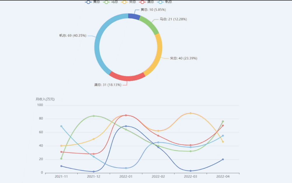
当鼠标移到下面折线图的时候,上面的饼图也会跟着变化,那是用了下面的这个方法
 myChart.on("updateAxisPointer", (params) => {
        console.log("params", params);
        const axesInfo = params.axesInfo[0];
        if (axesInfo) {
          const value = axesInfo.value + 1;
          myChart.setOption({
            series: {
              id: "pie",
              label: {
                formatter: "{b}: {@[" + value + "]} ({d}%)",
              },
              encode: {
                value: value,
                tooltip: value,
              },
            },
          });
        }
});版权声明:本文为qq_44158162原创文章,遵循CC 4.0 BY-SA版权协议,转载请附上原文出处链接和本声明。