1.骨架屏效果请参照vue3简单骨架屏封装
2.具体代码
<template>
  <div class="home-new">
      <!-- 内容 -->
      <Transition name="fade">
        <ul class="goods-list" v-if="list.length > 0">
          <li v-for="item in list" :key="item.id">
            <RouterLink to="/">
              <img
                :src="item.picture"
                alt=""
              />
              <p class="name ellipsis">{{ item.name }}</p>
              <p class="price">¥{{ item.price }}</p>
            </RouterLink>
          </li>
        </ul>
        <!-- 骨架屏 -->
        <div class="home-skeleton" v-else>
          <div
            class="item"
            v-for="i in 4"
            :key="i"
            :style="{ backgroundColor: '#f0f9f4' }"
          >
            <Skeleton bg="#e4e4e4" width="306px" height="306px" animated />
            <Skeleton bg="#e4e4e4" width="160px" height="24px" animated />
            <Skeleton bg="#e4e4e4" width="120px" height="24px" animated />
          </div>
        </div>
      </Transition>
  </div>
</template>
<script>
import { findNew } from '@/api/home'
import { ref } from 'vue'
export default {
  name: 'HomeNew',
  setup () {
    const list = ref([])
    findNew().then(data => {
      list.value = data.result
    })
    return { list }
  }
}
</script>
<style scoped lang="less">
.goods-list {
  display: flex;
  justify-content: space-between;
  height: 406px;
  li {
    width: 306px;
    height: 406px;
    background: #f0f9f4;
    .hoverShadow();
    img {
      width: 306px;
      height: 306px;
    }
    p {
      font-size: 22px;
      padding: 12px 30px 0 30px;
      text-align: center;
    }
    .price {
      color: @priceColor;
    }
  }
}

.home-skeleton {
  width: 1240px;
  height: 406px;
  display: flex;
  justify-content: space-between;
  .item {
    width: 306px;
    .skeleton ~ .skeleton {
      display: block;
      margin: 16px auto 0;
    }
  }
}

// 离开淡出动画
.fade {
  &-leave {
    &-active{
      position: absolute;
      width: 100%;
      transition: opacity .5s .2s;
      z-index: 1;
    }
    &-to {
      opacity: 0;
    }
  }
}
</style>
// 鼠标经过上移阴影动画
.hoverShadow () {
transition: all .5s;
&:hover {
transform: translate3d(0,-3px,0);
box-shadow: 0 3px 8px rgba(0,0,0,0.2);
}
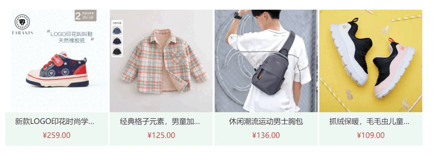
}3.效果
版权声明:本文为shuleijia原创文章,遵循CC 4.0 BY-SA版权协议,转载请附上原文出处链接和本声明。