offsetLeft和offsetTop获取元素偏移
offset系列属性可以动态获得元素的位置,大小等,不需要我们去看css了,没有right和bottom。
获得元素的距离以带有定位的父盒子为准,返回的数值不带单位,如果父盒子没有定位,就往上找,直到找到带有定位的父盒子,如果没有就以body为准。
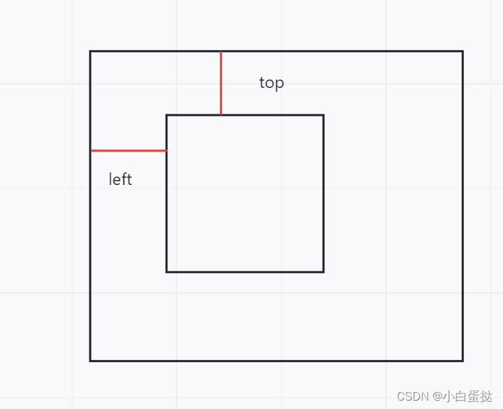
offsetWidth和offsetHeight获取元素的大小
返回的数值不带单位,包含padding和border值
offsetParent
返回带有定位的父盒子,parentNode是返回最近的父盒子,不管有没有定位。
offset属性和style的区别
offset可以得到样式表中任意的样式值,style只能得到行内样式表中的值
offset返回的数值没有单位 ,style得到的数值有单位
offsetWidth中包含padding和border值,style不包含
offset获得的width属性只能读,不能修改赋值,style可以进行重新赋值
offset获取元素大小位置用这个合适 style更改值方便
案例一获取鼠标在盒子内的坐标
盒子带有定位,点击可以获得鼠标的offsetLeft和offsetTop,用e.pageX-offsetLeft就可以获得鼠标在盒子内的x坐标。
<!-- 点击就可以得到鼠标距离盒子左右的距离
鼠标在页面的坐标
通过offsetLeft
然后相减
-->
<div></div>
<script>
var div = document.querySelector('div');
div.addEventListener('click', function(e) {
// console.log(e.pageX);
var a = e.pageX - div.offsetLeft;
var b = e.pageY - div.offsetTop;
console.log(a);
console.log(b);
// console.log('点击了');
})
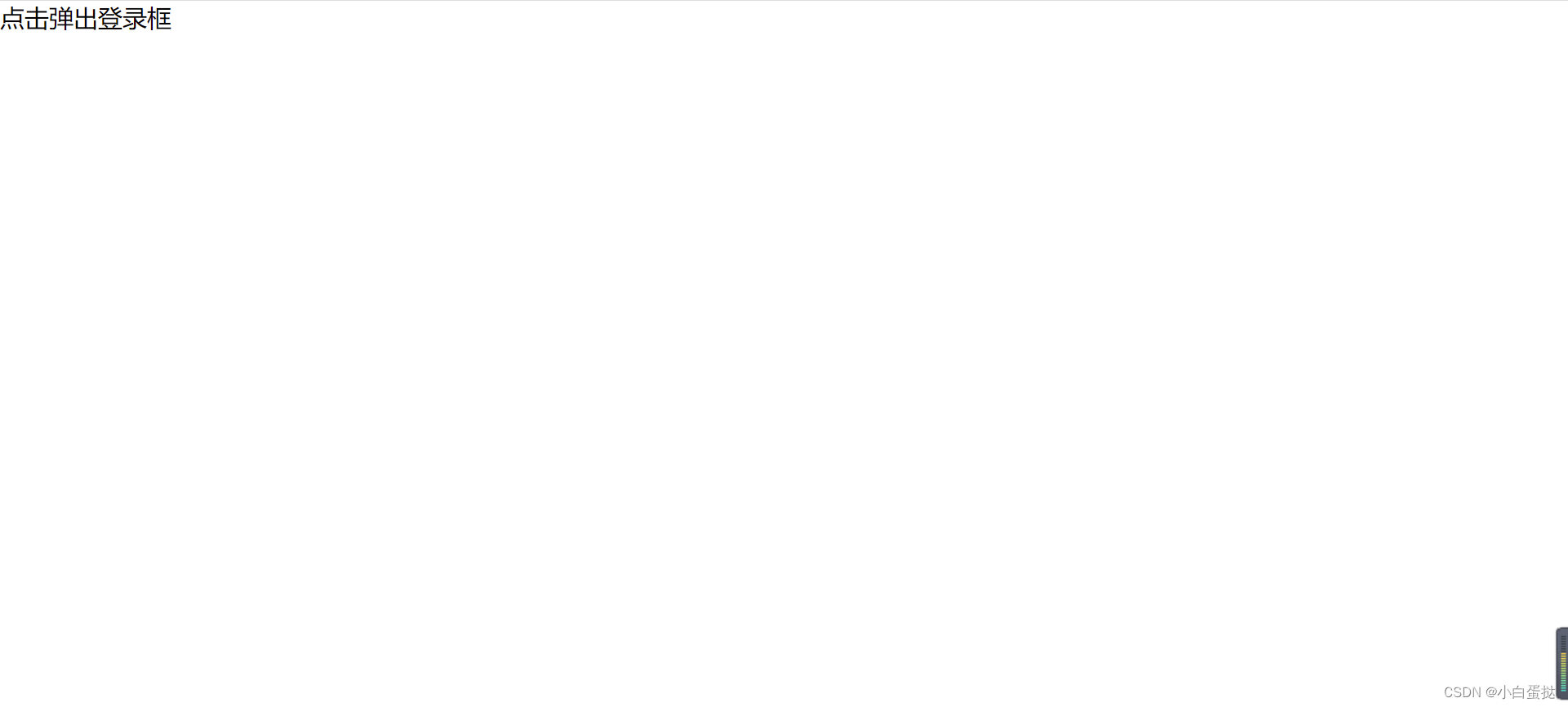
</script>案例二拖动模态框(弹出框)
1.点击弹出登录框文字后,弹出模态框同时背景变色。点击关闭按钮后,模态框和背景隐藏。
先让模态框和背景设为display:none,点击弹出文字后变为display:block,点击关闭按钮后再变为display:none。
var login = document.querySelector('.login');
var mask = document.querySelector('.login-bg');
var link = document.querySelector('.link');
var close = document.querySelector('.close');
var title = document.querySelector('#title');
//点击 显示出来
link.addEventListener('click', function() {
mask.style.display = 'block';
login.style.display = 'block';
})
//点击查号隐藏
close.addEventListener('click', function() {
mask.style.display = 'none';
login.style.display = 'none';
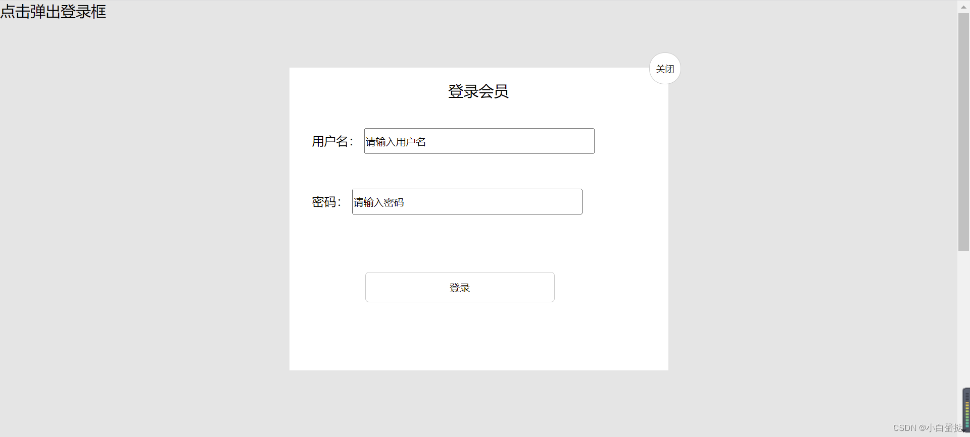
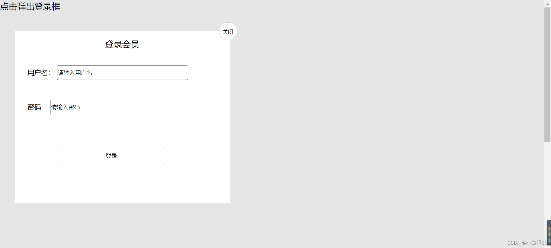
})2.鼠标按下登录会员区域可以拖动模态框在页面移动。
登录框设为固定定位。
给登录会员区域的盒子添加鼠标按下事件,获取鼠标在盒子内的坐标,e.pageX-盒子.offsetLeft。然后添加鼠标移动事件,鼠标移动时重新设置盒子的left值与top值。
  //拖拽事件 鼠标按下去 移动 松开
            //鼠标的坐标减去鼠标在盒子内的坐标 盒子内的坐标是不会变的

        title.addEventListener('mousedown', function(e) {
                var x = e.pageX - login.offsetLeft;
                var y = e.pageY - login.offsetTop;
                //鼠标在盒子内的坐标
                document.addEventListener('mousemove', fn)

                function fn(e) {
                    login.style.left = e.pageX - x + 'px';
                    login.style.top = e.pageY - y + 'px';
                    console.log(this);
                }
3.松开鼠标模态框停止移动。
消除鼠标移动事件。
  document.addEventListener('mouseup', function() {
                    document.removeEventListener('mousemove', fn);
                })
            })
完整代码
<!DOCTYPE html>
<html lang="en">
<head>
<meta charset="UTF-8">
<meta http-equiv="X-UA-Compatible" content="IE=edge">
<meta name="viewport" content="width=device-width, initial-scale=1.0">
<title>Document</title>
<style>
* {
margin: 0;
padding: 0;
}
a {
text-decoration: none;
color: black;
}
.login-header {
position: absolute;
width: 300px;
margin: 0 auto;
font-size: 20px;
}
.login {
display: none;
position: fixed;
left: 50%;
top: 50%;
/* margin-left: -250px;
margin-top: -200px; */
transform: translate(-50%, -50%);
width: 500px;
height: 400px;
background-color: #fff;
}
.login-bg {
display: none;
width: 100%;
height: 1000px;
background: rgba(0, 0, 0, .1);
}
.login-title {
height: 60px;
font-size: 20px;
text-align: center;
line-height: 60px;
}
.login-title .close {
position: absolute;
top: -20px;
right: -17px;
font-size: 10px;
width: 40px;
height: 40px;
border-radius: 20px;
border: 1px solid #ccc;
text-align: center;
line-height: 40px;
background-color: #fff;
}
.user {
height: 60px;
margin-left: 30px;
margin-top: 20px;
}
.user input {
height: 30px;
width: 300px;
}
.password {
height: 60px;
margin-left: 30px;
margin-top: 20px;
}
.password input {
height: 30px;
width: 300px;
}
lable {
text-align: right;
}
.begin input {
height: 40px;
width: 250px;
background-color: #fff;
border: 1px solid #ccc;
border-radius: 5px;
margin: 50px 100px;
}
</style>
</head>
<body>
<!-- 弹出框 模态框
1.点击弹出层会弹出模态框,并且显示灰色半透明的遮挡曾
2.点击关闭按钮,可以关闭 并且同时关闭灰色半透明的遮挡曾
3.鼠标放到模态框最上面一行,可以按住鼠标拖拽在页面中移动
4,松开 停止 -->
<div class="login-header"><a class="link" href="javascript:;">点击弹出登录框</a></div>
<div id="login" class="login">
<div id="title" class="login-title">登录会员
<span><a id="close" href="javascript:;" class="close">关闭</a></span>
</div>
<div class="user">
<label>用户名:</label>
<input type="text" name="" id="" value="请输入用户名">
</div>
<div class="password">
<label>密码:</label>
<input type="passwd" value="请输入密码">
</div>
<div class="begin">
<input type="submit" value="登录">
</div>
</div>
<div id="bg" class="login-bg"></div>
<script>
var login = document.querySelector('.login');
var mask = document.querySelector('.login-bg');
var link = document.querySelector('.link');
var close = document.querySelector('.close');
var title = document.querySelector('#title');
//点击 显示出来
link.addEventListener('click', function() {
mask.style.display = 'block';
login.style.display = 'block';
})
//点击查号隐藏
close.addEventListener('click', function() {
mask.style.display = 'none';
login.style.display = 'none';
})
//拖拽事件 鼠标按下去 移动 松开
//鼠标的坐标减去鼠标在盒子内的坐标 盒子内的坐标是不会变的
title.addEventListener('mousedown', function(e) {
var x = e.pageX - login.offsetLeft;
var y = e.pageY - login.offsetTop;
//鼠标在盒子内的坐标
document.addEventListener('mousemove', fn)
function fn(e) {
login.style.left = e.pageX - x + 'px';
login.style.top = e.pageY - y + 'px';
console.log(this);
}
document.addEventListener('mouseup', function() {
document.removeEventListener('mousemove', fn);
})
})
//鼠标弹起 移动事件清除
</script>
</body>
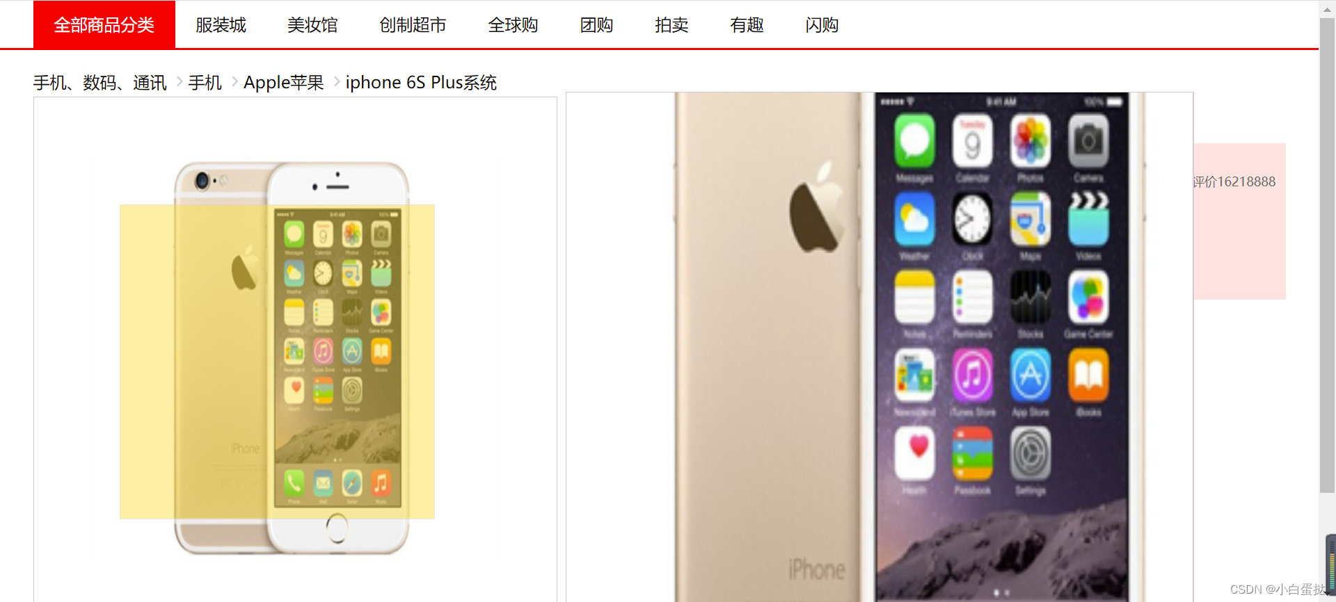
</html>案例三仿京东放大镜效果
1.先把遮罩层和大盒子隐藏display:none,鼠标放到左侧手机身上,出现黄色遮罩层和放大后的大盒子display:block。都是绝对定位。
    iphone.addEventListener('mouseover', function() {
            //鼠标经过
            mask.style.display = 'block';
            big.style.display = 'block';
        })
        iphone.addEventListener('mouseout', function() {
            mask.style.display = 'none';
            big.style.display = 'none';
        })
2.设置鼠标经过遮罩层移动效果,且移动范围不能超过底下的盒子。
而且经过后鼠标变成移动样式。
思路:遮罩层的offsetLeft值小于0之后left和top值就设置为0。底下盒子高度是500px,遮罩层是300px,所以遮罩层的offsetTop值大于200后top值就设置为200。
 iphone.addEventListener('mousemove', function(e) {
                //计算鼠标在盒子内的坐标 父盒子有定位的话就是距离父盒子的距离
                var x = e.pageX - this.parentNode.offsetLeft;
                var y = e.pageY - this.parentNode.offsetTop;
                console.log(x, y);
                //盒子高度一半是150
                var maskX = x - mask.offsetWidth / 2;
                var maskY = y - mask.offsetWidth / 2;
                //遮挡曾是不能1超出小盒子的范围的
                //如果小于0,就把坐标设为0
                if (maskX <= 0) {
                    maskX = 0;

                } else if (maskX >= iphone.offsetWidth - mask.offsetWidth) {
                    maskX = iphone.offsetWidth - mask.offsetWidth;

                }
                if (maskY <= 0) {
                    maskY = 0;

                } else if (maskY >= iphone.offsetHeight - mask.offsetHeight) {
                    maskY = iphone.offsetHeight - mask.offsetHeight;

                }

                mask.style.left = maskX + 'px';
                mask.style.top = maskY + 'px';
3.遮罩层移动时,右边的大盒子里面的图片也随着变化,遮罩层往左移,大盒子里面的图得往右移动,因为右边盒子的图片大,所以不能移动同样的距离。
遮罩层移动距离/遮罩层最大移动距离=大图片移动距离/最大移动距离
遮罩层移动距离=e.pageX-父盒子的offsetLeft(这时鼠标在盒子内的坐标,想让鼠标放在遮罩层的中间)-遮罩层.offsetWidth。
遮罩层最大移动距离=父盒子的offsetWidth-遮罩层的offsetWidth
大图片最大移动距离=大图片的offsetWidth-大盒子的offsetWidth
所以就能求得大图片的移动距离。
 //遮挡层最大移动距离
                var maskMax = iphone.offsetWidth - mask.offsetWidth;
                //大图片最大移动距离
                var bigimg = document.querySelector('.bigimg');
                var bigMax = bigimg.offsetWidth - big.offsetWidth;
                //大图片移动距离
                var bigX = maskX * bigMax / maskMax;
                var bigY = maskY * bigMax / maskMax;
                bigimg.style.left = -bigX + 'px';
                bigimg.style.top = -bigY + 'px';

            })
完整代码
<!DOCTYPE html>
<html lang="en">
<head>
<meta charset="UTF-8">
<meta http-equiv="X-UA-Compatible" content="IE=edge">
<meta name="viewport" content="width=device-width, initial-scale=1.0">
<title>Document</title>
<style>
@font-face {
font-family: 'icomoon';
src: url('fonts/icomoon.eot?e3lgy6');
src: url('fonts/icomoon.eot?e3lgy6#iefix') format('embedded-opentype'), url('fonts/icomoon.ttf?e3lgy6') format('truetype'), url('fonts/icomoon.woff?e3lgy6') format('woff'), url('fonts/icomoon.svg?e3lgy6#icomoon') format('svg');
font-weight: normal;
font-style: normal;
font-display: block;
}
* {
padding: 0;
margin: 0;
}
.w {
width: 1200px;
margin: 0 auto;
/* background-color: antiquewhite; */
/* overflow: hidden;
height: 3000px; */
}
a {
text-decoration: none;
color: black;
}
li {
list-style: none;
}
nav {
height: 45px;
border-bottom: 2px solid red;
}
nav ul a {
float: left;
padding-right: 20px;
padding-left: 20px;
line-height: 45px;
}
nav ul .red {
background-color: red;
color: #fff;
}
.banner-nav {
height: 20px;
margin-top: 20px;
}
.banner-nav ul li {
float: left;
height: 20px;
/* 一开始没加就是第一张图效果 加了之后就好了 */
color: #ccc;
}
.banner-nav ul li:nth-child(-n+3)::after {
content: '';
font-family: 'icomoon';
}
.content {
position: relative;
height: 600px;
}
.content .iphone {
float: left;
margin-top: 5px;
/* background: url(1.jpg) no-repeat; */
}
.content .iphone img {
width: 500px;
height: 500px;
border: 1px solid #ccc;
}
.content .iphone .mask {
display: none;
position: absolute;
top: 0;
left: 0;
width: 300px;
height: 300px;
background-color: #Fede4f;
opacity: .5;
border: 1px solid #ccc;
cursor: move;
}
.content .iphone .big {
display: none;
position: absolute;
left: 510px;
top: 0;
width: 600px;
height: 600px;
background-color: pink;
z-index: 999;
border: 1px solid #ccc;
overflow: hidden;
}
.content .iphone .big .bigimg {
position: absolute;
top: 0;
left: 0;
}
.content .message {
float: right;
width: 600px;
height: 500px;
/* border: 1px solid red; */
}
.content .message span {
color: red;
font-size: 12px;
}
.content .message .price {
width: 600px;
height: 150px;
background-color: mistyrose;
margin-top: 8px;
overflow: hidden;
}
.content .message .price table {
margin-top: 10px;
width: 600px;
}
.content .message .price table tr {
height: 50px;
}
.content .message .price table tr td:nth-child(1) {
width: 30px;
color: #666;
font-size: 12px;
}
.content .message .price table tr:nth-child(1) td:nth-child(2) {
width: 400px;
color: red;
font-size: 20px;
}
.content .message .price table tr:nth-child(1) td:nth-child(3) {
width: 100px;
color: #666;
font-size: 12px;
}
.content .message .price table tr:nth-child(2) {
margin-top: 20px;
}
.content .message .price table tr:nth-child(2) td:nth-child(1) {
height: 50px;
vertical-align: top;
}
.content .message .price table tr:nth-child(2) td:nth-child(2) {
color: #666;
font-size: 12px;
height: 50px;
line-height: 35px;
}
.content .message .price table tr:nth-child(2) td:nth-child(2) span {
display: inline-block;
width: 50px;
height: 20px;
background-color: red;
color: #fff;
line-height: 20px;
text-align: center;
}
.choice {
width: 600px;
height: 200px;
}
.choice table {
color: #666;
font-size: 12px;
border-spacing: 10px;
}
.choice table tr {
height: 40px;
}
.choice table tr:nth-child(1) {
height: 20px;
}
.choice table tr td ul li {
float: left;
width: 60px;
height: 30px;
border: 1px solid #ccc;
background-color: rgba(0, 0, 0, 0.05);
line-height: 30px;
text-align: center;
}
.choice table tr td ul li:nth-child(1) {
border: 1.5px solid red;
}
.buy {
width: 600px;
height: 70px;
}
.num {
float: left;
width: 40px;
height: 55px;
border: 1px solid #ccc;
line-height: 55px;
color: #666;
font-size: 20px;
text-align: center;
}
.buy .add {
float: left;
width: 20px;
height: 55px;
border: 1px solid #ccc;
line-height: 26px;
text-align: center;
}
.buy .add h4 {
width: 20px;
height: 26px;
border: 1px solid #ccc;
line-height: 26px;
text-align: center;
}
.buy h3 {
float: left;
width: 200px;
height: 50px;
color: #fff;
background-color: red;
line-height: 50px;
text-align: center;
margin-left: 15px;
}
.buy h3 a {
color: #fff;
}
</style>
</head>
<body>
<nav>
<ul class="w">
<li>
<a href="#" class="red">全部商品分类</a>
</li>
<li>
<a href="#">服装城</a>
</li>
<li>
<a href="#">美妆馆</a>
</li>
<li>
<a href="#">创制超市</a>
</li>
<li>
<a href="#">全球购</a>
</li>
<li>
<a href="#">团购</a>
</li>
<li>
<a href="#">拍卖</a>
</li>
<li>
<a href="#">有趣</a>
</li>
<li>
<a href="#">闪购</a>
</li>
</ul>
</nav>
<div class="banner-nav w">
<ul>
<li>
<a href="#">手机、数码、通讯</a>
</li>
<li>
<a href="#">手机</a>
</li>
<li>
<a href="#">Apple苹果</a>
</li>
<li>
<a href="#">iphone 6S Plus系统</a>
</li>
</ul>
</div>
<div class="content w">
<div class="iphone">
<img src="1.jpg" alt="">
<div class="mask"></div>
<div class="big"><img class="bigimg" src="1.jpg" alt="" style="width:1000px;height:1000px"></div>
</div>
<div class="message">
<h4>Apple iphone6s(A7100)64G玫瑰金色 移动通信电信4G手机</h4>
<span>推荐使用下方</span>
<div class="price">
<table>
<tr>
<td>价格</td>
<td>¥5299<span>降价通知</span></td>
<td>累计评价16218888</td>
</tr>
<tr>
<td>促销</td>
<td><span>加购价</span>满200-10满200-10满200-10满200-10满200-10满200-10满200-10满200-10满200-10满200-10满200-10</td>
<td></td>
</tr>
</table>
</div>
<div class="choice">
<table>
<tr>
<td>支持</td>
<td>以旧换新</td>
</tr>
<tr>
<td>选择颜色</td>
<td>
<ul>
<li>玫瑰金</li>
<li>金色</li>
<li>白色</li>
<li>土豪色</li>
</ul>
</td>
</tr>
<tr>
<td>选择版本</td>
<td>
<ul>
<li>公开版</li>
<li>移动4G</li>
</ul>
</td>
</tr>
<tr>
<td>购买方式</td>
<td>
<ul>
<li>官方标配</li>
<li>移动</li>
<li>电信</li>
</ul>
</td>
</tr>
</table>
</div>
<div class="buy">
<div class="num">
1
</div>
<div class="add">
<h4>+</h4>
<h4>-</h4>
</div>
<h3><a>加入购物车</a></h3>
</div>
</div>
</div>
</div>
<script>
var iphone = document.querySelector('.iphone');
var mask = document.querySelector('.mask');
var big = document.querySelector('.big');
iphone.addEventListener('mouseover', function() {
//鼠标经过
mask.style.display = 'block';
big.style.display = 'block';
})
iphone.addEventListener('mouseout', function() {
mask.style.display = 'none';
big.style.display = 'none';
})
iphone.addEventListener('mousemove', function(e) {
//计算鼠标在盒子内的坐标 父盒子有定位的话就是距离父盒子的距离
var x = e.pageX - this.parentNode.offsetLeft;
var y = e.pageY - this.parentNode.offsetTop;
console.log(x, y);
//盒子高度一半是150
var maskX = x - mask.offsetWidth / 2;
var maskY = y - mask.offsetWidth / 2;
//遮挡曾是不能1超出小盒子的范围的
//如果小于0,就把坐标设为0
if (maskX <= 0) {
maskX = 0;
} else if (maskX >= iphone.offsetWidth - mask.offsetWidth) {
maskX = iphone.offsetWidth - mask.offsetWidth;
}
if (maskY <= 0) {
maskY = 0;
} else if (maskY >= iphone.offsetHeight - mask.offsetHeight) {
maskY = iphone.offsetHeight - mask.offsetHeight;
}
mask.style.left = maskX + 'px';
mask.style.top = maskY + 'px';
//遮挡层最大移动距离
var maskMax = iphone.offsetWidth - mask.offsetWidth;
//大图片最大移动距离
var bigimg = document.querySelector('.bigimg');
var bigMax = bigimg.offsetWidth - big.offsetWidth;
//大图片移动距离
var bigX = maskX * bigMax / maskMax;
var bigY = maskY * bigMax / maskMax;
bigimg.style.left = -bigX + 'px';
bigimg.style.top = -bigY + 'px';
})
//移动黄色遮罩层 大图片跟随移动
//遮挡层移动距离/最大移动距离=大图片移动距离/最大移动距离
//maskX,Y/200=?/大图片减去大盒子
</script>
</body>
</html>