环状菜单组件
今天咱们来实现一个环状菜单组件,大概效果如下图: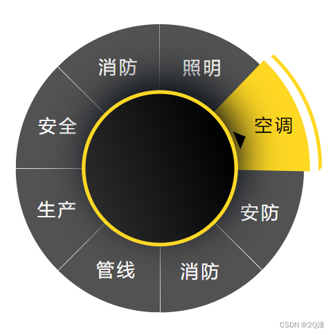
最近呢,正好学习了clip-path这个属性,那么我就想尝试使用它来完成这个效果。
那么首先,我们需要实现一个扇形的css。
div {
    width: 480px;
    height: 480px;
    border-radius: 50%;
    background-color: rgba(24, 24, 24, .75);
    clip-path: polygon(50% 50%, 100% -2px, 100% 0, 50% 0);
}
然后我们得到了以下的扇形效果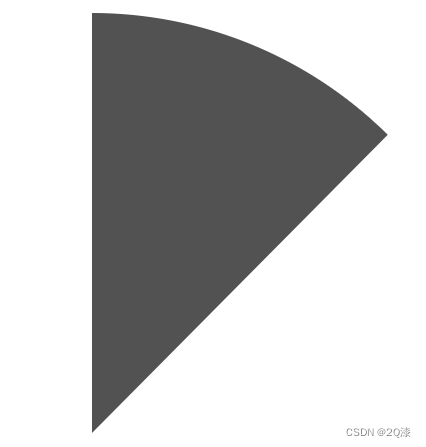
此时我们就需要8个扇形来拼凑出一个圆。那么我们是根据clip-path来裁剪出不同的扇形来拼凑成一个圆吗?答案当然不是。此时其实有一个更好的方法,我们只需要写出8个一样的扇形,然后对其旋转,此时我们就能得到一个圆并且旋转的角度也是有规律可循的。
<div class="annular">
    <div
        ref="annularContainer"
        class="annular_container"
    >
        <div
            v-for="(item, index) in menuList"
            :key="index"
            class="annular_container_item"
            @click="changeItems(item, index)"
        >
        	<span>{{ item.name }}</span>
        </div>
    </div>
</div>
// menuList的父元素
const annularContainer: Ref<HTMLElement | null | any> = ref(null);
onMounted(() => {
    // 根据当前的menuList初始化样式
    initStyle();
});
const initStyle = () => {
    const children: any[] = Array.from(annularContainer.value.children);
    children.forEach((item: HTMLElement | null | any, index: number) => {
        const indexLength = 360 / props.menuList.length * index;
        // 设置item的旋转角度
        setItemRotate(item, indexLength);
    });
};
/**
 * @description: 设置item的旋转角度,该功能主要就是通过旋转的角度来实现的
 * @param {HTMLElement | null | any} item - menuList列表的其中一个item
 * @param {Number} indexLength - 当前item需要旋转的角度值
 */
const setItemRotate = (item: HTMLElement | null | any, indexLength: number) => {
    const children = item.children[0];
    item.style.transform = `rotate(${indexLength}deg)`;
    children.style.transform = `rotate(${-indexLength}deg)`;
};
那么通过以上代码就得到了这样一个彼此区分开来,又是一个由各个扇形合成的整体的圆。
中间的空隙是通过clip-path属性中polygon(50% 50%, 100% -2px, 100% 0, 50% 0)中的-2px来隔开的。可根据实际情况设置缝隙,也可以不要。
与此同时,我们把文字加上。为了让文字正常显示,我们也设置了旋转角度。它所需要的角度正好是负的父元素旋转的角度。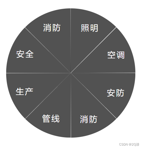
然后我们实现右侧黄色滑块扇形。同样采用clip-path,得到一个稍大的扇形。外侧弧度的border我也使用边框加clip-path来实现的。
接下来,就是实现动画了。
这种情况下,其实可以实现两种动画,一种是黄色滑块扇形以及中间圆环旋转角度运动,但经过证明,它不好看。
于是实现另一种动画,黄色滑块扇形以及中间圆环固定,底部灰色圆形旋转。这个时候的运动其实更简单,我们只需要让他们整体在原本的位置上多旋转一些角度即可。
以下完成的代码:
<template>
    <div class="annular">
        <div
            ref="annularContainer"
            class="annular_container"
        >
            <div
                v-for="(item, index) in menuList"
                :key="index"
                class="annular_container_item"
                @click="changeItems(item, index)"
            >
                <span>{{ item.name }}</span>
            </div>
        </div>
        <div
            ref="annularChecked"
            class="annular_checked"
        >
            <div
                class="circle"
                :style="{ backgroundColor: sliderColor }"
            >
                <span>{{ name }}</span>
            </div>
            <div
                class="line"
                :style="{ borderColor: sliderColor }"
            />
        </div>
        <div
            ref="annularCenter"
            class="annular_center"
            :style="{ borderColor: sliderColor }"
        >
            <span class="triangle" />
        </div>
        <div class="annular_content">
            <slot
                name="center"
            />
        </div>
    </div>
</template>

<script lang="ts">
import {
    defineComponent, Ref, ref, onMounted, onBeforeUnmount
} from 'vue';

export default defineComponent({
    name: 'BAnnularMenu',
    props: {
        menuList: {
            type: Array,
            // required: true
            default: () => [
                { name: '照明', index: 0 },
                { name: '空调', index: 1 },
                { name: '安防', index: 2 },
                { name: '消防', index: 3 },
                { name: '管线', index: 4 },
                { name: '生产', index: 5 },
                { name: '安全', index: 5 },
                { name: '消防', index: 3 }
            ]
        },
        initCurrent: {
            type: Number,
            default: 1
        },
        sliderColor: {
            type: String,
            default: '#FFD824'
        }
    },
    setup (props) {
        // menuList的父元素
        const annularContainer: Ref<HTMLElement | null | any> = ref(null);
        // 中间旋转的圆块
        const annularCenter: Ref<HTMLElement | null | any> = ref(null);
        // 当前被选中的黄色块
        const annularChecked: Ref<HTMLElement | null | any> = ref(null);

        const name = ref('空调');
        let timer: any = null;
        onMounted(() => {
            // 根据当前的menuList初始化样式
            initStyle();
        });
        onBeforeUnmount(() => {
            if (timer) {
                clearTimeout(timer);
                timer = null;
            }
        });
        const initStyle = () => {
            const children: any[] = Array.from(annularContainer.value.children);
            children.forEach((item: HTMLElement | null | any, index: number) => {
                const indexLength = 360 / props.menuList.length * index;
                // 设置item的旋转角度
                setItemRotate(item, indexLength);
            });
        };
        /**
         * @description: 点击item后发生的变化
         * @param {HTMLElement | null | any} item - 当前点击的menuList列表的其中一个item
         * @param {Number} i - 当前点击的menuList列表的其中一个item的index
         */
        const changeItems = (item: HTMLElement | null | any, i: number) => {
            // 排除传参错误的情况
            const initCurrent = props.initCurrent > props.menuList.length - 1 ? 0 : props.initCurrent;
            const blockChildren = Array.from(annularChecked.value.children);
            const circle: HTMLElement | null | any = blockChildren[0];
            circle.children[0].style.opacity = 0;
            const children: any[] = Array.from(annularContainer.value.children);
            children.forEach((item: HTMLElement | null | any, index: number) => {
                const indexLength = 360 / props.menuList.length * (initCurrent < i ? (index - (i - initCurrent)) : (index + (initCurrent - i)));
                setItemRotate(item, indexLength);
            });
            const currentItem: any = props.menuList[i];
            timer = setTimeout(() => {
                name.value = currentItem.name;
                circle.children[0].style.opacity = 1;
            }, 500);
        };
        /**
         * @description: 设置item的旋转角度,该功能主要就是通过旋转的角度来实现的
         * @param {HTMLElement | null | any} item - menuList列表的其中一个item
         * @param {Number} indexLength - 计算出当前item需要旋转的角度值
         */
        const setItemRotate = (item: HTMLElement | null | any, indexLength: number) => {
            const children = item.children[0];
            item.style.transform = `rotate(${indexLength}deg)`;
            children.style.transform = `rotate(${-indexLength}deg)`;
        };
        return { annularContainer, annularCenter, annularChecked, name, changeItems, timer };
    }
});
</script>

<style lang="scss">
.annular {
    width: 543px;
    height: 631px;
    background: url(http://basex.uino.com/twinfile/1519595751883714562.png);
    display: flex;
    align-items: center;
    justify-content: center;
    position: relative;
    font-size: 30px;
    color: #fff;
    letter-spacing: 4px;

    &_container {
        width: 480px;
        height: 480px;
        border-radius: 50%;
        position: relative;
        background-color: rgba(255, 255, 255, .3);

        &_item {
            position: absolute;
            width: 480px;
            height: 480px;
            border-radius: 50%;
            background-color: rgba(24, 24, 24, .75);
            cursor: pointer;
            z-index: 1;
            transition: all 1s;
            clip-path: polygon(50% 50%, 100% -2px, 100% 0, 50% 0);

            span {
                position: absolute;
                left: 58%;
                top: 10%;
            }

            &:nth-of-type(2) {
                .checked {
                    display: block;
                }
            }
        }
    }

    &_checked {
        position: absolute;
        left: 22px;
        top: 66px;

        .circle {
            position: absolute;
            width: 500px;
            height: 500px;
            border-radius: 50%;
            transition: all 1s;
            z-index: 2;
            clip-path: polygon(50% 50%, 100% 2%, 100% 0, 49% 0);
            transform: rotate(45deg);

            span {
                position: absolute;
                left: 60%;
                top: 8%;
                color: #000;
                z-index: 5;
                transition: all .5s;
                transform: rotate(-45deg);
            }
        }

        .line {
            position: absolute;
            width: 520px;
            height: 520px;
            border: 6px solid #FED825;
            border-radius: 50%;
            left: 0;
            top: -12px;
            cursor: pointer;
            transition: all 1s;
            clip-path: inset(0 76px 280px 254px);
            transform: rotate(45deg);
        }
    }

    &_center {
        position: absolute;
        width: 260px;
        height: 260px;
        border-radius: 50%;
        border: 6px solid #FFD824;
        background-image: linear-gradient(rgba(0, 0, 0, 1), rgba(42, 42, 42, 1));
        display: flex;
        align-items: center;
        justify-content: center;
        box-shadow: -15px -15px 65px #010711;
        transition: all 1s;
        z-index: 3;
        transform: rotate(67.5deg);

        .triangle {
            position: absolute;
            left: 114px;
            top: -44px;
            border-top: 16px solid transparent;
            border-left: 16px solid transparent;
            border-bottom: 16px solid rgba(0, 0, 0, 1);
            border-right: 16px solid transparent;
        }
    }

    &_content {
        position: absolute;
        z-index: 4;
    }
}
</style>
版权声明:本文为qq_40864647原创文章,遵循CC 4.0 BY-SA版权协议,转载请附上原文出处链接和本声明。