参考链接:
Data visualization
Analyzing RNA-seq data with DESeq2翻译(2)
R里面有很多需要学习的东西,这一篇的学习占了我一下午的时间。
#这一部分和RNA-seq(5)学习笔记代码一样,因为之前我的res文件丢失,故重新做了一份
setwd("D:/biotech/RNA/aligned")
getwd()

options(stringsAsFactors = FALSE)

library(DESeq2)
remove(treat2)
#读数据
mycounts<-read.csv("readout.csv")
rownames(mycounts)<-mycounts[,1]
#把带ID的列删除
mycounts<-mycounts[,-1]
head(mycounts)

condition <- factor(c(rep("control",2),rep("treat",3)), levels = c("control","treat"))
condition

colData <- data.frame(row.names=colnames(mycounts), condition)
colData

dds <- DESeqDataSetFromMatrix(mycounts, colData, design= ~ condition)
dds <- DESeq(dds)
dds

res = results(dds, contrast=c("condition", "control", "treat"))
res = res[order(res$pvalue),]
summary(res)
plotMA(res,ylim=c(-2,2))
topGene <- rownames(res)[which.min(res$padj)]
with(res[topGene, ], {
  points(baseMean, log2FoldChange, col="dodgerblue", cex=6, lwd=2)
  text(baseMean, log2FoldChange, topGene, pos=2, col="dodgerblue")
})
结果如下: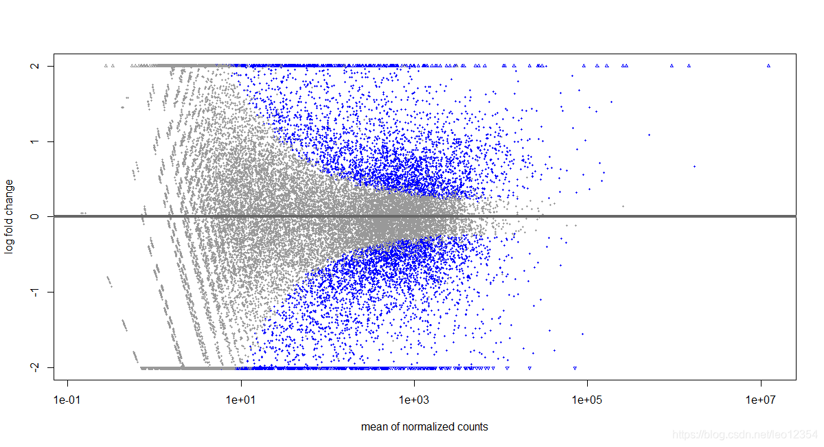
对log2 fold change进行收缩一下,得到的MA图会好看一些。
res_order<-res[order(row.names(res)),]
res = res_order
res.shrink <- lfcShrink(dds,contrast = c("condition","treat","control"), res=res)
#但结果提示Error in lfcShrink(dds, contrast = c("condition", "treat", "control"),  :   type='apeglm' shrinkage only for use with 'coef',目前不确定原因,故采取了下边两种方式
1. resApe <-lfcShrink(dds, coef=2,type="apeglm")
2. resLFC <- lfcShrink(dds, coef=2)
plotMA(resApe, ylim = c(-5,5))
topGene <- rownames(res)[which.min(res$padj)]
with(res[topGene, ], {
  points(baseMean, log2FoldChange, col="dodgerblue", cex=2, lwd=2)
  text(baseMean, log2FoldChange, topGene, pos=2, col="dodgerblue")
})
结果如图: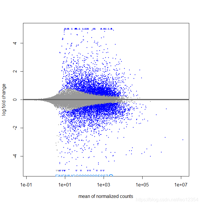
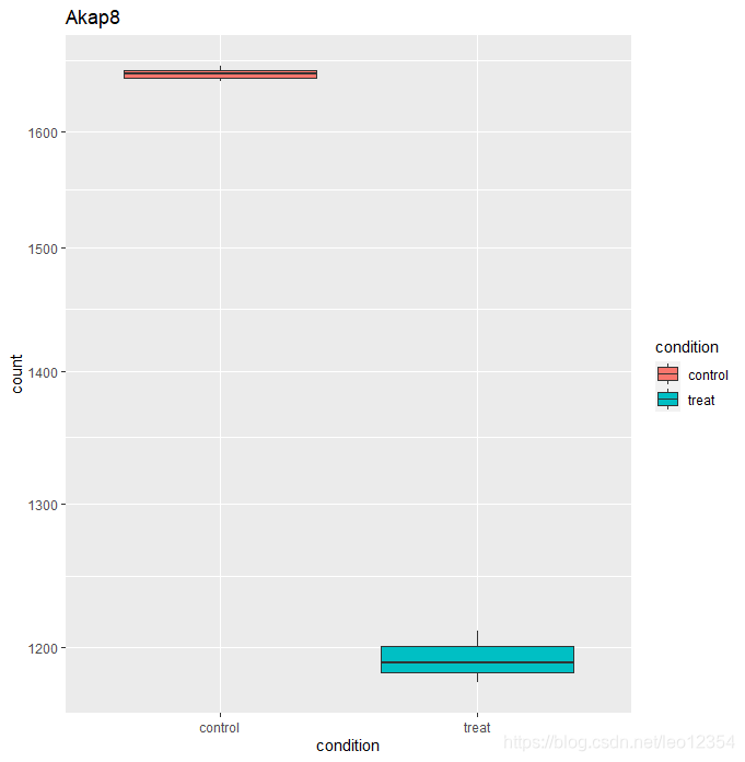
DESeq2提供了一个plotCounts()函数来查看某一个感兴趣的gene在组间的差别。counts会根据groups分组。
d1=plotCounts(dds, gene="ENSMUSG00000024045", intgroup="condition", returnData=TRUE)
ggplot(d1,aes(condition, count)) + geom_boxplot(aes(fill=condition)) + scale_y_log10() + ggtitle("Akap8")
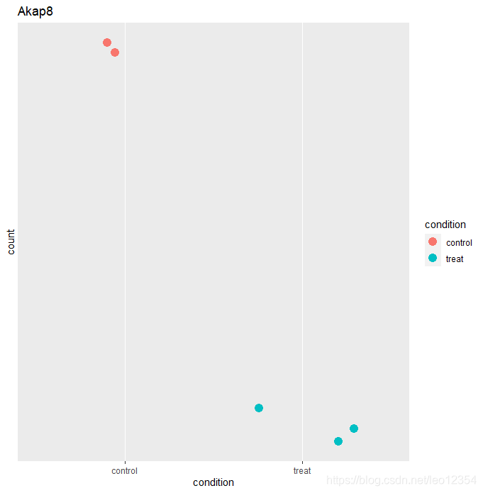
#点图
ggplot(d1, aes(x=condition, y=count)) +
  geom_point(aes(color= condition),size= 4, position=position_jitter(w=0.3,h=0)) +
  scale_y_log10(breaks=c(25,20,60))+ ggtitle("Akap8")
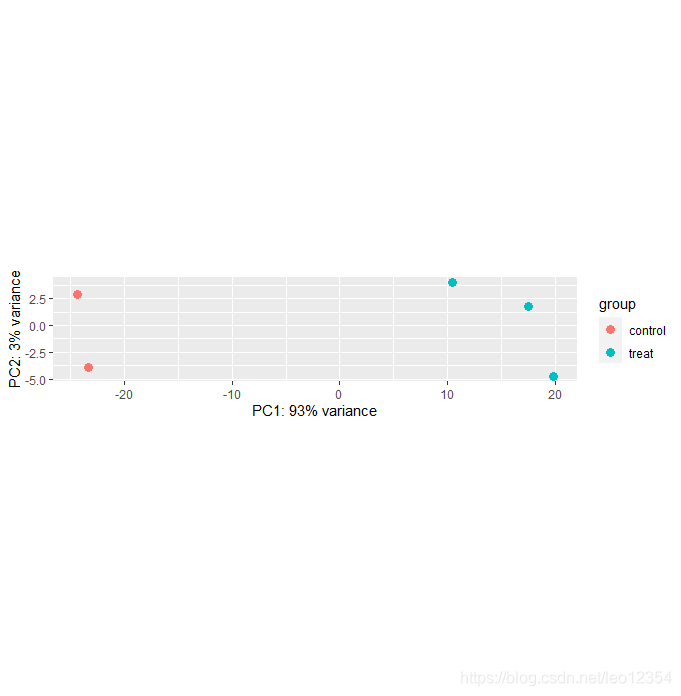
variance stabilizing transformation(VST)可消除方差对mean均值的依赖,尤其是低均值时的高log counts的变异。
vsdata <- vst(dds, blind=FALSE)
plotPCA(vsdata, intgroup="condition")
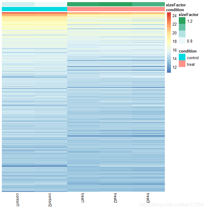
library("pheatmap")
select<-order(rowMeans(counts(dds, normalized = TRUE)),
              decreasing = TRUE)[1:200]
df <- as.data.frame(colData(dds)[,c("condition","sizeFactor")])
#log2(n + 1)
ntd <- normTransform(dds)
pheatmap(assay(ntd)[select,], cluster_rows=FALSE, show_rownames=FALSE,
         cluster_cols=FALSE, annotation_col=df)
#加载R包,并看看都有啥可以选择的颜色
library("RColorBrewer")
display.brewer.all()
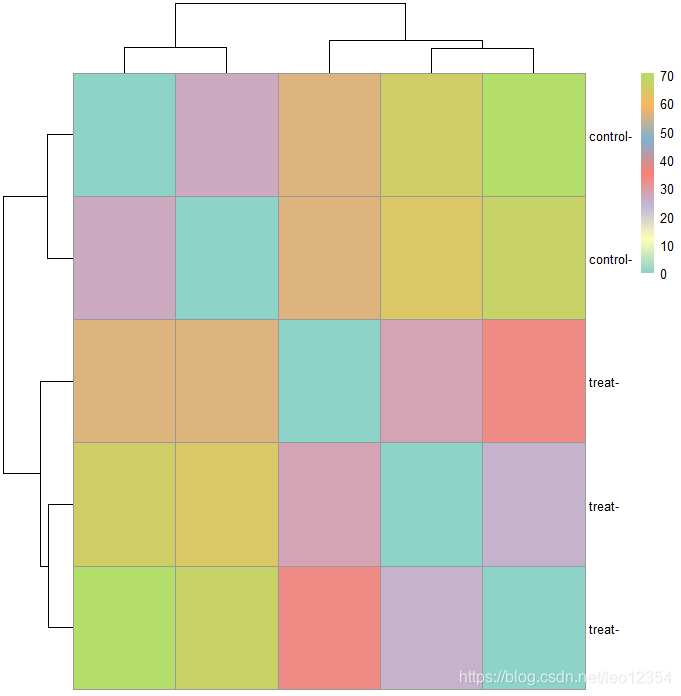
#转换数据还可以做出样本聚类热图。用dist函数来获得sample-to-sample距离。
sampleDists <- dist(t(assay(vsdata)))
sampleDistMatrix <- as.matrix(sampleDists)
rownames(sampleDistMatrix) <- paste(vsdata$condition, vsdata$type, sep="-")
colnames(sampleDistMatrix) <- NULL
colors <- colorRampPalette(brewer.pal(7,"Set3"))(255)
pheatmap(sampleDistMatrix,
clustering_distance_rows=sampleDists,
clustering_distance_cols=sampleDists,
col=colors)
版权声明:本文为leo12354原创文章,遵循CC 4.0 BY-SA版权协议,转载请附上原文出处链接和本声明。