本文主要介绍怎样一步一步实现WPF控件ComboBox的自定义样式,包括ComboBox的输入框、下拉框按钮及下拉展示条目的样式,均实现自定义样式。
1、新建WPF应用程序项目
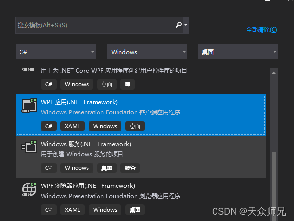
2、 添加一个ComboBox控件
<Window x:Class="WpfApp2.MainWindow"
        xmlns="http://schemas.microsoft.com/winfx/2006/xaml/presentation"
        xmlns:x="http://schemas.microsoft.com/winfx/2006/xaml"
        xmlns:d="http://schemas.microsoft.com/expression/blend/2008"
        xmlns:mc="http://schemas.openxmlformats.org/markup-compatibility/2006"
        xmlns:local="clr-namespace:WpfApp2"
        mc:Ignorable="d"
        Title="MainWindow" Height="450" Width="600">
    <Grid>
        <StackPanel Orientation="Vertical"
                    HorizontalAlignment="Center"
                    VerticalAlignment="Center">
            <ComboBox Name="myCbb"
                      Height="25"
                      Width="250"/>

        </StackPanel>
    </Grid>
</Window>
3、添加ComboBox样式代码
<Window x:Class="WpfApp2.MainWindow"
        xmlns="http://schemas.microsoft.com/winfx/2006/xaml/presentation"
        xmlns:x="http://schemas.microsoft.com/winfx/2006/xaml"
        xmlns:d="http://schemas.microsoft.com/expression/blend/2008"
        xmlns:mc="http://schemas.openxmlformats.org/markup-compatibility/2006"
        xmlns:local="clr-namespace:WpfApp2"
        mc:Ignorable="d"
        Title="MainWindow" Height="450" Width="600">
    <Window.Resources>
        <Style x:Key="MyCbbStyle" TargetType="ComboBox">
            <Setter Property="Template">
                <Setter.Value>
                    <ControlTemplate TargetType="ComboBox">
                        <Grid>
                            <Grid.ColumnDefinitions>
                                <ColumnDefinition Width="7*"/>
                                <ColumnDefinition Width="3*" MaxWidth="20"/>
                            </Grid.ColumnDefinitions>

                            <Border Grid.Column="0"
                                    BorderBrush="Blue"
                                    BorderThickness="1,1,0,1"
                                    Background="AliceBlue">
                                <TextBox x:Name="myTxt"
                                         Text="{TemplateBinding Text}"
                                         Background="Transparent"
                                         BorderThickness="0"
                                         VerticalContentAlignment="Center"
                                         FontSize="14"
                                         FontWeight="Bold"
                                         Foreground="Red"/>
                            </Border>
                            <Border Grid.Column="1"
                                    BorderBrush="Red"
                                    BorderThickness="1">

                            </Border>
                        </Grid>
                    </ControlTemplate>
                </Setter.Value>
            </Setter>
        </Style>
    </Window.Resources>

    <Grid>
        <StackPanel Orientation="Vertical"
                    HorizontalAlignment="Center"
                    VerticalAlignment="Center">
            <ComboBox Name="myCbb"
                      Height="25"
                      Width="250"
                      Style="{StaticResource MyCbbStyle}"/>

        </StackPanel>
    </Grid>
</Window>
运行效果图如下:
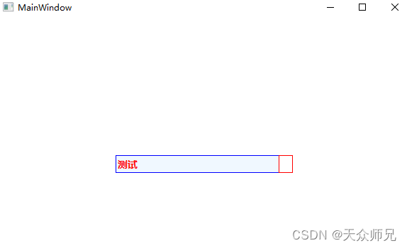
说明:重写ComboBox控件样式,修改Template模板,将ComboBox界面分为左右两部分,左侧部分为输入框及选中条目的显示框,输入框添加的是TextBox,可根据UI设计设置要显示的字体样式。注意边框的颜色和输入框的背景色都在Border上设置,避免边框重叠。
右侧部分预留给下拉框按钮。
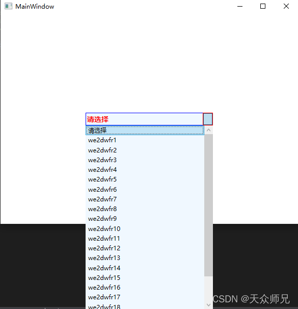
4、右侧区域添加ToggleButton,切换ComboBox下拉框的伸展与收缩,并添加伸展区域。
<Window x:Class="WpfApp2.MainWindow"
        xmlns="http://schemas.microsoft.com/winfx/2006/xaml/presentation"
        xmlns:x="http://schemas.microsoft.com/winfx/2006/xaml"
        xmlns:d="http://schemas.microsoft.com/expression/blend/2008"
        xmlns:mc="http://schemas.openxmlformats.org/markup-compatibility/2006"
        xmlns:local="clr-namespace:WpfApp2"
        mc:Ignorable="d"
        Title="MainWindow" Height="450" Width="600">
    <Window.Resources>
        <Style x:Key="MyCbbStyle" TargetType="ComboBox">
            <Setter Property="Template">
                <Setter.Value>
                    <ControlTemplate TargetType="ComboBox">
                        <Grid>
                            <Grid.ColumnDefinitions>
                                <ColumnDefinition Width="7*"/>
                                <ColumnDefinition Width="3*" MaxWidth="20"/>
                            </Grid.ColumnDefinitions>

                            <Border Grid.Column="0"
                                    BorderBrush="Blue"
                                    BorderThickness="1,1,0,1"
                                    Background="AliceBlue">
                                <TextBox x:Name="myTxt"
                                         Text="{TemplateBinding Text}"
                                         Background="Transparent"
                                         BorderThickness="0"
                                         VerticalContentAlignment="Center"
                                         FontSize="14"
                                         FontWeight="Bold"
                                         Foreground="Red"/>
                            </Border>
                            <Border Grid.Column="1"
                                    BorderBrush="Red"
                                    BorderThickness="1">
                                <ToggleButton IsChecked="{Binding Path=IsDropDownOpen, Mode=TwoWay, RelativeSource={RelativeSource TemplatedParent}}"
                                              ClickMode="Press"></ToggleButton>
                            </Border>
                            <Popup Name="MyPopup"
                                   IsOpen="{TemplateBinding IsDropDownOpen}"
                                   Placement="Bottom">
                                <Border MinWidth="{TemplateBinding ActualWidth}"
                                        MaxHeight="{TemplateBinding MaxDropDownHeight}">
                                    <ScrollViewer MaxHeight="{TemplateBinding MaxDropDownHeight}"
                                                  HorizontalScrollBarVisibility="Auto"
                                                  VerticalScrollBarVisibility="Auto">
                                        <StackPanel Background="AliceBlue"
                                                    IsItemsHost="True"
                                                    />

                                    </ScrollViewer>
                                </Border>
                            </Popup>
                        </Grid>
                    </ControlTemplate>
                </Setter.Value>
            </Setter>
        </Style>
    </Window.Resources>

    <Grid>
        <StackPanel Orientation="Vertical"
                    HorizontalAlignment="Center"
                    VerticalAlignment="Center">
            <ComboBox Name="myCbb"
                      Height="25"
                      Width="250"
                      DisplayMemberPath="Name"
                      SelectedValuePath="ID"
                      SelectedIndex="0"
                      Style="{StaticResource MyCbbStyle}"/>

        </StackPanel>
    </Grid>
</Window>
添加下拉框绑定数据对象CbbData.cs
  public class CbbData
    {
        public string ID { get; set; }

        public string Name { get; set; }
    }
添加初始化下拉框数据源方法,修改MainWindow.xaml.cs
 public partial class MainWindow : Window
    {
        public MainWindow()
        {
            InitializeComponent();
            List<CbbData> cbbDatas = new List<CbbData>();
            CbbData cbbData1 = new CbbData();
            cbbData1.ID = "";
            cbbData1.Name = "请选择";
            cbbDatas.Add(cbbData1);
            for (int i = 0; i < 20; i++)
            {
                CbbData cbbData = new CbbData();
                cbbData.ID = (i + 1).ToString();
                cbbData.Name = "we2dwfr" + (i + 1).ToString();
                cbbDatas.Add(cbbData);
            }

            myCbb.ItemsSource = cbbDatas;
        }


    }
运行效果图:
5、添加ToggleButton的自定义模板
<Window.Resources>
        <ControlTemplate x:Key="MyToggleBtnStyle"
                         TargetType="ToggleButton">
            <Border Name="MyBorder"
                    Background="AliceBlue"
                    BorderThickness="1"
                    BorderBrush="Transparent">
                <Path Name="MyPath"
                      Fill="Red"
                      Height="10"
                      Width="10"
                      Data="M5,5 L10,10 L15,5 z"
                      Stretch="Fill">
                </Path>
            </Border>
            <ControlTemplate.Triggers>
                <Trigger Property="IsMouseOver" Value="True">
                    <Setter TargetName="MyPath" Property="Fill" Value="Green"></Setter>
                    <Setter TargetName="MyBorder" Property="Background" Value="White"></Setter>
                </Trigger>
            </ControlTemplate.Triggers>
        </ControlTemplate>

        <Style x:Key="MyCbbStyle" TargetType="ComboBox">
            <Setter Property="Template">
                <Setter.Value>
                    <ControlTemplate TargetType="ComboBox">
                        <Grid>
                            <Grid.ColumnDefinitions>
                                <ColumnDefinition Width="7*"/>
                                <ColumnDefinition Width="3*" MaxWidth="20"/>
                            </Grid.ColumnDefinitions>

                            <Border Grid.Column="0"
                                    BorderBrush="Blue"
                                    BorderThickness="1,1,0,1"
                                    Background="AliceBlue">
                                <TextBox x:Name="myTxt"
                                         Text="{TemplateBinding Text}"
                                         Background="Transparent"
                                         BorderThickness="0"
                                         VerticalContentAlignment="Center"
                                         FontSize="14"
                                         FontWeight="Bold"
                                         Foreground="Red"/>
                            </Border>
                            <Border Grid.Column="1"
                                    BorderBrush="Red"
                                    BorderThickness="1">
                                <ToggleButton IsChecked="{Binding Path=IsDropDownOpen, Mode=TwoWay, RelativeSource={RelativeSource TemplatedParent}}"
                                              ClickMode="Press"
                                              Template="{StaticResource MyToggleBtnStyle}"></ToggleButton>
                            </Border>
                            <Popup Name="MyPopup"
                                   IsOpen="{TemplateBinding IsDropDownOpen}"
                                   Placement="Bottom">
                                <Border MinWidth="{TemplateBinding ActualWidth}"
                                        MaxHeight="{TemplateBinding MaxDropDownHeight}">
                                    <ScrollViewer MaxHeight="{TemplateBinding MaxDropDownHeight}"
                                                  HorizontalScrollBarVisibility="Auto"
                                                  VerticalScrollBarVisibility="Auto">
                                        <StackPanel Background="AliceBlue"
                                                    IsItemsHost="True"
                                                    />

                                    </ScrollViewer>
                                </Border>
                            </Popup>
                        </Grid>
                    </ControlTemplate>
                </Setter.Value>
            </Setter>
        </Style>
    </Window.Resources>
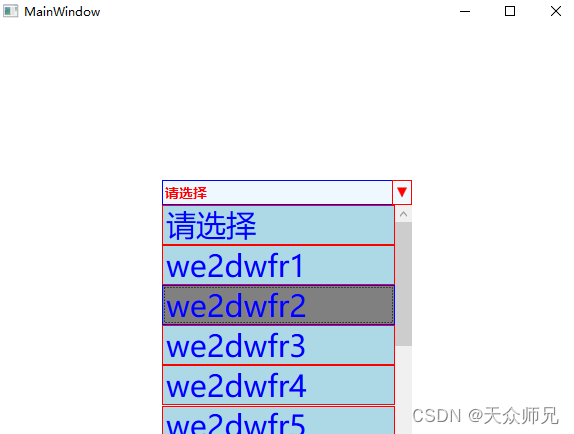
将ToggleButton模板设置为Path画的三角形。
6、实现自定义ComboBoxItem样式,根据UI设计设置下列框条目的边框、背景色、高度、字体大小、字体颜色、鼠标移入样式改变等。
 <Window.Resources>

        <ControlTemplate x:Key="MyComboBoxItem"
                         TargetType="ComboBoxItem">
            <Grid Background="{TemplateBinding Background}"
                  >
                <Border x:Name="itemBorder"
                        BorderThickness="{TemplateBinding BorderThickness}"
                        BorderBrush="Red"
                        Background="LightBlue"
                        Height="40"/>
                <ContentPresenter x:Name="contentShow"
                                  Margin="{TemplateBinding Padding}"
                                  VerticalAlignment="Center"
                                  HorizontalAlignment="Left"
                                  />
            </Grid>
            <ControlTemplate.Triggers>
                <Trigger Property="IsMouseOver" Value="True">
                    <Setter TargetName="itemBorder"
                            Property="Background"
                            Value="Gray"/>
                    <Setter TargetName="itemBorder"
                            Property="BorderBrush"
                            Value="Blue"/>
                </Trigger>
            </ControlTemplate.Triggers>
        </ControlTemplate>

        <ControlTemplate x:Key="MyToggleBtnStyle"
                         TargetType="ToggleButton">
            <Border Name="MyBorder"
                    Background="AliceBlue"
                    BorderThickness="1"
                    BorderBrush="Transparent">
                <Path Name="MyPath"
                      Fill="Red"
                      Height="10"
                      Width="10"
                      Data="M5,5 L10,10 L15,5 z"
                      Stretch="Fill">
                </Path>
            </Border>
            <ControlTemplate.Triggers>
                <Trigger Property="IsMouseOver" Value="True">
                    <Setter TargetName="MyPath" Property="Fill" Value="Green"></Setter>
                    <Setter TargetName="MyBorder" Property="Background" Value="White"></Setter>
                </Trigger>
            </ControlTemplate.Triggers>
        </ControlTemplate>

        <Style x:Key="MyCbbStyle" TargetType="ComboBox">
            <Setter Property="ItemContainerStyle">
                <Setter.Value>
                    <Style TargetType="ComboBoxItem">
                        <Setter Property="FontSize" Value="30"/>
                        <Setter Property="Foreground" Value="Blue"/>
                        <Setter Property="Template"
                                Value="{StaticResource MyComboBoxItem}"/>
                    </Style>
                </Setter.Value>
            </Setter>

            <Setter Property="Template">
                <Setter.Value>
                    <ControlTemplate TargetType="ComboBox">
                        <Grid>
                            <Grid.ColumnDefinitions>
                                <ColumnDefinition Width="7*"/>
                                <ColumnDefinition Width="3*" MaxWidth="20"/>
                            </Grid.ColumnDefinitions>

                            <Border Grid.Column="0"
                                    BorderBrush="Blue"
                                    BorderThickness="1,1,0,1"
                                    Background="AliceBlue">
                                <TextBox x:Name="myTxt"
                                         Text="{TemplateBinding Text}"
                                         Background="Transparent"
                                         BorderThickness="0"
                                         VerticalContentAlignment="Center"
                                         FontSize="14"
                                         FontWeight="Bold"
                                         Foreground="Red"/>
                            </Border>
                            <Border Grid.Column="1"
                                    BorderBrush="Red"
                                    BorderThickness="1">
                                <ToggleButton IsChecked="{Binding Path=IsDropDownOpen, Mode=TwoWay, RelativeSource={RelativeSource TemplatedParent}}"
                                              ClickMode="Press"
                                              Template="{StaticResource MyToggleBtnStyle}"></ToggleButton>
                            </Border>
                            <Popup Name="MyPopup"
                                   IsOpen="{TemplateBinding IsDropDownOpen}"
                                   Placement="Bottom">
                                <Border MinWidth="{TemplateBinding ActualWidth}"
                                        MaxHeight="{TemplateBinding MaxDropDownHeight}">
                                    <ScrollViewer MaxHeight="{TemplateBinding MaxDropDownHeight}"
                                                  HorizontalScrollBarVisibility="Auto"
                                                  VerticalScrollBarVisibility="Auto">
                                        <StackPanel Background="AliceBlue"
                                                    IsItemsHost="True"
                                                    />

                                    </ScrollViewer>
                                </Border>
                            </Popup>
                        </Grid>
                    </ControlTemplate>
                </Setter.Value>
            </Setter>
        </Style>
    </Window.Resources>
运行效果图:
7、下拉框条目实现图片和文字的组合,自定义ComboBoxItem的样式。
添加images文件夹保存图片
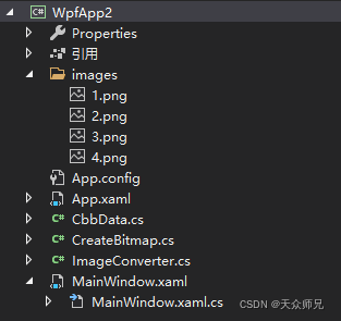
添加CreateBitmap.cs类实现图片转化为BitmapImage
 public class CreateBitmap
    {
        public static BitmapImage GetBitmap(string name)
        {
            BitmapImage bitmap;
            string rootPath = @"pack://application:,,,/WpfApp2;component/images/" + name + ".png";
            bitmap = new BitmapImage(new Uri(rootPath, UriKind.Absolute));
            return bitmap;
        }
    }
添加ImageConverter.cs类将图片名称转换为ImageSource,为下拉框的条目图片提供数据源。
  public class ImageConverter : IValueConverter
    {
        public object Convert(object value, Type targetType, object parameter, CultureInfo culture)
        {
            if (value == null)
                return null;
            string imgName = value.ToString();

            BitmapImage bitmap = CreateBitmap.GetBitmap(imgName);
            return bitmap;
        }

        public object ConvertBack(object value, Type targetType, object parameter, CultureInfo culture)
        {
            throw new NotImplementedException();
        }
    }
修改ComboBoxItem模板
    <Window.Resources>
        <local:ImageConverter x:Key="ImageConverter"/>
        <ControlTemplate x:Key="MyComboBoxItem"
                         TargetType="ComboBoxItem">
            <Grid Background="{TemplateBinding Background}"
                  >
                <Border x:Name="itemBorder"
                        BorderThickness="{TemplateBinding BorderThickness}"
                        BorderBrush="Red"
                        Background="LightBlue"
                        Height="40"
                        >
                    <StackPanel Orientation="Horizontal">
                        <Image Source="{Binding ImgName,Converter={StaticResource ImageConverter}}"
                               Width="30"
                               Height="30"/>
                        <TextBlock Text="{Binding Name}"
                                   Margin="10,0,0,0"
                                   HorizontalAlignment="Center"
                                   VerticalAlignment="Center"/>
                    </StackPanel>
                </Border>
            </Grid>
            <ControlTemplate.Triggers>
                <Trigger Property="IsMouseOver" Value="True">
                    <Setter TargetName="itemBorder"
                            Property="Background"
                            Value="Gray"/>
                    <Setter TargetName="itemBorder"
                            Property="BorderBrush"
                            Value="Blue"/>
                </Trigger>
            </ControlTemplate.Triggers>
        </ControlTemplate>

        <ControlTemplate x:Key="MyToggleBtnStyle"
                         TargetType="ToggleButton">
            <Border Name="MyBorder"
                    Background="AliceBlue"
                    BorderThickness="1"
                    BorderBrush="Transparent">
                <Path Name="MyPath"
                      Fill="Red"
                      Height="10"
                      Width="10"
                      Data="M5,5 L10,10 L15,5 z"
                      Stretch="Fill">
                </Path>
            </Border>
            <ControlTemplate.Triggers>
                <Trigger Property="IsMouseOver" Value="True">
                    <Setter TargetName="MyPath" Property="Fill" Value="Green"></Setter>
                    <Setter TargetName="MyBorder" Property="Background" Value="White"></Setter>
                </Trigger>
            </ControlTemplate.Triggers>
        </ControlTemplate>

        <Style x:Key="MyCbbStyle" TargetType="ComboBox">
            <Setter Property="ItemContainerStyle">
                <Setter.Value>
                    <Style TargetType="ComboBoxItem">
                        <Setter Property="FontSize" Value="30"/>
                        <Setter Property="Foreground" Value="Blue"/>
                        <Setter Property="Template"
                                Value="{StaticResource MyComboBoxItem}"/>
                    </Style>
                </Setter.Value>
            </Setter>

            <Setter Property="Template">
                <Setter.Value>
                    <ControlTemplate TargetType="ComboBox">
                        <Grid>
                            <Grid.ColumnDefinitions>
                                <ColumnDefinition Width="7*"/>
                                <ColumnDefinition Width="3*" MaxWidth="20"/>
                            </Grid.ColumnDefinitions>

                            <Border Grid.Column="0"
                                    BorderBrush="Blue"
                                    BorderThickness="1,1,0,1"
                                    Background="AliceBlue">
                                <TextBox x:Name="myTxt"
                                         Text="{TemplateBinding Text}"
                                         Background="Transparent"
                                         BorderThickness="0"
                                         VerticalContentAlignment="Center"
                                         FontSize="14"
                                         FontWeight="Bold"
                                         Foreground="Red"/>
                            </Border>
                            <Border Grid.Column="1"
                                    BorderBrush="Red"
                                    BorderThickness="1">
                                <ToggleButton IsChecked="{Binding Path=IsDropDownOpen, Mode=TwoWay, RelativeSource={RelativeSource TemplatedParent}}"
                                              ClickMode="Press"
                                              Template="{StaticResource MyToggleBtnStyle}"></ToggleButton>
                            </Border>
                            <Popup Name="MyPopup"
                                   IsOpen="{TemplateBinding IsDropDownOpen}"
                                   Placement="Bottom">
                                <Border MinWidth="{TemplateBinding ActualWidth}"
                                        MaxHeight="{TemplateBinding MaxDropDownHeight}">
                                    <ScrollViewer MaxHeight="{TemplateBinding MaxDropDownHeight}"
                                                  HorizontalScrollBarVisibility="Auto"
                                                  VerticalScrollBarVisibility="Auto">
                                        <StackPanel Background="AliceBlue"
                                                    IsItemsHost="True"
                                                    />

                                    </ScrollViewer>
                                </Border>
                            </Popup>
                        </Grid>
                    </ControlTemplate>
                </Setter.Value>
            </Setter>
        </Style>
    </Window.Resources>
修改MainWindow.xaml.cs
  public MainWindow()
        {
            InitializeComponent();
            List<CbbData> cbbDatas = new List<CbbData>();
            CbbData cbbData1 = new CbbData();
            cbbData1.ID = "";
            cbbData1.Name = "请选择";
            cbbDatas.Add(cbbData1);
            for (int i = 0; i < 20; i++)
            {
                CbbData cbbData = new CbbData();
                cbbData.ID = (i + 1).ToString();
                cbbData.Name = "we2dwfr" + (i + 1).ToString();
                int imgname = (i + 1) % 4;
                if (imgname == 0)
                {
                    imgname = 4;
                }
                cbbData.ImgName = imgname.ToString();
                cbbDatas.Add(cbbData);
            }

            myCbb.ItemsSource = cbbDatas;
        }
运行效果图
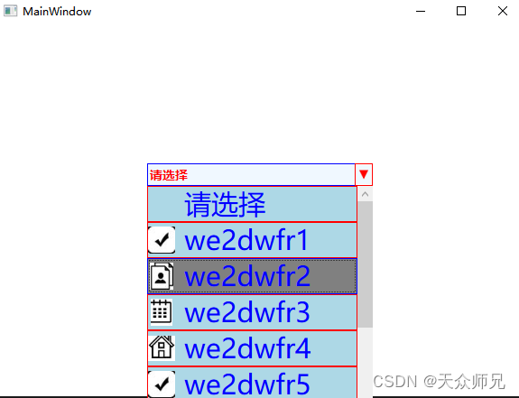
8、ComboBox的显示框是否可编辑由TextBox的IsReadOnly属性控制,只读不让修改设置True。
 <TextBox x:Name="myTxt"
          Text="{TemplateBinding Text}"
          Background="Transparent"
          BorderThickness="0"
          VerticalContentAlignment="Center"
          FontSize="14"
          FontWeight="Bold"
          Foreground="Red"
          IsReadOnly="True"/>