swiper
滑块视图容器。其中只可放置swiper-item组件,否则会导致未定义的行为。
| 属性 | 类型 | 默认值 | 必填 | 说明 | 最低版本 |
|---|---|---|---|---|---|
| indicator-dots | boolean | false | 否 | 是否显示面板指示点 | 1.0.0 |
| indicator-color | color | rgba(0, 0, 0, .3) | 否 | 指示点颜色 | 1.1.0 |
| indicator-active-color | color | #000000 | 否 | 当前选中的指示点颜色 | 1.1.0 |
| autoplay | boolean | false | 否 | 是否自动切换 | 1.0.0 |
| current | number | 0 | 否 | 当前所在滑块的 index | 1.0.0 |
| interval | number | 5000 | 否 | 自动切换时间间隔 | 1.0.0 |
| duration | number | 500 | 否 | 滑动动画时长 | 1.0.0 |
| circular | boolean | false | 否 | 是否采用衔接滑动 | 1.0.0 |
| vertical | boolean | false | 否 | 滑动方向是否为纵向 | 1.0.0 |
| previous-margin | string | "0px" | 否 | 前边距,可用于露出前一项的一小部分,接受 px 和 rpx 值 | 1.9.0 |
| next-margin | string | "0px" | 否 | 后边距,可用于露出后一项的一小部分,接受 px 和 rpx 值 | 1.9.0 |
| snap-to-edge | boolean | "false" | 否 | 当 swiper-item 的个数大于等于 2,关闭 circular 并且开启 previous-margin 或 next-margin 的时候,可以指定这个边距是否应用到第一个、最后一个元素 | 2.12.1 |
| display-multiple-items | number | 1 | 否 | 同时显示的滑块数量 | 1.9.0 |
| easing-function | string | "default" | 否 | 指定 swiper 切换缓动动画类型 | 2.6.5 |
| bindchange | eventhandle | 否 | current 改变时会触发 change 事件,event.detail = {current, source} | 1.0.0 | |
| bindtransition | eventhandle | 否 | swiper-item 的位置发生改变时会触发 transition 事件,event.detail = {dx: dx, dy: dy} | 2.4.3 | |
| bindanimationfinish | eventhandle | 否 | 动画结束时会触发 animationfinish 事件,event.detail 同上 | 1.9.0 |
easing-function 的合法值
| 值 | 说明 | 最低版本 |
|---|---|---|
| default | 默认缓动函数 | |
| linear | 线性动画 | |
| easeInCubic | 缓入动画 | |
| easeOutCubic | 缓出动画 | |
| easeInOutCubic | 缓入缓出动画 |
change事件 source 返回值
从 1.4.0 开始,change事件增加 source字段,表示导致变更的原因,可能值如下:
autoplay自动播放导致swiper变化;touch用户划动引起swiper变化;- 其它原因将用空字符串表示。
Bug & Tip
tip: 如果在bindchange的事件回调函数中使用setData改变current值,则有可能导致setData被不停地调用,因而通常情况下请在改变current值前检测source字段来判断是否是由于用户触摸引起。
示例代码
wxml代码如下:
//wxml代码:

<swiper indicator-dots="{{indicatorDots}}" autoplay="{{autoplay}}" interval="{{interval}}" duration="{{duration}}" indicator-color="{{indicatorColor}}" indicator-active-color="{{indicatorActiveColor}}" circular="true">
   <block wx:for="{{banner}}">
      <swiper-item>
         <view class="{{item}}"></view>
      </swiper-item>
   </block>
</swiper>

//wxss代码

swiper {
  height: 400rpx;
}

swiper-item view {
  height: 100%;
}

.bg_red {
  background-color: Pink;
}

.bg_green {
  background-color: PaleGreen;
}

.bg_blue {
  background-color: SkyBlue;
}

//js代码

Page({
  data: {
    indicatorDots: true, //是否显示面板指示点
    vertical: false,//滑动方向是否为纵向
    autoplay: true,//是否自动切换
    interval: 3000,//自动切换时间间隔
    duration: 1000,//滑动动画时长
    indicatorColor: "#ffffff",//滑动圆点颜色
    indicatorActiveColor: "#6abd18", //当前圆点颜色
    banner:['bg_red','bg_green','bg_blue'],
   }
})
效果图如下:
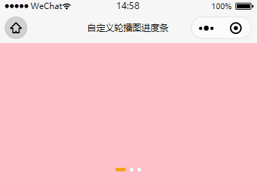
1、自定义圆点颜色
只需修改indicator-color和indicator-active-color参数值就可以了
2、自定义圆点位置
//只需在wxss文件里加上这两行代码即可
.wx-swiper-dots {
  position: relative;
  /* unset复原重置属性值 */
  left: unset !important;
  right: 0rpx;
}

.wx-swiper-dots .wx-swiper-dots-horizontal {
  margin-bottom: 0rpx;
}
效果如下:

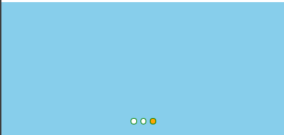
3、自定义圆点形状
//wxml代码:

<view class="parent">
    <swiper bindchange="monitorCurrent" indicator-dots="{{indicatorDots}}" autoplay="{{autoplay}}" interval="{{interval}}" duration="{{duration}}" indicator-color="{{indicatorColor}}" indicator-active-color="{{indicatorActiveColor}}" circular="true" current="{{current}}">
        <block wx:for="{{banner}}" wx:key="*this">
            <swiper-item>
             <view class="{{item}}"></view>
            </swiper-item>
        </block>
    </swiper>
    <!-- 自定义轮播图进度点 -->
  <view class="dots">
    <block wx:for="{{banner}}" wx:for-index="index" wx:key="*this">
      <view class="{{current==index?'active':''}}"></view>
    </block>
  </view>
  </view>

//wxss代码:

.parent {
  position: relative;
}
swiper-item view{
  width:100%;
  height:400rpx;
}
.bg_red {
  background-color: Pink;
}

.bg_green {
  background-color: PaleGreen;
}

.bg_blue {
  background-color: SkyBlue;
}
.dots {
  position: absolute;
  bottom: 30rpx;
  display: flex;
  justify-content: center;
  align-items: center;
  width: 100%;
}

.dots view {
  width: 15rpx;
  height: 15rpx;
  margin: 0 6rpx;
  border-radius: 15rpx;
  border:1rpx solid green;
  background-color: #fff;
}

.dots .active {
  width: 15rpx;
  height: 15rpx;
  border-radius: 15rpx;
  background-color: orange;
}

//js代码:

Page({
  data: {
    indicatorDots: false,//关闭滑块轮播圆点
    autoplay: true,
    interval: 3000,
    duration: 1000,
    indicatorColor: "#ffffff",//滑动圆点颜色
    indicatorActiveColor: "#6abd18", //当前圆点颜色
    banner:['bg_red','bg_green','bg_blue'],
    current: 0,
  },
   //监听轮播图的下标
   monitorCurrent: function (e) {
    // console.log(e.detail.current)
    let current = e.detail.current;
    this.setData({
      current: current
    })
  }
})
效果图如下:
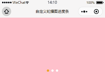
4、自定义长条状
//wxml代码

<view class="parent">
    <swiper bindchange="monitorCurrent" indicator-dots="{{indicatorDots}}" autoplay="{{autoplay}}" interval="{{interval}}" duration="{{duration}}" indicator-color="{{indicatorColor}}" indicator-active-color="{{indicatorActiveColor}}" circular="true" current="{{current}}">
        <block wx:for="{{banner}}" wx:key="*this">
            <swiper-item>
             <view class="{{item}}"></view>
            </swiper-item>
        </block>
    </swiper>
    <!-- 自定义轮播图进度点 -->
  <view class="dots">
    <block wx:for="{{banner}}" wx:for-index="index" wx:key="*this">
      <view class="{{current==index?'active':''}}"></view>
    </block>
  </view>
</view>

//wxss代码

.parent {
  position: relative;
}
swiper-item view{
  width:100%;
  height:400rpx;
}
.bg_red {
  background-color: Pink;
}

.bg_green {
  background-color: PaleGreen;
}

.bg_blue {
  background-color: SkyBlue;
}
.dots {
  position: absolute;
  bottom: 30rpx;
  display: flex;
  justify-content: center;
  align-items: center;
  width: 100%;
}

.dots view {
  width: 15rpx;
  height: 15rpx;
  margin: 0 6rpx;
  border-radius: 15rpx;
  background-color: #fff;
}

.dots .active {
  width: 35rpx;
  background-color: orange;
}


//js代码

Page({
  data: {
    indicatorDots: false,//关闭滑块轮播圆点
    autoplay: true,
    interval: 3000,
    duration: 1000,
    indicatorColor: "#ffffff",//滑动圆点颜色
    indicatorActiveColor: "#6abd18", //当前圆点颜色
    banner:['bg_red','bg_green','bg_blue'],
    current: 0,
   },
  //监听轮播图的下标
  monitorCurrent: function (e) {
    // console.log(e.detail.current)
    let current = e.detail.current;
    this.setData({
      current: current
    })
  }
})
效果如下:
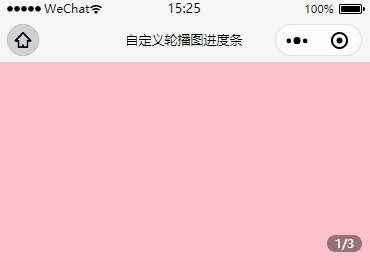
5、自定义带页码:
如果要显示页码的话,我们只需要使用轮播图的下标(从0开始)加上1来表示当前页,轮播图数组的长度来表示页码总数就好了
//wxml代码:

<view class="parent">
      <swiper bindchange="monitorCurrent" indicator-dots="{{indicatorDots}}" circular="true"  autoplay="{{autoplay}}" current="{{current}}">
         <block wx:for="{{banner}}" wx:key="*this">
            <swiper-item>
                <view class="{{item}}"></view>
            </swiper-item>
            </block>
      </swiper>
    <!-- 自定义轮播图进度点 -->
     <view class="dots">{{current+1}}/{{banner.length}}</view>
</view>

//wxss代码:

.parent {
  position: relative;
}
swiper-item view{
  width:100%;
  height:400rpx;
}
.bg_red {
  background-color: Pink;
}

.bg_green {
  background-color: PaleGreen;
}

.bg_blue {
  background-color: SkyBlue;
}
.dots {
  position: absolute;
  right: 20rpx;
  bottom: 20rpx;
  width: 70rpx;
  height: 35rpx;
  line-height: 35rpx;
  text-align: center;
  border-radius: 20rpx;
  background-color: rgba(0, 0, 0, 0.4);
  color: #fff;
  font-size: 24rpx;
}

//js代码

Page({
  data: {
    indicatorDots: false,
    autoplay: true,
    interval: 3000,
    duration: 1000,
    banner:['bg_red','bg_green','bg_blue'],
    current: 0,
  },
  //监听轮播图的下标
  monitorCurrent: function (e) {
    // console.log(e.detail.current)
    let current = e.detail.current;
    this.setData({
      current: current
    })
  }
})
效果图如下:
6、自定义带计时器:
wxml:在结构上,在写进度条时需要有两层,以我的GIF为例,外层用来放灰色的背景,内层用来放橙色的背景,接着我们只需要动态的去绑定width参数就好了。
<view class="parent">
      <swiper bindchange="monitorCurrent" indicator-dots="{{indicatorDots}}" circular="true"  autoplay="{{autoplay}}" current="{{current}}">
         <block wx:for="{{banner}}" wx:key="*this">
            <swiper-item>
                <view class="{{item}}"></view>
            </swiper-item>
            </block>
      </swiper>
    <!-- 自定义轮播图进度点 -->
     <view class="dots-parent">
    <block wx:for="{{banner}}" wx:for-index="index" wx:key="*this">
      <view class="progress-line-bg">
        <view class="{{current==index?'progress-line':''}}" style="width:{{progressNum}}%;"></view>
      </view>
    </block>
  </view>
</view>js:在动作上,我们需要先封装一个轮播图进度条计时器的方法,其功能是使用选中的进度条从0达到100的填充效果,接着在生命周期onShow函数上初次执行这个方法,紧接着轮播图翻页时,再二次去执行这个方法就好了。需要注意的是计时器是在全局data对象里面注册的,这样做的用意是每次执行时都可以确保把上一个计时器给清理掉。另外考虑到性能的问题,在页面隐藏(onHide)或者卸载(onUnload)时,我们要把轮播图给关了,防止再次生成计时器,接在还需把没执行完的计时器也清理掉,具体看代码解析。另外我设置轮播图自动翻页的时间是5秒,需要修改的话记得把计时器那也从新计算一下。
Page({
  data: {
    indicatorDots: false,
    interval: 3000,
    duration: 1000,
    banner:['bg_red','bg_green','bg_blue'],
    current: 0,
    //是否自动播放轮播图
    autoplay: false,
    //轮播图进度条的计时器
    progressNumInterval: null,
    //轮播图进度条的进度
    progressNum: 0
  },
  /**
   * 生命周期函数--监听页面显示
   */
  onShow: function () {
    //开启轮播图
    this.setData({
      autoplay: true
    })
    // 初次执行顶部轮播图的进度条的进度点
    this.progressLineInterval();
  },

  //监听轮播图的下标
  monitorCurrent: function (e) {
    // console.log(e.detail.current)
    let current = e.detail.current;
    this.setData({
      current: current
    })
    // 二次执行顶部轮播图的小圆点的进度点
    this.progressLineInterval();
  },

  //封装轮播图进度条计时器的方法
  progressLineInterval: function () {
    // 清理小圆点的计时器
    clearInterval(this.data.progressNumInterval)
    // 清理小圆点的进度
    this.setData({
      progressNum: 0,
    })
    /**
     * 轮播图的切换时间为5秒,进度条的进度为1-100%,
     * 因为5000/100=50毫秒,所以每50毫秒就要执行1个进度点
     * 另外需要把计时器寄存在data{}对象上,否则会清理不掉上一个计时器
     * */
    this.data.progressNumInterval = setInterval(() => {
      let progressNum = this.data.progressNum;
      // console.log(progressNum)
      if (progressNum < 100) {
        progressNum++;
      } else {
        progressNum = 0;
        // 清理进度条的计时器
        clearInterval(this.data.progressNumInterval)
      }
      this.setData({
        progressNum: progressNum
      })
    }, 50)
  },

  /**
   * 生命周期函数--监听页面隐藏
   */
  onHide: function () {
    //关闭轮播图
    this.setData({
      autoplay: false
    })
    // 清理进度条的计时器
    clearInterval(this.data.progressNumInterval)
  },

  /**
   * 生命周期函数--监听页面卸载
   */
  onUnload: function () {
    //关闭轮播图
    this.setData({
      autoplay: false
    })
    // 清理进度条的计时器
    clearInterval(this.data.progressNumInterval)
  }
})
wxss:
.parent {
  position: relative;
}
swiper-item view{
  width:100%;
  height:400rpx;
}
.bg_red {
  background-color: Pink;
}

.bg_green {
  background-color: PaleGreen;
}

.bg_blue {
  background-color: SkyBlue;
}
.dots-parent {
  position: absolute;
  bottom: 30rpx;
  display: flex;
  justify-content: center;
  align-items: center;
  width: 100%;
}

.dots-parent .progress-line-bg {
  width: 45rpx;
  height: 8rpx;
  border-radius: 8rpx;
  background-color: rgba(255, 255, 255, 0.5);
  margin-left: 10rpx;
}

.progress-line {
  background-color: #E42C2C;
  height: 8rpx;
  border-radius: 8rpx;
}
版权声明:本文为qq_39399966原创文章,遵循CC 4.0 BY-SA版权协议,转载请附上原文出处链接和本声明。