目录
导库
import pandas as pd
import numpy as np
import matplotlib.pyplot as plt
import seaborn as sns
import missingno as msno  # 缺失值处理可视化模块
载入数据
载入训练集测试集数据
简略观察数据(head,shape)
data = pd.read_csv('data.csv')
test = pd.read_csv('test.csv')

data.head().append(data.tail())
test.head().append(test.tail())
data.shape
test.shape
数据总览
数据相关统计量(describe)
数据类型(info)
data.describe()
test.describe()

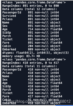
data.info()
test.info()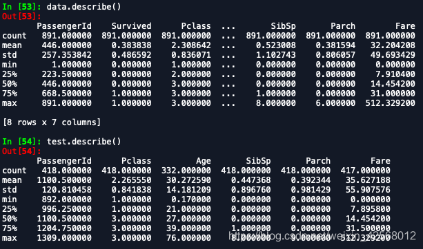
判断数据缺失和异常
异常值检测(nan)
data.isnull().sum()
test.isnull().sum()
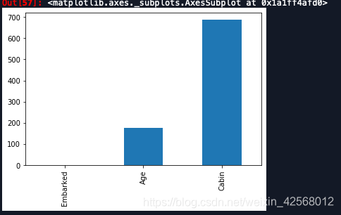
# nan可视化
missing = data.isnull().sum()
missing = missing[missing > 0]
missing.sort_values(inplace=True)
missing.plot.bar()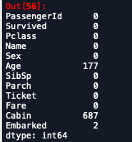
msno.matrix(data.sample(250),figsize=(10, 6))
# msno.matrix(data.sample(250),figsize=(10, 6),color=(0.5, 0.15, 0.65))
msno.bar(data.sample(500),figsize=(10, 6))

msno.matrix(test.sample(250),figsize=(10, 6))
msno.bar(test.sample(500),figsize=(10, 6))

data["Cabin"].value_counts() # 查看具体列的类别数量 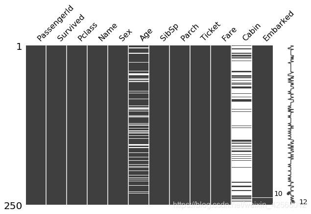
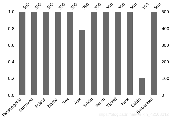
查看预测值分布
总体分布概况(无界约翰逊分布等)
查看skewness, kurtosis
## 1) 总体分布概况(无界约翰逊分布等) 经约翰变换后服从正态分布的随机变量的概率分布
import scipy.stats as st
y = data['Survived']
plt.figure(1); plt.title('Johnson SU')  # 约翰逊分布
sns.distplot(y, kde=False, fit=st.johnsonsu)
plt.figure(2); plt.title('Normal')  # 正态分布
sns.distplot(y, kde=False, fit=st.norm)
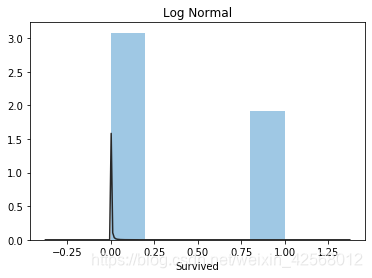
plt.figure(3); plt.title('Log Normal')
sns.distplot(y, kde=False, fit=st.lognorm)  # 对数正态分布


## 2) 查看skewness偏度 和 kurtosis峰度
# 偏度: 是描述数据分布形态的统计量,其描述的是某总体取值分布的对称性,简单来说就是数据的不对称程度,绝对值越大表明数据分布越不对称,偏斜程度大
# 峰度: 描述某变量所有取值分布形态陡缓程度的统计量,简单来说就是数据分布顶的尖锐程度(>0尖顶峰, <0平顶峰, =0与正态分布陡峭程度一致)

sns.distplot(data['Survived']);
print("Skewness: %f" % data['Survived'].skew())
print("Kurtosis: %f" % data['Survived'].kurt())
data.skew(), data.kurt()
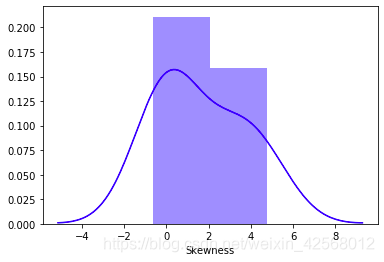
sns.distplot(data.skew(),color='blue',axlabel ='Skewness')
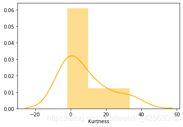
sns.distplot(data.kurt(),color='orange',axlabel ='Kurtness')


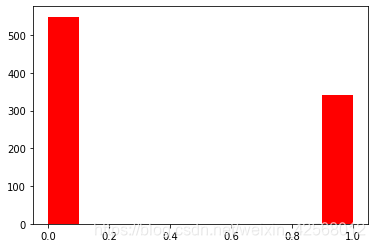
## 3) 查看预测值的具体频数
plt.hist(data['Survived'], orientation = 'vertical',histtype = 'bar', color ='red')
plt.show()
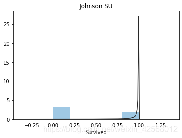
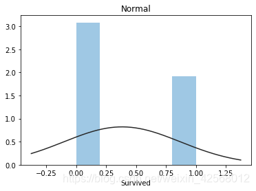
查看预测值具体频数
类别特征(unique分布)
数字特征
## 识别变量特征
# 数字特征
numeric_features = data.select_dtypes(include=[np.number])
numeric_feature = numeric_features.columns.tolist()
# 类型特征
categorical_features = data.select_dtypes(include=[np.object])
categorical_features = categorical_features.columns.tolist()

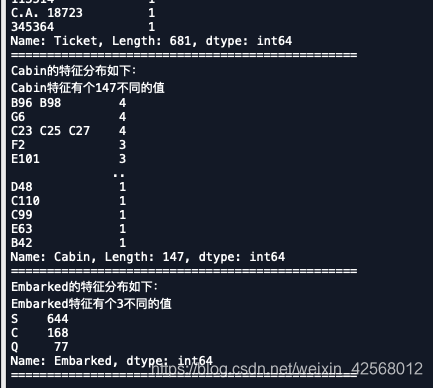
# 特征nunique分布 这里用了一个遍历法,以此对类别变量进行展示说明
for cat_fea in categorical_features:
    print(cat_fea + "的特征分布如下:")
    print("{}特征有个{}不同的值".format(cat_fea, data[cat_fea].nunique()))
    print(data[cat_fea].value_counts())
    print('================================================')
数字特征分析
相关性分析
偏度和峰值
关系可视化
多变量互相回归关系可视化
类型特征分析
unique分布
类别特征箱形图
类别特征小提醒图
类别特征柱形图
类别频数可视化(count_plot)
## 识别变量特征
# 数字特征
numeric_features = data.select_dtypes(include=[np.number])
numeric_features = numeric_features.columns.tolist()
# 类型特征
categorical_features = data.select_dtypes(include=[np.object])
categorical_features = categorical_features.columns.tolist()

# 特征nunique分布 这里用了一个遍历法,以此对类别变量进行展示说明
for cat_fea in categorical_features:
    print(cat_fea + "的特征分布如下:")
    print("{}特征有个{}不同的值".format(cat_fea, data[cat_fea].nunique()))
    print(data[cat_fea].value_counts())
    print('================================================')

## 1) 相关性分析 这主要是对数值型变量之间的相关性进行了可视化
data_numeric = data[numeric_features]
correlation = data_numeric.corr()
print(correlation['Survived'].sort_values(ascending = False),'\n')
#画热力图分析相关性
f ,ax =plt.subplots(figsize=(7,7))
plt.title('Correlation of Numeric Features with Survived',y=1,size=16)
sns.heatmap(correlation,square=True,vmax=0.8)


del price_numeric['price']


## 2) 查看几个特征得 偏度和峰值 采用format函数,并对间距进行了设置
for col in numeric_features:
    print('{:15}'.format(col),
          'Skewness: {:05.2f}'.format(data[col].skew()) ,
          '   ' ,
          'Kurtosis: {:06.2f}'.format(data[col].kurt())
         )


## 3) 每个数字特征得分布可视化
f = pd.melt(data, value_vars=numeric_features)
g = sns.FacetGrid(f, col="variable",  col_wrap=2, sharex=False, sharey=False)
g = g.map(sns.distplot, "value")


## 4) 数字特征相互之间的关系可视化
sns.set()
columns = ['PassengerId', 'Survived', 'Pclass', 'Age', 'SibSp', 'Parch', 'Fare']
sns.pairplot(data[columns],size = 2 ,kind ='scatter',diag_kind='kde')
plt.show()
生成数据报告
pandas_profiling
import matplotlib as plt
import pandas_profiling
pfr = pandas_profiling.ProfileReport(data)
pfr.to_file("./example.html")
边缘直方图
# 导入numpy库
import numpy as np
# 导入pandas库
import pandas as pd
# 导入matplotlib库
import matplotlib as mpl
import matplotlib.pyplot as plt
# 导入seaborn库
import seaborn as sns

large = 22; med = 16; small = 12
            # 设置子图上的标题字体
params = {'axes.titlesize': large,
            # 设置图例的字体
          'legend.fontsize': med,
            # 设置图像的画布
          'figure.figsize': (16, 10),
            # 设置标签的字体
          'axes.labelsize': med,
            # 设置x轴上的标尺的字体
          'xtick.labelsize': med,
            # 设置整个画布的标题字体
          'ytick.labelsize': med,
          'figure.titlesize': large}
# 更新默认属性
plt.rcParams.update(params)
 # 设定整体风格
plt.style.use('seaborn-whitegrid')
# 设定整体背景风格
sns.set_style("white")

# step1:导入数据
df = pd.read_csv('/Users/xinran/Downloads/mpg_ggplot2.csv')

# step2:创建子图对象与网格
    # 画布

fig = plt.figure(figsize = (16, 10),     # 画布大小_(16, 10)
                 dpi = 80,               # 分辨率
                 facecolor = 'white')    # 背景颜色,默认为白色
    # 网格

grid = plt.GridSpec(4,                   # 行数
                    4,                   # 列数
                    hspace = 0.5,        # 行与行之间的间隔
                    wspace = 0.2)        # 列与列之间的间隔

# step3:明确子图的位置
    # 确定如图所示散点图的位置
ax_main = fig.add_subplot(grid[:-1, :-1])
    # 确定如图所示右边直方图的位置
ax_right = fig.add_subplot(grid[:-1, -1], xticklabels = [], yticklabels = [])
    # 确定如图所示最底下直方图的位置
ax_bottom = fig.add_subplot(grid[-1, 0:-1], xticklabels = [], yticklabels = [])

# step4:散点图
    # category__Category是pandas的一种数据类型
    # astype__实现变量类型转换
    # cat__获取分类变量的类别
    # codes__按照类别编码
ax_main.scatter('displ',             # 横坐标
               'hwy',                # 纵坐标
                s = df.cty*4,        # 设置点的尺寸
               data = df,            # 所使用的数据
               c = df.manufacturer.astype('category').cat.codes,   # 颜色类别
                cmap = 'tab10',      # 调色板
                edgecolors = 'gray', # 边框颜色
                linewidths = 0.5,    # 线宽
                alpha = 0.9)          # 透明度

# step5:右边的直方图
ax_right.hist(df.hwy,                 # 需要绘图的变量
             40,                      # 需要分为多少段
             histtype = 'stepfilled', # 生成一个的线条轮廓
             orientation = 'horizontal',  # 方位__水平
             color = 'deeppink')      # 颜色__深粉色


# step6:底部的直方图
ax_bottom.hist(df.displ,                # 需要绘图的变量
              40,                       # 需要分为多少段
              histtype = 'stepfilled',  # 生成一个的线条轮廓
              orientation = 'vertical', # 方位__垂直
              color = 'deeppink')       # 颜色__深粉色
ax_bottom.invert_yaxis()

# step7:装饰图像
ax_main.set(title='Scatterplot with Histograms \n displ vs hwy',  # 设置标题
            xlabel='displ',             # 横坐标名称
            ylabel='hwy')               # 纵坐标名称
ax_main.title.set_fontsize(20)          # 设置标题字体大小
    # xaxis.label__x坐标轴的标题
    # yaxis.label__y坐标轴的标题
    # xticklabel__x坐标轴的标尺
    # yticklabel__y坐标轴的标尺
        # 遍历每一个对象并且修改其字体大小
for item in ([ax_main.xaxis.label, ax_main.yaxis.label] + ax_main.get_xticklabels() + ax_main.get_yticklabels()):
    item.set_fontsize(14)               # 修改字体大小

xlabels = ax_main.get_xticks().tolist() # 将散点图上的x坐标轴上的标尺提取后转换为list(一位小数)
ax_main.set_xticklabels(xlabels)        # 将xlabels中的数字设置为散点图上的坐标轴上的标尺
plt.show()
版权声明:本文为weixin_42568012原创文章,遵循CC 4.0 BY-SA版权协议,转载请附上原文出处链接和本声明。