实现 图片+文字 一起居中显示的 Button
Android 中原生的 Button 可以添加图标和文字(通过控制标签来实现图标相对于文字的位置):
标签:
android:drawableLeft,
android:drawableRight,
android:drawableTop,
android:drawableBottom;
但是如果使用上述标签,就会发现图标会贴着 Button 边缘,无法和文字一起居中。
例如: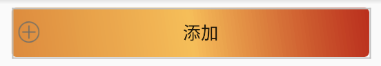
实现 图片+文字 一起居中显示的 Button的几种方法
1.使用 LinearLayout组合布局
代码:
<LinearLayout
        android:id="@+id/btn_add"
        android:layout_width="360dp"
        android:layout_height="50dp"
        android:layout_marginTop="20dp"
        android:background="@drawable/roundrect"
        android:gravity="center"
        android:layout_gravity="center"
        android:orientation="horizontal">

        <ImageButton
            android:id="@+id/id_add_img"
            android:layout_width="wrap_content"
            android:layout_height="wrap_content"
            android:background="#00000000"
            android:src="@mipmap/add" />

        <TextView
            android:layout_width="wrap_content"
            android:layout_height="wrap_content"
            android:layout_marginLeft="10dp"
            android:text="@string/btn_AddDevice"
            android:textSize="18sp" />

    </LinearLayout>
效果图:
特点:使用方便,结构清晰,但是如果需要多个此类型结构的 Button,则代码量太大,损耗性能。(垂直方向的操作类似)
注意:本文设置了android:background="@drawable/roundrect"属性,该属性设置按钮为圆角矩形且为渐变色填充(想看详细代码可以下拉到“补充”),读者可自行修改为自己想要的特性。
2.使用 Button + 便签,并重写其onDraw(Canvas canvas) 方法
2.1 实现左右居中
布局代码:
<com.example.customcontrols.DrawableHorizontalButton
        android:id="@+id/btn_btnTest2"
        android:layout_width="360dp"
        android:layout_height="50dp"
        android:background="@drawable/roundrect"
        android:drawableLeft="@mipmap/add"
        android:text="@string/btn_AddDevice"
        android:textSize="18sp"
        android:drawablePadding="10dp"
        android:layout_marginTop="20dp"
        android:layout_gravity="center">
    </com.example.customcontrols.DrawableHorizontalButton>
<com.example.customcontrols.DrawableHorizontalButton
        android:id="@+id/btn_btnTest3"
        android:layout_width="360dp"
        android:layout_height="50dp"
        android:background="@drawable/roundrect"
        android:drawableRight="@mipmap/add"
        android:text="@string/btn_AddDevice"
        android:textSize="18sp"
        android:drawablePadding="10dp"
        android:layout_marginTop="20dp"
        android:layout_gravity="center"
        >
    </com.example.customcontrols.DrawableHorizontalButton>
重写onDraw(Canvas canvas) 方法:
public class DrawableHorizontalButton extends AppCompatButton {

    public DrawableHorizontalButton(Context context, AttributeSet attrs) {
        super(context, attrs);
    }

    @Override
    protected void onDraw(Canvas canvas) {
        canvas = getTopCanvas(canvas);
        super.onDraw(canvas);
    }

    private Canvas getTopCanvas(Canvas canvas) {
        Drawable[] drawables = getCompoundDrawables();
        if (drawables == null) {
            return canvas;
        }
        Drawable drawable = drawables[0];// 左面的drawable
        if (drawable == null) {
            drawable = drawables[2];// 右面的drawable
        }

        float textSize = getPaint().measureText(getText().toString()); //获取文本所占尺寸
        int drawWidth = drawable.getIntrinsicWidth(); //获取图标所占尺寸
        int drawPadding = getCompoundDrawablePadding(); //获取中间空余的尺寸
        float contentWidth = textSize + drawWidth + drawPadding; //计算当前所占尺寸
        int leftPadding = (int) (getWidth() - contentWidth);
        setPadding(0, 0, leftPadding, 0); // 直接贴到左边
        float dx = (getWidth() - contentWidth) / 2; //获取中心位置
        canvas.translate(dx, 0);// 整体往右移动
        return canvas;
    }

}
实现效果:
2.2 实现上下居中
布局代码
<com.example.customcontrols.DrawableVerticalButton
        android:id="@+id/btn_btnTest5"
        android:layout_width="180dp"
        android:layout_height="180dp"
        android:background="@drawable/roundrect"
        android:drawableTop="@mipmap/cat"
        android:text="@string/btn_Cat"
        android:textSize="18sp"
        android:drawablePadding="5dp"
        android:layout_marginTop="20dp"
        android:layout_gravity="center"
        >
    </com.example.customcontrols.DrawableVerticalButton>

    <com.example.customcontrols.DrawableVerticalButton
        android:id="@+id/btn_btnTest4"
        android:layout_width="180dp"
        android:layout_height="180dp"
        android:background="@drawable/roundrect"
        android:drawableBottom="@mipmap/cat"
        android:text="@string/btn_Cat"
        android:textSize="18sp"
        android:drawablePadding="5dp"
        android:layout_marginTop="20dp"
        android:layout_gravity="center"
        >
    </com.example.customcontrols.DrawableVerticalButton>
重写onDraw(Canvas canvas) 方法:
public class DrawableVerticalButton extends AppCompatButton {

    public DrawableVerticalButton(Context context, AttributeSet attrs){
        super(context, attrs);
    }

    @Override
    protected void onDraw(Canvas canvas){
        canvas = getTopCanvas(canvas);
        super.onDraw(canvas);
    }

    private Canvas getTopCanvas(Canvas canvas){
        Drawable[] drawables = getCompoundDrawables();
        if (drawables == null) {
            return canvas;
        }
        Drawable drawable = drawables[1];// 上面的drawable
        if (drawable == null) {
            drawable = drawables[3];// 下面的drawable
        }

        float textSize = getPaint().getTextSize();
        int iconSize = drawable.getIntrinsicHeight();
        int drawPadding = getCompoundDrawablePadding();

        float contentSize = textSize + iconSize + drawPadding;
        int topPadding = (int) (getHeight() - contentSize);
        setPadding(0, topPadding, 0, 0);
        float dy = (contentSize - getHeight()) / 2;
        canvas.translate(0, dy);//上移

        return canvas;
    }
}
实现效果:
补充:设置 BUTTON 圆角及渐变色的代码
系数均可修改。
<?xml version="1.0" encoding="utf-8"?>
<shape xmlns:android="http://schemas.android.com/apk/res/android"
    android:shape="rectangle" >

    <gradient
        android:angle="45"
        android:startColor="@color/colorOrange"
        android:centerColor="@color/colorYellow"
        android:endColor="@color/colorred"
        />

    <padding
        android:bottom="7dp"
        android:left="7dp"
        android:right="7dp"
        android:top="7dp" />

    <corners android:radius="5dp" />

</shape>
版权声明:本文为Gong_zhuo原创文章,遵循CC 4.0 BY-SA版权协议,转载请附上原文出处链接和本声明。