参考:https://www.bilibili.com/video/BV1Jx411L7LU
图像显示移动坐标轴,替换标签和坐标名称
import matplotlib.pyplot as plt
import numpy as np

x = np.linspace(-3, 3, 50)
y1 = 2 * x + 1
y2 = x**2

plt.figure()   #一个figure表示一个图像里的内容,未出现下一个figure命令前都在一个图中显示
plt.plot(x, y2)
# plot the second curve in this figure with certain parameters
plt.plot(x, y1, color='red', linewidth=1.0, linestyle='--')
# set x limits
plt.xlim((-1, 2))
plt.ylim((-2, 3))
plt.xlabel('I am x')  #轴的名称修改
plt.ylabel('I am y')

# set new sticks
new_ticks = np.linspace(-1, 2, 5)
print(new_ticks)
plt.xticks(new_ticks) #修改轴上标签的名称
# set tick labels
plt.yticks([-2, -1.8, -1, 1.22, 3],     #原坐标数据位置名称
           [r'$really\ bad$', r'$bad\ \alpha$', r'$normal$', r'$good$', r'$really\ good$'])#新轴上标签名称
plt.show()
下图中的x和y轴被限制了,且通过ticks修改了标签名称,紫色的α是通过转义字符的功能完成的,图像的标题“figure1”可以通过figure中的num完成修改
%matplotlib
import matplotlib.pyplot as plt
import numpy as np

x = np.linspace(-3, 3, 50)
y1 = 2 * x + 1
y2 = x**2

plt.figure(num='这是一个标题头')
plt.plot(x, y2)
# plot the second curve in this figure with certain parameters
plt.plot(x, y1, color='red', linewidth=1.0, linestyle='--')
# set x limits
plt.xlim((-1, 2))
plt.ylim((-2, 3))
plt.xlabel('I am x')
plt.ylabel('I am y')

# set new sticks
new_ticks = np.linspace(-1, 2, 5)
print(new_ticks)
plt.xticks(new_ticks)
# set tick labels
plt.yticks([-2, -1.8, -1, 1.22, 3],
           [r'$really\ bad$', r'$bad\ \alpha$', r'$normal$', r'$good$', r'$really\ good$'])
ax = plt.gca()
ax.spines['right'].set_color('none')  #将顶部和右侧的实线坐标隐藏
ax.spines['top'].set_color('none')

ax.xaxis.set_ticks_position('bottom')  #x轴用那个轴代替
# ACCEPTS: [ 'top' | 'bottom' | 'both' | 'default' | 'none' ]

ax.spines['bottom'].set_position(('data', 0))#横坐标的位置显示在y=0的位置
# the 1st is in 'outward' | 'axes' | 'data'
# axes: percentage of y axis
# data: depend on y data

ax.yaxis.set_ticks_position('left')
# ACCEPTS: [ 'left' | 'right' | 'both' | 'default' | 'none' ]

ax.spines['left'].set_position(('data',0)) ## 纵坐标显示在x=0的位置
plt.show()

图像的图例的设置legend()
%matplotlib
import matplotlib.pyplot as plt
import numpy as np

x = np.linspace(-3, 3, 50)
y1 = 2*x + 1
y2 = x**2

plt.figure()
# set x limits
plt.xlim((-1, 2))
plt.ylim((-2, 3))

# set new sticks
new_sticks = np.linspace(-1, 2, 5)
plt.xticks(new_sticks)
# set tick labels
plt.yticks([-2, -1.8, -1, 1.22, 3],
           [r'$really\ bad$', r'$bad$', r'$normal$', r'$good$', r'$really\ good$'])

l1, = plt.plot(x, y1, label='linear line')
l2, = plt.plot(x, y2, color='red', linewidth=1.0, linestyle='--', label='square line')

plt.legend(loc='upper right')
# plt.legend(handles=[l1, l2], labels=['up', 'down'],  loc='best')
# the "," is very important in here l1, = plt... and l2, = plt... for this step
"""legend( handles=(line1, line2, line3),
           labels=('label1', 'label2', 'label3'),
           'upper right')
    The *loc* location codes are::

          'best' : 0,          (currently not supported for figure legends)
          'upper right'  : 1,
          'upper left'   : 2,
          'lower left'   : 3,
          'lower right'  : 4,
          'right'        : 5,
          'center left'  : 6,
          'center right' : 7,
          'lower center' : 8,
          'upper center' : 9,
          'center'       : 10,"""

plt.show()

只是修改了legend,其他和上个程序例子一样
每个图像的label可以设置,但在后边设置所有线的图例时,会被legend的名称取代
plt.legend(handles=[l1,l2],labels=['this is line1','this is line2'],loc='upper right')

对线的标注
import matplotlib.pyplot as plt
import numpy as np

x = np.linspace(-3, 3, 50)
y = 2*x + 1

plt.figure(num=1, figsize=(8, 5),)
plt.plot(x, y,)

ax = plt.gca()
ax.spines['right'].set_color('none')
ax.spines['top'].set_color('none')
ax.spines['top'].set_color('none')
ax.xaxis.set_ticks_position('bottom')
ax.spines['bottom'].set_position(('data', 0))
ax.yaxis.set_ticks_position('left')
ax.spines['left'].set_position(('data', 0))

x0 = 1
y0 = 2*x0 + 1
plt.plot([x0, x0,], [0, y0,], 'k--', linewidth=2.5)## 显示虚线
plt.scatter([x0, ], [y0, ], s=50, color='b')

# method 1:
##第1参:文字,第二参:标注点,第三参:,第四参:文字位置,第五参:位置方式,相对标注点
'''
xycoords 参数如下:
figure points:图左下角的点
figure pixels:图左下角的像素
figure fraction:图的左下部分
axes points:坐标轴左下角的点
axes pixels:坐标轴左下角的像素
axes fraction:左下轴的分数
data:使用被注释对象的坐标系统(默认)
'''
#文本放置位置是相对于需要标注点的(+30,-30)
plt.annotate(r'$2x+1=%s$' % y0, xy=(x0, y0), xycoords='data', xytext=(+30, -30),
             textcoords='offset points', fontsize=16,
             arrowprops=dict(arrowstyle='->', connectionstyle="arc3,rad=.2"))

# method 2:
########################
plt.text(-3.7, 3, r'$This\ is\ the\ some\ text. \mu\ \sigma_i\ \alpha_t$',
         fontdict={'size': 16, 'color': 'r'})

plt.show()

每个轴的小标签显示背景
%matplotlib

import matplotlib.pyplot as plt
import numpy as np

x = np.linspace(-3, 3, 50)
y = 0.1*x

plt.figure()
plt.plot(x, y, linewidth=10, zorder=1)      # set zorder for ordering the plot in plt 2.0.2 or higher
plt.ylim(-2, 2)
ax = plt.gca()
ax.spines['right'].set_color('none')
ax.spines['top'].set_color('none')
ax.spines['top'].set_color('none')
ax.xaxis.set_ticks_position('bottom')
ax.spines['bottom'].set_position(('data', 0))
ax.yaxis.set_ticks_position('left')
ax.spines['left'].set_position(('data', 0))


for label in ax.get_xticklabels() + ax.get_yticklabels():  #得到所有的轴标签
    label.set_fontsize(12)
    # set zorder for ordering the plot in plt 2.0.2 or higher
    label.set_bbox(dict(facecolor='white', edgecolor='none', alpha=0.8, zorder=2))## 设置背景
plt.show()

柱状图
%matplotlib

import matplotlib.pyplot as plt
import numpy as np

n = 12
X = np.arange(n)
Y1 = (1 - X / float(n)) * np.random.uniform(0.5, 1.0, n)
Y2 = (1 - X / float(n)) * np.random.uniform(0.5, 1.0, n)

plt.bar(X, +Y1, facecolor='#9999ff', edgecolor='white')
plt.bar(X, -Y2, facecolor='#ff9999', edgecolor='white')

for x, y in zip(X, Y1):
    # ha: horizontal alignment
    # va: vertical alignment
    plt.text(x + 0.4, y + 0.05, '%.2f' % y, ha='center', va='bottom')

for x, y in zip(X, Y2):
    # ha: horizontal alignment
    # va: vertical alignment
    #实用plt.txt显示柱状图的值
    plt.text(x + 0.4, -y - 0.05, '%.2f' % y, ha='center', va='top')

plt.xlim(-.5, n)
plt.xticks(())
plt.ylim(-1.25, 1.25)
plt.yticks(())

plt.show()

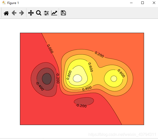
等高线图
%matplotlib

import matplotlib.pyplot as plt
import numpy as np

def f(x,y):
    # the height function
    return (1 - x / 2 + x**5 + y**3) * np.exp(-x**2 -y**2)

n = 256
x = np.linspace(-3, 3, n)
y = np.linspace(-3, 3, n)
X,Y = np.meshgrid(x, y) #设置网格,为了对应位置的高度

# use plt.contourf to filling contours
# X, Y and value for (X,Y) point
plt.contourf(X, Y, f(X, Y), 8, alpha=.75, cmap=plt.cm.hot)

# use plt.contour to add contour lines
C = plt.contour(X, Y, f(X, Y), 8, colors='black',linewidths=.5)
# adding label
plt.clabel(C, inline=True, fontsize=10)

plt.xticks(())
plt.yticks(())
plt.show()
# help(plt.contourf)
像素图片
%matplotlib

import matplotlib.pyplot as plt
import numpy as np

# image data
a = np.array([0.313660827978, 0.365348418405, 0.423733120134,
              0.365348418405, 0.439599930621, 0.525083754405,
              0.423733120134, 0.525083754405, 0.651536351379]).reshape(3,3)

"""
for the value of "interpolation", check this:
http://matplotlib.org/examples/images_contours_and_fields/interpolation_methods.html
for the value of "origin"= ['upper', 'lower'], check this:
http://matplotlib.org/examples/pylab_examples/image_origin.html
cmap是颜色形式
"""
plt.imshow(a, interpolation='nearest', origin='lower')# cmap='bone',
plt.colorbar(shrink=.92)### 将颜色的柱状压缩至95%

plt.xticks(())
plt.yticks(())
plt.show()
第一个图是默认的cmap,第二个用的cmap=‘bone’

版权声明:本文为weixin_43794311原创文章,遵循CC 4.0 BY-SA版权协议,转载请附上原文出处链接和本声明。