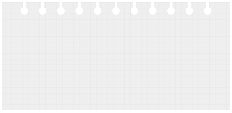
实现思路:
网格背景,由css3的线性渐变来实现。
纸上的打孔,由圆和圆柱组成,多个打孔,可以由box-shadow的平铺来实现。
实际代码:
Title.bg-grid {
height: 400px;
padding: 10px;
padding-top: 64px;
background-color: #efefef;
background-image: linear-gradient(#e7e6e6 1px, transparent 0),
linear-gradient(90deg, #e7e6e6 1px, transparent 0);
background-size: 21px 21px, 21px 21px;
background-position: center;
}
.bg-grid:before,
.bg-grid:after{
content: '';
position: absolute;
z-index: 0;
left: 50%;
transform: translateX(-50%);
display: inline-block;
background-color: #fff;
height: 28px;
box-shadow: 68px 0 0 0 #fff,
calc(68px * 2) 0 0 0 #fff,
calc(68px * 3) 0 0 0 #fff,
calc(68px * 4) 0 0 0 #fff,
calc(68px * 5) 0 0 0 #fff,
-68px 0 0 0 #fff,
calc(68px * -2) 0 0 0 #fff,
calc(68px * -3) 0 0 0 #fff,
calc(68px * -4) 0 0 0 #fff,
calc(68px * -5) 0 0 0 #fff;
}
.bg-grid:before {
top: 0;
width: 10px;
}
.bg-grid:after {
top: 26px;
width: 28px;
border-radius: 50%;
}
.bg-grid{
}
更多炫酷CSS3、html5、javascript特效代码,尽在:js特效大全