一、微信官方文档的写法
1. 新建一个components组件为tabBar,在其他页面引入该组件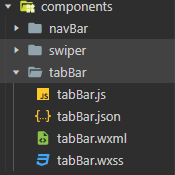
tabBar.js
// components/tabBar.js
Component({
  /**
   * 组件的属性列表
   */
  properties: {

  },

  /**
   * 组件的初始数据
   */
  data: {
    selected: 0,
    color: "#000",
    selectedColor: "#526AB7",
    list: [
      {
        "pagePath": "/pages/index/index",
        "text": "首页",
        "iconPath": "../../images/com_icon/index.jpg",
        "selectedIconPath": "../../images/com_icon/index.jpg"
      },
      {
        "pagePath": "/pages/welfare/welfare",
        "text": "福利",
        "iconPath": "../../images/com_icon/welfare.jpg",
        "selectedIconPath": "../../images/com_icon/welfare.jpg"
      },
      {
        "pagePath": "/pages/bill/bill",
        "text": "账单",
        "iconPath": "../../images/com_icon/bill.jpg",
        "selectedIconPath": "../../images/com_icon/bill.jpg"
      },
      {
        "pagePath": "/pages/mine/mine",
        "text": "我的",
        "iconPath": "../../images/com_icon/mine.jpg",
        "selectedIconPath": "../../images/com_icon/mine.jpg"
      }
    ]

  },

  /**
   * 组件的方法列表
   */
  methods: {
    changeTab(e){
      // console.log(e)
      const url=e.currentTarget.dataset.pagepath
      // console.log(url)
      wx.switchTab({url})
      this.setData({
        selected:e.currentTarget.dataset.index
      })
    }
  }
})
tabBar.wxml
<!--components/tabBar/tabBar.wxml-->
<view class="tabbar-box">
<view class="tabbar-container">
    <view wx:for="{{list}}" wx:for-item="item" wx:key="index" data-pagePath="{{item.pagePath}}" data-index="{{index}}" bindtap="changeTab">
        <image class="tabbar-image"  src="{{selected===index?item.selectedIconPath:item.iconPath}}"  lazy-load="false"> </image>
        <text style="color: {{selected === index ? selectedColor : color}}">{{item.text}}</text>
    </view>
    <!-- <view>
         <image class="tabbar-image"  src="/images/com_icon/welfare.jpg"  lazy-load="false"> </image>
        <text class="">福利</text>
    </view>
    <view>
         <image class="tabbar-image"  src="/images/com_icon/bill.jpg"  lazy-load="false"> </image>
        <text class="">账单</text>
    </view>
    <view>
         <image class="tabbar-image"  src="/images/com_icon/mine.jpg"  lazy-load="false"> </image>
        <text class="">我的</text>
    </view>  -->
</view>
</view>
tabBar.wxss
/* components/tabBar/tabBar.wxss */
.tabbar-box{
    position: fixed;
    bottom: 0;
    width: 100%;
    background-color: #fff;
}
.tabbar-container{
    display: flex;
    justify-content: space-between;
    height: 60px;
}
.tabbar-container>view{
    width: 25%;
    text-align: center;
}
.tabbar-image{
    display: inline-block;
    width: 40px;
    height: 40px;
}
.tabbar-container>view>text{
    display: block;
    height: 20px;
    font-size: 14px;
    line-height: 10px;
}
@media screen and (min-width:310px){
    .tabbar-container{
        display: flex;
        justify-content: space-between;
        height: 50px;
    }
    .tabbar-image{
        display: inline-block;
        width: 30px;
        height: 30px;
    }
}
tabBar.json
{
  "component": true,
  "usingComponents": {}
}
app.js
 "tabBar": {
    "custom": true,
    "color": "#000",
    "selectedColor": "#526AB7",
    "borderStyle": "black",
    "backgroundColor": "#ffffff",
    "list": [
      {
        "pagePath": "pages/index/index",
        "text": "首页",
        "iconPath": "images/com_icon/index.jpg",
        "selectedIconPath": "images/com_icon/index.jpg"
      },
      {
        "pagePath": "pages/welfare/welfare",
        "text": "福利",
        "iconPath": "images/com_icon/welfare.jpg",
        "selectedIconPath": "images/com_icon/welfare.jpg"
      },
      {
        "pagePath": "pages/bill/bill",
        "text": "账单",
        "iconPath": "images/com_icon/bill.jpg",
        "selectedIconPath": "images/com_icon/bill.jpg"
      },
      {
        "pagePath": "pages/mine/mine",
        "text": "我的",
        "iconPath": "images/com_icon/mine.jpg",
        "selectedIconPath": "images/com_icon/mine.jpg"
      }
    ]
  }
在page中使用:
welfare.wxml
<!-- pages/welfare/welfare.wxml -->
<view class="view-page">
    <view class='page-content'>
	<!--主要内容-->
	</view>
    <tabbar></tabbar>
</view>
welfare.json
{
  "usingComponents": {
    "tabbar": "/components/tabBar/tabBar"
  }
}
缺点:切换时会出现闪动,所以不推荐
二、子页面都写成组件 component 的方式,tabBar为页面page(推荐)
这种方法是上面那种相反 ,有点类似与vue中的写法, 通过绑定hidden="{{selected == 0? false: true}}"
来切换子页面,从而达到底部的tabbar不会闪动的效果
为了演示,我直接在pages文件夹下新建,目录结构如下
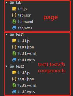
先看 tab 页面( page 与 component 最主要的区别在于js文件,一定得注意)
tab.js
// tab.js
let app = getApp()

Page({
  data: {
    selected: 0,
    color: "#000",
    selectedColor: "#526AB7",
    list: [
      {
        "iconPath": "/images/com_icon/index.jpg",
        "selectedIconPath": "/images/com_icon/bill.jpg",
        "text": "首页"
      },
      {
        "iconPath": "/images/com_icon/welfare.jpg",
        "selectedIconPath": "/images/com_icon/mine.jpg",
        "text": "福利"
      }
    ]
  },
  changeTab: function (e) {
    console.log(e)
    let that = this;
    if (this.data.selected === e.currentTarget.dataset.index) {
      return false;
    } else {
      console.log(e.currentTarget.dataset.index)
      that.setData({
        selected: e.currentTarget.dataset.index
      })
    }
  },
  onLoad: function () {
  }
})
tab.wxml
<view hidden="{{selected == 0? false: true}}">
  <test1/>
</view>
<view hidden="{{selected == 1? false: true}}">
  <test2/>
</view>
<view class="tabbar-box">
<view class="tabbar-container">
    <view wx:for="{{list}}" wx:for-item="item" wx:key="index" data-pagePath="{{item.pagePath}}" data-index="{{index}}" bindtap="changeTab">
        <image class="tabbar-image"  src="{{selected===index?item.selectedIconPath:item.iconPath}}"  lazy-load="false"> </image>
        <text style="color:{{selected===index?selectedColor : color}}">{{item.text}}</text>
    </view>
</view>
</view>
tab.json(引入test1、test2组件)
{
  "usingComponents": {
    "test1":"/pages/test1/test1",
    "test2":"/pages/test2/test2"
  }
}
tab.wxss 同 方法一的 tabBar.wxss
--------------------------------------------------- -----------------------分割线------------------------------------------------------------------------------------
test1与test2相似,这里就不重复贴码了
test1.wxml
<!--pages/test1/test1.wxml-->
<view style="margin-top:50px">test1.wxml</view>
test1.json
{
  "component": true,
  "usingComponents": {}
}
test1.js
// pages/test1/test1.js
Component({
  /**
   * 组件的属性列表
   */
  properties: {

  },

  /**
   * 组件的初始数据
   */
  data: {

  },

  /**
   * 组件的方法列表
   */
  methods: {

  }
})
码字不易,欢迎大家评论指导,喜欢关注一下哟
参考:
版权声明:本文为iChangebaobao原创文章,遵循CC 4.0 BY-SA版权协议,转载请附上原文出处链接和本声明。