目录
三、探索性/描述性数据分析
3.1 直方图与密度函数的估计
3.1.1 直方图
hist(x,breaks='Sturges', #取向量,用于指明直方图区间的分割位置;
						 #取整数,用于指定直方图的小区间数
	freq = NULL,			#取T表示使用频数画直方图,F表示使用频率画直方图
	probability = !freq,
	col = NULL,	 							#颜色
	main = paste("Histogram of",xname)),	#主标题
	xlim = range(breaks),ylim=NULL,		#轴的上下限
	xlab = xname,ylab,					#轴标签
	axes = TRUE,						#T:绘制轴与边框
	nclass = NULL)
3.1.2 核密度估计
用 density( ) 得到样本的核密度估计值,再用 lines( ) 得到密度估计的曲线
density(x,bw = "nrd0", #指定核密度估计的窗宽
		kernel = c("gaussian","epanechnikov","rectangular",
					"triangular","biweight","cosine","optcosine"),
		n = 512,  #等间隔的核密度估计点数
		from,to)  #需要计算核密度估计的左右端点
3.2 单组数据的描述性统计分析
3.2.1 单组数据的图形描述
单组数据的分布可以通过 直方图、茎叶图以及箱线图 考查
例:程序包DAAG中有内嵌数据集“possum”,它包括了从维多利亚南部到皇后区的七个地区的104只负鼠(possum)的年龄、尾巴长度、总长度等9个特征值,我们仅考虑43只雌性负鼠的特征值,建立子集fpossum,考察雌性负鼠的总长度的频率分布。
直方图 hist( )
> library(DAAG) #连接程序包
> data(possum) #连接数据集
> fpossum <- possum[sex=="f",]
> par(mfrow=c(1,2)) #设置图排列方式
> attach(fpossum)
> hist(totlngth,breaks = 72.5+(0:5)*5,ylim = c(0,22),xlab="total length",main="A:Breaks at 72.5,77.5,...")
> hist(totlngth,breaks = 75+(0:5)*5,ylim = c(0,22),xlab="total length",main="A:Breaks at 75,80,...")
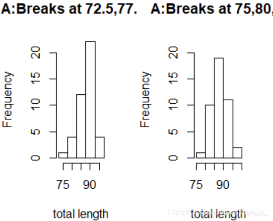
两个图选择的区间端点不同:可以看出,左边不对称,而右边显示该分布是对称的。
茎叶图 stem( )
> stem(fpossum$totlngth)

  The decimal point is at the |

  74 | 0
  76 |
  78 |
  80 | 05
  82 | 0500
  84 | 05005
  86 | 05505
  88 | 0005500005555
  90 | 5550055
  92 | 000
  94 | 05
  96 | 5
箱线图/框须图 boxplot( )
boxplot(formula,data=NULL,…,subset,na.action=NULL)
formula指明作图规则(y~grp表示数值变量y根据因子grp分类),data说明数据的来源
> boxplot(fpossum$totlngth)

箱子中的五根横线分别对应:最小值、上四分位数,中位数,下四分位数和最大值。
正态性检验
1)使用QQ图
> qqnorm(fpossum$totlngth)
> qqline(fpossum$totlngth,col='red')
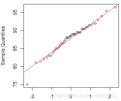
上图表明,数据与正态性略有差异,特别在图形的中部。
2)与正态密度函数比较
> dens<- density(totlngth)
> xlim<- range(dens$x);ylim<-range(dens$y)
> hist(totlngth,breaks = 72.5+(0:5)*5,xlim=xlim,ylim = ylim,probability=T,xlab="total length",main="A:Breaks at 72.5,77.5,...")
> lines(dens,col=par('fg'),lty=2)
> m<- mean(totlngth)
> s<- sd(totlngth)
> curve(dnorm(x,m,s),col='red',add = T)
> hist(totlngth,breaks = 75+(0:5)*5,xlim=xlim,ylim = ylim,probability=T,xlab="total length",main="A:Breaks at 75,80,...")
> lines(dens,col=par('fg'),lty=2)
> curve(dnorm(x,m,s),col='red',add = T)
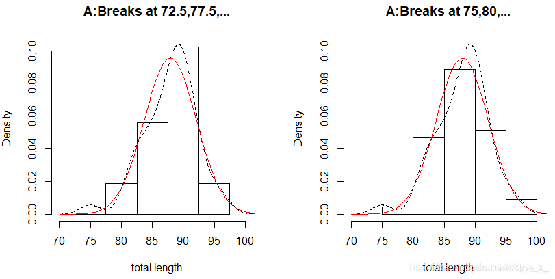
上图表明数据totlngth与正态性也略有差异,进一步需要使用统计量进行正态性检验。
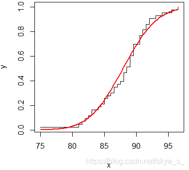
3)使用经验分布函数
> x<- sort(totlngth)
> n<- length(x)
> y<-(1:n)/n
> m<- mean(totlngth)
> s<-sd(totlngth)
> plot(x,y,type = 's')
> curve(pnorm(x,m,s),col='red',lwd=2,add=T)
3.2.2 单组数据的描述性统计
总体描述 summary( )
可以计算出但组数据的均值和五数(最小值,上四分位数,中位数,下四分位数,最大值)
> summary(totlngth)
   Min. 1st Qu.  Median    Mean 3rd Qu.    Max.
  75.00   85.25   88.50   87.91   90.50   96.50
五数及样本分位数概括
计算五数
> fivenum(totlngth)
[1] 75.00 85.25 88.50 90.50 96.50
计算分位数
> quantile(totlngth)
   0%   25%   50%   75%  100%
75.00 85.25 88.50 90.50 96.50
计算指定的分位数
> quantile(totlngth,prob=c(0.1,0.25,0.5))
  10%   25%   50%
82.60 85.25 88.50
中位数
> median(totlngth)
[1] 88.5
最大值
> max(totlngth)
[1] 96.5
最小值
> min(totlngth)
[1] 75
均值
> mean(totlngth)
[1] 87.90698
离差的概括
绝对离差 mad() 在R中的定义为:1.4826*median(abs(x-median(x)))
极值
> max(totlngth)-min(totlngth)
[1] 21.5
四分位极值
> IQR(totlngth)
[1] 5.25
标准差
> sd(totlngth)
[1] 4.182241
方差
> sd(totlngth)^2
[1] 17.49114
> var(totlngth)
[1] 17.49114
绝对离差
> mad(totlngth)
[1] 3.7065
样本偏度系数和峰度系数
偏度系数 skewness( )
| 偏度系数 > 0 | 正偏(右偏) |
|---|---|
| 偏度系数 = 0 | 关于均值对称 |
| 偏度系数 < 0 | 负偏(左偏) |
峰度系数 kurtosis( )
| 峰度系数 > 0 | 高逢度,比高斯分布更尖 |
|---|---|
| 峰度系数 = 0 | 与高斯分布相当 |
| 峰度系数 < 0 | 低峰度,比高斯分布更平坦 |
> library(fBasics)
> skewness(totlngth)
[1] -0.54838 #左偏
> kurtosis(totlngth)
[1] 0.6170082 #高峰度
basicStats( )
> basicStats(totlngth)
               totlngth
nobs          43.000000  #观测总数
NAs            0.000000
Minimum       75.000000
Maximum       96.500000
1. Quartile   85.250000
3. Quartile   90.500000
Mean          87.906977
Median        88.500000
Sum         3780.000000
SE Mean        0.637786
LCL Mean      86.619873
UCL Mean      89.194081
Variance      17.491141
Stdev          4.182241
Skewness      -0.548380
Kurtosis       0.617008
3.3 多组数据的描述性统计分析
3.3.1 两组数据的图形概括
例:在程序包DAAG中有数据集cars,估计速度(speed)和终止距离(dist)之间的关系
散点图
> library(DAAG)
> data(cars)
> attach(cars)
> plot(dist~speed,xlab='speed',ylab='stopping distance')
> lines(lowess(speed,dist),lwd=2) # 局部加权回归(Lowess)
#在轴上标明数据的具体位置
> rug(side=2,jitter(dist,20))
> rug(side=1,jitter(speed,5))
#在数轴两边加上单变量的箱线图
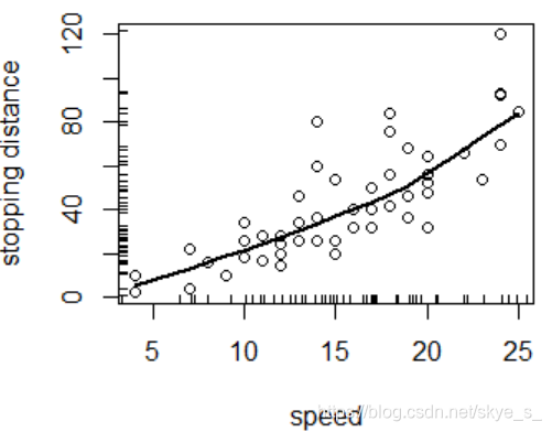
上图表明二者基本呈线性相依关系。
lowess(x,y=NULL,f=2/3,iter=3,delta=0.01*diff(range(xy$x[o]))) 适用于二维
loess( ) 适用于多维
等高线图 contour( )
有时数据太多太集中,散点图上的信息不容易看出来。一般,先使用MASS程序包中的二维核密度估计函数kde2d()来估计二维数据的密度函数,再利用函数contour()画出密度的等高线图。
> library(MASS)
> z <- kde2d(x,y)
> contour(z,col ='red',drawlabels = F)
三维透视图 persp( )
数据的变换
当直接用原数据得不到有意义的图形时,可以对数值进行变换,得到有意义的图形。最常用的是:对数变换、倒数变换、指数变换和Box-Cox变换。
> library(MASS)
> data("Animals")
> attach(Animals)
> par(mfrow=c(1,2))
> plot(brain~body)
> title(main='原始数据')
> plot(log(brain)~log(body))
> title(main='取对数后')
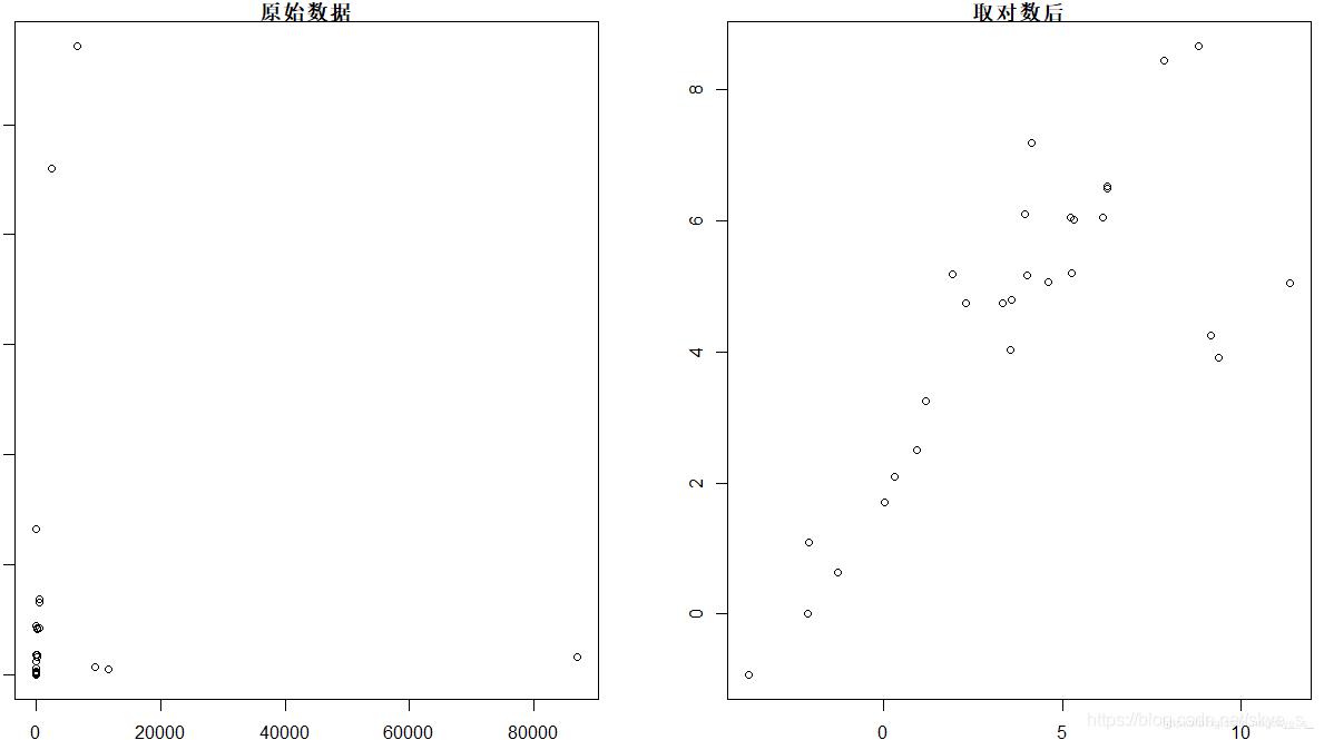
左侧的散点图没有价值,而从右侧的散点图可以看出两组数据在取对数后呈现明显的线性相依关系。
3.3.2 多组数据的图形描述
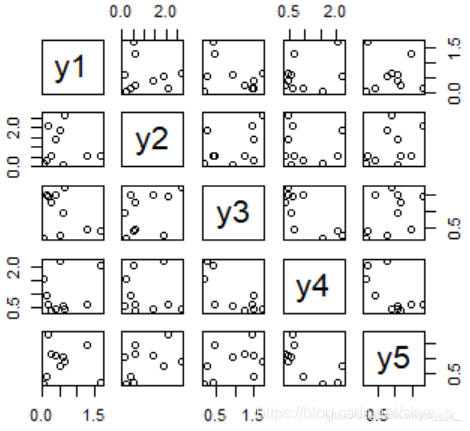
例子:产生五个样本容量为10的标准正态分布的样本,取绝对值后生成数据框d
>n<-10
>d<- data.frame(y1=abs(rnorm(n)),y2=abs(rnorm(n)),y3=abs(rnorm(n)),
				y4=abs(rnorm(n)),y5=abs(rnorm(n)))
散点图 pairs( ) plot( )
多组数据的散点图就是不同变量的散点图像矩阵一样放在一起。
> plot(d) # 或 pairs(d)
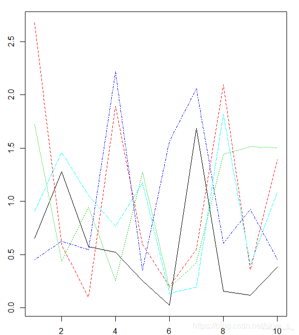
矩阵图 matplot( )
与散点图矩阵的区别在于将各个散点图放在了同一个作图区域中。
> matplot(d,type = 'l')
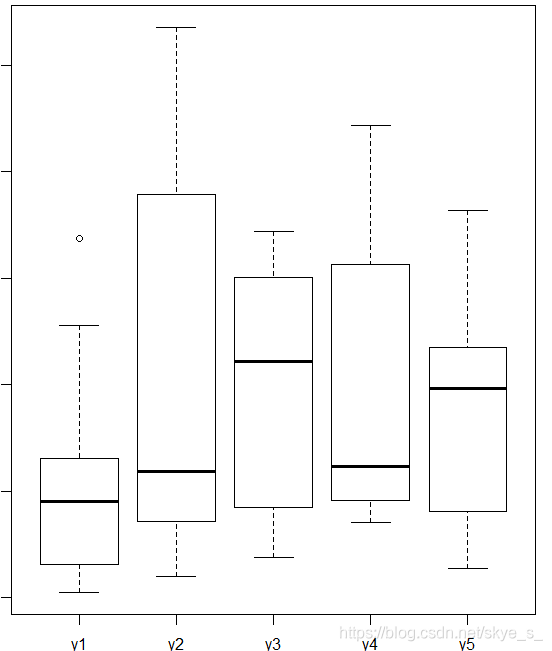
箱线图 boxplot( )
3.3.3 多组数据的描述性统计
例子:程序包datasets中数据框state.x77描述了美国50个州的人口数、人均收入、人均寿命、一年中有雾的天数等情况。
> state.x77
               Population Income Illiteracy Life Exp Murder HS Grad Frost   Area
Alabama              3615   3624        2.1    69.05   15.1    41.3    20  50708
Alaska                365   6315        1.5    69.31   11.3    66.7   152 566432
Arizona              2212   4530        1.8    70.55    7.8    58.1    15 113417
Arkansas             2110   3378        1.9    70.66   10.1    39.9    65  51945
California          21198   5114        1.1    71.71   10.3    62.6    20 156361
......
Wisconsin            4589   4468        0.7    72.48    3.0    54.5   149  54464
Wyoming               376   4566        0.6    70.29    6.9    62.9   173  97203
1)使用函数 summary( ) 概括state.x77
> summary(state.x77)
   Population        Income       Illiteracy       Life Exp         Murder          HS Grad
 Min.   :  365   Min.   :3098   Min.   :0.500   Min.   :67.96   Min.   : 1.400   Min.   :37.80
 1st Qu.: 1080   1st Qu.:3993   1st Qu.:0.625   1st Qu.:70.12   1st Qu.: 4.350   1st Qu.:48.05
 Median : 2838   Median :4519   Median :0.950   Median :70.67   Median : 6.850   Median :53.25
 Mean   : 4246   Mean   :4436   Mean   :1.170   Mean   :70.88   Mean   : 7.378   Mean   :53.11
 3rd Qu.: 4968   3rd Qu.:4814   3rd Qu.:1.575   3rd Qu.:71.89   3rd Qu.:10.675   3rd Qu.:59.15
 Max.   :21198   Max.   :6315   Max.   :2.800   Max.   :73.60   Max.   :15.100   Max.   :67.30
     Frost             Area
 Min.   :  0.00   Min.   :  1049
 1st Qu.: 66.25   1st Qu.: 36985
 Median :114.50   Median : 54277
 Mean   :104.46   Mean   : 70736
 3rd Qu.:139.75   3rd Qu.: 81163
 Max.   :188.00   Max.   :566432
2)使用分组概括函数 aggregate(x,by,FUN,…) ,其中,x是数据框,by指定分组变量 ,fun是用于计算的统计函数
统计不同地区(Northeast, South, North Central, West)的均值。
> aggregate(state.x77,list(Region = state.region),mean)
         Region Population   Income Illiteracy Life Exp    Murder  HS Grad    Frost      Area
1     Northeast   5495.111 4570.222   1.000000 71.26444  4.722222 53.96667 132.7778  18141.00
2         South   4208.125 4011.938   1.737500 69.70625 10.581250 44.34375  64.6250  54605.12
3 North Central   4803.000 4611.083   0.700000 71.76667  5.275000 54.51667 138.8333  62652.00
4          West   2915.308 4702.615   1.023077 71.23462  7.215385 62.00000 102.1538 134463.00
统计一年中雾天超过130的地区的均值
> aggregate(state.x77,list(Region = state.region,Cold=state.x77[,"Frost"]<130),mean)
         Region  Cold Population   Income Illiteracy Life Exp    Murder  HS Grad    Frost      Area
1     Northeast FALSE  1360.5000 4307.500  0.7750000 71.43500  3.650000 56.35000 160.5000  13519.00
2 North Central FALSE  2372.1667 4588.833  0.6166667 72.57667  2.266667 55.66667 157.6667  68567.50
3          West FALSE   970.1667 4880.500  0.7500000 70.69167  7.666667 64.20000 161.8333 184162.17
4     Northeast  TRUE  8802.8000 4780.400  1.1800000 71.12800  5.580000 52.06000 110.6000  21838.60
5         South  TRUE  4208.1250 4011.938  1.7375000 69.70625 10.581250 44.34375  64.6250  54605.12
6 North Central  TRUE  7233.8333 4633.333  0.7833333 70.95667  8.283333 53.36667 120.0000  56736.50
7          West  TRUE  4582.5714 4550.143  1.2571429 71.70000  6.828571 60.11429  51.0000  91863.71
# Cold=T,表示该地区一年有雾的天数超过130天
标准差sd( )与协方差var( )的计算
> var(state.x77)
              Population        Income   Illiteracy      Life Exp       Murder       HS Grad
Population 19931683.7588   571229.7796  292.8679592 -4.078425e+02  5663.523714  -3551.509551
Income       571229.7796   377573.3061 -163.7020408  2.806632e+02  -521.894286   3076.768980
Illiteracy      292.8680     -163.7020    0.3715306 -4.815122e-01     1.581776     -3.235469
Life Exp       -407.8425      280.6632   -0.4815122  1.802020e+00    -3.869480      6.312685
Murder         5663.5237     -521.8943    1.5817755 -3.869480e+00    13.627465    -14.549616
HS Grad       -3551.5096     3076.7690   -3.2354694  6.312685e+00   -14.549616     65.237894
Frost        -77081.9727     7227.6041  -21.2900000  1.828678e+01  -103.406000    153.992163
Area        8587916.9494 19049013.7510 4018.3371429 -1.229410e+04 71940.429959 229873.192816
                  Frost          Area
Population -77081.97265  8.587917e+06
Income       7227.60408  1.904901e+07
Illiteracy    -21.29000  4.018337e+03
Life Exp       18.28678 -1.229410e+04
Murder       -103.40600  7.194043e+04
HS Grad       153.99216  2.298732e+05
Frost        2702.00857  2.627039e+05
Area       262703.89306  7.280748e+09

> options(digits=3) #设置小数位
> aggregate(state.x77,list(Region = state.region),sd)
         Region Population Income Illiteracy Life Exp Murder HS Grad Frost   Area
1     Northeast       6080    559      0.278    0.744   2.67    3.93  30.9  18076
2         South       2780    605      0.552    1.022   2.63    5.74  31.3  57965
3 North Central       3703    283      0.141    1.037   3.57    3.62  23.9  14967
4          West       5579    664      0.608    1.352   2.68    3.50  68.9 134982
相关系数的计算 cor( )
cor(x, y = NULL, use = ‘all.obs’, method = c(‘pearson’,‘kendall’,‘spearman’))
> x <- c(44.4,45.9,46,46.5,46.7,47,48.7,49.2,60.1)
> v <- c(2.6,10.1,11.5,30,32.6,50,55.2,85.8,86.8)
> cor(x,v)
[1] 0.769
> cor(x,v,method = 'spearman')
[1] 1
> cor(x,v,method = 'kendall')
[1] 1
> plot(x,v)
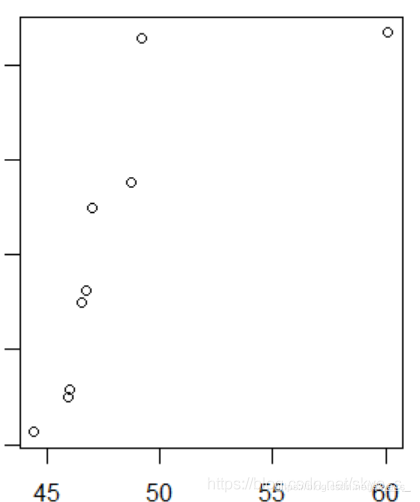
从散点图中可以看出,x与v的线性相关系数收到右上角一个极端值的影响变小了 。因此在计算相关性度量的时候,要考虑计算哪种相关系数更有意义。
3.3.4 分组数据的图形概括
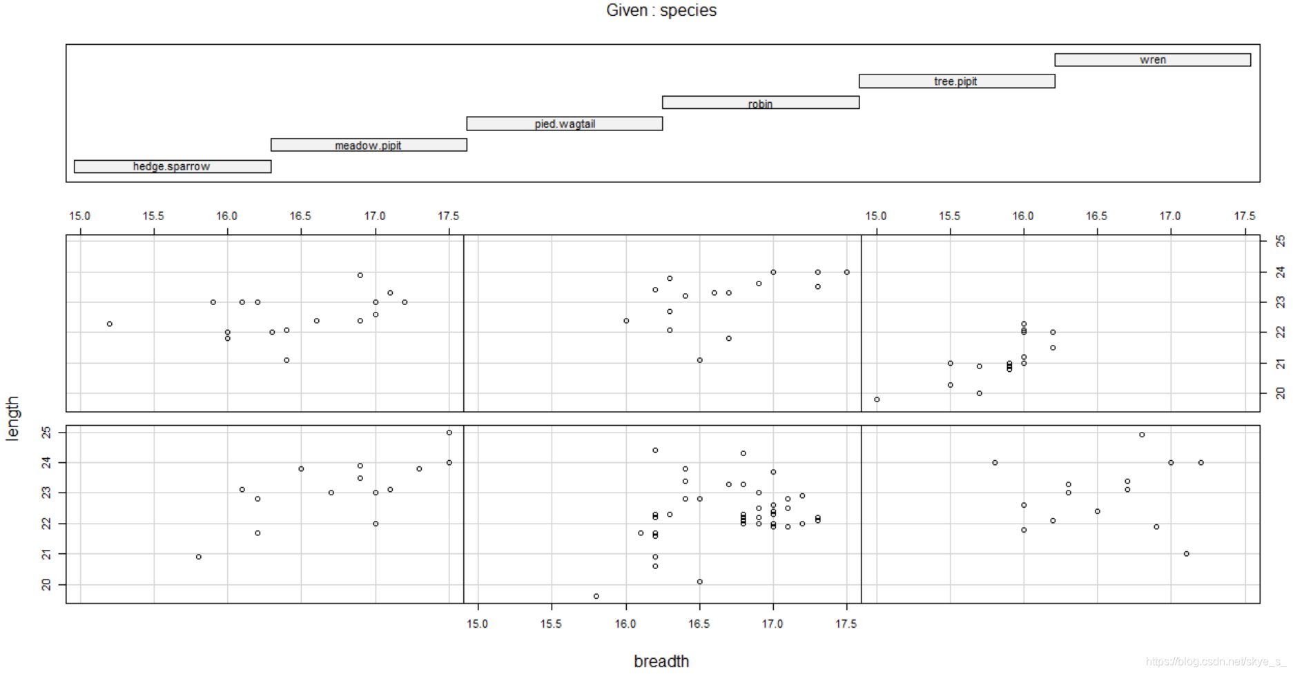
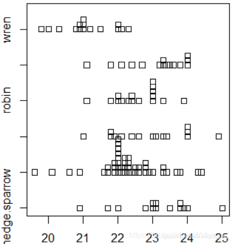
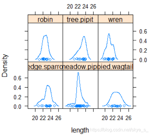
例:程序包DAAG中cuckoos数据集。杜鹃把蛋下在其他种类鸟的鸟巢中,这些鸟会帮它们孵化,我们希望了解在不同类的鸟巢中杜鹃蛋的长度。
> data("cuckoos")
> cuckoos
    length breadth       species  id
1     21.7    16.1  meadow.pipit  21
2     22.6    17.0  meadow.pipit  22
3     20.9    16.2  meadow.pipit  23
......
119   21.2    16.0          wren 237
120   21.0    16.0          wren 238
> attach(cuckoos)
使用条件散点图 coplot(formula, data, … )
| 对于一个因子变量a | coplot(y~x | a) |
|---|---|
| 对于两个因子变量a b | coplot(y~x | a*b) |
> coplot(length~breadth | species)
使用直方图 hists( ) histogram( )
1)直方组图hists()
#直方组图定义
hists<- function(x,y,...){
y<- factor(y)
n<- length(levels(y))
op<- par(mfcol=c(n,1),mar=c(2,4,1,1))
b<- hist(x,...,plot=F)$breaks
for (l in levels(y)){
hist(x[y==l],breaks=b,probability = T,ylim=c(0,1.0),
main=" ",ylab=l,col='lightblue',xlab="",...)
points(density(x[y==l]),type='l',lwd=3,col='red')
}
par(op)
}
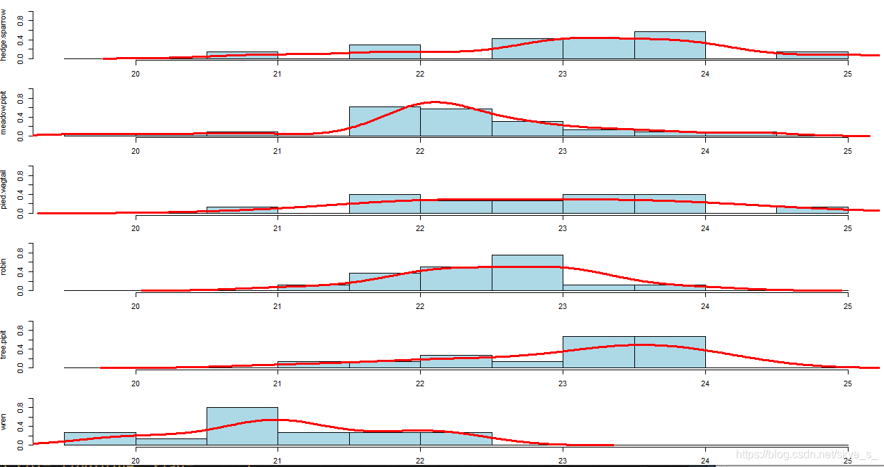
> hists(length,species)
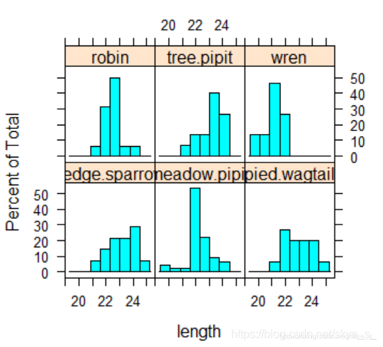
2)用lattice包中的histogram( )
> histogram(~length|species)
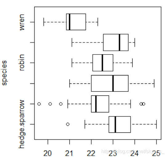
使用箱线图 boxplot( )
> boxplot(length~species,horizontal = T) # T:横向放置箱子
使用条形图 stripchart(x, method=‘overplot’, …)
method说明数据重复的时候该如何放置,overplot是重叠放置,stack是把数据垒起来,jitter是散放在数据的周围。
> stripchart(length~species,method='jitter')
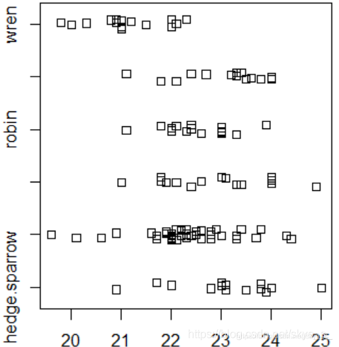
> stripchart(length~species,method='stack')
使用密度曲线 densityplot( )
> densityplot(~length|species)
3.4 分类数据的描述性统计分析
3.4.1 列联表的制作
由分类数据构造列联表
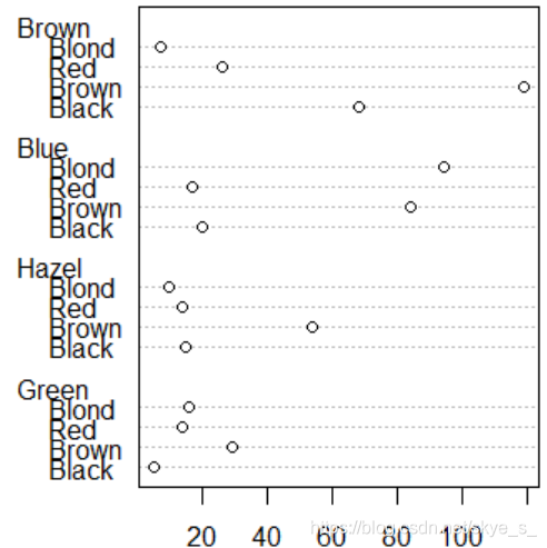
例:为考查眼睛颜色(Eye)与头发颜色(Hair)之间的关系,收集了下面一组数据:
| - | Eye | - | - | - |
|---|---|---|---|---|
| Hair | Brown | Blue | Hazel | Green |
| Black | 68 | 20 | 15 | 5 |
| Brown | 119 | 84 | 54 | 29 |
| Red | 26 | 17 | 14 | 14 |
| Blond | 7 | 94 | 10 | 16 |
> Eye.Hair<- matrix(c(68,20,15,5,119,84,54,29,26,17,14,14,7,94,10,16),nrow = 4,byrow = T)
> colnames(Eye.Hair)<-c('Brown','Blue','Hazel','Green')
> rownames(Eye.Hair)<-c('Black','Brown','Red','Blond')
> Eye.Hair
      Brown Blue Hazel Green
Black    68   20    15     5
Brown   119   84    54    29
Red      26   17    14    14
Blond     7   94    10    16
由原始数据构造列联表
R中可以使用函数table( ), xtabs( ), ftable( )由原始数据构造列联表。
table(factor1,factor2,…)
例:数据包ISwR中的数据集juul中含有三个分类变量:sex, tanner, menarche
> table(sex)
> table(sex,manarche)
> table(menarche,tanner)
获得边际列表 margin.table( )
> margin.table(Eye.Hair,1) #按行
Black Brown   Red Blond
  108   286    71   127
> margin.table(Eye.Hair,2) #按列
Brown  Blue Hazel Green
  220   215    93    64
频率列联表 prop.table( )
(相对)频率列联表
> round(prop.table(Eye.Hair,1),digits=2)
      Brown Blue Hazel Green
Black  0.63 0.19  0.14  0.05
Brown  0.42 0.29  0.19  0.10
Red    0.37 0.24  0.20  0.20
Blond  0.06 0.74  0.08  0.13
全局相对频率列联表
> round(Eye.Hair/sum(Eye.Hair),digits = 2)
      Brown Blue Hazel Green
Black  0.11 0.03  0.03  0.01
Brown  0.20 0.14  0.09  0.05
Red    0.04 0.03  0.02  0.02
Blond  0.01 0.16  0.02  0.03
#round() 保留小数点指定位数 digits 有效数字
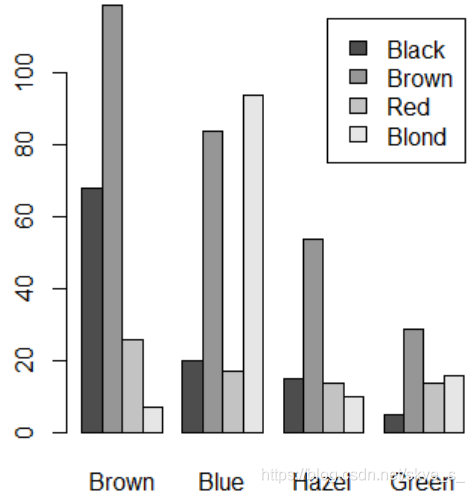
3.4.2 列联表的图形描述
使用条形图
> data("HairEyeColor")
> a<- as.table(apply(HairEyeColor,c(1,2),sum)) #apply(矩阵,按x,y,求和)
> a
       Eye
Hair    Brown Blue Hazel Green
  Black    68   20    15     5
  Brown   119   84    54    29
  Red      26   17    14    14
  Blond     7   94    10    16
> barplot(a,legend.text = attr(a,'dimnames')$Hair)
> barplot(a,besid=TRUE,legend.text = attr(a,'dimnames')$Hair)
使用点图 dotchart( )
> dotchart(a)