问题描述
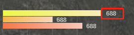
在工作中想要实现如下效果:
解决思路
在 div 标签中添加一个 relative 定位,然后使用绝对定位 absolute 在最右侧
自己的解决办法
.bar {
height: 12px;
margin-top: 1px;
position: relative;
&.first {
background-image: linear-gradient(90deg, #ecf848 0%, #f9eab9 99%);
}
&.second {
background-image: linear-gradient(90deg, #f5b549 0%, #f9d6b9 100%);
}
&.third {
background-image: linear-gradient(90deg, #f57849 0%, #f9c7b9 100%);
}
span{
position: absolute;
right: 0;
font-size: 12px;
color: rgba(255, 255, 255, 0.7);
}
}
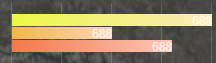
结果:
按照上面的写法,只能是 span 标签的最右侧和父标签div 的最右侧重叠,无法实现目标。解决办法,计算 span标签的值,然后right 设置为计算的长度
考虑到上述实现需要依赖于js,而且过于麻烦,想想有没有办法只通过CSS实现目标呢?
解决办法一: left: 100%;
.bar {
height: 12px;
margin-top: 1px;
position: relative;
&.first {
background-image: linear-gradient(90deg, #ecf848 0%, #f9eab9 99%);
}
&.second {
background-image: linear-gradient(90deg, #f5b549 0%, #f9d6b9 100%);
}
&.third {
background-image: linear-gradient(90deg, #f57849 0%, #f9c7b9 100%);
}
span{
position: absolute;
left: calc(100% + 8px);
font-size: 12px;
color: rgba(255, 255, 255, 0.7);
}
}
left 参照的宽度是 父容器 的宽度
解决办法二: right:0; transform: translate(100%, 0)
.bar {
height: 12px;
margin-top: 1px;
position: relative;
&.first {
background-image: linear-gradient(90deg, #ecf848 0%, #f9eab9 99%);
}
&.second {
background-image: linear-gradient(90deg, #f5b549 0%, #f9d6b9 100%);
}
&.third {
background-image: linear-gradient(90deg, #f57849 0%, #f9c7b9 100%);
}
span{
position: absolute;
right:0;
transform: translate(100%, 0);
font-size: 12px;
color: rgba(255, 255, 255, 0.7);
}
}
transform: translate 参照的宽度是自身内容的宽度
到此这篇关于CSS 说明横向进度条最后显示文字的实现代码的文章就介绍到这了,更多相关css横向进度条显示文字内容请搜索脚本之家以前的文章或继续浏览下面的相关文章,希望大家以后多多支持脚本之家!