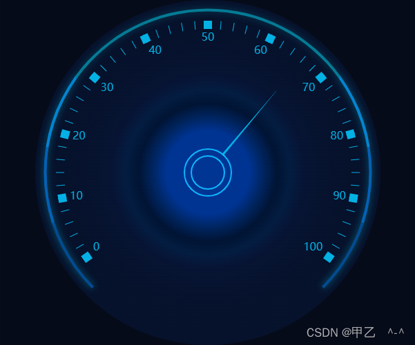
整体效果如下:

基础配置:
 let evaluation = this.$echarts.init(document.getElementById(id))
      evaluation.setOption({
        grid: {
          top: '6%',
          bottom: '18%',
          left: '3%',
          width: '96%',
          containLabel: true
        },

        xAxis: {
          show: false
        },

        yAxis: { show: false },
        series: seriesData,
        tooltip: {  // 提示设置
        },
        backgroundColor: "rgba(5,11,26,0.90)",
        borderColor: "rgba(5,11,26,0.90)",
        textStyle: {
          color: '#E6F3FF',
          fontWeight: '400',
          fontSize: '12px'
        },

      });
      window.onresize = function () {
        evaluation.resize()
      }
series数据(我的seriesData):
实现中间圆环主要是通过设置指针尾部圆点实现的:markPoint 一共3组数据,在前面2组数据上设置了不同大小,就可以实现双圆环啦
[{
        name: '',
        z: 2,
        type: 'gauge',
        center: ['50%', '50%'],    // 默认全局居中
        radius: '88%', // 半径
        //起始角度。圆心 正右手侧为0度,正上方为90度,正左手侧为180度。
        startAngle: 215,
        //结束角度。
        endAngle: -35,
        data: [66],
        clockwise: true,	//仪表盘刻度是否是顺时针增长
        min: 0,  //配置仪表板的数值范围
        max: 100,
        axisLine: {  // 坐标轴线
          show: false, // 不显示坐标轴线
          lineStyle: { // 属性lineStyle控制线条样式
            color:
              [
                [0.1, '#03B1E5'],
                [0.9, '#03B1E5'],
                [1, '#03B1E5']
              ],
            width: 2,
            shadowColor: '#03B1E5', //默认透明
            shadowBlur: 3 // 阴影
          }
        },

        axisTick: { // 刻度线
          length: 12,// 属性length控制线长
          lineStyle: { // 属性lineStyle控制线条样式
            color: 'auto'//分割线和刻度线与轴线的颜色对应
          }

        },
        splitLine: {// 分隔线
          length: 12, // 属性length控制线长
          lineStyle: {// 属性lineStyle(详见lineStyle)控制线条样式
            color: 'auto',//分割线和刻度线与轴线的颜色对应
            width: 12
          },

        },
        //刻度标签。
        axisLabel: {
          fontSize: 16,
          color: "#03B1E5", // 文字颜色
        },
        pointer: {
          length: '70%',  // 指针长度
          width: 2
        },
        // 指针尾部圆点
        markPoint: {
          symbol: 'circle',
          symbolSize: 68,
          data: [
            //跟你的仪表盘的中心位置对应上,颜色可以和画板底色一样
            { x: '50%', y: '50%', itemStyle: { color: '#003593', borderWidth: 2, borderColor: '#0EB6FF' } }
          ]
        },

        detail: {
          offsetCenter: [0, 0], // 中间文字
          color: "rgba(0,0,0,0)",
        },
        progress: {	//配置数值当前进度条统一样式
          show: true,
          overlap: false,		//多组数据时进度条是否重叠。
          roundCap: true,		//是否在两端显示成圆形。
          clip: true,			//是否裁剪掉超出仪表盘的部分
        },
        anchor: {	 //表盘中指针的固定点统一样式配置
        }
      },
      // 外圆 设置外部坐标曲线样式 刻度线和分割线不显示
      {
        name: '',
        z: 2,
        type: 'gauge',
        center: ['50%', '50%'],    // 默认全局居中
        radius: '95%', // 半径
        //起始角度。圆心 正右手侧为0度,正上方为90度,正左手侧为180度。
        startAngle: 225,
        //结束角度。
        endAngle: -45,
        data: [],
        clockwise: true,	//仪表盘刻度是否是顺时针增长
        min: 0,  //配置仪表板的数值范围
        max: 100,
        axisLine: {  // 坐标轴线
          lineStyle: { // 属性lineStyle控制线条样式
            color:
              [
                [0.1, '#034B91'],
                [0.2, '#0460B5'],
                [0.3, '#0384D1'],
                [0.5, 'rgba(3, 183, 208, 0.6)'],
                [0.7, 'rgba(3, 183, 208, 0.6)'],
                [0.8, '#0384D1'],
                [0.9, '#0460B5'],
                [1, '#034B91']
              ],
            width: 4,
            shadowColor: 'rgba(3, 183, 208, 0.6)', //默认透明
            shadowBlur: 10 // 阴影
          }
        },

        axisTick: { // 刻度线
          length: 0,// 属性length控制线长
          lineStyle: { // 属性lineStyle控制线条样式
            color: 'auto'//分割线和刻度线与轴线的颜色对应
          }

        },
        splitLine: {// 分隔线
          length: 0, // 属性length控制线长
          lineStyle: {// 属性lineStyle(详见lineStyle)控制线条样式
            color: 'auto',//分割线和刻度线与轴线的颜色对应
            width: 12
          },

        },
        //刻度标签。
        axisLabel: {
          fontSize: 10,
          color: "rgba(0,0,0,0)", // 文字颜色
        },
        pointer: {
          length: '70%',  // 指针长度
          width: 0
        },
        // 指针尾部圆点
        markPoint: {
          symbol: 'circle',
          symbolSize: 48,
          data: [
            //跟你的仪表盘的中心位置对应上,颜色可以和画板底色一样
            { x: '50%', y: '50%', itemStyle: { color: '#003593', borderWidth: 2, borderColor: '#0EB6FF' } }
          ]
        },

        detail: {
          offsetCenter: [0, 0], // 中间文字
          color: "rgba(0,0,0,0)",
        },
        progress: {	//配置数值当前进度条统一样式
          show: true,
          overlap: false,		//多组数据时进度条是否重叠。
          roundCap: true,		//是否在两端显示成圆形。
          clip: true,			//是否裁剪掉超出仪表盘的部分
        },
        anchor: {	 //表盘中指针的固定点统一样式配置
        }
      },
      {
        // 内部实心圆  设置背景颜色渐变
        type: 'pie',
        radius: '100%',
        center: ['50%', '50%'],
        z: -1,
        itemStyle: {
          normal: {
            color: new echarts.graphic.RadialGradient(.5, .5, .4, [{
              offset: 0,
              color: '#003493'
            },
            {
              offset: .3,
              color: '#003493'
            },
            {
              offset: .4,
              color: '#002560'
            },
            {
              offset: .5,
              color: '#011434'
            },
            {
              offset: .6,
              color: '#031D41'
            },
            {
              offset: .7,
              color: 'rgba(8, 26, 69,0.6)'
            },
            {
              offset: 1,
              color: 'rgba(8, 26, 69,0.4)'
            }], false),
            label: {
              show: false
            },
            labelLine: {
              show: false
            }
          }
        },
        hoverAnimation: false,
        label: {
          show: false
        },
        tooltip: {
          show: false
        },
        data: [1],

      },
      ],
以上效果如下:
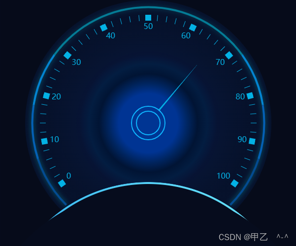
最下面的圆弧是单独写的css样式:
在盒子内部再加上一个div:
 <div class="dashboard">
      <div id="intention" ref="intention" style="width: 100%;height:100%;"></div>  // 仪表盘容器
      <div class="bottom-line"></div>  // 设置底部圆弧
    </div>
以下是scss样式:
.dashboard {
// 容器父盒子样式
  margin: 100px auto;
  width: 600px;
  height: 500px;
  position: relative;
  overflow: hidden;
// 底部曲线样式
  .bottom-line {
    position: absolute;
    top: 370px;
    height: 600px;
    width: 600px;
    border: none;
    box-sizing: border-box;
    padding: 4px; // 边框颜色填充范围
    background-image: linear-gradient(#060c1d, #081123), // 填充content-box
      linear-gradient(to left bottom, #72edff, #0083e7); // 填充padding-box
    // border-image: -webkit-linear-gradient(#72edff, #0083e7) 20 20; // 边框渐变色 设置之后无法设置  border-radius 所以放弃
    background-clip: content-box, padding-box;  // 设置盒子模型
    border-radius: 600px;
  }

  // .bottom-line:hover {
  //   filter: hue-rotate(30deg); //  filter(滤镜) 属性  hue-rotate给图像应用色相旋转。"angle"一值设定图像会被调整的色环角度值。值为0deg,则图像无变化。若值未设置,默认值是0deg。该值虽然没有最大值,超过360deg的值相当于又绕一圈。
  // }
// 伪元素遮挡多余线条
  .bottom-line::after {
    position: absolute;
    top: 14px;
    left: -50px;
    height: 700px;
    width: 700px;
    border-radius: 700px;
    background-color: #060c1d;
    z-index: 1;
    content: '';
  }
}
最后效果如图:
版权声明:本文为weixin_54106595原创文章,遵循CC 4.0 BY-SA版权协议,转载请附上原文出处链接和本声明。