1. 自动内减
box-sizing:border-box;

<a href="javascript:;"></a>  // 点击不跳转

box-shadow: 32px 26px 15px #000;  /* 盒子阴影 */

// background-size和background连写同时设置时,需要注意覆盖问题
background: url('./images/1.jpg') no-repeat center center / 100% 100% (contain/cover);

div:nth-child(4) {

     // contain:包含——》让背景图片进行等比例缩放,直到不会超出盒子的最大
     // 优点:进行等比例缩放,不会让图片变形
     // 缺点:可能盒子会出现留白
     background-size: contain;  // 完整显示

     // cover:覆盖——》让背景图片进行等比例缩放,直接填满整个盒子刚好没有空白为止
     // 优点:进行等比例缩放,不会让图片变形
     // 缺点:可能背景图片会超出盒子
     background-size: cover;   // 宽度自适应铺满整个盒子

    // 文字阴影  第三个参数使模糊度
    text-shadow: 0 0 5px #fff, 0 0 20px #fefcc9, 10px -10px 30px #feec85, -20px -20px 40px #ffae34, 20px -40px 50px #ec760c, -20px -60px 60px #cd4606, 0 -80px 70px #973716, 10px -90px 80px #451b0e;
    }
两行文本文字溢出省略号显示
.ellipsis-2 {
- overflow: hidden;
- text-overflow: ellipsis; // 溢出部分用省略号显示
- display: -webkit-box; // 将对象作为弹性伸缩盒子模型
- -webkit-line-clamp: 2; // 设置文本显示2行
- -webkit-box-orient: vertical; // 从上到下排列子元素
}
header {

    position: fixed;
    left: 0;
    top: 0;
    z-index: 1;   // 置顶层级
    width: 100%;
    height: (84 / @vm);
    background-color: #fff;
 }
1.1 a 标签+宽高+背景渐变色
.pay .right a {
    display: block; // 变成快,才能设置宽和高
    width: 90px;
    height: 35px;
    // 北京渐变色
    background-image: linear-gradient(90deg,
    #6fc2aa 5%,
    #54b196 100%
    );
    border-radius: 3px;
    text-align: center;
    line-height: 35px;
    color: #fff;
}
1.2过度属性
<style>
    div {
      width: 200px;
      height: 200px;
      background-color: red;
      /* 过渡 */
      transition: all 1s;
    }

    div:hover {
      width: 800px;
      /* width: 200px; */
      /* background-color: yellow; */
    }

  </style>
</head>
<body>

// 使用transform-origin属性改变转换原 方位名词(left、top、right、bottom、center
transform-origin: right bottom;

// transform:scale(缩放倍数);Øscale值大于1表示放大, scale值小于1表示缩小
transform:scale(1.2);


// 水平居中问题---------------------
.father {
    position:relative;
    width: 304px;
    height: 405px;
    margin:0 auto;
    border:1px solid #000;
}
.son {
    position: absolute;
    left: 50%;
    top:50%;
    transform:translate(-50%,-50%);  // 移动自身的50%
    transform: rotate(180deg);  // 旋转
    width: 242px;
  	height: 84px;
  	background-color: #27ba9b;
}


// 点击显示背景渐变
.xtx-topics .goods-list .pic::before {
    content: '';
    position: absolute;
    width: 100%;
    height: 100%;
    opacity: 0;  /* 隐藏背景 */
    /* background-color: rgba(0,0,0,.3); */
    background-image: linear-gradient( to top,rgba(0,0,0,.8) , transparent 50%);
    transition: all .3s;
  }
  .xtx-topics .goods-list li:hover .pic::before {
    opacity: 1;  /* 显示背景 */
  }


// 添加投影和上移动效果
.xtx-supper-goods .goods-list li {
    position: relative;
    top: 0;
    float: left;
    width: 304px;
    height: 405px;
    margin-right: 8px;
    background-color: #f0f9f4;
   /* 过渡 */
   transition: top .3s , box-shadow .3s;
  }

  .xtx-supper-goods .goods-list li:hover {
    top: -3px;
    box-shadow: 0 3px 8px rgba(0,0,0,.2);
  }


// 鼠标点击后出现边框和隐藏部分
.xtx-fresh-goods .goods-list li {
    position: relative;
    float: left;
    width: 242px;
    height: 304px;
    border: 2px solid transparent;   // 边框透明
    box-sizing: border-box;
    padding: 8px 29px;
    margin-left: 8px;
    margin-bottom: 3px;
      /* 溢出隐藏 */
    overflow: hidden;
  }
  .xtx-fresh-goods .goods-list li:hover {
    border-color: #27ba9b;
  }
  .xtx-fresh-goods .goods-list .find {
    position: absolute;
    left: 0;
    bottom: -84px;
    width: 242px;
  	height: 84px;
  	background-color: #27ba9b;
    /* box-sizing: border-box; */
    text-align: center;
    color: #fff;
    /* 过渡 */
    transition: bottom .3s;
  }
  .xtx-fresh-goods .goods-list li:hover .find {
    bottom: 0;
  }
走马灯效果无缝动画
<!DOCTYPE html>
<html lang="en">
  <head>
    <meta charset="UTF-8" />
    <meta name="viewport" content="width=device-width, initial-scale=1.0" />
    <title>Document</title>
    <style>
      * {
        padding: 0;
        margin: 0;
      }
      li {
        list-style: none;
      }

      img {
        width: 200px;
      }

      .box {
        width: 600px;
        height: 112px;
        border: 5px solid #000;
        margin: 100px auto;
        overflow: hidden;
      }
      // infinite 循环    linear 匀速
      .box ul {
        width: 2000px;
        animation: move 5s infinite linear;
      }

      .box li {
        float: left;
      }

      /* 定义动画:位移, ul 左侧使用  x -1400  */
      @keyframes move {
        to {
          transform: translateX(-1400px);
        }
      }

      /* 用户鼠标移入box,动画暂停 */
      .box:hover ul {
        animation-play-state: paused;
      }

    </style>
  </head>
  <body>
    <div class="box">
      <ul>
        <li><img src="./images/1.jpg" alt="" /></li>
        <li><img src="./images/2.jpg" alt="" /></li>
        <li><img src="./images/3.jpg" alt="" /></li>
        <li><img src="./images/4.jpg" alt="" /></li>
        <li><img src="./images/5.jpg" alt="" /></li>
        <li><img src="./images/6.jpg" alt="" /></li>
        <li><img src="./images/7.jpg" alt="" /></li>

        <!-- 第567移动的时候,显示区域不能留白 -->
        <li><img src="./images/1.jpg" alt="" /></li>
        <li><img src="./images/2.jpg" alt="" /></li>
        <li><img src="./images/3.jpg" alt="" /></li>
      </ul>
    </div>
  </body>
</html>
1.2 DOCTYPE文档说明 骨架结构标签
<!DOCTYPE html>  // html5  文档类型声明,告诉浏览器该网页的 HTML版本
<html lang="zh-CN">  // 中文  设置网页的语言为中文应该如何操作
<head>
  <meta charset="UTF-8">  // 防止乱码 UTF-8万国码  开发中统一使用的字符编码是什么?
  <meta http-equiv="X-UA-Compatible" content="IE=edge">
  <meta name="viewport" content="width=device-width, initial-scale=1.0">
  <title>Document</title>
</head>
<body>

</body>
</html>
全名出游季
* {
margin: 0;
padding: 0;
}
html {
height: 100%;
}
body {
height: 100%;
background: url(./../images/f1_1.jpg) no-repeat center 0;
/* 缩放背景图 */
/* 图片等比例缩放, 当宽度或高度和盒子尺寸相等, 图片就不再缩放 */
/* background-size: contain; */
/* 图片等比例缩放, 图片完全覆盖到整个盒子, 可能会导致图片显示不全 */
background-size: cover;
}
/*
1. img 引入图片, 控制位置
2. 定义动画,使用动画
*/
.cloud img {
position: absolute;
left: 50%;
top: 0;
}
.cloud img:nth-child(1) {
margin-left: -300px;
top: 20px;
animation: cloud 1s infinite alternate;
}
.cloud img:nth-child(2) {
margin-left: 400px;
top: 100px;
animation: cloud 1s infinite alternate 0.2s;
}
.cloud img:nth-child(3) {
margin-left: -550px;
top: 200px;
animation: cloud 1s infinite alternate 0.4s;
}
/* 云彩动画 */
@keyframes cloud {
to {
transform: translateX(20px);
}
}
<!DOCTYPE html>
<html lang="en">
<head>
<meta charset="UTF-8">
<meta http-equiv="X-UA-Compatible" content="IE=edge">
<meta name="viewport" content="width=device-width, initial-scale=1.0">
<title>Document</title>
<link rel="stylesheet" href="./css/index.css">
</head>
<body>
<!-- 云彩图片 -->
<div class="cloud">
<img src="./images/yun1.png" alt="">
<img src="./images/yun2.png" alt="">
<img src="./images/yun3.png" alt="">
</div>
</body>
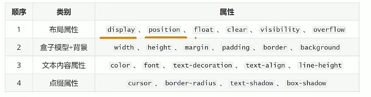
</html>不同的CSS书写顺序会影响浏览器的渲染性能,推荐前端工程师使用专业的书写顺序习惯
1.3 能够知道SEO三大标签,能够设置网页的ico图标,能够书写版心公共类代码
SEO三大标签分别是哪些?
1. title:网页标题标签 2. description:网页描述标签 3. keywords:网页关键词标签

常见有语义的布局标签有哪些?
header:网页头部
nav:网页导航
footer:网页底部
aside:网页侧边栏
section:网页区块
article:网页文章

版心的使用场景是什么? • 让页面的主体内容约束在网页中间 Ø
版心的常用代码是什么?
.container {
    width: 1240px;
    margin: 0 auto; /* 水平居中 */
  }
1.4 ico图标设置
给网页设置ico图标需要使用什么标签?
 <link rel="shortcut icon" href="favicon.ico" type="image/x-icon"/>
2. 去除常见标签默认的 margin 和 padding
/* 去除常见标签默认的 margin 和 padding */
body,
h1,
h2,
h3,
h4,
h5,
h6,
p,
ul,
ol,
li,
dl,
dt,
dd,
input {
  margin: 0;
  padding: 0;
}
3. 设置网页统一的字体大小、行高、字体系列相关属性
/* 设置网页统一的字体大小、行高、字体系列相关属性 */
body {
  font: 16px/1.5 "Helvetica Neue", Helvetica, Arial, "Microsoft Yahei",
    "Hiragino Sans GB", "Heiti SC", "WenQuanYi Micro Hei", sans-serif;
  color: #333;
}
4.
/* 去除列表默认样式 */
ul,
ol {
  list-style: none;
}

/* 去除默认的倾斜效果 */
em,
i {
  font-style: normal;
}

/* 去除a标签默认下划线,并设置默认文字颜色 */
a {
  text-decoration: none;
  // text-decoration: line-through; 中间穿透下划线
  color: #333;
}

/* 设置img的垂直对齐方式为居中对齐,去除img默认下间隙 */
img {
  vertical-align: middle;
}

/* 去除input默认样式 */
input {
  border: none;
  outline: none;
  color: #333;
}

/* 左浮动 */
.fl {
  float: left;
}

/* 右浮动 */
.fr {
  float: right;
}

/* 双伪元素清除法 */
.clearfix::before,
.clearfix::after {
  content: "";
  display: table;
}
.clearfix::after {
  clear: both;
}
版权声明:本文为qq_56514785原创文章,遵循CC 4.0 BY-SA版权协议,转载请附上原文出处链接和本声明。