一、div居中的几个方法
display:flex 是一种布局方式。它即可以应用于容器中,也可以应用于行内元素。是W3C提出的一种新的方案,可以简便、完整、响应式地实现各种页面布局。目前,它已经得到了所有浏览器的支持。
Flex是Flexible Box的缩写,意为"弹性布局",用来为盒状模型提供最大的灵活性。设为Flex布局以后,子元素的float、clear和vertical-align属性将失效。
margin 简写属性在一个声明中设置所有外边距属性
弹性布局
1、子div先充满父元素,在margin:auto,<style>
.container{
height: 600px;
width: 600px;
border:1px solid black;
display: flex;
}
.box{
width: 200px;
height: 100px;
background-color: blue;
margin: auto;
}
</style>
<div class="container">
<div class="box"></div>
</div>2、弹性布局,通过定义伸缩容器的两个属性,justify-content主轴方向,align-items纵轴方向均为center
<style>
.container{
height: 600px;
width: 600px;
border:1px solid black;
display: flex;
justify-content: center;
align-items: center;
}
.box{
width: 200px;
height: 100px;
background-color: blue;
}
</style>
<div class="container">
<div class="box"></div>
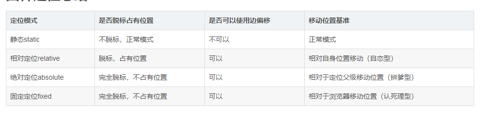
</div>定位
先相对于父元素margin平移,再回拉法,
<style>
.container {
    height: 600px;
    width: 600px;
    border: 1px solid black;
    position: relative;
        }
.box {
            width: 300px;
            height: 300px;
            background-color: blue;
            position: absolute;
            top: 50%;
            left: 50%;
            margin-top: -150px;
            margin-left: -150px;
/* transform: translate(-50%, -50%);*/
        }
</style>
<style>
.container {
height: 600px;
width: 600px;
border: 1px solid black;
position: relative;
}
.box {
position: absolute;
top: 0;
right: 0;
bottom: 0;
left: 0;
width: 300px;
height: 300px;
background-color: blue;
margin:auto;
}
<style>利用表单单元格td特有属性,vertical-align,使子div垂直居中,再对子div设置水平居中.
    .container{
               width: 100px;
                        height: 100px;
                        border: 1px solid blue;

                        /*让标签元素以表格单元格形式呈现,类似于td标签,主要是利用它的特殊属性:
                        元素垂直居中对齐,但其会被float、position:absolute、
                        所以尽量不要与其同用,设置了display:table-cell的元素对宽度高度敏感,
                        对margin值无反应,所以页面上出现在了左边,我就不想再在外面加调了哈,
                        但会响应padding属性,基本和td标签无异*/
                        display: table-cell;/* 使子div垂直居中 */
                        vertical-align:middle;/* 再对子div设置水平居中 */
        }
        .box{
                 width: 50px;
                        height: 50px;
                        background: blue;
                        margin:0 auto;
        }
    </style>
二、参考文献
https://www.cnblogs.com/web-fusheng/p/6724759.html
2、css display:flex 属性
3、position