带背景音乐网站效果:
http://www.fengzhao.icu/photos/html/%E6%8A%96%E9%9F%B3%E4%B8%8A%E5%BE%88%E7%81%AB%E7%9A%843D%E7%AB%8B%E4%BD%93%E5%8A%A8%E6%80%81%E7%9B%B8%E5%86%8C.html
如何创建网站:参考我的这篇文章
https://blog.csdn.net/allen_csdns/article/details/103487917
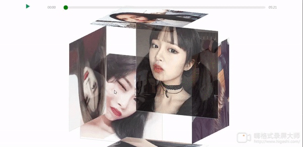
动态效果图
另外有需要带背景音乐的效果联系我
源码Demo:
一、新建一个index.html的文件,代码如下
<!DOCTYPE html>
<html lang="en">
<head>
<meta charset="utf-8">
<meta name="viewport" content="width=device-width, initial-scale=1.0, maximum-scale=1.0, user-scalable=0" />
<title>纯CSS实现鼠标经过3D立体动态展示图片特效代码</title>
<!-- <link type="text/css" href="../css/抖音上很火的3D立体动态相册.css" rel="stylesheet" /> -->
<style>
*{
	margin:0;
	padding:0;
}
body{
	max-width: 100%;
	min-width: 100%;
	height: 100%;
	background-size: cover;
	background-repeat: no-repeat;
	background-attachment: fixed;
	background-size:100% 100%;
	position: absolute;
	margin-left: auto;
	margin-right: auto;
}
li{
	list-style: none;
}
.box{
	width:200px;
	height:200px;
	background-size: cover;
	background-repeat: no-repeat;
	background-attachment: fixed;
	background-size:100% 100%;
	position: absolute;
	margin-left: 42%;
	margin-top: 22%;
	-webkit-transform-style:preserve-3d;
	-webkit-transform:rotateX(13deg);
	-webkit-animation:move 5s linear infinite;
}
.minbox{
	width:100px;
	height:100px;
	position: absolute;
	left:50px;
	top:30px;
	-webkit-transform-style:preserve-3d;
}
.minbox li{
	width:100px;
	height:100px;
	position: absolute;
	left:0;
	top:0;
}
.minbox li:nth-child(1){
	background: url(../img/01.png) no-repeat 0 0;
	-webkit-transform:translateZ(50px);
}
.minbox li:nth-child(2){
	background: url(../img/02.png) no-repeat 0 0;
	-webkit-transform:rotateX(180deg) translateZ(50px);
}
.minbox li:nth-child(3){
	background: url(../img/03.png) no-repeat 0 0;
	-webkit-transform:rotateX(-90deg) translateZ(50px);
}
.minbox li:nth-child(4){
	background: url(../img/04.png) no-repeat 0 0;
	-webkit-transform:rotateX(90deg) translateZ(50px);
}
.minbox li:nth-child(5){
	background: url(../img/05.png) no-repeat 0 0;
	-webkit-transform:rotateY(-90deg) translateZ(50px);
}
.minbox li:nth-child(6){
	background: url(../img/06.png) no-repeat 0 0;
	-webkit-transform:rotateY(90deg) translateZ(50px);
}
.maxbox li:nth-child(1){
	background: url(../img/1.png) no-repeat 0 0;
	-webkit-transform:translateZ(50px);
}
.maxbox li:nth-child(2){
	background: url(../img/2.png) no-repeat 0 0;
	-webkit-transform:translateZ(50px);
}
.maxbox li:nth-child(3){
	background: url(../img/3.png) no-repeat 0 0;
	-webkit-transform:rotateX(-90deg) translateZ(50px);
}
.maxbox li:nth-child(4){
	background: url(../img/4.png) no-repeat 0 0;
	-webkit-transform:rotateX(90deg) translateZ(50px);
}
.maxbox li:nth-child(5){
	background: url(../img/5.png) no-repeat 0 0;
	-webkit-transform:rotateY(-90deg) translateZ(50px);
}
.maxbox li:nth-child(6){
	background: url(../img/6.png) no-repeat 0 0;
	-webkit-transform:rotateY(90deg) translateZ(50px);
}
.maxbox{
	width: 800px;
	height: 400px;
	position: absolute;
	left: 0;
	top: -20px;
	-webkit-transform-style: preserve-3d;

}
.maxbox li{
	width: 200px;
	height: 200px;
	background: #fff;
	border:1px solid #ccc;
	position: absolute;
	left: 0;
	top: 0;
	opacity: 0.2;
	-webkit-transition:all 1s ease;
}
.maxbox li:nth-child(1){
	-webkit-transform:translateZ(100px);
}
.maxbox li:nth-child(2){
	-webkit-transform:rotateX(180deg) translateZ(100px);
}
.maxbox li:nth-child(3){
	-webkit-transform:rotateX(-90deg) translateZ(100px);
}
.maxbox li:nth-child(4){
	-webkit-transform:rotateX(90deg) translateZ(100px);
}
.maxbox li:nth-child(5){
	-webkit-transform:rotateY(-90deg) translateZ(100px);
}
.maxbox li:nth-child(6){
	-webkit-transform:rotateY(90deg) translateZ(100px);
}
.box:hover ol li:nth-child(1){
	-webkit-transform:translateZ(300px);
	width: 400px;
	height: 400px;
	opacity: 0.8;
	left: -100px;
	top: -100px;
}
.box:hover ol li:nth-child(2){
	-webkit-transform:rotateX(180deg) translateZ(300px);
	width: 400px;
	height: 400px;
	opacity: 0.8;
	left: -100px;
	top: -100px;
}
.box:hover ol li:nth-child(3){
	-webkit-transform:rotateX(-90deg) translateZ(300px);
	width: 400px;
	height: 400px;
	opacity: 0.8;
	left: -100px;
	top: -100px;
}
.box:hover ol li:nth-child(4){
	-webkit-transform:rotateX(90deg) translateZ(300px);
	width: 400px;
	height: 400px;
	opacity: 0.8;
	left: -100px;
	top: -100px;
}
.box:hover ol li:nth-child(5){
	-webkit-transform:rotateY(-90deg) translateZ(300px);
	width: 400px;
	height: 400px;
	opacity: 0.8;
	left: -100px;
	top: -100px;
}
.box:hover ol li:nth-child(6){
	-webkit-transform:rotateY(90deg) translateZ(300px);
	width: 400px;
	height: 400px;
	opacity: 0.8;
	left: -100px;
	top: -100px;
}
@keyframes move{
	0%{
		-webkit-transform: rotateX(13deg) rotateY(0deg);
	}
	100%{
		-webkit-transform:rotateX(13deg) rotateY(360deg);
	}
}
/*背景音乐*/
.m-main{width:1200px; height: 60px;margin: 0 auto}
.m-main video{display: none; }
.m-main .player {
    width: 100%;
    height: 60px;
    position: relative;
    bottom: 0;
}
.m-main .player>a{display: inline-block; width: 20px; margin: 0 auto; padding: 10px; color: #FFF; text-align: center;float: left;font-size: 12px}
.m-main .player>a img{
    width: 20px;
    height: 20px;
    position: absolute;
    top: 20px;
    left: 41px;
}
#img1{
    display: block;
}
#img2{
    display: none;
}
.m-main .play-box {
    width: 1070px;
    height: 60px;
    margin: 0 auto;
    position: absolute;
    top: 0;
    right: 0;
}
.m-main .play-box .left {
    width: 100%;
    float: left;
}
.m-main .play-box .left p.timeline { width: 83%;height: 10px; background-color: rgba(216, 216, 216, 0.5); border-radius: 5px; margin:30px auto 0; position: relative; z-index: 2; }
.m-main .play-box .left p.timeline span {position: relative; width: 0; height: 10px; background-color: #D3EEDF; border-radius: 5px; display: block; -webkit-transition: width ease-out 0.3s;-o-transition: width ease-out 0.3s;transition: width ease-out 0.3s;}
.m-main .play-box .left p.timeline span:after{content: ""; position: absolute; top: -4px; right:-0.6rem;width: 1.2rem; height:1.2rem; border-radius: 50%;background-color: green;}
.m-main .play-box .left div.info { height: 26px; line-height: 26px; font-size: 14px; color: #9A9A9A; position: relative; top: -18px; margin:0 10px; z-index: 1;}
.m-main .play-box .left div.info .size { float: left; display: block;}
.m-main .play-box .left div.info .timeshow { float: right; display: block;margin-right: 30px}
</style>
</style>
</head>
<body>
<div class="box">
	<ul class="minbox">
		<li></li>
		<li></li>
		<li></li>
		<li></li>
		<li></li>
		<li></li>
	</ul>
	<ol class="maxbox">
		<li></li>
		<li></li>
		<li></li>
		<li></li>
		<li></li>
		<li></li>
	</ol>
</div>
<div class="m-main">
		<div class="player">
			<a href="javascript:void(0)" rel="external nofollow" rel="external nofollow" id="js-play">
				<img src="../img/play-btn_03.png" alt="" id="img1"/>
			</a>
			<a href="javascript:void(0)" rel="external nofollow" rel="external nofollow" id="js-pause">
				<img src="../img/pause.png" alt="" id="img2"/>
			</a>
			<div class="play-box">
				<div class="left">
					<p class="timeline"><span style=""></span></p>
					<div class="info">
						<span class="size">00:00</span>
						<span class="timeshow">00:00</span>
					</div>
				</div>
			</div>
		</div>
		<div class="video">
			<video controls autoplay name="media" id="js-video"><source src="http://chipsguide.snaillove.com/Public/Uploads/file_server_storage/Audio/2017/03/23/19/192_20003137.mp3" type="video/mp4"></video>
		</div>
	</div>
</div>
<script type="text/javascript" src="http://apps.bdimg.com/libs/jquery/2.1.4/jquery.min.js"></script>
<script type="text/javascript">
	$(function(){
		AudioControl('js-video');
		function AudioControl(id){
			// 音频控制进度条
			var audio = document.getElementById(id);
			$(audio).on('loadedmetadata',function(){
				audio.pause();
				// 进度条控制
				$(document).on('touchend','.timeline',function(e){
					var x = e.originalEvent.changedTouches[0].clientX-this.offsetLeft;
					var X = x < 0 ? 0 : x ;
					var W = $(this).width();
					var place = X > W ? W : X;
					audio.currentTime = (place/W).toFixed(2)*audio.duration;
					$(this).children().css({width:(place/W).toFixed(2)*100+"%"})
				});
				// 播放
				$(document).on('click','#js-play',function(){
					audio.play()
				});
				// 暂停
				$(document).on('click','#js-pause',function(){
					audio.pause()
				});
			});
			setInterval(function () {
				var currentTime = audio.currentTime;
				setTimeShow(currentTime);
			}, 1000);
			// 设置播放时间
			function setTimeShow(t) {
				t = Math.floor(t);
				var playTime = secondToMin(audio.currentTime);
				$(".size").html(playTime);
				$('.timeshow').text(secondToMin(audio.duration));
				$('.timeline').children().css({width:(t/audio.duration).toFixed(4)*100+"%"})
			}
			// 计算时间
			function secondToMin(s) {
				var MM = Math.floor(s / 60);
				var SS = s % 60;
				if (MM < 10)
					MM = "0" + MM;
				if (SS < 10)
					SS = "0" + SS;
				var min = MM + ":" + SS;
				return min.split('.')[0];
			}
		}
	})
</script>
<script>
	var $img1=$('#img1');
	var $img2=$('#img2');
	$img1.click(function(){
		$img1.css({
			'display':'none'
		});
		$img2.css({
			'display':'block'
		});
	});
	$img2.click(function(){
		$img2.css({
			'display':'none'
		});
		$img1.css({
			'display':'block'
		});
	});
</script>
</body>
</html>
公众号:
微信:
版权声明:本文为allen_csdns原创文章,遵循CC 4.0 BY-SA版权协议,转载请附上原文出处链接和本声明。