效果:
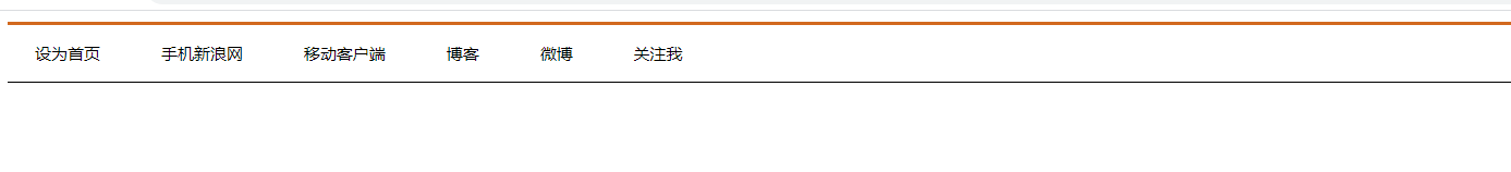
代码:
<!DOCTYPE html>
<html lang="en">
<head>
    <meta charset="UTF-8">
    <meta name="viewport" content="width=device-width, initial-scale=1.0">
    <title>Document</title>
    <style>

        .nav{
            height: 41px;
            border-top: 3px solid chocolate;
            border-bottom: black 1px solid;
        }
        .nav a {
            /* a是行内元素没有大小需要转换 */
            display: inline-block;
            height: 41px;
            /* 行高等于高,使文字垂直居中 */
            line-height: 41px;
            text-decoration: none;
            padding: 0px 20px;
            color: black;
            font-size: 12px;
        }
        .nav a:hover{
            background-color: ghostwhite;
            color: goldenrod;
        }
    </style>
</head>
<body>

    <div class="nav">
        <a href="#">设为首页</a>
        <a href="#">手机新浪网</a>
        <a href="#">移动客户端</a>
        <a href="#">博客</a>
        <a href="#">微博</a>
        <a href="#">关注我</a>
    </div>

</body>
</html>
复习盒子模型
版权声明:本文为Valentino112358原创文章,遵循CC 4.0 BY-SA版权协议,转载请附上原文出处链接和本声明。