好看的旋转动画
html代码
<div class="outDiv">
    <div class="inDiv"></div>
</div>

css代码
.outDiv{
    background: #000;
    width: 50px;
    height: 50px;
    position: absolute;
    top: 50%;
    left: 50%;
    border-radius: 100%;
    border: 10px solid rgb(97, 113, 255);
    border-top: 10px solid rgb(187, 220, 98);
    border-left: 10px solid rgb(120, 220, 137);
    border-right: 10px solid rgb(255, 161, 98);
    transform: translate(-50%,-50%) rotate(25deg);
    animation: loading 1s ease-in-out infinite;
    display: flex;
    justify-content: center;
    align-items: center;
}
.inDiv {
    width: 30px;
    height: 30px;
    background: yellow;
    border-radius: 100%;
    border: 8px solid blue;
    border-top: 8px solid rgb(214, 161, 16);
    border-left: 8px solid rgb(90, 218, 139);
    border-right: 8px solid rgb(108, 166, 219);
    border-bottom: 8px solid rgb(228, 94, 233);
}
@keyframes loading {
    0% {transform: translate(-50%,-50%) rotate(25deg);}
    100% {transform:  translate(-50%,-50%) rotate(385deg)}
}
修改input的占位符的样式
// html
<input type="text" placeholder="请设置用户名">
//css
input::-webkit-input-placeholder{color: red} /*Chrome/Opera/Safari*/
input::-moz-placeholder{color: yellow} /*Firefox 19*/
input:-ms-input-placeholder{color: green} /*id10+*/
input:-moz-placeholder{color: pink} /*Firefox 18-*/
input:focus{
    background-color: yellowgreen;
    color:aquamarine;
    /*取消边框*/
    outline: none;
    border:none;
}
单行或多行超出显示省略号
// html
<!--处理多行或者单行文本超出并显示省略号-->
<div class="container">
    <p class="danhang">你好你好你好你好你好你好你好你好你好你好你好你好</p>
    <p class="duohang">hello hello hello hello hello
        hello hello hello hello hello
        hello hello hello hello hello
        hello hello hello hello hello
        hello hello hello hello hello
         hello hello hello hello hell
          hello hello hello hello hell
           hello hello hello hello hell
            hello hello hello hello hell
             hello hello hello hello hellhello hello hello</p>
</div>

// css
    .container {
      width: 300px;
      height: 200px;
      margin: 100px;
      padding: 20px;
      border: 1px solid #eee;
      font-size: 13px;
      color: #555;
    }
.danhang {
    width: 200px;
    overflow: hidden;
    text-overflow: ellipsis;
    white-space: nowrap;
    word-break: break-all
}
.duohang {
  display: -webkit-box; /*重点,不能用block等其他,将对象作为弹性伸缩盒子模型显示*/
  /*从上到下垂直排列子元素*/
-webkit-box-orient: vertical;
 /*行数,超出三行隐藏,用省略号表示...*/
-webkit-line-clamp: 3;
line-clamp: 3;
word-break: break-all;
overflow: hidden;
max-width: 100%;
}
自定义滚动条的样式
改变样式之前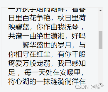
改变样式之后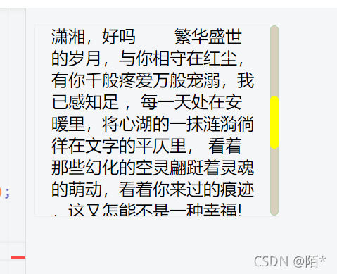
参考代码
// html
<p class="scroll-style">
     只是,亲爱的,
    今日这霏霏细雨是否也会浓稠你对我的思念?
    你是否也如往昔般在烟雨江南的雕栏曲处将你我的红尘绘制成娟?
    你曾说你喜爱诗情画意的生活,亲爱的,等我们暮年白发苍苍的时候,
    我们一齐执手烟雨湖畔,看春日里百花争艳,秋日里荷映碧蓝,你作曲我抚琴
    ,共谱一曲绝世潇湘,好吗
  繁华盛世的岁月,与你相守在红尘,有你千般疼爱万般宠溺,我已感知足
,每一天处在安暖里,将心湖的一抹涟漪徜徉在文字的平仄里,
看着那些幻化的空灵翩跹着灵魂的萌动,看着你来过的痕迹
,这又怎能不是一种幸福!为了你,我甘情绪愿就此成论,
我愿意在你赋予的一寸圈地蜗居一世,即便是只能在臆想里期遇,
即便只能是千里两相隔,即便是一路春色,我也只唯你此处风景独好。亲爱的,
只是我想你的时候你是否也在想我?是否能在灵犀里听到我想你时的心跳脉搏
</p>
// css

.scroll-style{
    width: 200px;
    height: 150px;
    border: 1px solid #eee;
    padding: 15px;
    overflow: auto;
}
.scroll-style::-webkit-scrollbar{
    width: 8px;
    background: white;
}
.scroll-style::-webkit-scrollbar-corner,
.scroll-style::-webkit-scrollbar-thumb,
.scroll-style::-webkit-scrollbar-track{
    border-radius: 4px
}
.scroll-style::-webkit-scrollbar-corner,
.scroll-style::-webkit-scrollbar-track{
    background-color: rgba(180,160,124,0.5);
    box-shadow:inset 0 0 1px rgba(6, 228, 106, 0.5);
    }
    .scroll-style::-webkit-scrollbar-thumb{
        background-color: yellow;
    }
通过transparent来实现三角形
效果图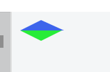
参考代码
 <div class="one"></div>
 <div class="two"></div>
// css

/* 通过transparent来画三角形 */
.one {
   width: 0;
   height: 0;
   border-style: solid;
   border-width: 0 22px 10px 20px;
   border-color: transparent transparent rgb(61, 101, 235) transparent;
 }

 .two {
   width: 0;
   height: 0;
   border-style: solid;
   border-width: 10px 20px 0 20px;
   border-color:  rgb(39, 236, 56) transparent transparent transparent;
 }
 div:last-child {
   margin-top: 3rem;
 }
实现卡片残缺一角
效果图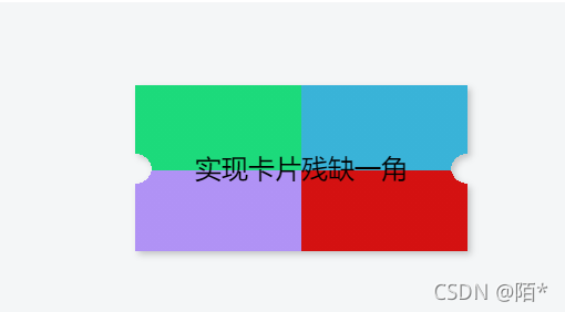
代码参考
// html
<div class="coupon">实现卡片残缺一角</div>
//css
.coupon {
 width: 200px;
  height: 100px;
  line-height: 100px;
  margin: 50px auto;
  text-align: center;
  position: relative;
  background: radial-gradient(circle at right bottom, transparent 10px, #39b3d8 0) top right /50% 51px no-repeat,
  radial-gradient(circle at left bottom, transparent 10px, #1cda7b 0) top left / 50% 51px no-repeat,
  radial-gradient(circle at right top, transparent 10px, #d41111 0) bottom right / 50% 51px no-repeat,
  radial-gradient(circle at left top, transparent 10px, #b092f5 0) bottom left / 50% 51px no-repeat;
  filter: drop-shadow(2px 2px 2px rgba(0, 0, 0, .2));
}
旋转按钮
➜
body {
    background: #ffffff;
}
.circle {
    width: 72px;
    height: 72px;
    border-radius: 50%;
    display: flex;
    justify-content: center;
     background: radial-gradient(ellipse closest-side,   #94e9cf 50%, #ffffff);
    align-items: center;
    animation: loading  3s infinite ;
    -webkit-animation:loading 5s infinite; /* Safari 和 Chrome */
    animation-timing-function: linear

}
.btn {
    background: #15795a;
    height: 50px;
    width:50px;
    border-radius: 50%;
    color: #ffffff;
    font-weight: bold;
    display: flex;
    justify-content: center;
    align-items: center;
    animation:  noloading 5s infinite;
       -webkit-animation:noloading 5s infinite; /* Safari 和 Chrome */
         animation-timing-function: linear

}
@keyframes noloading {
      0% {
        transform: rotate(0);

    }
    100% {
        transform: rotate(-360deg);

    }
}
@keyframes loading {
    0% {
        transform: rotate(0deg);
          width: 72px;
    height: 72px;
    }
    100% {
        transform: rotate(360deg);
              width: 74px;
    height: 74px;
    }
}
刮刮乐
<!DOCTYPE html>
<html lang="en">
  <head>
    <meta charset="UTF-8" />
    <meta name="viewport" content="width=device-width, initial-scale=1.0" />
    <meta http-equiv="X-UA-Compatible" content="ie=edge" />
    <title>Document</title>
  </head>
  <style>
    .ggk {
      width: 250px;
      height: 150px;
      position: relative;
    }
    .content,
    #canvas_1 {
      width: 250px;
      height: 150px;
      text-align: center;
      line-height: 150px;
      position: absolute;
      left: 0;
      top: 0;
    }
  </style>
  <body>
    <div class="ggk">
      <div class="content">一等奖</div>
      <canvas id="canvas_1" width="250" height="150"></canvas>
    </div>
    <script>
      var draw;
      var canvas1 = document.querySelector("canvas");
      var cvs = canvas1.getContext("2d");
      var ggk = document.querySelector("div");
      var content = document.querySelector(".content");
      cvs.fillStyle = "pink";
      cvs.fillRect(0, 0, 250, 150);
      cvs.font = "30px 微软雅黑";
      cvs.fillStyle = "#fff";
      cvs.fillText("刮刮卡", 85, 80);
      canvas1.onmousemove = function(e) {
        if (draw) {
          var x = e.pageX - ggk.offsetLeft;
          var y = e.pageY - ggk.offsetTop;
          cvs.globalCompositeOperation = "destination-out"
          cvs.arc(x, y, 18, 0, 2 * Math.PI);
          cvs.fill();
        }
      };
      canvas1.onmousedown = function(e) {
        draw= true;
        console.log(e);
      };
      canvas1.onmouseup = function(e) {
        draw= false;
        console.log(e);
      };
    </script>
  </body>
</html>
版权声明:本文为qq_43328914原创文章,遵循CC 4.0 BY-SA版权协议,转载请附上原文出处链接和本声明。