matplotlib的架构体系
由下到上分别为后端层,美工层,脚本层(函数层)
美工层Artist Layer
- 提供了绘制统计图所需的各种组成对象,如标题、直线、刻度标记等对象;所有对象都直接或间接继承自matplotlib.artist.Artist对象,各对象间形成一个树状的结构体系
- primitives 表示我们要渲染在画布上的标准的图形对象:Line2D, Rectangle, Text, AxesImage等;
- containers 是容纳这些图形对象的地方(Axis, Axes 和 Figure)
- 面向对象的绘图
from matplotlib.backends.backend_agg import FigureCanvasAgg as FigureCanvas
from matplotlib.figure import Figure
import numpy as np

x = np.arange(0,5,0.01)
y = np.sin(x*np.pi)
fig = Figure() # 创建对象
canvas = FigureCanvas(fig) # 和canvas关联
ax = fig.add_subplot(111) # 创建坐标系对象
ax.plot(x,y) # 绘制折线图
ax.set_title('The Sample Figure') # 设置标题
fig # 显示图形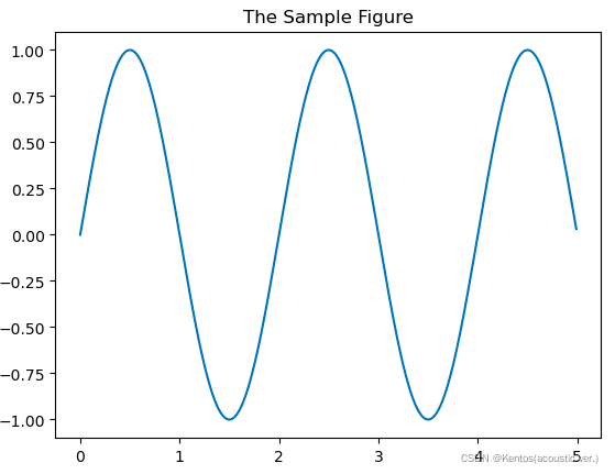
脚本层Scripting Layer
- matplotlib.pyplot模块
- 实现了类似于MATLIB的函数式绘图方式
# 函数式绘图
import matplotlib.pyplot as plt
import numpy as np

x = np.arange(-1,5,0.01)
y = np.sin(x*np.pi)
plt.title('The Sample Figure1') # 设置标题
plt.plot(x,y) # 绘制图形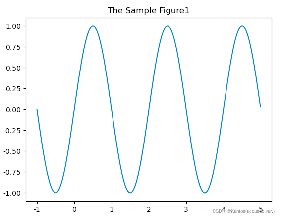
# 混合式绘图
import matplotlib.pyplot as plt
import numpy as np

x = np.arange(1,5,0.01)
y = np.sin(x*np.pi)
fig = plt.figure() # 创建对象
ax = fig.add_subplot(111) # 创建坐标系对象 默认111表示一行一列第一个
ax.set_title('The Sample Figure2') # 设置标题
plt.plot(x,y) # 绘制图形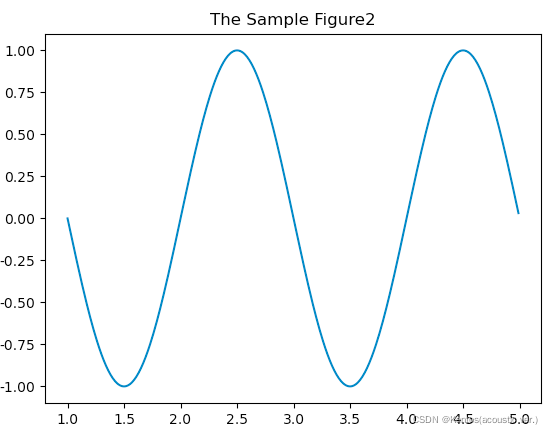
图形基本设置
图形大小
参数:figsize元组,表示图形的长和宽,单位为英寸,dpi表示每英寸点数
创建子图
使用pyplot模块中的subplot() 函数;或使用Figure对象的add_subplot() 函数
括号里的参数表示:有几行有几列在第几个位置(可用逗号隔开)
设置标题
使用pyplot模块的title() 函数设置标题;或使用Axes对象的set_title() 函数设置标题
设置坐标轴标签
使用pyplot模块的xlabel() 和ylabel() 函数设置x轴和y轴的标签;
或使用Axes对象的set_xlabel() 和set_ylabel() 函数设置x轴和y轴的标签
设置颜色
使用RGB值来设置颜色,通过对红(R)、绿(G)、蓝(B)三个颜色通道的变化,以及它们相互之间的叠加来得到各种颜色
常用的颜色可用简写如:r=red , y=yellow, b=blue, g=green
设置图例
创建图例需要和plot() 函数中的label 参数结合起来使用;
使用pyplot模块的legend() 函数设置图例;或使用Axes对象的legend() 函数设置图例
以下均采用面向对象的绘图方法
import matplotlib.pyplot as plt

x = np.arange(1,5,0.01)
y = np.sin(x*np.pi)

# 图形大小
fig = plt.figure(figsize=(10, 5), dpi=100)
fig.set_size_inches(10, 5)
fig.set_dpi(60)

# 创建子图
ax1 = fig.add_subplot(1,2,1) # 返回Axes对象
ax2 = fig.add_subplot(122)

# 设置标题
ax1.set_title('The Sample Figure1')
ax2.set_title('The Sample Figure2')

# 设置坐标轴标签
ax1.set_xlabel('x')
ax1.set_ylabel('y')

# 设置颜色
ax1.plot(x,y,c='r',label='tx')
ax2.plot(y,x,c='g')

# 设置图例
ax1.legend(loc='lower right')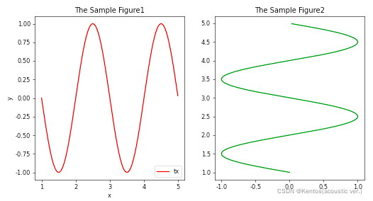
课堂练习一
将绘制折线图显示每天证券交易闭市时的市价变化情况
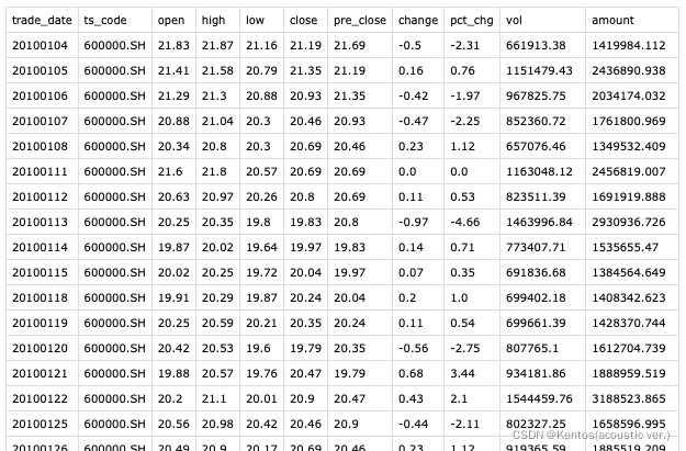
SH600000.csv
import pandas as pd
import matplotlib.pyplot as plt
df = pd.read_csv(r'/.../SH600000.csv',sep=';') # 读取文件内容
df['trade_date'] = pd.to_datetime(df['trade_date'].astype(str)) # 先转换为字符串后转换为时间类型
fig = plt.figure()
ax = fig.add_subplot()
ax.plot(df['trade_date'],df['close'],c='blue') # 会自动将时间类型的坐标轴缩短到合适的位置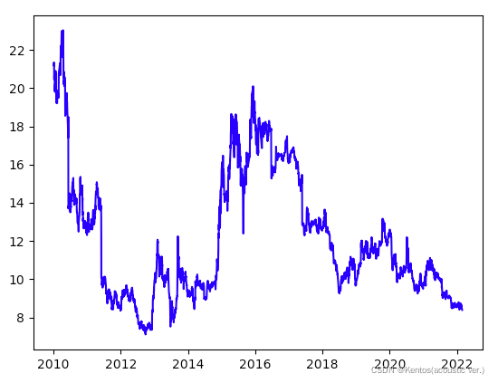
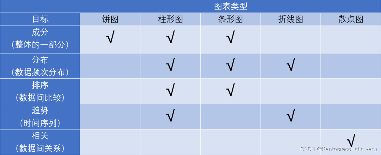
绘制基本图形
折线图
两个变量
pyplot模块的plot()函数;或Axes对象的plot()函数
变量间线性关系不明显时可以先将其中一个变量按升序排序再做图
两个变量都需要是数值型数据
import pandas as pd
import matplotlib.pyplot as plt
# 读取数据
df = pd.read_csv(r'/.../600000.csv')
df['date'] = pd.to_datetime(df['date'])
fig = plt.figure(figsize=(18,8))
ax = fig.add_subplot()
# 绘制折线图
ax.plot(df['date'],df['close'],c='g',marker='*',label='close') # marker标注数据点
ax.legend(loc='upper left')
# 填充
ax.fill_between(df['date'], # 定义曲线的节点的x坐标
                df['close'].min(), # 填充最低点
                df['close'], # 填充最高点
                facecolor='r', # 填充颜色
                alpha=0.6) # 填充透明度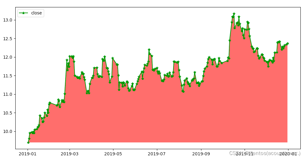
柱状图
两个变量
使用pyplot模块的bar() 函数绘制柱形图;或使用Axes对象的bar() 函数绘制柱形图
其他参数:width是每个bar的宽度,默认为0.8
import pandas as pd
import matplotlib.pyplot as plt

# 用来正常显示中文标签
plt.rcParams['font.sans-serif'] = ['SimHei']
# 用来正常显示负号
plt.rcParams['axes.unicode_minus'] = False

df = pd.read_csv(r'/.../consume_data.csv')
result = df.groupby('手机品牌',as_index=False)['月消费(元)'].sum() # 参数as_index=False返回DataFrame 对以'手机品牌'分组后返回的DataFrame选取字段['月消费(元)']进行求和
fig = plt.figure(figsize=(12,5))
ax = fig.add_subplot()
ax.bar(result['手机品牌'],result['月消费(元)'])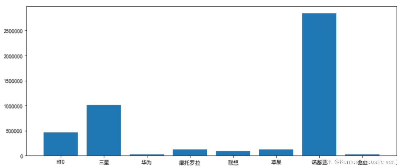
直方图(频率分布图)
一个变量(一维数组)
横轴代表数据分组,纵轴可用频数或百分比(频率)来表示;
对于等距分组的数据,矩形的高度即可直接代表频数的分布;
使用pyplot模块的hist() 函数绘制直方图;或使用Axes对象的hist() 函数绘制直方图
其他参数:range确定下部和上部范围的元组以忽略下部和上部异常值,默认范围是(x.min(),x.max()),facecolor直方图颜色,edgecolor直方图边框颜色,alpha透明度
# 直方图
import pandas as pd
import matplotlib.pyplot as plt

df = pd.read_csv(r'/.../600000.csv')
df['date'] = pd.to_datetime(df['date']) # 转换为时间序列

# 计算每日收益率
df['return'] = df['close'].pct_change() # pct_change()当前元素和先前元素之间的百分比变化,默认情况下,计算与上一行的百分比变化
df.dropna(inplace=True) # 在原数据中删除了包含缺失值的行
fig = plt.figure()
ax = fig.add_subplot()
ax.hist(df['return'])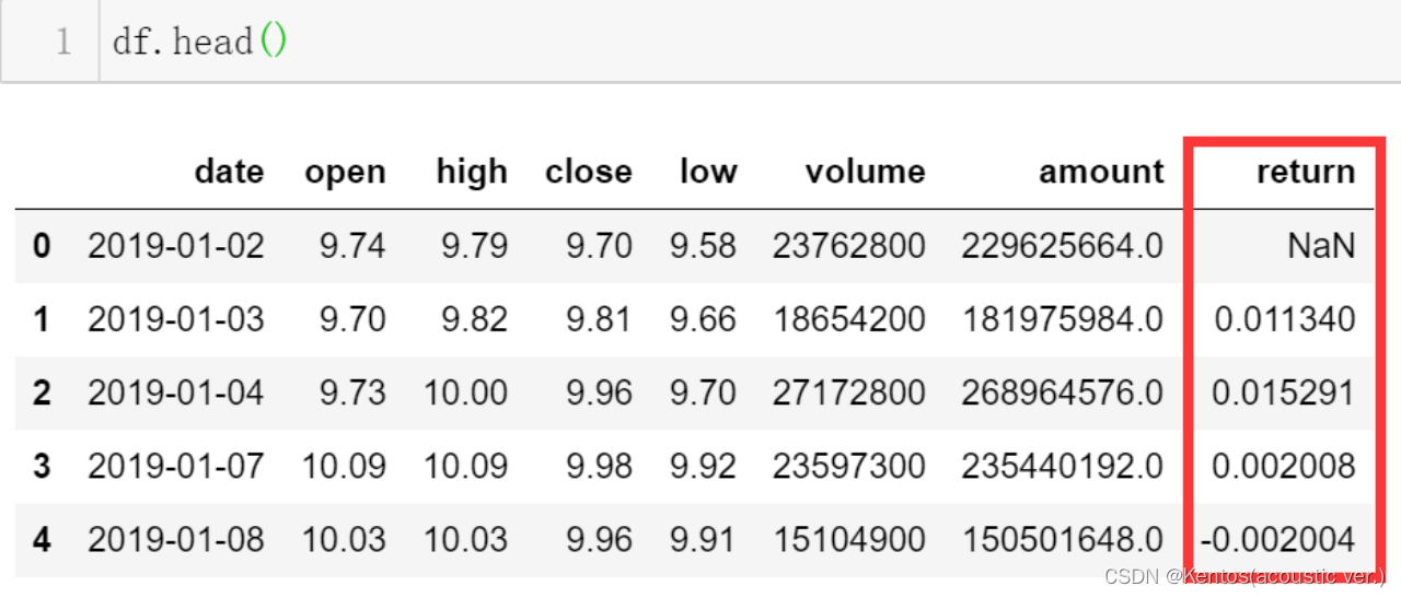

返回的内容
(array([ 10.,  21., 105.,  74.,  25.,   3.,   4.,   0.,   0.,   1.]), # 各组频数
 array([-0.03388358, -0.02223001, -0.01057644,  0.00107713,  0.01273071,
         0.02438428,  0.03603785,  0.04769142,  0.05934499,  0.07099856,
         0.08265213]), # 每组区间范围(起始位置和结束位置)
 <BarContainer object of 10 artists>)
饼图
一种用来描述定性数据频数或百分比的图形,通常以圆饼或椭圆饼的形式出现;
整个圆代表一个总体的全部数据,圆中的一个扇形表示总体的一个类别,其面积大小由相应部分占总体的比例来决定;
使用pyplot模块的pie() 函数绘制饼图;或使用Axes对象的pie() 函数绘制饼图
其他参数:shadow默认=False在图下面画一个阴影,radius半径默认为=1,startangle默认=0饼图开始从x轴逆时针旋转的角度,counterclock默认=True逆时针
import pandas as pd
import matplotlib.pyplot as plt
df = pd.read_csv(r'/.../user_data.csv')

# 分组统计
ga = df.groupby('gender')['id'].count()
fig = plt.figure()
ax = fig.add_subplot()

# 绘制饼图
ax.pie(ga,labels=['Female','Male'],autopct='%.1f%%') # 饼图上数据的标签和精确到的小数点位数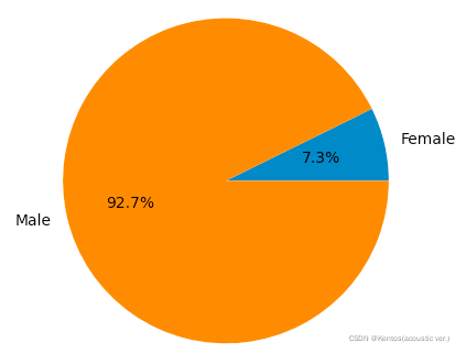
散点图
两个变量
使用pyplot模块的scatter() 函数绘制散点图;或使用Axes对象的scatter() 函数绘制散点图
其他参数:marker每个点的符号
import pandas as pd
import matplotlib.pyplot as plt

df = pd.read_csv(r'/.../ad_data.csv')
fig = plt.figure()
ax = fig.add_subplot()
ax.scatter(df['广告费用'],df['购买用户数'],marker='*') 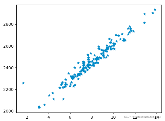
茎叶图stem
df2 = pd.read_csv(r'/.../ramen-ratings.csv')
df2_c = df2.groupby(['Country']) # 根据国家分类
df2_cc = df2_c['Brand'].count() # 统计每个国家拥有的Brand数量
fig = plt.figure(figsize=(12,6))
ax = fig.add_subplot()
# 每个国家拥有的Brand数量
ax.stem(df2_cc)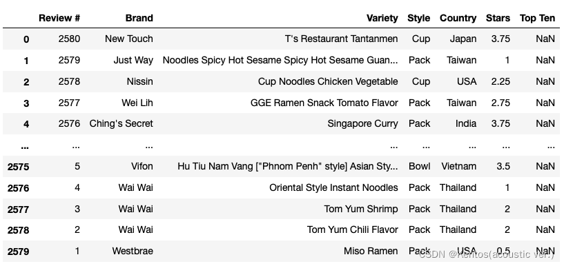
ramen-ratings.csv
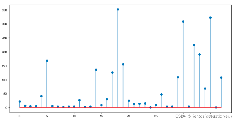
这样看起来更像柱状图,茎叶图适用于数据较少且数据间差别不大的情况,比如一个班的身高,既能保留确切的数据又能观察到数据的分布。
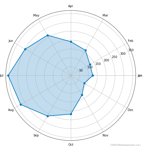
雷达图
# 构造数据
values = df1.iloc[1:2,2:14]

# 将DataFrame转换为列表
values = np.array(values)
values = values.tolist()[0]

feature = ['Jan','Feb','Mar','Apr','May','Jun','Jul','Aug','Sep','Oct','Nov','Dec']

# 设置每个数据点的显示位置,在雷达图上用角度表示
# 将圆均匀分割,最后一个数据不包含
angles = np.linspace(0, 2*np.pi, len(values), endpoint=False)

# 拼接数据首尾,使图形中线条封闭
# 将数据头[values[0]]作为拼接的列表
feature = np.concatenate((feature,[feature[0]]))
values = np.concatenate((values,[values[0]]))
angles = np.concatenate((angles,[angles[0]]))

# 绘图
fig = plt.figure(figsize=(8,8))

# 设置为极坐标格式
ax = fig.add_subplot(111, polar=True)

# 绘制折线图
ax.plot(angles, values, 'o-', linewidth=2)

# 填充颜色
ax.fill(angles, values, alpha=0.25)

# 设置图标上的角度划分刻度,为每个数据点处添加标签
ax.set_thetagrids(angles * 180/np.pi, feature)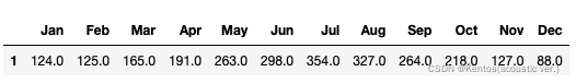
其他
vlines
在每个x上绘制从ymin到ymax的垂直线
twinx
创建一个共享xaxis的双轴
# 构造数据
t = np.arange(0.01, 10.0, 0.01)
data1 = np.exp(t) # 指数函数
data2 = np.sin(2 * np.pi * t) # 正弦

# 第一个子图
ax1 = plt.gca() # 创建子图
ax1.set_xlabel('time (s)')
ax1.set_ylabel('exp', color='r')
ax1.plot(t, data1, color='r') # 作图

# 创建与ax1共享x轴的第二个子图
ax2 = ax1.twinx()
ax2.set_ylabel('sin', color='b')
ax2.plot(t, data2, color='b') # 作图

plt.show()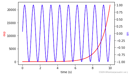
课堂练习二
创建子图,绘制任意字段的分布图,以及某个字段与pH的散点图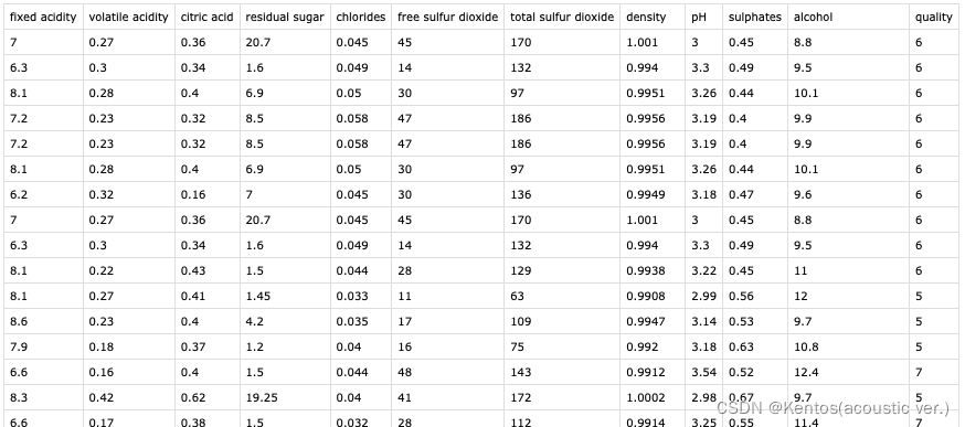
winequality.csv
import pandas as pd
import matplotlib.pyplot as plt

df = pd.read_csv(r'/.../winequality.csv',sep=';')
fig = plt.figure(figsize=(12,6))

# 创建子图
ax1 = fig.add_subplot(221)
ax2 = fig.add_subplot(222)
ax3 = fig.add_subplot(223)
ax4 = fig.add_subplot(224)

# 设置标题
ax1.set_title('quality')
ax2.set_title('alcohol')
ax3.set_title('pH')
ax4.set_title('sulphates-pH')

# 设置坐标轴标签
ax4.set_xlabel('sulphates')
ax4.set_ylabel('pH')

# 绘制图形
ax1.hist(df['quality'])
ax2.hist(df['alcohol'])
ax3.hist(df['pH'])
ax4.scatter(df['sulphates'],df['pH'])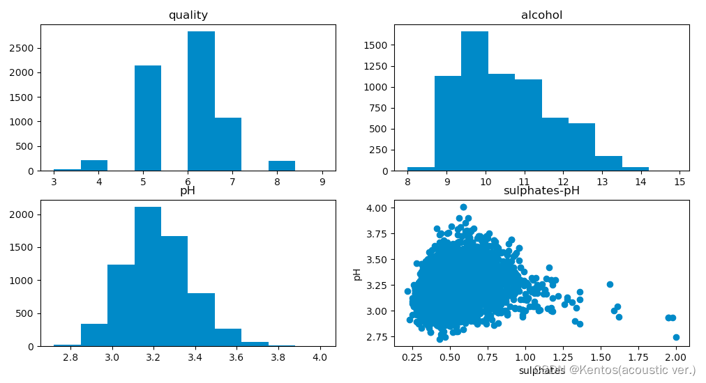
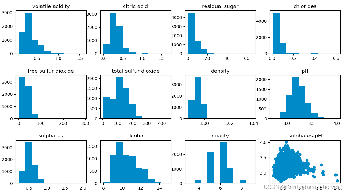
课堂练习三
编写一个函数,自动创建子图并绘制出所有字段的分布图
import pandas as pd
import matplotlib.pyplot as plt

df = pd.read_csv(r'/Users/dengsiyang/Desktop/python语言应用/数据可视化/winequality.csv',sep=';')
fig = plt.figure(figsize=(15,10))

def fun():
    for x in range(1,df.shape[1]):
        index = df.columns[x] # 获取列标题
        ax = fig.add_subplot(3,4,x) # 创建子图
        fig.subplots_adjust(hspace=0.5) # 调整子图的距离
        ax.set_title(index) # 设置子图标题
        ax.hist(df[index]) # 绘制分布图
    ax = fig.add_subplot(3,4,12)
    ax.set_title('sulphates-pH')
    ax.scatter(df['sulphates'],df['pH'])

f = fun()
f