先来写个实心三角形
.box_right,.box_bottom {
				width: 200px;
				height: 120px;
				background: #fff;
				position: relative;
				border-radius: 10px;
			}
			.box_bottom:after {
				content: '';
				width: 0;
				height: 0;
				border-top: 15px solid #ffff;
				border-left: 10px solid transparent;
				border-right: 10px solid transparent;
				position: absolute;
				bottom: -15px;
				left: 90px;
			}
			.box_right:after {
				content: '';
				width: 0;
				height: 0;
				border-left: 15px solid #ffff;
				border-bottom: 10px solid transparent;
				border-top: 10px solid transparent;
				position: absolute;
				top: 50px;
				right: -15px;
			}
<div class="wrapper">
	<div class="box_top"></div>
	<div class="box_left"></div>
</div>
效果(三角形的宽度等于左边框的的宽度加上又边框的宽度,当三角形的方向朝上或者朝下的时候)
再来个空心三角形
<!DOCTYPE html>
<html>
<head>
<meta charset="utf-8">
<title>10.30_2测试</title>
<style type="text/css">
body,html {
margin: 0;
height: 100%;
}
.wrapper {
height: 200px;
display: flex;
justify-content: space-around;
align-items: center;
background: #EDEDED;
}
.box_top,.box_left,.box_right,.box_bottom {
width: 200px;
height: 120px;
background: #fff;
position: relative;
border-radius: 10px;
border: 1px solid #333333;
}
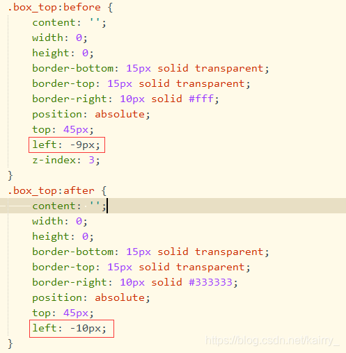
.box_top:before {
content: '';
width: 0;
height: 0;
border-bottom: 15px solid transparent;
border-top: 15px solid transparent;
border-right: 10px solid #fff;
position: absolute;
top: 45px;
left: -9px;
z-index: 3;
}
.box_top:after {
content: '';
width: 0;
height: 0;
border-bottom: 15px solid transparent;
border-top: 15px solid transparent;
border-right: 10px solid #333333;
position: absolute;
top: 45px;
left: -10px;
}
.box_left:before {
content: '';
width: 0;
height: 0;
border-left: 15px solid transparent;
border-right: 15px solid transparent;
border-bottom: 10px solid #fff;
position: absolute;
top: -9px;
left: 85px;
z-index: 3;
}
.box_left:after {
content: '';
width: 0;
height: 0;
border-left: 15px solid transparent;
border-right: 15px solid transparent;
border-bottom: 10px solid #333333;
position: absolute;
top: -10px;
left: 85px;
}
</style>
</head>
<body>
<div class="wrapper">
<div class="box_top"></div>
<div class="box_left"></div>
</div>
</body>
</html>
效果(其实就是利用和dom背景色相同的伪类定为在与边框颜色相同的伪类上,从而实现了看起来是空心三角形的效果)这时三角形的高度同上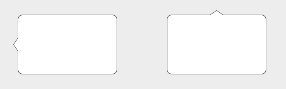
上面的伪类元素要和下面的伪类元素对应的定位值要有差值,这样就通过覆盖形成了空心三角形的效果
总结:不难发现,当你要实现某个方向的三角形,只需要将相反方向的border设置相应的颜色,相邻两边的border设置成透明(transparent),这样基本就大功告成了。
举个栗子:想实现向上的三角形,那么你只要设置border-bottom成你要的颜色(和dom元素的背景色一致),border-left和border-right的颜色设置成透明(transparent)。再用定位调整一下三角形的位置就OK了。
溜了溜了,只想到了这么多,欢迎补充,谢谢大家~
版权声明:本文为kairry_原创文章,遵循CC 4.0 BY-SA版权协议,转载请附上原文出处链接和本声明。