效果图:
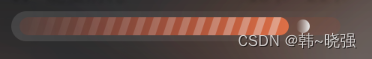
view分析:UI给到的图有一个渐变的大背景、第二进度条、当前进度条、当前进度条上的斜线、小圆
开始自定义view,后面附完整源码
1.新建HorizontalProgressBar类继承View
class HorizontalProgressBar : View {
constructor(context: Context) : this(context, null)

    constructor(context: Context, attributeSet: AttributeSet?) : this(context, attributeSet, 0)

    constructor(context: Context, attributeSet: AttributeSet?, defStyleAttr: Int) : super(
        context,
        attributeSet,
        defStyleAttr
    ) {

    }
}
2.自定义属性
    <declare-styleable name="HorizontalProgressBar">

        <attr name="secondProgressColor" format="color" />
<attr name="hpbProgressStartColor" f版权声明:本文为qq_21434809原创文章,遵循CC 4.0 BY-SA版权协议,转载请附上原文出处链接和本声明。