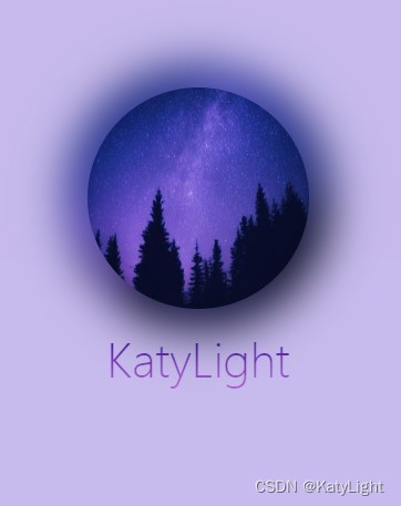
这个是基本效果,阴影和 图片内容有关。

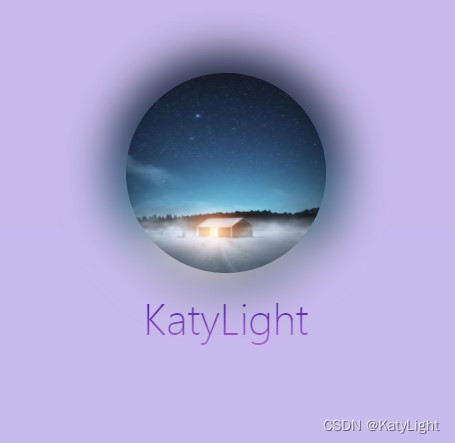
其他图片的效果
根据需求删减代码,这里我做了一个简单的动画效果。
外面的box是为了让动画更阴影同步。
如果用倒影会导致镜像的周围模糊被切割。
以下是代码:
<!DOCTYPE html>
<html lang="en">
<head>
  <meta charset="UTF-8">
  <title>Title</title>
  <style>
    body {
background-color: #c8bbea;
      padding: 0;
      margin: 0;
    }

    .row {
      width: 100%;
      padding-top: 200px;
    }

    .box {

      display: block;
      width: 200px;
      margin: 0 auto;
      transition: all .3s ease-in;
      position: relative;
    }
    .text{
      position: absolute;
      width: 100%;
      text-align: center;
      margin: 0 auto;
      font-size: 40px;
      font-weight: 100;
      top:320px;
      color: transparent;
     -webkit-background-clip: text;
      -webkit-text-fill-color:transparent;
      background-image: linear-gradient(#340e9f, #c066ce);
      z-index: -2;
    }


    .box:hover {
      transform: translateY(-100px);
      /*transform: rotateX(78deg);*/
      transition: all .3s ease-in;
    }


    .avatar {
      height: 200px;
      width: 200px;
      border-radius: 50%;
      position: relative;
      background: url("https://scpic.chinaz.net/files/pic/pic9/202010/apic28717.jpg") no-repeat center center;
      background-size: 100% 100%;
      display: block;

    }


    .avatar::after {
      content: '';
      backdrop-filter: blur(10px);
      position: absolute;
      display: block;
      top: -10%;
      left: -10%;
      width: 120%;
      height: 120%;
      border-radius: 50%;
      z-index: -1;
      background: inherit;
      background-size: 100% 100%;
      filter: blur(20px) ;
    /*  brightness(110%) opacity(.8)*/
    }
  </style>
</head>
<body>
<div class="row">
  <div class="box">
    <div class="avatar"></div>

  </div>
  <div class="text">KatyLight</div>
</div>
</body>
</html>
版权声明:本文为qq_33014695原创文章,遵循CC 4.0 BY-SA版权协议,转载请附上原文出处链接和本声明。