HTML 代码
<!DOCTYPE html>
<html lang="en">
<head>
    <meta charset="UTF-8">
    <title>高度自适应分辨率</title>
    <link rel="stylesheet" href="./css/index.css">
</head>
<body>
<div class="main">
    <!--logo-->
    <div class="logo">
        <div class="left">
            <img src="./images/logo.jpg" alt="">
        </div>
        <div class="right">
            <div class="top">CSS 适配分辨率</div>
            <div class="bottom">CSS adaptation resolution</div>
        </div>
    </div>
    <!--content-->
    <div class="content">
        <div class="cn">宽度固定</div>
        <div class="en">Fixed width</div>
        <div class="cn">高度自适应</div>
        <div class="en">Highly adaptive</div>
    </div>
</div>
</body>
</html>
CSS 代码
*{
margin: 0;
padding: 0;
}
html,body {
height: 100%;
overflow: hidden;
font-family: 黑体;
}
.main {
height: 100%;
}
.logo, .content {
width: 100%;
text-align: center;
}
.logo {
height: 15.625vw;
background: #fff;
display: flex;
justify-content: center;
align-items: center;
}
.logo .left {
margin-right: 5vw;
}
.logo .left img{
width: 13.54vw;
height: 13.54vw;
}
.logo .right {
color: #ff0000;
font-size: 3.64vw;
}
.logo .right .top {
font-size: 6.4vw;
}
.content {
/*1vw = 19.2px*/
position: absolute;
top: 15.625vw;
bottom: 0;
left: 0;
background-color: cornflowerblue;
color: #ddd;
display: flex;
flex-flow: column;
align-items: center;
justify-content: center;
font-size: 6.25vw;
line-height: 8.25vw;
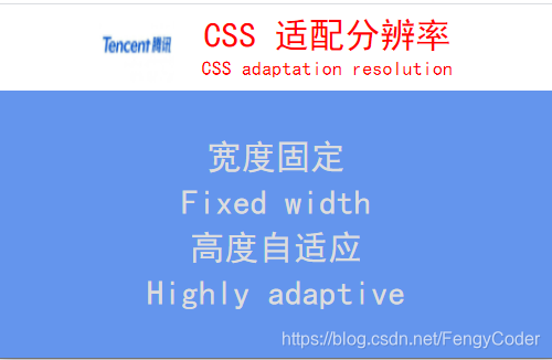
}效果图:
版权声明:本文为FengyCoder原创文章,遵循CC 4.0 BY-SA版权协议,转载请附上原文出处链接和本声明。