flex box
flex-direction 弹性容器中子元素的排列方式
row 横向从左到右排列(左对齐),默认的排列方式
row-reverse 横向从右到左排列(右对齐)
column 纵向排列
column-reverse 纵向排列从下往上(底部对齐)
flex-direction 排列方式
<!DOCTYPE html>
<html>
	<head>
		<meta charset="utf-8">
		<title></title>
	    <style>
			#main{
				width: 300px;
				height: 300px;
				background-color: aquamarine;
				display: inline-flex;
                flex-direction: row;
			}
			#one{
				width: 75px;
				height: 75px;
				background-color: red;
			}
			#two{
				width: 75px;
				height: 75px;
				background-color: yellow;
			}
			#three{
				width: 75px;
				height: 75px;
				background-color: blue;
			}
		</style>
    </head>
	<body>
		<div id="main">
					<div id="one">
						one
					</div>
					<div id="two">
						two
					</div>
					<div id="three">
						three
					</div>
				</div>
	</body>
</html>
只换
flex-direction: row-reverse; 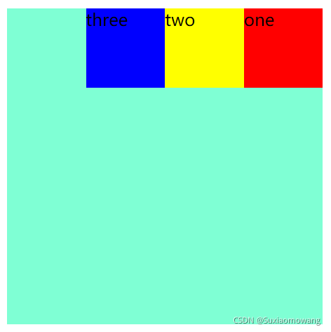
只换
flex-direction: column; 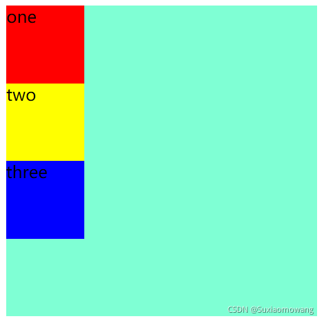
只换
flex-direction: column-reverse; 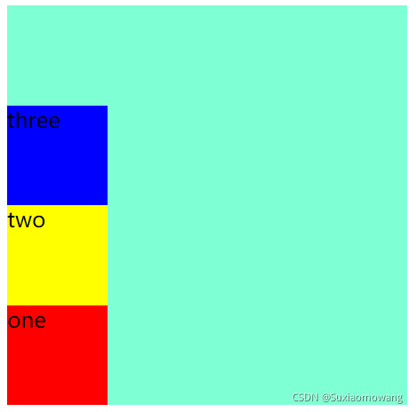
justify-content 对齐方式(横向)
flex-start:弹性子元素向左边框紧挨着摆放
flex-end:弹性子元素向右边框紧挨着摆放
center:弹性项目居中紧挨着摆放
space-between:弹性项目平均分布在该行上
space-around:弹性项目平均分布在该行上,两边留有一半的间隔空间。如果剩余空间为负或者只有一个弹性项,则该值等同于center
添加 justify-content ,
<!DOCTYPE html>
<html>
	<head>
		<meta charset="utf-8">
		<title></title>
	    <style>
			#main{
				width: 300px;
				height: 300px;
				background-color: aquamarine;
				display: inline-flex;
			    flex-direction: row;
				justify-content: flex-start;
			}
			#one{
				width: 75px;
				height: 75px;
				background-color: red;
			}
			#two{
				width: 75px;
				height: 75px;
				background-color: yellow;
			}
			#three{
				width: 75px;
				height: 75px;
				background-color: blue;
			}
		</style>
    </head>
	<body>
		<div id="main">
					<div id="one">
						one
					</div>
					<div id="two">
						two
					</div>
					<div id="three">
						three
					</div>
				</div>
	</body>
</html> 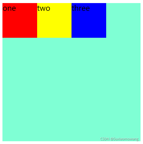
没有变化,换 flex-end 属性
justify-content: flex-end; 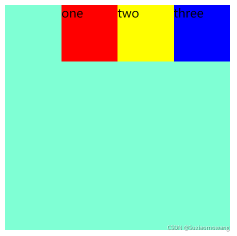
换 center 属性
justify-content: center; 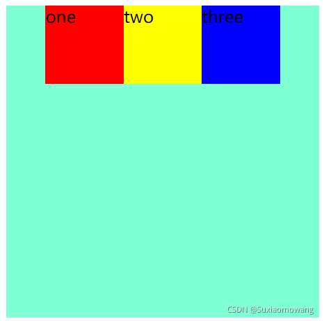
换 space-between 属性
justify-content: space-between; 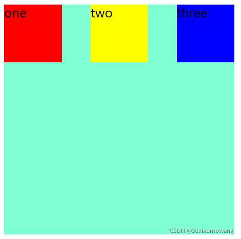
换 space-around 属性
justify-content: space-around; 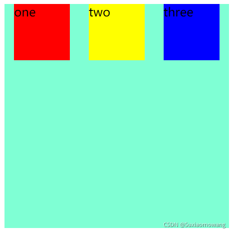
align-items 对齐方式(纵向)
flex-start 弹性子元素向上边框紧挨着摆放
flex-end 弹性子元素向下边框紧挨着摆放
center 弹性项目居中紧挨着摆放。
<!DOCTYPE html>
<html>
	<head>
		<meta charset="utf-8">
		<title></title>
	    <style>
			#main{
				width: 300px;
				height: 300px;
				background-color: aquamarine;
				display: inline-flex;
			    flex-direction: row;
				align-items: flex-start;
			}
			#one{
				width: 75px;
				height: 75px;
				background-color: red;
			}
			#two{
				width: 75px;
				height: 75px;
				background-color: yellow;
			}
			#three{
				width: 75px;
				height: 75px;
				background-color: blue;
			}
		</style>
    </head>
	<body>
		<div id="main">
					<div id="one">
						one
					</div>
					<div id="two">
						two
					</div>
					<div id="three">
						three
					</div>
				</div>
	</body>
</html> 
没有变化,换 flex-end 属性
align-items: flex-end; 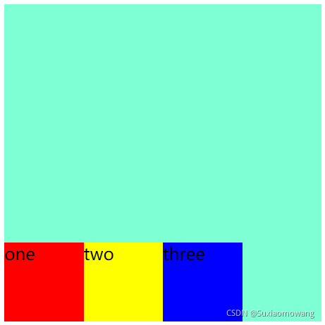
换 center 属性
align-items: center; 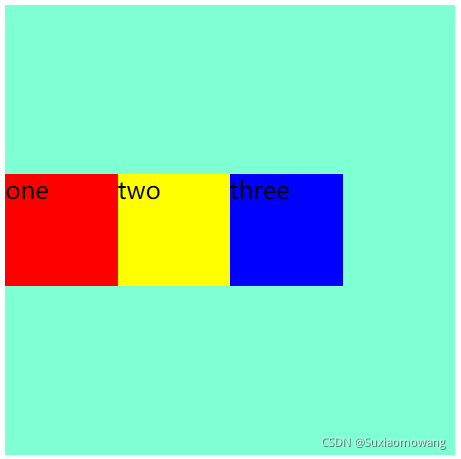
flex-wrap 对齐方式
nowrap 默认, 弹性容器为单行。该情况下弹性子项可能会溢出容器
wrap 弹性容器为多行。该情况下弹性子项溢出的部分会被放置到新行,子项内部会发生断行
wrap-reverse 反转 wrap 排列
<!DOCTYPE html>
<html>
	<head>
		<meta charset="utf-8">
		<title></title>
	    <style>
			#main{
				width: 300px;
				height: 300px;
				background-color: aquamarine;
				display: inline-flex;
			    flex-direction: row;
				flex-wrap: nowrap;
			}
			#one{
				width: 75px;
				height: 75px;
				background-color: red;
				margin-right: 275px;
			}
			#two{
				width: 75px;
				height: 75px;
				background-color: yellow;
			}
			#three{
				width: 75px;
				height: 75px;
				background-color: blue;
			}
		</style>
    </head>
	<body>
		<div id="main">
					<div id="one">
						one
					</div>
					<div id="two">
						two
					</div>
					<div id="three">
						three
					</div>
				</div>
	</body>
</html>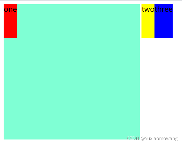
默认 :文本被撑出父元素,未换行
换 wrap 属性
flex-wrap: wrap; 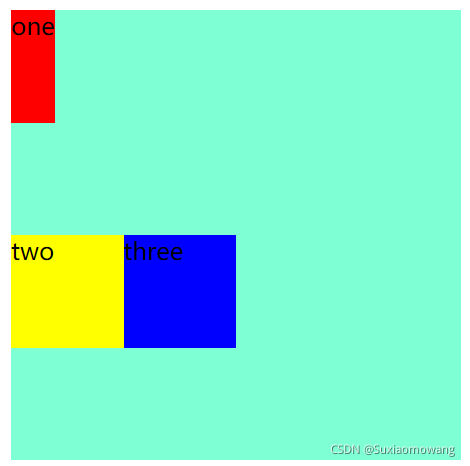
换 wrap-reverse 属性
flex-wrap: wrap-reverse; 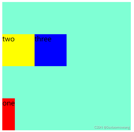
align-content 行对齐
stretch 默认各行将会伸展以占用剩余的空间
flex-start 各行向弹性盒容器的起始位置堆叠
flex-end 各行向弹性盒容器的结束位置堆叠
center 各行向弹性盒容器的中间位置堆叠
space-between 各行在弹性盒容器中平均分布
space-around 各行在弹性盒容器中平均分布,两端保留子元素与子元素之间间距大小的一半
align-content: stretch; align-content: flex-start; align-content: flex-end; align-content: center; align-content: space-between; align-content: space-around;order 元素排列顺序
整数数字:用整数值来定义排列顺序,数值小的排在前面,可以为负值
<!DOCTYPE html>
<html>
	<head>
		<meta charset="utf-8">
		<title></title>
	    <style>
			#main{
				width: 300px;
				height: 300px;
				background-color: aquamarine;
				display: inline-flex;
			    flex-direction: row;
			}
			#one{
				width: 75px;
				height: 75px;
				background-color: red;
				order: 3;
			}
			#two{
				width: 75px;
				height: 75px;
				background-color: yellow;
				order: 1;
			}
			#three{
				width: 75px;
				height: 75px;
				background-color: blue;
				order: 2;
			}
		</style>
    </head>
	<body>
		<div id="main">
					<div id="one">
						one
					</div>
					<div id="two">
						two
					</div>
					<div id="three">
						three
					</div>
				</div>
	</body>
</html> 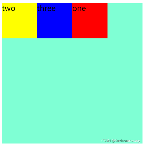
align-self 覆盖 align-items
auto 如果'align-self'的值为'auto',则其计算值为元素的父元素的'align-items'值,如果其没有父元素,则计算值为 'stretch'
flex-start 弹性盒子元素的侧轴(纵轴)起始位置的边界紧靠住该行的侧轴起始边界
flex-end 弹性盒子元素的侧轴(纵轴)起始位置的边界紧靠住该行的侧轴结束边界
center 弹性盒子元素在该行的侧轴(纵轴)上居中放置。(如果该行的尺寸小于弹性盒子元素的尺寸,则会向两个方向溢出相同的长度)
<!DOCTYPE html>
<html>
	<head>
		<meta charset="utf-8">
		<title></title>
	    <style>
			#main{
				width: 300px;
				height: 300px;
				background-color: aquamarine;
				display: inline-flex;
			    flex-direction: column;
				align-items: flex-start;
			}
			#one{
				width: 75px;
				height: 75px;
				background-color: red;
			}
			#two{
				width: 75px;
				height: 75px;
				background-color: yellow;
				align-self: flex-end;
			}
			#three{
				width: 75px;
				height: 75px;
				background-color: blue;
			}
		</style>
    </head>
	<body>
		<div id="main">
					<div id="one">
						one
					</div>
					<div id="two">
						two
					</div>
					<div id="three">
						three
					</div>
				</div>
	</body>
</html> 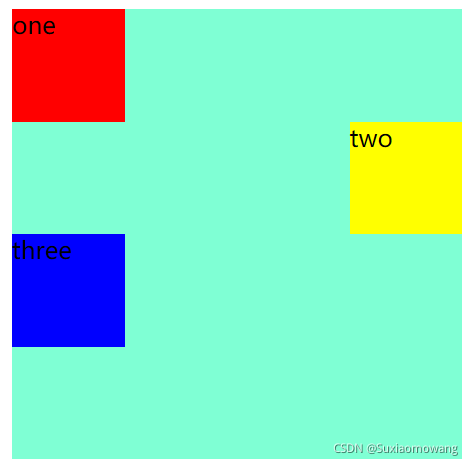
flex 元素分配空间
<!DOCTYPE html>
<html>
	<head>
		<meta charset="utf-8">
		<title></title>
	    <style>
			#main{
				width: 300px;
				height: 300px;
				background-color: aquamarine;
				display: inline-flex;
			    flex-direction: row;
			}
			#one{
				width: 75px;
				height: 75px;
				background-color: red;
				flex: 3;
			}
			#two{
				width: 75px;
				height: 75px;
				background-color: yellow;
				flex: 2;
			}
			#three{
				width: 75px;
				height: 75px;
				background-color: blue;
				flex: 1;
			}
		</style>
    </head>
	<body>
		<div id="main">
					<div id="one">
						one
					</div>
					<div id="two">
						two
					</div>
					<div id="three">
						three
					</div>
				</div>
	</body>
</html> 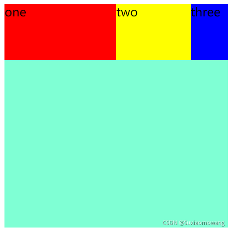
弹性盒子中需要设置 margin: auto; 可以使得弹性子元素完全居中
<!DOCTYPE html>
<html>
	<head>
		<meta charset="utf-8">
		<title></title>
	    <style>
			#main{
				width: 300px;
				height: 300px;
				background-color: aquamarine;
				display: inline-flex;
			    flex-direction: row;
			}
/* 			#one{
				width: 75px;
				height: 75px;
				background-color: red;
			} */
			#two{
				width: 75px;
				height: 75px;
				background-color: yellow;
				margin: auto;
			}
/* 			#three{
				width: 75px;
				height: 75px;
				background-color: blue;
			} */
		</style>
    </head>
	<body>
		<div id="main">
					<!-- <div id="one">
						one
					</div> -->
					<div id="two">
						two
					</div>
					<!-- <div id="three">
						three
					</div> -->
				</div>
	</body>
</html> 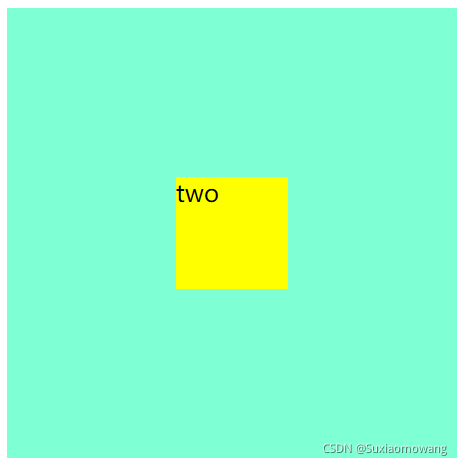
可以看到子元素完全居中