
注意:无特殊说明,Flutter版本及Dart版本如下:
Flutter版本: 1.12.13+hotfix.5
Dart版本: 2.7.0
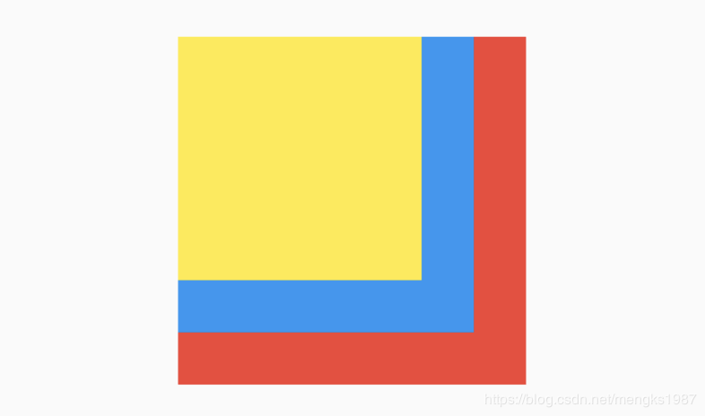
Stack
Stack组件可以将子组件叠加显示,根据子组件的顺利依次向上叠加,用法如下:
Stack(
children: [
Container(
height: 200,
width: 200,
color: Colors.red,
),
Container(
height: 170,
width: 170,
color: Colors.blue,
),
Container(
height: 140,
width: 140,
color: Colors.yellow,
)
],
)
效果如下:
Stack未定位的子组件大小由fit参数决定,默认值是StackFit.loose,表示子组件自己决定,StackFit.expand表示尽可能的大,用法如下:
Stack(
fit: StackFit.expand,
...
)
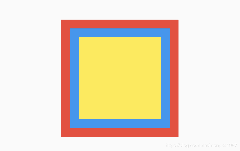
Stack未定位的子组件的默认左上角对齐,通过alignment参数控制,用法如下:
Stack(
alignment: Alignment.center,
...
)
效果如下:
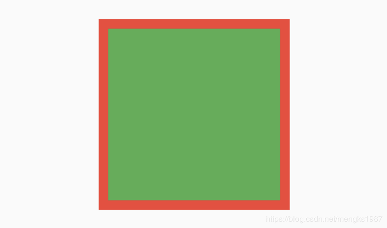
有没有注意到fit和alignment参数控制的都是未定位的子组件,那什么样的组件叫做定位的子组件?使用Positioned包裹的子组件就是定位的子组件,用法如下:
Stack(
alignment: Alignment.center,
children: [
Container(
height: 200,
width: 200,
color: Colors.red,
),
Positioned(
left: 10,
right: 10,
bottom: 10,
top: 10,
child: Container(
color: Colors.green,
),
)
],
)
Positioned组件可以指定距Stack各边的距离,效果如下:
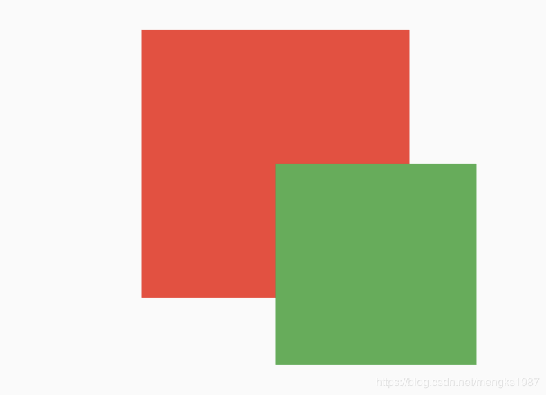
如果子组件超过Stack边界由overflow控制,默认是裁剪,下面设置总是显示的用法:
Stack(
overflow: Overflow.visible,
children: [
Container(
height: 200,
width: 200,
color: Colors.red,
),
Positioned(
left: 100,
top: 100,
height: 150,
width: 150,
child: Container(
color: Colors.green,
),
)
],
)
效果如下:
IndexedStack
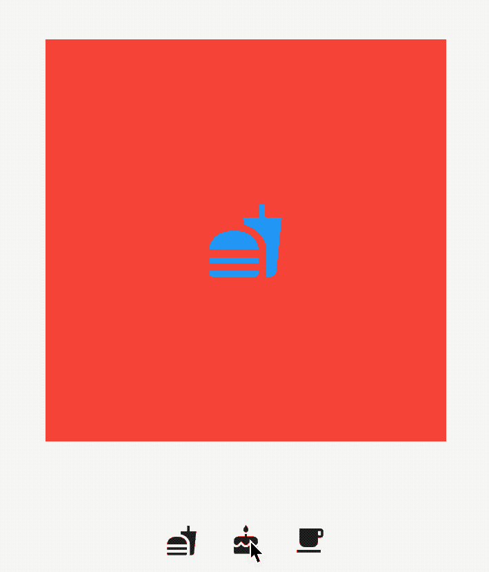
IndexedStack是Stack的子类,Stack是将所有的子组件叠加显示,而IndexedStack只显示指定的子组件,用法如下:
IndexedStack(
index: _index,
children: [
Center(
child: Container(
height: 300,
width: 300,
color: Colors.red,
alignment: Alignment.center,
child: Icon(
Icons.fastfood,
size: 60,
color: Colors.blue,
),
),
),
Center(
child: Container(
height: 300,
width: 300,
color: Colors.green,
alignment: Alignment.center,
child: Icon(
Icons.cake,
size: 60,
color: Colors.blue,
),
),
),
Center(
child: Container(
height: 300,
width: 300,
color: Colors.yellow,
alignment: Alignment.center,
child: Icon(
Icons.local_cafe,
size: 60,
color: Colors.blue,
),
),
),
],
)
通过点击按钮更新_index值,代码如下:
Row(
mainAxisAlignment: MainAxisAlignment.center,
children: [
IconButton(
icon: Icon(Icons.fastfood),
onPressed: () {
setState(() {
_index = 0;
});
},
),
IconButton(
icon: Icon(Icons.cake),
onPressed: () {
setState(() {
_index = 1;
});
},
),
IconButton(
icon: Icon(Icons.local_cafe),
onPressed: () {
setState(() {
_index = 2;
});
},
),
],
)
效果如下:
Positioned
Positioned用于定位Stack子组件,Positioned必须是Stack的子组件,基本用法如下:
Stack(
children: [
Positioned(
left: 10,
right: 10,
top: 10,
bottom: 10,
child: Container(color: Colors.red),
),
],
)
效果如下:
相关说明:
提供top、bottom、left、right四种定位属性,分别表示距离上下左右的距离。
只能用于Stack组件中。
left、right和width3个参数只能设置其中2个,因为设置了其中2个,第三个已经确定了,同理top、bottom和height也只能设置其中2个。
Positioned提供便捷的构建方式,比如Positioned.fromRect、Positioned.fill等,这些便捷的构建方式万变不离其宗,只不过换了一种方式设置top、bottom、left、right四种定位属性。
今天的文章对大家是否有帮助?如果有,请在文章底部留言和点赞,以表示对我的支持,你们的留言、点赞和转发关注是我持续更新的动力!
更多相关阅读: