目录
准备工作
一、案例1:实现搜索书籍页面
二、案例2:实现购物车页面布局
三、案例3:实现购物车页面订单信息
四、案例4:图标组件的使用
五、熟悉其他的(页面内容-组件)的效果
准备工作:
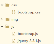
页面中引入库
①bootstrap.min.css:Bootstrap核心样式【添加到head标签中】
<link rel="stylesheet" type="text/css" href="css/bootstrap.min.css"/>
② jquery-3.3.1.js:jQuery库
【注意:必须在Bootstrap核心库引入之前引入jQuery库】
③ bootstrap.min.js:Bootstrap核心库
【注意】②③添加到</body>之前,如下:
<!--引入jQuery的库:必须在Bootstrap库之前引入-->
<script src="js/jquery-3.3.1.js"type="text/javascript"></script>
<1--引入Bootstrap的类库-->
<script sre="js/bootstrap.min.js" type="text/javascript"></script>
Bootstrap文档:
简介 · Bootstrap v4 中文文档 v4.6 | Bootstrap 中文网
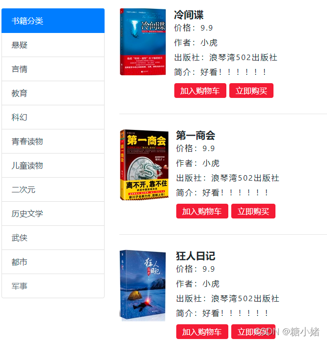
一、案例1:实现搜索书籍页面
主要用于组件:媒体对象-Media object
代码如下:
HTML:
<div class="col-9">
	<!-- 右9 -->
	<div class="media">
	  <img src="./img/img/1.png" class="mr-3" alt="...">
	  <div class="media-body">
		<h5 class="mt-0"><b>冷间谍</b></h5>
		<p>价格:9.9</p>
		<p>作者:小虎</p>
		<p>出版社:浪琴湾502出版社</p>
		<p>简介:好看!!!!!!</p>
		<p>
			<button class="btn badge-danger">加入购物车</button>
			<button class="btn badge-danger">立即购买</button>
		</p>
	  </div>
	</div>
<hr/>
<div class="media">
  <img src="./img/img/2.png" class="mr-3" alt="...">
  <div class="media-body">
	<h5 class="mt-0"><b>第一商会</b></h5>
	<p>价格:9.9</p>
	<p>作者:小虎</p>
	<p>出版社:浪琴湾502出版社</p>
	<p>简介:好看!!!!!!</p>
	<p>
		<button class="btn badge-danger">加入购物车</button>
		<button class="btn badge-danger">立即购买</button>
	</p>
  </div>
</div>
<hr/>
<div class="media">
  <img src="./img/img/3.png" class="mr-3" alt="...">
  <div class="media-body">
	<h5 class="mt-0"><b>狂人日记</b></h5>
	<p>价格:9.9</p>
	<p>作者:小虎</p>
	<p>出版社:浪琴湾502出版社</p>
	<p>简介:好看!!!!!!</p>
	<p>
		<button class="btn badge-danger">加入购物车</button>
		<button class="btn badge-danger">立即购买</button>
	</p>
  </div>
</div>
样式:
<style type="text/css">
	.navbar-collapse{
		flex-grow: 0;/*在固定容器中 1代表弹性扩大占用父容器剩余空间 设置为0表示不占用 */
	}
	.ss{
		background-color: #BDC1C4;/* 背景颜色 */
		height: 100px;/* 高度 */
		margin-top: 20px;/* 上间距  */
	}
	.form-group{
		width: 300px;/* 宽度 */
		margin-top: 31px;/* 上间距
		margin-left: auto; /* 左间距 自适应 */
		margin-right: auto;/* 右间距 */
	}

	.list-group,.media{
		margin-top: 30px;/* 上间距 */
	}

	.media-body p{
		line-height: 14px;
		letter-spacing: 2px;
	}

	.media-body p button{
		height: 30px;
		line-height: 10px;
	}
</style>
效果如下:
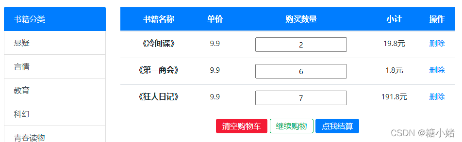
二、案例2:实现购物车页面布局
主要用于页面内容:表格-Table
代码如下:
HTML:
<div class="col-9">
	<!-- 右9 -->
	<table class="table table-hover">
	  <thead>
		<tr class="bg-primary">
		  <th scope="col">书籍名称</th>
		  <th scope="col">单价</th>
		  <th scope="col">购买数量</th>
		  <th scope="col">小计</th>
		  <th scope="col">操作</th>
		</tr>
	  </thead>
	  <tbody>
		<tr>
		  <th scope="row">《冷间谍》</th>
		  <td>9.9</td>
		  <td><input value="2"></td>
		  <td>19.8元</td>
		  <td><a href="#">删除</td>
		</tr>
	   <tr>
		 <th scope="row">《第一商会》</th>
		 <td>9.9</td>
		 <td><input value="6"></td>
		 <td>1.8元</td>
		 <td><a href="#">删除</td>
	   </tr>
	   <tr>
		 <th scope="row">《狂人日记》</th>
		 <td>9.9</td>
		 <td><input value="7"></td>
		 <td>191.8元</td>
		 <td><a href="#">删除</td>
	   </tr>
	  </tbody>
	</table>
	<p class="yyy">
		<button class="btn btn-danger">清空购物车</button>
		<button class="btn btn-outline-success">继续购物</button>
		<button class="btn btn-primary">点我结算</button>
	</p>
</div>
样式:
<style type="text/css">
	.navbar-collapse{
		flex-grow: 0;/*在固定容器中 1代表弹性扩大占用父容器剩余空间 设置为0表示不占用 */
	}
	.ss{
		background-color: #BDC1C4;/* 背景颜色 */
		height: 100px;/* 高度 */
		margin-top: 20px;/* 上间距  */
	}
	.form-group{
		width: 300px;/* 宽度 */
		margin-top: 31px;/* 上间距
		margin-left: auto; /* 左间距 自适应 */
		margin-right: auto;/* 右间距 */
	}

	.list-group,.table{
		margin-top: 30px;/* 上间距 */
	}
	.table-hover thead{
		color:white
	}
	.table-hover tr,.table-hover tr input{
		text-align: center;/* 让文字内容水平居中 */
	}
	/* 按钮居中 */
	.yyy{
		text-align: center;/* 让按钮居中 */
	}
	/* 按钮 */
	.yyy button{
		height: 30px;
		line-height: 10px;
	}
</style>
效果如下:
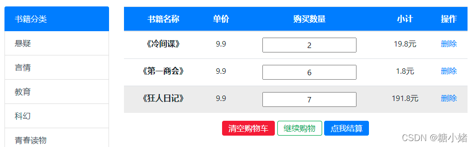
同样自带鼠标移上事件!!
三、案例3:实现购物车页面订单信息
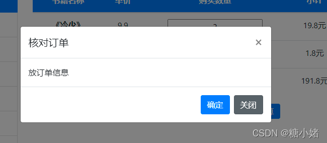
主要用于组件:模态框-Modal
代码如下:
HTML:
<body >
<!-- 模态框的html代码建议放在body下面 -->
<!-- modal-dialog-centered 让modal-dialog(黑灰透明遮罩)居中 -->
<!-- Modal -->
<div class="modal fade" id="exampleModal" tabindex="-1" aria-labelledby="exampleModalLabel" aria-hidden="true">
<div class="modal-dialog modal-dialog-centered">
<div class="modal-content">
<div class="modal-header">
<h5 class="modal-title" id="exampleModalLabel">核对订单</h5>
<button type="button" class="close" data-dismiss="modal" aria-label="Close">
<span aria-hidden="true">×</span>
</button>
</div>
<div class="modal-body">
放订单信息
</div>
<div class="modal-footer">
<button type="button" class="btn btn-primary">确定</button>
<button type="button" class="btn btn-secondary" data-dismiss="modal">关闭</button>
</div>
</div>
</div>
</div>
<!-- 导航条组件 -->
<nav class="navbar navbar-expand-lg navbar-light bg-light">
<!-- 改动容器 -->
<div class="container"><!-- 用来是想两侧留白 -->
<a class="navbar-brand" href="#">您好,欢迎来到小虎的家</a>
<button class="navbar-toggler" type="button" data-toggle="collapse" data-target="#navbarNav" aria-controls="navbarNav" aria-expanded="false" aria-label="Toggle navigation">
<span class="navbar-toggler-icon"></span>
</button>
<div class="collapse navbar-collapse" id="navbarNav">
<ul class="navbar-nav">
<li class="nav-item active">
<a class="nav-link" href="#">首页 <span class="sr-only">(current)</span></a>
</li>
<li class="nav-item">
<a class="nav-link" href="#">登录</a>
</li>
<li class="nav-item">
<a class="nav-link" href="#">注册</a>
</li>
<li class="nav-item">
<a class="nav-link ">我的购物车</a><!--a class="nav-link disabled" disabled 禁用 -->
</li>
</ul>
</div>
</div>
</nav>
<!-- 思路:
第一行:搜索区域
第二行:
左3 书书籍分类
右9
上为轮播图
下位新书上架以及热门书籍
第三行:
-->
<div class="container">
<!-- 第一行 -->
<div class="ss">
<div class="col">
<form>
<div class="form-group">
<!-- 输入框组-->
<div class="input-group mb-3">
<input type="text" class="form-control" placeholder="书籍名称" aria-label="Recipient's username" aria-describedby="button-addon2">
<div class="input-group-append">
<button class="btn btn-primary" type="button" id="button-addon2">查询</button>
</div>
</div>
</div>
</form>
</div>
</div>
<!-- 第二行 -->
<div class="row">
<div class="col-3">
<!-- 书籍分类 -->
<div class="list-group">
<a href="#" class="list-group-item list-group-item-action active" aria-current="true">
书籍分类
</a>
<a href="#" class="list-group-item list-group-item-action">悬疑</a>
<a href="#" class="list-group-item list-group-item-action">言情</a>
<a href="#" class="list-group-item list-group-item-action">教育</a>
<a href="#" class="list-group-item list-group-item-action">科幻</a>
<a href="#" class="list-group-item list-group-item-action">青春读物</a>
<a href="#" class="list-group-item list-group-item-action">儿童读物</a>
<a href="#" class="list-group-item list-group-item-action" >二次元 </a>
<a href="#" class="list-group-item list-group-item-action">历史文学</a>
<a href="#" class="list-group-item list-group-item-action">武侠</a>
<a href="#" class="list-group-item list-group-item-action">都市</a>
<a href="#" class="list-group-item list-group-item-action disabled">军事</a>
</div>
</div>
<div class="col-9">
<!-- 右9 -->
<table class="table table-hover">
<thead>
<tr class="bg-primary">
<th scope="col">书籍名称</th>
<th scope="col">单价</th>
<th scope="col">购买数量</th>
<th scope="col">小计</th>
<th scope="col">操作</th>
</tr>
</thead>
<tbody>
<tr>
<th scope="row">《冷间谍》</th>
<td>9.9</td>
<td><input value="2"></td>
<td>19.8元</td>
<td><a href="#">删除</td>
</tr>
<tr>
<th scope="row">《第一商会》</th>
<td>9.9</td>
<td><input value="6"></td>
<td>1.8元</td>
<td><a href="#">删除</td>
</tr>
<tr>
<th scope="row">《狂人日记》</th>
<td>9.9</td>
<td><input value="7"></td>
<td>191.8元</td>
<td><a href="#">删除</td>
</tr>
</tbody>
</table>
<p class="yyy">
<button class="btn btn-danger">清空购物车</button>
<button class="btn btn-outline-success">继续购物</button>
<button class="btn btn-primary" data-toggle="modal" data-target="#exampleModal">点我结算</button>
</p>
</div>
</div>
</div>
</div>
<!-- 引入jQuery的类库 -->
<script src="js/jquery-3.3.1.js" type="text/javascript" charset="utf-8"></script>
<!-- 引入Bootstrap的类库-->
<script src="js/bootstrap.js" type="text/javascript" charset="utf-8"></script>
</body>
样式:
<style type="text/css">
	.navbar-collapse{
		flex-grow: 0;/*在固定容器中 1代表弹性扩大占用父容器剩余空间 设置为0表示不占用 */
	}
	.ss{
		background-color: #BDC1C4;/* 背景颜色 */
		height: 100px;/* 高度 */
		margin-top: 20px;/* 上间距  */
	}
	.form-group{
		width: 300px;/* 宽度 */
		margin-top: 31px;/* 上间距
		margin-left: auto; /* 左间距 自适应 */
		margin-right: auto;/* 右间距 */
	}

	.list-group,.table{
		margin-top: 30px;/* 上间距 */
	}
	.table-hover thead{
		color:white
	}
	.table-hover tr,.table-hover tr input{
		text-align: center;/* 让文字内容水平居中 */
	}
	/* 按钮居中 */
	.yyy{
		text-align: center;/* 让按钮居中 */
	}
	/* 按钮 */
	.yyy button{
		height: 30px;
		line-height: 10px;
	}


	/*  data-toggle="modal" 点击这个按钮呈现模态效果 */
	/* data-target="#exampleModal"   target 目标  让id为exampleModal的模态框出来*/
</style>
效果如下:(点击结算弹出)
四、案例4:图标组件的使用
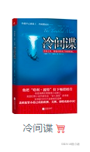
扩展内容-图标
要下载:

代码如下:
HTML:
<div class="col">
<figure class="figure">
<img src="./img/img/9.png" class="figure-img img-fluid rounded" alt="...">
<figcaption class="figure-caption text-right">冷间谍 <i class="bi bi-cart4 text-danger"></i></figcaption>
</figure>
</div>
样式:
<style type="text/css">
.navbar-collapse{
	flex-grow: 0;/*在固定容器中 1代表弹性扩大占用父容器剩余空间 设置为0表示不占用 */
}
.ss{
	background-color: #BDC1C4;/* 背景颜色 */
	height: 100px;/* 高度 */
	margin-top: 20px;/* 上间距  */
}
.form-group{
	width: 300px;/* 宽度 */
	margin-top: 31px;/* 上间距
	margin-left: auto; /* 左间距 自适应 */
	margin-right: auto;/* 右间距 */
}
/* 轮播图 */
#carouselExampleIndicators{
	margin-top:30px ;/* 上间距 */

}
/* 画像、文字水平居中 */
.figure{
	text-align: center;
	margin-top: 20px;
	}

	/* 书籍分类上间距 */

	.list-group{
		margin-top: 20px;
	}
	/* 轮播图 指示灯样式-背景颜色 */
	.carousel-indicators li{
		background-color: black;
	}
		/* 新书上架、热门书籍样式 */
	.xxx{
		background-image: url(img/title_bj.png);
		background-repeat: no-repeat;
		color: white;/* 字体颜色 */
		margin-top: 20px;/* 外上间距 */
		font-size: 20px;/* 体大小 */
		padding-left: 15px;/* 内左间距 */
	}
</style>
效果如下:
五、熟悉其他的(页面内容-组件)的效果
折叠 滚动监听 下拉菜单 分页
导航-面包屑导航 等等(需要留下印象)
版权声明:本文为m0_61148761原创文章,遵循CC 4.0 BY-SA版权协议,转载请附上原文出处链接和本声明。