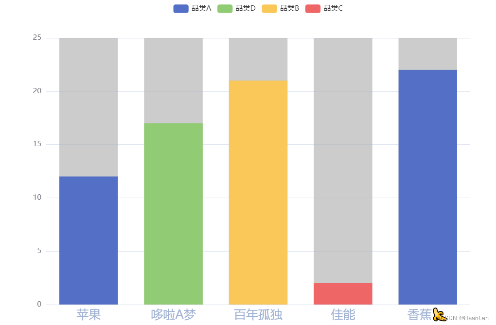
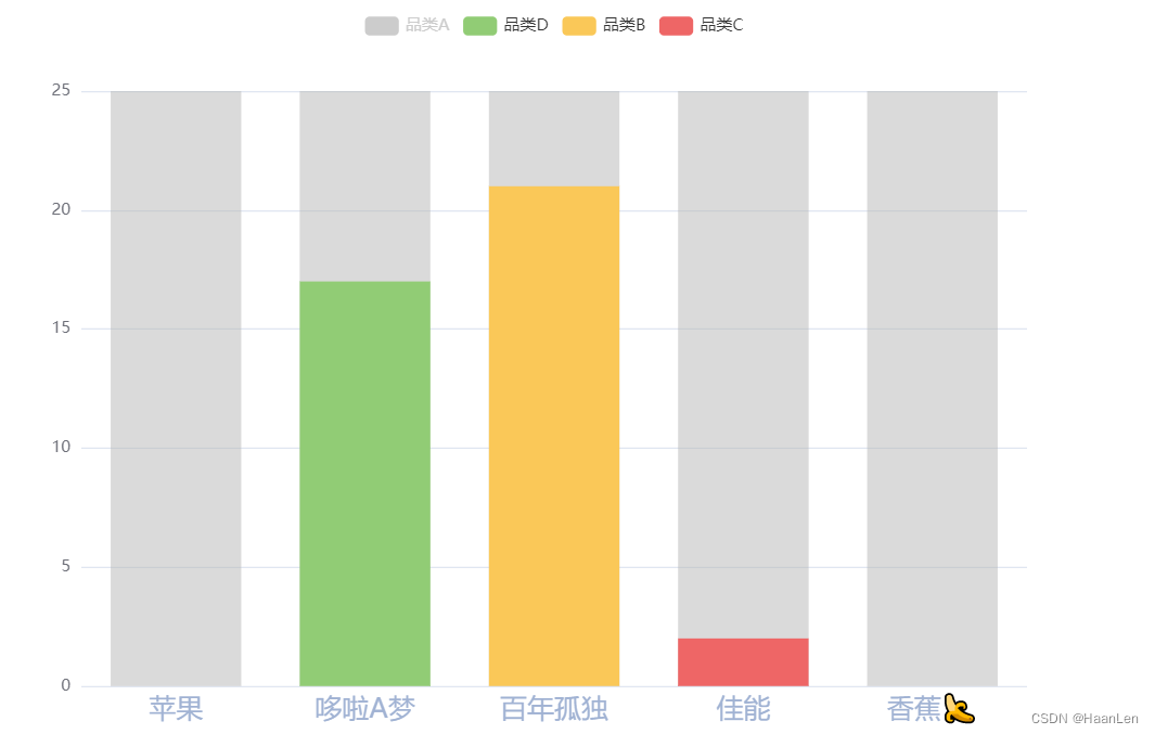
legend只能使用series(系列名称)来展示;
每个类别中显示多条数据,然后只有堆叠柱状图实现,当需要的显示value,其余的利用null填充。
点击类别可控制多条同一品类的柱条的显示与隐藏
option = {
  legend: {
    show: true,
    formatter: function (name) {
      const list = {
        test_1: '品类A',
        test_2: '品类B',
        test_3: '品类C',
        test_4: '品类D'
      };
      return list[name];
    }
  },
  xAxis: [
    {
      type: 'category',
      data: ['苹果', '哆啦A梦', '百年孤独', '佳能', '香蕉?'],
      axisTick: {
        // 轴刻度
        show: false
      },
      axisLabel: {
        // 轴文字
        color: '#A0B2D3',
        fontSize: 20
      },
      axisLine: {
        // 轴线
        show: false
      }
    }
  ],
  yAxis: {
    type: 'value'
  },
  series: [
    {
      name: 'test_1',
      data: [12, null, null, null, null],
      type: 'bar',
      stack: 'Mon',
      showBackground: true,
      backgroundStyle: {
        color: 'rgba(180, 180, 180, 0.2)'
      }
    },
    {
      name: 'test_4',
      data: [null, 17, null, null, null],
      type: 'bar',
      stack: 'Mon',
      showBackground: true,
      backgroundStyle: {
        color: 'rgba(180, 180, 180, 0.2)'
      }
    },
    {
      name: 'test_2',
      data: [0, 0, 21, null, null],
      type: 'bar',
      stack: 'Mon',
      showBackground: true,
      backgroundStyle: {
        color: 'rgba(180, 180, 180, 0.2)'
      }
    },
    {
      name: 'test_3',
      data: [0, 0, 0, 2, 0],
      type: 'bar',
      stack: 'Mon',
      showBackground: true,
      backgroundStyle: {
        color: 'rgba(180, 180, 180, 0.2)'
      }
    },
    {
      name: 'test_1',
      data: [0, 0, 0, 0, 22],
      type: 'bar',
      stack: 'Mon',
      showBackground: true,
      backgroundStyle: {
        color: 'rgba(180, 180, 180, 0.2)'
      }
    }
  ]
};
版权声明:本文为weixin_40119412原创文章,遵循CC 4.0 BY-SA版权协议,转载请附上原文出处链接和本声明。