需求: 实现list从上到下排列,一列三行;余下的另起一列。
效果直接运行html
<!DOCTYPE html>
<html>

<head>
    <meta charset="UTF-8">
    <title>多列布局</title>
    <style>
        .container {
            writing-mode: vertical-lr;
            /* 内容从上到下垂直排列,下一垂直行位于上一行右侧 */
            height: 180px;
            /* 必须控制容器高度,宽度自适应 */
            font-size: 0;
            /* 子元素为行内块元素,需要设置父元素font-size为0,否则子元素会有间隙 */
            background-color: lightcyan;
            margin: 0;
            padding: 0;
        }

        .container li {
            display: inline-block;
            /*必须设置为行内块,否则会水平排列*/
            width: 100px;
            height: 50px;
            background-color: bisque;
            text-align: center;
            line-height: 50px;
            writing-mode: horizontal-tb;
            /* 这里必须改成水平,否则文字显示方向不对*/
            margin: 0 10px 10px 0;
            color: #000;
            font-size: 40px;
            /* 必须重设字体大小,否则font-size为0 */
        }

        .flex {
            display: flex;
            flex-direction: column;
            background-color: pink;
            margin: 50px 0 0;
            padding: 0;
            height: 180px; /* 必须设置高度, 否则就垂直一列排完了 */
            flex-wrap: wrap;
            width: 330px; /* (100+10)*3  需要设置容器宽度, 否则子元素与子元素水平防线的间距不对(对间距无要求可忽略) */
        }

        .flex li {
            width: 100px;
            height: 50px;
            background-color: bisque;
            text-align: center;
            line-height: 50px;
            margin: 0  0 10px 0; /* margin-left,margin-right设置无效*/
            color: #000;
            font-size: 40px;
            list-style: none
        }
    </style>
</head>

<body>
    <ul class="container">
        <li>1</li>
        <li>2</li>
        <li>3</li>
        <li>4</li>
        <li>5</li>
        <li>6</li>
        <li>7</li>
        <li>8</li>
    </ul>

    <ul class="flex">
        <li>1</li>
        <li>2</li>
        <li>3</li>
        <li>4</li>
        <li>5</li>
        <li>6</li>
        <li>7</li>
        <li>8</li>
    </ul>
</body>

</html>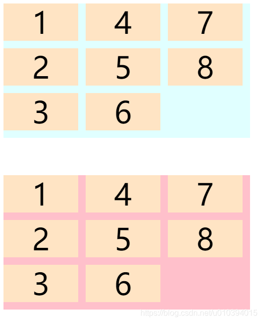
版权声明:本文为u010394015原创文章,遵循CC 4.0 BY-SA版权协议,转载请附上原文出处链接和本声明。