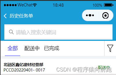
在项目中合理的采用webapp的组件库能够很好的提高我们的开发效率,我们也应该合理的进行运用.
首先我们是对手机的状态栏的代码进行了自定义。
其次就是采用组件库的van-sticky进行吸顶距离计算
最后右侧的图标和tab采用的是flex进行布局,因为vant的tab不能很好的实现效果,主要是样式不好调,所以我们得重新书写代码。完成对应的效果图。
<nav-bar-2 navTitle="历史任务单" isShow="{{true}}"></nav-bar-2>

<view style="height:40px; padding: 5px 10px;"></view>
<view class="search-bar-area" style="margin-top:{{navigationBarAndStatusBarHeight}}px;">
  <view class="search-bar">
    <van-search value="{{ value }}" shape="round" background="#1e90ff" placeholder="请输入搜索关键词" />
  </view>
</view>

<view style="margin-top: {{navigationBarAndStatusBarHeight}}px;">

  <van-sticky offset-top="{{ navigationBarAndStatusBarHeight+40+10 }}">
    <view class="fx">
      <view class="navBar">
        <block wx:for="{{tabs}}" wx:key="item" class="navbaritem">
          <view id="{{index}}" class="navItem {{tabIndex == index ? 'active' : '' }}" bindtap="onTabClick">
            <view class="navItemTitle">{{item}}</view>
          </view>
        </block>
      </view>
      <view class="saixuan">
        <van-icon name="filter-o" style="font-size: 60rpx;"/>
      </view>

    </view>


  </van-sticky>

  <!-- 内容区域 -->
  <view class="content_wrapper">
    <!-- 第一个tab -->
    <block wx:if="{{tabIndex == 0}}">
      <view class="top1">
        <view class="zhengti">
          <view class="fc">
            <text class="fontsize">hello鑫亿建材经营部</text>
            <text>PCCD20220401- 0017</text>
          </view>
          <view>
            <text class="font">配送中</text>
          </view>
        </view>

        <view class="neibu">
          <view class="fx">
            <view class="fontsize size">冀东42.5R水泥</view>
            <view class="fontsize size">500.54t</view>
          </view>

          <view>开始供货:2022-07-27 15:30:30</view>

          <view class="fx">
            <view>采购人:李勇</view>
            <view>2022-07-27 15:30:30</view>
          </view>

        </view>

        <view class="neibu fx">
          <view class="bar1">
            <view class="fontsize size">0.00 t / 0车</view>
            <view class="bar">
              <view class="barmiddle">0%</view>
            </view>
          </view>

          <view class="fx1">
            <view class="fontsize">收料单</view>
            <van-icon name="arrow" />
          </view>
        </view>

      </view>
    </block>

    <!-- 第二个tab -->
    <block wx:if="{{tabIndex == 1}}">
      <view>活动页面</view>
    </block>

    <!-- 第三个tab -->
    <block wx:if="{{tabIndex == 2}}">
      <view>附近页面</view>
    </block>
  </view>
</view>
下面是css样式
.navBar {
  display: flex;
  justify-content: flex-start;
  width: 100rpx;
  height: 100rpx;
  position: relative;
  background: #fff;
  width: 90%;
  text-align: center;
}

.navItem {
  display: flex;
  align-items: center;
  justify-content: center;
  border-bottom: 4rpx solid transparent;
  margin-left: 30rpx;
}

.active {
  color: blue;
  border-bottom: 2rpx solid blue;
}

.content_wrapper{
  flex: 1;
}

.navItemTitle{
  width: 100rpx;
  font-size: 35rpx;
}
page{
  background-color: rgb(240, 244, 247);
}

.fixed{
  position: fixed;
  width: 90%;
  z-index: 100;
}

.head{
  height: 40px;
  background-color: rgb(25, 158, 216);
  padding: 20rpx;
}


page{
  background-color: rgb(240, 244, 247);
}
.fx{
   display: flex;
   justify-content: space-between;
}
.fxwidth{
  width: 90%;
}
.saixuan{
  width: 10%;
  height: 100rpx;
  background-color: #fff;
  display: flex;
  justify-content: center;
  align-items: center;
  border-left: 2rpx solid #ccc;
}


.van-tab{
  flex: none!important;
  padding-left: 30rpx !important;
}
.van-tabs__line{
  width: 40rpx!important;
}
.top{
  margin-top: 20rpx;
}
.top1{
  margin-top: 20rpx;
  background-color: white;
}

.zhengti{
  padding-left: 20rpx;
  padding-top: 20rpx;
  padding-right: 40rpx;
  padding-bottom: 10rpx;
  background-color: #fff;
  display: flex;
  justify-content: space-between;
  align-items: center;
  border-bottom: 1px solid rgb(163, 153, 153);
}
.fc{
  display: flex;
  flex-direction: column;
}

.font{
  color: green;
}
.fontsize{
  font-weight: 700;
}
.neibu{
  padding-top: 10rpx;
  padding-left: 20rpx;
  padding-right: 20rpx;
  padding-bottom: 20rpx;
}
.size{
  font-size: 35rpx;
}

.bar{
  height: 40rpx;
  background-color: #ccc;
  border-radius: 20rpx;
  position: relative;
}
.bar1{
  width: 80%;
}
.fx1{
  display: flex;
  align-items: center;
  justify-content: space-between;
}

.barmiddle{
  position: absolute;
  left: 50%;
}

.search-bar-area{
  position: fixed;
  width: 100%;
  z-index: 98;
  top:0;
  left:0;
}
.search-bar{
  /*bar固定高度40px*/
  height: 40px;
  padding: 5px 10px;
  background:  rgb(25, 158, 216);
}
import {
  useGetNavBarInfo
} from "../../hooks/index";

Page({
  /**
   * 页面的初始数据
   * tabs:tab栏的栏目名
   * tabIndex:当前tab所在的index
   */
  data: {
    tabs: ['全部', '配送中', '已完成'],
    tabIndex: 0,
    navigationBarAndStatusBarHeight:''
  },

  // 处理点击tab
  onTabClick(e) {
    let id = e.currentTarget.id;
    this.setData({
      tabIndex: id,
    })
  },

  async onLoad(options) {
    let that = this;
    let {
        navigationBarAndStatusBarHeight
    } = await useGetNavBarInfo();
    this.setData({
        navigationBarAndStatusBarHeight,
        screenHeight: wx.getStorageSync('screenHeight')
    });
  },
})
引入对应的组件库,自定义状态栏
{
“navigationStyle”: “custom”,
“usingComponents”: {
“nav-bar-2”: “/base-ui/nav-bar-2/index”,
“van-search”: “@vant/weapp/search/index”,
“van-tab”: “@vant/weapp/tab/index”,
“van-tabs”: “@vant/weapp/tabs/index”,
“van-icon”: “@vant/weapp/icon/index”,
“van-sticky”: “@vant/weapp/sticky/index”
}
}
滑动切换
 <view class="swiper-tab">
      <view class="flex">
        <view class="swiper-tab-item {{currentTab == 0 ? 'swiper-tab-item-active' : ''}}" data-current="0" bindtap="changeSwiperTab">详情信息</view>
        <view class="swiper-tab-item {{currentTab == 1 ? 'swiper-tab-item-active' : ''}}" data-current="1" bindtap="changeSwiperTab">发货记录</view>
      </view>
      <view class="flex" style="align-items: center;justify-content: center;">
        <van-icon name="plus" style="color: #ccc;"/>
        <view class="padding-right-10" style="color: rgb(16, 83, 230);">复制新增</view>
      </view>


    </view>

    <swiper current="{{currentTab}}" duration="300" bindchange="swiperTab">
      <swiper-item>
        页面一内容
      </swiper-item>
      <swiper-item>
        页面二内容
      </swiper-item>
    </swiper>
.swiper-tab {
  background-color: #fff;
  padding-top: 10rpx;
  display: flex;
  justify-content: space-between;
}
.swiper-tab-item {
  padding: 15rpx;
  margin-left: 20rpx;
}
.swiper-tab-item-active {
  border-bottom: rgb(8, 70, 240) 2px solid;
  color: rgb(8, 70, 240) ;
}
  changeSwiperTab: function (e) {
    var _this = this;
    if (this.data.currentTab === e.target.dataset.current) {
      return false;
    } else {
      _this.setData({
        currentTab: e.target.dataset.current
      })
    }
  },
  /**
   * 滑动选项卡切换
   */
  swiperTab: function (e) {
    var _this = this;
    _this.setData({
      currentTab: e.detail.current
    })
  },
版权声明:本文为qq_46199553原创文章,遵循CC 4.0 BY-SA版权协议,转载请附上原文出处链接和本声明。