标题 3D 相册自动旋转+流星雨背景+轮播图
百度网盘
链接:https://pan.baidu.com/s/1ER9g74XdnurAr053RnoVsA
提取码:love
效果图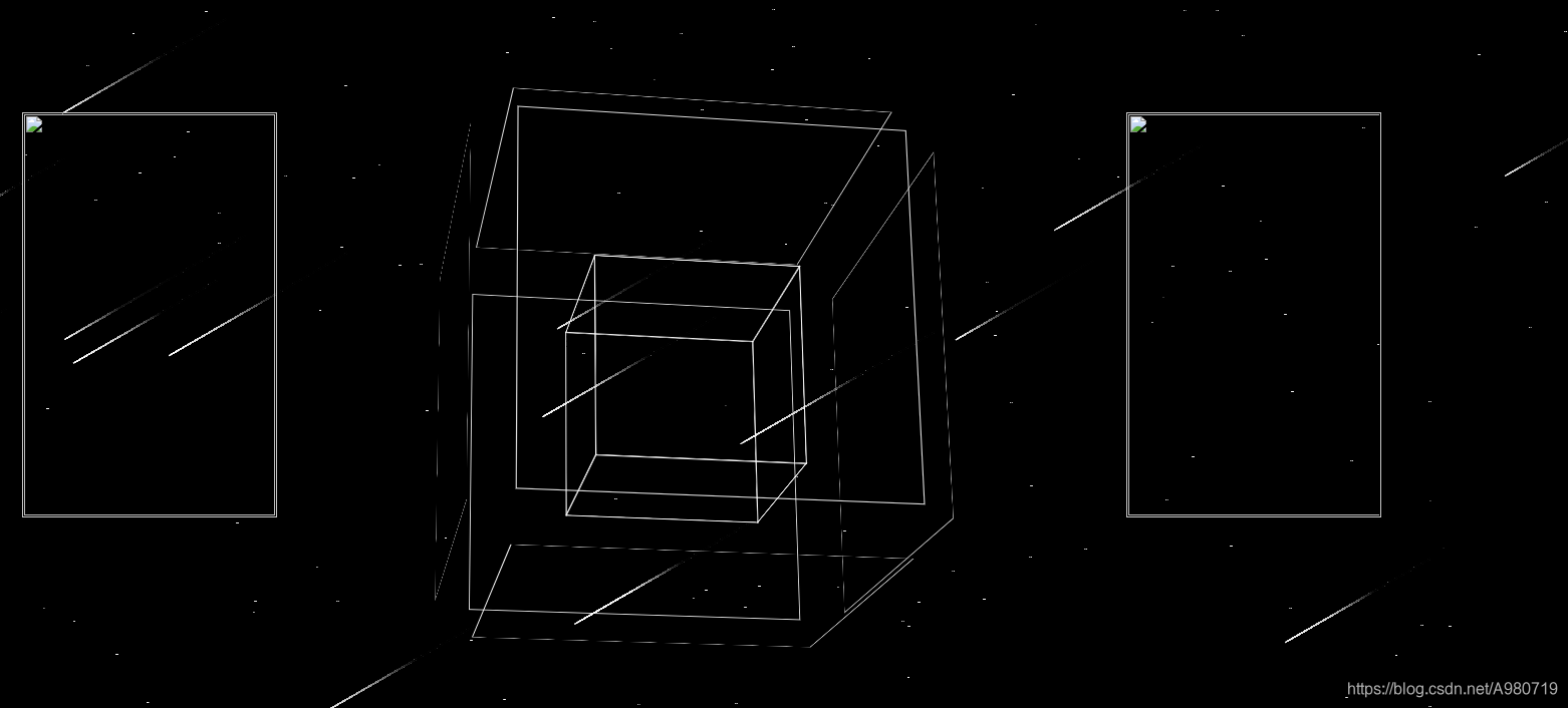
<!--  -->
<!DOCTYPE html>
<html lang="en">
<head>
    <meta charset="UTF-8">
    <meta name="viewport" content="width=device-width, initial-scale=1.0">
    <meta http-equiv="X-UA-Compatible" content="ie=edge">
    <!-- <embed src="1.mp3" hidden="true" autostart="true" loop="true"> -->
    <title>相册</title>
    <style>
    *{ padding:0; margin:0; list-style:none; border:0;}
    html,body #stars .abc{
            margin: 0;
            padding: 0;
        }
        body,#stars .abc{
            width: 100%;
            height: 100%;
             perspective: 1000px;
            background-color:black;
        }
        .abc
        {
            position:absolute;
             /* overflow: hidden;*/
             margin:20px auto;
        }
         #stars

        {
          position: absolute;

          overflow: hidden;

        }
    .all{
            width:250px;
            height:400px;
            padding:1px;
            border:1px solid #ccc;
            margin:120px 0px 0px 35px;
            position:relative;
            float :left;
             background-size:contain;
        }
        .screen{
          width:250px;
            height:400px;
            overflow:hidden;
            position:relative;
        }
        .screen li{ width:250px;height:400px; overflow:hidden; float:left;}
        .screen ul{ position:absolute; left:0; top:0px; width:3000px;}
        .all1{
           width:250px;
           height:400px;
            padding:1px;
            border:1px solid #ccc;
            margin:120px auto;
            position:relative;
            left:300px;
            float :right;
            background-size:contain;
        }
        .screen1{
           width:250px;
           height:400px;
             padding:0px;
            overflow:hidden;
            position:relative;
        }
        .screen1 li{ width:250px;height:400px;overflow:hidden; float:left;}
        .screen1 ul{ position:absolute; left:-10; top:0px; width:3000px;}

         .album
         {
            width: 546px;
            height: 546px;
         margin: 300px 0px 0px 0px;
         }
        .album,#stars{
            perspective: 2000px;
        }
        .album .photos{
            position:relative ;
            width: 246px;
            height: 246px;
            margin: 0px 300px;
            transform-style: preserve-3d; /*设置3d风格*/
            transform: rotateX(-10deg) rotateY(0deg);
        }
        .album .photos .photo{
            display: inline-block;
            position: absolute;
            width: 200px;
            height: 200px;
            border: 1px solid #fff;
            /*background-color: ;*/
            background-size:contain;
            transition: 2s;
        }
</style>
</head>
<body >
<div class="abc" >
<!-- <p> <marquee style="background-color: white "> 时光 </marquee></p> -->
<canvas id="stars"></canvas>
<div class="all" id='all'>
    <div class="screen" id="screen">
        <ul id="ul">
            <li><img src="1.1.jpg" width="250" height="400" /></li>
            <li><img src="1.2.jpg" width="250" height="400"/></li>
            <li><img src="1.3.jpg" width="250" height="400" /></li>
            <li><img src="1.4.jpg" width="250" height="400"/></li>
            <li><img src="1.5.jpg" width="250" height="400"/></li>
        </ul>
    </div>
</div>
    <div class="album " style="float: left"  >
        <div class="photos" >
            <div class="photo" style="background-image:url(1.jpg)" >1</div>
            <div class="photo" style="background-image:url(2.jpg)" >2</div>
            <div class="photo" style="background-image:url(3.jpg)" >3</div>
            <div class="photo" style="background-image:url(4.jpg)" >4</div>
            <div class="photo" style="background-image:url(5.jpg)" >5</div>
            <div class="photo" style="background-image:url(6.jpg)" >6</div>
            <div class="photo" style="background-image:url(7.jpg)" >7</div>
            <div class="photo" style="background-image:url(8.jpg)" >8</div>
            <div class="photo" style="background-image:url(9.jpg)" >9</div>
            <div class="photo" style="background-image:url(10.jpg)">10</div>
            <div class="photo" style="background-image:url(11.jpg)">11</div>
            <div class="photo" style="background-image:url(12.jpg)">12</div>
        </div>
    </div>
     <div class="all1" id='all1'>
     <div class="screen1" id="screen1">
        <ul id="ull1">
            <li><img src="1.jpg" width="270" height="400" /></li>
            <li><img src="2.jpg" width="270" height="400" /></li>
            <li><img src="3.jpg" width="270" height="400"/></li>
            <li><img src="4.jpg" width="270" height="400"/></li>
            <li><img src="5.jpg" width="370" height="450" /></li>
        </ul>
    </div>
</div>
</div>
<p> <marquee style="background-color: white "> ***************</marquee></p>   //跑马灯
</body>
<script>
 var context;
var arr = new Array();
var starCount = 800;
var rains = new Array();
var rainCount =20;
//初始化画布及context
function init(){
//获取canvas
var stars = document.getElementById("stars");
windowWidth = window.innerWidth; //当前的窗口的高度
stars.width=windowWidth;
stars.height=window.innerHeight;
//获取context
context = stars.getContext("2d");
}
//创建一个星星对象
var Star = function (){
this.x = windowWidth * Math.random();//横坐标
this.y = 5000 * Math.random();//纵坐标
this.text=".";//文本
this.color = "white";//颜色
//产生随机颜色
this.getColor=function(){
var _r = Math.random();
if(_r<0.5){
this.color = "#333";
}else{
this.color = "white";
}
}
//初始化
this.init=function(){
this.getColor();
}
//绘制
this.draw=function(){
context.fillStyle=this.color;
context.fillText(this.text,this.x,this.y);
}
}
function drawMoon(){
var moon = new Image();
context.drawImage(moon,-5,-10);
}
//页面加载的时候
//星星闪起来
function playStars(){
for (var n = 0; n < starCount; n++){
arr[n].getColor();
arr[n].draw();
}
setTimeout("playStars()",100);
}

/*流星雨开始*/
var MeteorRain = function(){
this.x = -1;
this.y = -1;
this.length = -1;//长度
this.angle = 30; //倾斜角度
this.width = -1;//宽度
this.height = -1;//高度
this.speed = 1;//速度
this.offset_x = -1;//横轴移动偏移量
this.offset_y = -1;//纵轴移动偏移量
this.alpha = 1; //透明度
this.color1 = "";//流星的色彩
this.color2 = ""; //流星的色彩
/****************初始化函数********************/
this.init = function () //初始化
{
this.getPos();
this.alpha = 1;//透明度
this.getRandomColor();
//最小长度,最大长度
var x = Math.random() * 80 + 150;
this.length = Math.ceil(x);
// x = Math.random()*10+30;
this.angle = 30; //流星倾斜角
x = Math.random()+0.5;
this.speed = Math.ceil(x); //流星的速度
var cos = Math.cos(this.angle*3.14/180);
var sin = Math.sin(this.angle*3.14/180) ;
this.width = this.length*cos ; //流星所占宽度
this.height = this.length*sin ;//流星所占高度
this.offset_x = this.speed*cos ;
this.offset_y = this.speed*sin;
}
/**************获取随机颜色函数*****************/
this.getRandomColor = function (){
var a = Math.ceil(255-240* Math.random());
//中段颜色
this.color1 = "rgba("+a+","+a+","+a+",1)";
//结束颜色
this.color2 = "black";
}
/***************重新计算流星坐标的函数******************/
this.countPos = function ()//
{
//往左下移动,x减少,y增加
this.x = this.x - this.offset_x;
this.y = this.y + this.offset_y;
}
/*****************获取随机坐标的函数*****************/
this.getPos = function () //
{
//横坐标200--1200
this.x = Math.random() * window.innerWidth; //窗口高度
//纵坐标小于600
this.y = Math.random() * window.innerHeight; //窗口宽度
}
/****绘制流星***************************/
this.draw = function () //绘制一个流星的函数
{
context.save();
context.beginPath();
context.lineWidth = 1; //宽度
context.globalAlpha = this.alpha; //设置透明度
//创建横向渐变颜色,起点坐标至终点坐标
var line = context.createLinearGradient(this.x, this.y,
this.x + this.width,
this.y - this.height);
//分段设置颜色
line.addColorStop(0, "white");
line.addColorStop(0.3, this.color1);
line.addColorStop(0.6, this.color2);
context.strokeStyle = line;
//起点
context.moveTo(this.x, this.y);
//终点
context.lineTo(this.x + this.width, this.y - this.height);
context.closePath();
context.stroke();
context.restore();
}
this.move = function(){
//清空流星像素
var x = this.x+this.width-this.offset_x;
var y = this.y-this.height;
context.clearRect(x-3,y-3,this.offset_x+5,this.offset_y+5);
// context.strokeStyle="red";
// context.strokeRect(x,y-1,this.offset_x+1,this.offset_y+1);
//重新计算位置,往左下移动
this.countPos();
//透明度增加
this.alpha -= 0.002;
//重绘
this.draw();
}
}
//绘制流星
function playRains(){

for (var n = 0; n < rainCount; n++){
var rain = rains[n];
rain.move();//移动
if(rain.y>window.innerHeight){//超出界限后重来
context.clearRect(rain.x,rain.y-rain.height,rain.width,rain.height);
rains[n] = new MeteorRain();
rains[n].init();
}
}
setTimeout("playRains()",2);
}
    var embed=document.querySelector("embed");
    var photos = document.querySelector(".photos");
    var photo = photos.querySelectorAll(".photo");
     window.onload = function(){
          var screen1 = document.getElementById("screen1");
            var ul1 = screen1.children[0];
            var div1 = screen1.children[2];
            var imgWidth1 = screen1.offsetWidth;
            var tempLi1 = ul1.children[0].cloneNode(true);
            ul1.appendChild(tempLi1);
            var key1 = 0;
            var square1 = 0;
            var timer1 = setInterval(autoPlay1, 2000);

            function autoPlay1() {
                key1++;
                if(key1 > ul1.children.length - 1) {
                    ul1.style.left = 0;
                    key1 = 1;
                }
                animate1(ul1, -key1* imgWidth1);
                square1++;
                if(square1 > 4) {
                    square1 = 0;
                }
            }
              function animate1(ele,target){
                    clearInterval(ele.timer);
                    var speed = target>ele.offsetLeft?10:-10;
                    ele.timer = setInterval(function () {
                        var val = target - ele.offsetLeft;
                        ele.style.left = ele.offsetLeft + speed + "px";
                        if(Math.abs(val)<Math.abs(speed)){
                            ele.style.left = target + "px";
                            clearInterval(ele.timer1);
                        }
                    },10)
            }
       var screen = document.getElementById("screen");
            var ul = screen.children[0];
            var div = screen.children[2];
            var imgWidth = screen.offsetWidth;
            var tempLi = ul.children[0].cloneNode(true);
            ul.appendChild(tempLi);
            var key = 0;
            var square = 0;
            var timer = setInterval(autoPlay, 2000);
            function autoPlay() {
                key++;
                if(key > ul.children.length - 1) {
                    ul.style.left = 0;
                    key = 1;
                }
                animate(ul, -key * imgWidth);
                square++;
                if(square > 4) {
                    square = 0;
                }
            }
            function animate(ele,target){
                    clearInterval(ele.timer);
                    var speed = target>ele.offsetLeft?10:-10;
                    ele.timer = setInterval(function () {
                        var val = target - ele.offsetLeft;
                        ele.style.left = ele.offsetLeft + speed + "px";
                        if(Math.abs(val)<Math.abs(speed)){
                            ele.style.left = target + "px";
                            clearInterval(ele.timer);
                        }
                    },10)
            }
        for(var i=0;i<4;i=i+1){
            photo[i].style.transform = "rotateY("+90*(i+1)+"deg) translateZ(100px)";
                  //这里需要明白   transform的用法
            photo[i+6].style.transform = "rotateY("+90*(i+1)+"deg) translateZ(100px)";
           }
             photo[4].style.transform = "rotateX("+90+"deg)  translateZ(100px)";
             photo[10].style.transform = "rotateX("+90+"deg) translateZ(100px)";
             photo[5].style.transform = "rotateX("+270+"deg)  translateZ(100px)";
             photo[11].style.transform = "rotateX("+270+"deg) translateZ(100px)";

	        kaishi= function(e){// 实现外层照片的变大功能
	       for(var i=0;i<4;i=i+1){
	        photo[i+6].style.transform = "rotateY("+90*(i+1)+"deg) translateZ(250px)";
	        photo[i+6].style.width="400px";
	        photo[i+6].style.height="400px";
	        photo[i+6].style.margin= "-110px -110px";
	        photo[i+6].style.opacity="0.85";
	           }
              photo[10].style.transform = "rotateX("+90+"deg) translateZ(250px)";
              photo[10].style.width="400px";
              photo[10].style.height="400px";
              photo[10].style.margin= "-110px -110px";
              photo[10].style.opacity="0.85";
              photo[11].style.transform = "rotateX("+270+"deg) translateZ(250px)";
              photo[11].style.width="400px";
              photo[11].style.height="400px";
              photo[11].style.margin= "-110px -110px";
              photo[10].style.opacity="0.85";//照片的透明度
             var t=0;

           show=function(){
               t++;
            photos.style.transform = "rotateX("+t*0.3+"deg) rotateY("+t*0.15+"deg)";

            }
             var t1=setInterval('show()',20);
}
init();
//画星星
for (var i=0;i<starCount;i++) {
var star = new Star();
star.init();
star.draw();
arr.push(star);
}
//画流星
for (var i=0;i<rainCount;i++) {
var rain = new MeteorRain();
rain.init();
rain.draw();
rains.push(rain);
}
drawMoon();//绘制月亮
playStars();//绘制闪动的星星
playRains();//绘制流星
}
 var t2=setTimeout('kaishi()',3000);
</script>
</html >
流星雨的相对位置容易出错
流星雨是借鉴的别人的
还遗留了一个问题 就是屏幕的自适应问题
版权声明:本文为A980719原创文章,遵循CC 4.0 BY-SA版权协议,转载请附上原文出处链接和本声明。