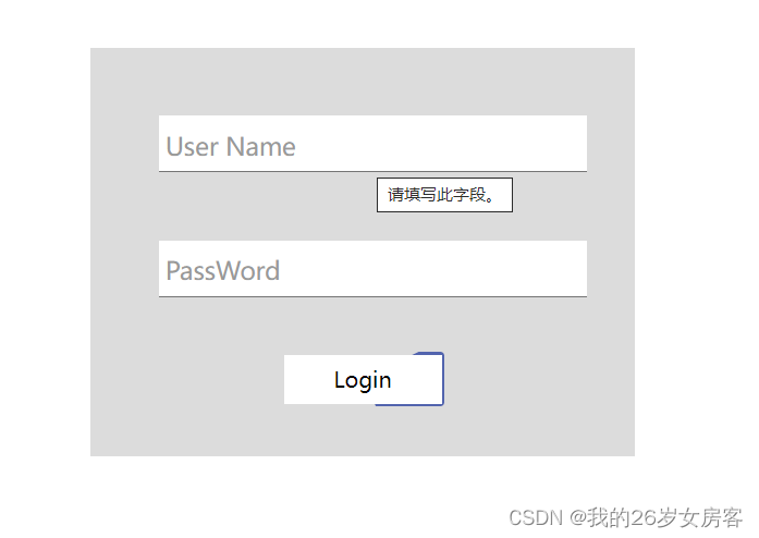
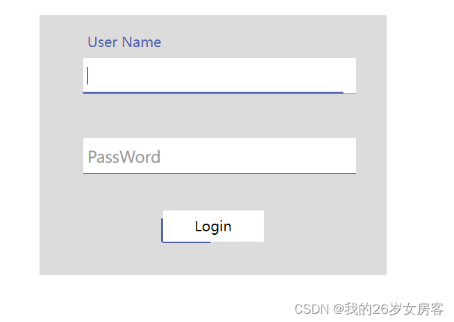
我们总是看见一些效果比较酷炫的登录页面,那么他们是怎么实现的呢?今天我就简单的写了一个,样式比较丑,别太在意,可以自己修改样式。
效果图:
html代码:
<!DOCTYPE html>
<html lang="en">
<head>
    <meta charset="UTF-8">
    <meta http-equiv="X-UA-Compatible" content="IE=edge">
    <meta name="viewport" content="width=device-width, initial-scale=1.0">
    <title>Document</title>
    <link rel="stylesheet" href="./login.css"></link>
</head>
<body>
    <div class="center">
        <div class="from-item">
            <input id="username" required type="text" />
            <span class="bar"></span>
            <label for="username">User Name</label>
        </div>
        <div class="from-item">
            <input id="password" required type="text" />
            <span class="bar"></span>
            <label for="password">PassWord</label>
        </div>
        <div class="btn">
            <p>Login</p>
        </div>
    </div>
</body>
</html>
css代码:
html,
body {
    height: 100%;
    width: 100%;
    display: flex;
    justify-content: center;
    align-items: center;
}

.center {
    width: 400px;
    height: 300px;
    position: absolute;
    background-color: gainsboro;
}

.from-item {
    position: relative;
    width: 300px;
    margin-top: 50px;
    margin-left: 50px;
}

.from-item input {
    font-size: 18px;
    padding: 10px 10px 10px 5px;
    display: block;
    width: 300px;
    border: none;
    outline: none;
    border-bottom: 1px solid #757575;
}

.from-item label {
    position: absolute;
    color: #999;
    font-size: 18px;
    transition: 0.4s ease;
    top: 10px;
    left: 5px;
}

.from-item .bar {
    position: absolute;
    width: 0;
    height: 2px;
    bottom: 0;
    left: 50%;
    transform: translate(-50%, -50%);
    background: #5264ae;
    transition: 0.4s ease;
}

.from-item input:focus~.bar {
    width: 100%;
}

.from-item input:valid~label,
.from-item input:focus~label {
    color: #5264ae;
    transform: translateY(-40px);
    font-size: 16px;
}

.btn {
    margin-top: 40px;
    width: 120px;
    height: 40px;
    margin-left: 35%;
    border-radius: 3px;
    display: flex;
    justify-content: center;
    align-items: center;
    position: relative;
    overflow: hidden;
}
.btn>p{
    z-index: 5;
}
.btn::before {
    content: '';
    background: #5264ae;
    position: absolute;
    height: 200%;
    width: 200%;
    border-radius: 3px;
    animation: border-line 3s infinite linear;
    z-index: 2;
    transform-origin: 0 0;
    top: 50%;
    left: 50%;
}

@keyframes border-line {
    to {
        transform: rotate(1turn);
    }
}

.btn::after {
    content: '';
    background: #fff;
    height: calc(100% - 4px);
    width: calc(100% - 4px);
    position: absolute;
    z-index: 3;
}版权声明:本文为qq_53897534原创文章,遵循CC 4.0 BY-SA版权协议,转载请附上原文出处链接和本声明。