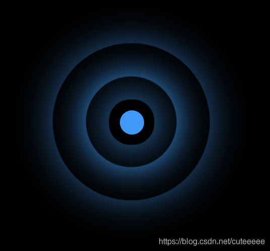
完整代码如下:
<!DOCTYPE html>
<html lang="en">

<head>
    <meta charset="UTF-8">
    <meta name="viewport" content="width=device-width, initial-scale=1.0">
    <title>热点图</title>
    <style>
        .box {
            position: relative;
            margin: 100px auto;
            width: 100px;
            height: 100px;
            background-color: #000;
        }

        .point {
            position: absolute;
            left: 50%;
            top: 50%;
            transform: translate(-50%, -50%);
            width: 8px;
            height: 8px;
            background-color: #0099ff;
            border-radius: 50%;
        }

        div[class^="pulse"] {
            position: absolute;
            left: 50%;
            top: 50%;
            transform: translate(-50%, -50%);
            width: 8px;
            height: 8px;
            border-radius: 50%;
            box-shadow: 0 0 12px #009dfd;
        }

        @keyframes pulse {
            0% {}
            70% {
                /* 不用scale是因为阴影也会被放大,不好看 */
                /* transform: scale(3); */
                width: 40px;
                height: 40px;
                opacity: 1;
            }
            100% {
                width: 70px;
                height: 70px;
                opacity: 0;
            }
        }

        .pulse1 {
            animation: pulse 1.2s linear infinite;
        }

        .pulse2 {
            animation: pulse 1.2s linear 0.4s infinite;
        }

        .pulse3 {
            animation: pulse 1.2s linear 0.8s infinite;
        }
    </style>
</head>

<body>
    <div class="box">
        <div class="point"></div>
        <div class="pulse1"></div>
        <div class="pulse2"></div>
        <div class="pulse3"></div>
    </div>
    <script>
    </script>
</body>

</html>
版权声明:本文为cuteeeee原创文章,遵循CC 4.0 BY-SA版权协议,转载请附上原文出处链接和本声明。