介绍
Material 组件库中提供了两种进度指示器:
LinearProgressIndicator和CircularProgressIndicator,它们都可以同时用于精确的进度指示和模糊的进度指示。精确进度通常用于任务进度可以计算和预估的情况,比如文件下载;而模糊进度则用户任务进度无法准确获得的情况,如下拉刷新,数据提交等。
LinearProgressIndicator和CircularProgressIndicator
常用属性
value表示当前的进度,取值范围为[0,1];
value为null时则指示器会执行一个循环动画(模糊进度);
value不为null时,指示器为一个具体进度的进度条backgroundColor指示器的背景色 valueColor指示器的进度条颜色,该值类型是
Animation<Color>,这允许我们对进度条的颜色也可以指定动画。如果我们想对进度条应用一种固定的颜色,此时我们可以通过
AlwaysStoppedAnimation来指定
CircularProgressIndicator
strokeWidth表示圆形进度条的粗细
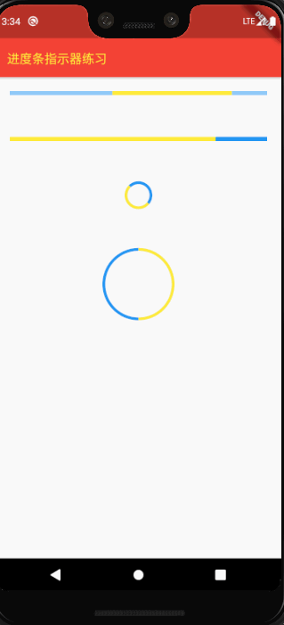
demo
import 'package:flutter/cupertino.dart';
import 'package:flutter/material.dart';

void main(){
  runApp(MyApp());
}

class MyApp extends StatelessWidget{
  @override
  Widget build(BuildContext context) {
    return MaterialApp(
      home: Scaffold(
        appBar: AppBar(
          backgroundColor: Colors.red,
          title: Text(
            '进度条指示器练习',
            style: TextStyle(fontSize: 18, color: Colors.yellow),
          ),
        ),
        body: IndicatorTest(),
      ),
    );
  }
}

class IndicatorTest extends StatelessWidget{
  @override
  Widget build(BuildContext context) {
    // TODO: implement build
    return Column(
      children: <Widget>[

        Container(
          margin: EdgeInsets.all(20),
          child: LinearProgressIndicator(
            backgroundColor: Colors.blue[200],
            valueColor: AlwaysStoppedAnimation(Colors.yellow),
          ),
        ),

        SizedBox(height: 20,),

        Container(
          margin: EdgeInsets.all(20),
          child: LinearProgressIndicator(
            backgroundColor: Colors.blue,
            valueColor: AlwaysStoppedAnimation(Colors.yellow),
            value: 0.8,
          ),
        ),

        SizedBox(height: 20,),

        Container(
          margin: EdgeInsets.all(20),
          child: CircularProgressIndicator(
            backgroundColor: Colors.blue,
            valueColor: AlwaysStoppedAnimation(Colors.yellow),
          ),
        ),

        SizedBox(height: 20,),

        Container(
          width: 100,
          height: 100,
          margin: EdgeInsets.all(20),
          child: CircularProgressIndicator(
            backgroundColor: Colors.blue,
            valueColor: AlwaysStoppedAnimation(Colors.yellow),
            value: 0.5,
          ),
        ),
      ],
    );
  }

}
版权声明:本文为u010184528原创文章,遵循CC 4.0 BY-SA版权协议,转载请附上原文出处链接和本声明。