
数据可视化:在Julia中生成漂亮的图表是蛮容易的
接下来,我们将看到Julia绘图提供的一些工具,可以为您的数据生成高质量的数据图表。
数学函数绘图
# import Pkg
# Pkg.add("LaTeXStrings")
using LaTeXStrings
using Plots
import Plots:plot
plot([sin, cos], 0, 25)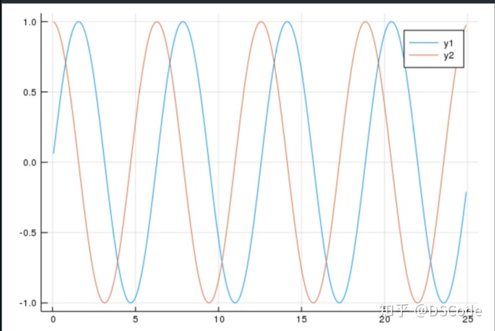
注意: plot函数同时存在与Julia其他的画图包中,用:指明你所使用的plot属于哪个包
声明一些变量来存储我们想要用LaTex编写的函数
x2 = L"x^2"
logx = L"log(x)"
sqrtx = L"sqrt{x}"
创建三个函数并绘制所有函数!
y1 = sqrt.(x)
y2 = log.(x)
y3 = x.^2

f1 = plot(x,y1,legend = false)
plot!(f1, x,y2) # "plot!" means "plot on the same canvas we just plotted on"
plot!(f1, x,y3)
title!("Plot $x2 vs. $logx vs. $sqrtx")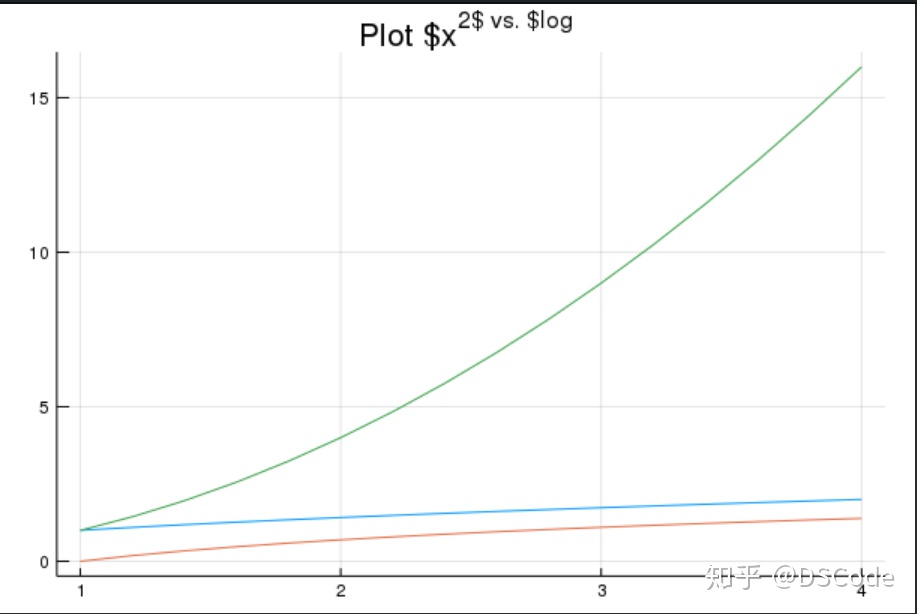
可以使用文本或特殊字符串来注释每条曲线
annotate!(f1,[(x[6],y1[6],text(sqrtx,16,:center)),
          (x[11],y2[11],text(logx,:right,16)),
          (x[6],y3[6],text(x2,16))])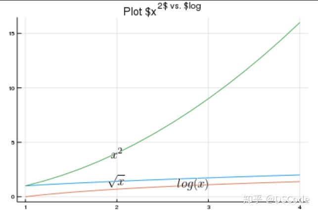
注意! 可能会出现sh: latex:未找到命令 latex: failed to create a dvi file 这是因为你没有安装 latex-mk 工具,用于输出-数学符号的工具,自行安装
好现在你可以解释x^2比sqrt(x)快得多
# 第一部分完整代码
# import Pkg
# Pkg.add("LaTeXStrings")
using LaTeXStrings
using Plots
gr(dpi=400)
import Plots:plot
x = 1:0.2:4
x2 = L"x^2"
logx = L"log(x)"
sqrtx = L"sqrt{x}"
y1 = sqrt.(x)
y2 = log.(x)
y3 = x.^2
f1 = plot(x,y1,legend = false)
plot!(f1, x,y2) # "plot!" means "plot on the same canvas we just plotted on"
plot!(f1, x,y3)
title!("Plot $x2 vs. $logx vs. $sqrtx")
annotate!(f1,[(x[6],y1[6],text(sqrtx,16,:center)),
          (x[11],y2[11],text(logx,:right,16)),
          (x[6],y3[6],text(x2,16))])
第2部分:统计图。
2D直方图非常简单!
n = 1000
set1 = randn(n)
set2 = randn(n)
histogram2d(set1,set2,nbins=20,colorbar=true)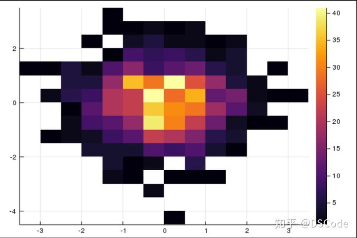
利用最开始的房屋数据集,了解更多相关信息!
using DataFrames
houses = readtable("houses.csv")
filter_houses = houses[houses[:sq__ft].>0,:]
x = filter_houses[:sq__ft]
y = filter_houses[:price]
gh = histogram2d(x,y,nbins=20,colorbar=true)
xaxis!(gh,"square feet")
yaxis!(gh,"price")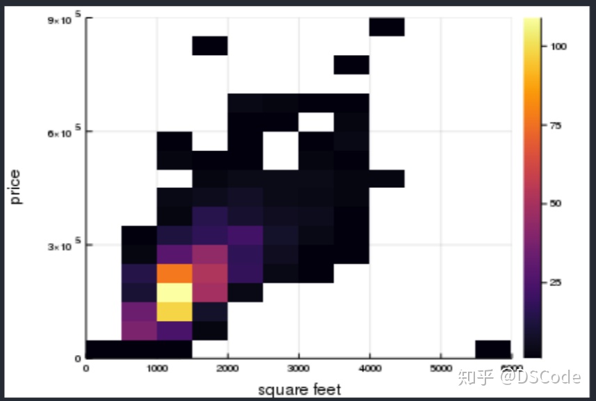
有意思!
大多数房屋售价在1000-1500之间,售价约为150,000美元
来看看更多的统计数据。
我们可以尝试说服自己随机分配确实非常相似。
通过盒图和小提琴图来做到这一点。
# import Pkg; Pkg.add("StatPlots")

using StatPlots
y = rand(10000,6) # generate 6 random samples of size 1000 each
f2 = violin(["Series 1" "Series 2" "Series 3" "Series 4" "Series 5"],y,leg=false,color=:red)

boxplot!(["Series 1" "Series 2" "Series 3" "Series 4" "Series 5"],y,leg=false,color=:green)这里贴出代码,在Linux上安装StatPlots发生了编译错误,暂时没有解决,属于Julia包管理的bug,官方正在构建下一代包管理器.
研究房屋数据集中不同城市的价格分布。
some_cities = ["SACRAMENTO","RANCHO CORDOVA","RIO LINDA","CITRUS HEIGHTS","NORTH HIGHLANDS","ANTELOPE","ELK GROVE","ELVERTA" ] # try picking pther cities!

fh = plot(xrotation=90)
for ucity in some_cities
    subs = filter_houses[filter_houses[:city].==ucity,:]
    city_prices = subs[:price]
    violin!(fh,[ucity],city_prices,leg=false)
end
display(fh)
创建子图很容易! 您可以按如下方式创建自己的布局。
mylayout = @layout([a{0.5h};[b{0.7w} c]])
plot(fh,f2,gh,layout=mylayout,legend=false)

# this layout:
# 1
# 2 3
使用PyPlot
using PyPlot
x = 1:100;
y = vcat(ones(Int,20),1:10,10*ones(70));

xkcd()
fig = figure()
ax = axes()
p = PyPlot.plot(x,y)
annotate("some n caption",xy=[30;10],arrowprops=Dict("arrowstyle"=>"->"),xytext=[40;7])

xticks([])
yticks([])
xlabel("index")
ylabel("value")
title("our first xkcd plot")

ax[:spines]["top"][:set_color]("none")
ax[:spines]["right"][:set_color]("none")
ax[:spines]["left"][:set_color]("none")
ax[:spines]["bottom"][:set_color]("none")

fig[:canvas][:draw]()

display(fig)
贴代码,环境问题,最后图没显示出来 emmmm
版权声明:本文为weixin_32039589原创文章,遵循CC 4.0 BY-SA版权协议,转载请附上原文出处链接和本声明。