当我们的组件库具备一些组件之后,需要开发者能够更流畅地使用,就需要有使用文档。
这里我是用vuepress来搭建对应的开发文档。
关于如何独立地使用vuepress,我之前地文章可以参考:使用vuepress搭建文档站点_笑道三千的博客-CSDN博客
本文地内容也是和这个差不多,只不过整合了vue的组件使用范例。
一,安装VuePress
npm install -D vuepress
二,新建基础文件
根目录下新建如下文件:
--docs
----README.md
----.vuepress
	|
------config.js
在README.md:
---
home: true
heroImage: /images/logo.PNG
heroText: biu-ui
tagline: 基于element-ui二次封装
actionText: 快速上手 →
actionLink: /zh/guide/
features:
# - title: 简洁至上
#   details: 以 Markdown 为中心的项目结构,以最少的配置帮助你专注于写作。
# - title: Vue驱动
#   details: 享受 Vue + webpack 的开发体验,在 Markdown 中使用 Vue 组件,同时可以使用 Vue 来开发自定义主题。
# - title: 高性能
#   details: VuePress 为每个页面预渲染生成静态的 HTML,同时在页面被加载的时候,将作为 SPA 运行。

---

::: slot footer
修改了底部
:::
在config.js:
module.exports ={
    //这里面路径最开始的/是指向.vuepress/public/的
    base:'/',//部署站点的基础路径,默认/
    lang: 'zh-CN',//语言设置
    title: 'biu-ui',//所有页面标题的后缀,并且在默认主题的导航栏中显示
    description: '一个基于element2搭建的组件库',//站点描述,它会被每个页面的 Frontmatter 中的 description 字段覆盖
    head: [['link', { rel: 'icon', href: '/images/logo.PNG' }]],//站点头部的icon
}
三,主题配置
我是用的vuepress-theme-vdoing。
npm install vuepress-theme-vdoing -D
四,配置导航栏和侧边栏
也就是修改config.js文件:
module.exports ={
    //这里面路径最开始的/是指向.vuepress/public/的
    base:'/',//部署站点的基础路径,默认/
    lang: 'zh-CN',//语言设置
    title: '你好, VuePress !',//所有页面标题的后缀,并且在默认主题的导航栏中显示
    description: '这是我的第一个 VuePress 站点',//站点描述,它会被每个页面的 Frontmatter 中的 description 字段覆盖
    head: [['link', { rel: 'icon', href: '/images/logo.PNG' }]],//站点头部的icon
    theme: 'vdoing',
    themeConfig: {
        logo: '/images/logo.PNG',
        nav:[
            { text: "首页", link: "/" },
            {
                text: '测试知识库',
                link: '/pages/eb5fdd/'
            },
            {
                text: "相关链接",
                items: [
                    {
                    text: "测试百度的链接",
                    link: "https://www.baidu.com",
                    },
                ],
            },
        ],
        sidebar: { mode: 'structuring', collapsable: true} ,//  'structuring' | { mode: 'structuring', collapsable: Boolean} | 'auto' | 自定义
        sidebarDepth: 2,//侧边栏自动提取文章的几层标题
        sidebarOpen: true, // 初始状态是否打开侧边栏,默认true
        updateBar: {
            // 最近更新栏
            showToArticle: false, // 显示到文章页底部,默认true
            moreArticle: "/archives", // “更多文章”跳转的页面,默认'/archives'
        },
        category: false, // 是否打开分类功能,默认true。 如打开,会做的事情有:1. 自动生成的front matter包含分类字段 2.页面中显示与分类相关的信息和模块 3.自动生成分类页面(在@pages文件夹)。如关闭,则反之。
        tag: true, // 是否打开标签功能,默认true。 如打开,会做的事情有:1. 自动生成的front matter包含标签字段 2.页面中显示与标签相关的信息和模块 3.自动生成标签页面(在@pages文件夹)。如关闭,则反之。
        archive: true,// 是否打开归档功能,默认true。 如打开,会做的事情有:1.自动生成归档页面(在@pages文件夹)。如关闭,则反之。
    }
}
六,新建文档
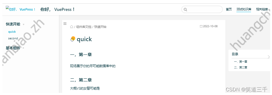
建立如下文件,dev运行之后,会在每个文件头部生成link,将第一篇文章的link替换到这里来即可:
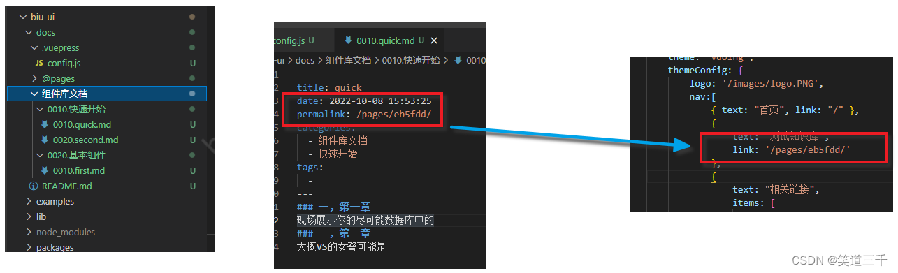
效果:
七,element组件的demo演示
1,安装Demo插件
这里我们会使用到一个 vuepress-plugin-demo-container 这个插件,使用以下命令安装
npm install vuepress-plugin-demo-container
然后在config.js文件中配置:
module.exports = {
  // ...
  plugins: ['demo-container'], // 配置插件
}
2,引入element-ui
平时在项目里面使用Element,需要在 app.js 中引入Element,并调用 Vue.use(Element) 才能够在Vue中使用Element的组件,那么我们如果想在VuePress中使用Element,就需要在这个文件里面配置。让我们在新建该文件docs/.vuepress/enhanceApp.js:
import ElementUI from 'element-ui';
import 'element-ui/lib/theme-chalk/index.css';

export default async ({
  Vue
}) => {
  if (typeof process === 'undefined') {
    Vue.use(ElementUI)
  }
}
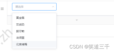
3,在markdown中使用 element组件
::: demo
```html
<template>
<el-select v-model="value" placeholder="请选择">
<el-option
v-for="item in options"
:key="item.value"
:label="item.label"
:value="item.value">
</el-option>
</el-select>
</template>
<script>
export default {
data() {
return {
options: [{
value: '选项1',
label: '黄金糕'
}, {
value: '选项2',
label: '双皮奶'
}, {
value: '选项3',
label: '蚵仔煎'
}, {
value: '选项4',
label: '龙须面'
}, {
value: '选项5',
label: '北京烤鸭'
}],
value: ''
}
}
}
</script>
```
:::
实现的效果:
八,自己封装的组件的演示
和第七节中一样,在文档中使用自己封装的组件,也是需要在enhanceApp.js中注册组件:
import ElementUI from 'element-ui';
import 'element-ui/lib/theme-chalk/index.css';
// 导入组件库
+ import { BiuButton } from "../../packages/index.js";
export default async ({
  Vue
}) => {
  if (typeof process === 'undefined') {
    Vue.use(ElementUI)
    // 按需注册组件
+   Vue.use(BiuButton);
  }
}
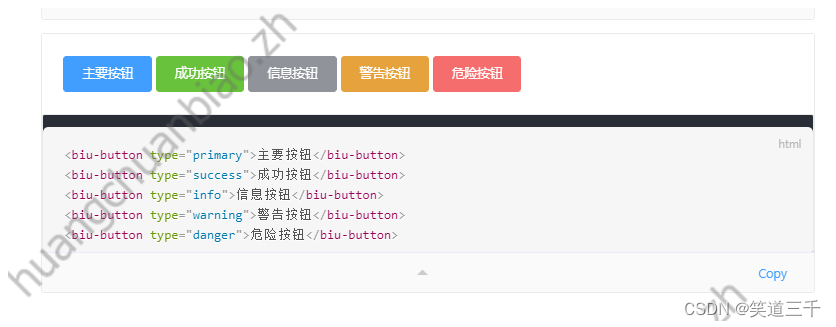
然后在文档中使用:
::: demo
```html
<biu-button type="primary">主要按钮</biu-button>
<biu-button type="success">成功按钮</biu-button>
<biu-button type="info">信息按钮</biu-button>
<biu-button type="warning">警告按钮</biu-button>
<biu-button type="danger">危险按钮</biu-button>
```
:::
实现的效果:
九,将文档部署到gitee
这一步网上有很多教程,我gitee账号还没有使命认证,就先不处理了。
执行步骤:https://juejin.cn/post/7077498041921437704
版权声明:本文为weixin_42349568原创文章,遵循CC 4.0 BY-SA版权协议,转载请附上原文出处链接和本声明。