matplotlib画图:柱形图、堆叠柱形图、分组柱形图。
分组柱形图与堆叠柱形图的区别
堆叠柱形图:有助于帮助我们观察部分与整体之间的关系。如:2020年每个区域每个季度的销售情况。
分组柱形图:当比较一个整体的某组成部分与其他整体对应组成部分时,分组柱形图表现更好。如:2020年各区域第一季度的销售情况比较。
柱形图
先画个柱形图:表示不同组男生的分数。
import matplotlib.pyplot as plt
import numpy as np

# G1,G2,G3,G4,G5小组的分数。
labels = ['G1', 'G2', 'G3', 'G4', 'G5']
men_means = [20, 35, 30, 35, 27]
women_means = [25, 32, 34, 20, 25]

men_std = [2, 3, 4, 1, 2]  # 误差(一般用标准差表示,要计算出各分组的标准差。)
women_std = [3, 5, 2, 3, 3]  # 误差

width = 0.35  # 柱形图的宽度
fig, ax = plt.subplots()  # 直接创建一个窗口和一个子坐标系
ax.bar(labels, men_means, width, yerr=men_std, label='men')  # yerr是y轴方向上的误差,xerr是x轴方向上的误差。
plt.xlabel('Groups')  # x轴标签
plt.ylabel('Scores')  # y轴标签
plt.title('Scores by group and gender ')  # 该柱形图的标题
plt.show()
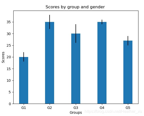
(误差线:误差线用来显示潜在的误差或相对于系列中每个数据标志的不确定程度。可以用标准差或标准偏差表示。)
堆叠柱形图
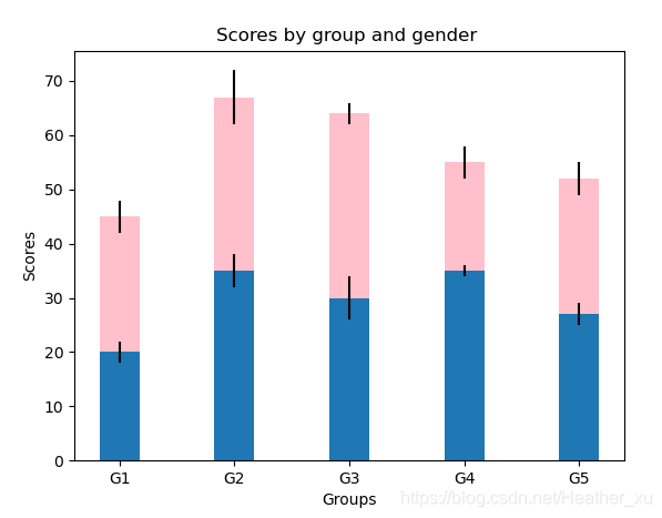
用堆叠柱状图比较各组男生、女生之间的成绩。
基于上面已经画好的 男生成绩柱形图,只需要再其上方堆叠 女生成绩柱形图 即可。
import matplotlib.pyplot as plt
import numpy as np

# G1,G2,G3,G4,G5小组的分数。
labels = ['G1', 'G2', 'G3', 'G4', 'G5']
men_means = [20, 35, 30, 35, 27]
women_means = [25, 32, 34, 20, 25]

men_std = [2, 3, 4, 1, 2]  # 误差(一般用标准差表示,要计算出各分组的标准差。)
women_std = [3, 5, 2, 3, 3]  # 误差

width = 0.35  # 柱形图的宽度
fig, ax = plt.subplots()  # 直接创建一个窗口和一个子坐标系
ax.bar(labels, men_means, width, yerr=men_std, label='men')  # yerr是y轴方向上的误差,xerr是x轴方向上的误差。
# 堆叠柱形图就是一个堆一个,现在将女生分数柱形图堆在男生分数柱形图上方,bottom=men_means。color=‘pink’将柱形图设置为粉色。
ax.bar(labels, women_means, width, color='pink', yerr=women_std, bottom=men_means, label='women')

plt.xlabel('Groups')  # x轴标签
plt.ylabel('Scores')  # y轴标签
plt.title('Scores by group and gender ')  # 该柱形图的标题
plt.show()
分组柱形图
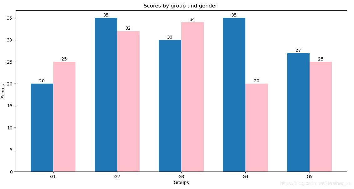
比较男生(女生)成绩在不同组中的差异。
import matplotlib.pyplot as plt
import numpy as np

# G1,G2,G3,G4,G5小组的分数。
labels = ['G1', 'G2', 'G3', 'G4', 'G5']
men_means = [20, 35, 30, 35, 27]
women_means = [25, 32, 34, 20, 25]
x = np.arange(len(labels))
width = 0.35  # 柱形图的宽度

fig, ax = plt.subplots()  # 直接创建一个窗口和一个子坐标系
rects1 = ax.bar(x - width/2, men_means, width, label='Men')  # x-width/2 计算出左边柱形图的位置。
rects2 = ax.bar(x + width/2, women_means, width, color='pink', label='Women')  # x-width/2 计算出右边柱形图位置。

ax.set_xticks(x)  # 设置具体刻度。
ax.set_xticklabels(labels)  # 设置刻度标签。

plt.xlabel('Groups')  # x轴标签
plt.ylabel('Scores')  # y轴标签
plt.title('Scores by group and gender ')  # 该柱形图的标题


def autolabel(rects):
    """ 在每个柱形条上方添加一个文本标签,显示高度。"""
    for rect in rects:
        height = rect.get_height()  # 获取柱形条的高度。
        # annotate() 用于在图形上给数据添加文本注解(注释)。
        ax.annotate('{}'.format(height),  # s 注释文本内容
                    xy=(rect.get_x() + rect.get_width() / 2, height),  # 被注释的坐标点:xy=(横坐标,纵坐标),即每个柱形条的顶部中心。
                    xytext=(0, 3),  # 注释文本的坐标点(相对于被注释点取坐标):xytext(横坐标,纵坐标)。
                    textcoords="offset points",  # 被注释点的坐标系属性:点,像素,百分比等。"offset points"指偏移量,单位:点。
                    ha='center')  # ha='center' 让注解居中

autolabel(rects1)
autolabel(rects2)
plt.show()
版权声明:本文为Heather_xu原创文章,遵循CC 4.0 BY-SA版权协议,转载请附上原文出处链接和本声明。