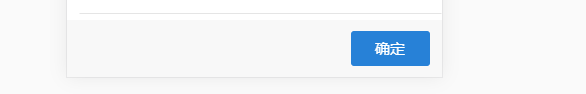
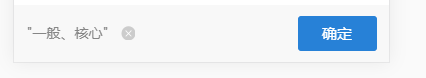
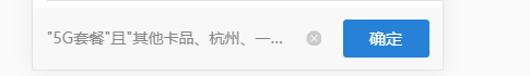
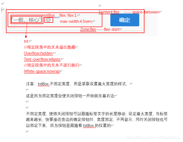
如图,需要实现的是类似于上图的一个固底的标签选择栏,这个栏目有右边的确定按钮,显示选择的标签的文字和可以清除文字的关闭按钮,注意,关闭按钮在内容为空时不显示,当有标签文字时,跟随在标签后面,当关闭按钮向右移动至确定按钮时,不能再移动,同时文字多出的部分显示省略号。
样式比较复杂,主要的核心在于中间的文字省略,主要的核心代码是:
display: flex;
flex: 1;//在可用的空间内100%填充
overflow: hidden;
text-overflow: ellipsis;
//规定段落中的文本不进行换行
white-space: nowrap;
然而,直接在文字的CSS中使用这一段代码是不能生效的。
直接上代码:
<!--固底的选择栏 -->
 <div class="confirmBox">
    <!--确定按钮、文字和关闭按钮 -->
    <dl class="content">
      <!--文字和关闭按钮 -->
      <div class="zone">
        <dd class="txtBox" v-if="bottomTags">
          <div class="txt">{{ bottomTags }}</div>
        </dd>
        <div class="icon" v-show="bottomTags.length > 0">
          <img
            src="https://mall-minio.wochanye.com/publicimg/mall/2020-04-29/49d5f117-6517-45d2-8977-e52d1d6f3ad8.png"
            class="closeIcon"
            @click="refreshAllTags"
          />
        </div>
     </div>
     <!--确定按钮 -->
    <dd class="btn" @click="saveSelectedTags">确定</dd>
  </dl>
</div>
<style rel="stylesheet/scss" lang="scss" scoped>
//固底的选择栏
.confirmBox {
background-color: #f8f8f8;
width: 7.5rem;
position: fixed; //将button按钮固定在页面底部,注意,:和;是英文的哦,一定不要写成中文哦。
bottom: 0rem;
//固底的导航栏上下内边距相同————垂直居中
padding-bottom: 0.22rem;
padding-top: 0.22rem;
//确定按钮、文字和关闭按钮
.content {
display: flex;
justify-content: space-between;
align-items: center;
padding-left: 0.25rem;
padding-right: 0.25rem;
}
//文字和关闭按钮
.zone {
//使关闭按钮和后面的确定按钮统一行高
display: flex;
justify-content: flex-start;
align-items: center;
}
//“标签”文字
.txtBox {
max-width: 4.5rem;
font-size: 0.28rem;
font-family: PingFangSC-Medium, PingFang SC;
color: rgba(134, 134, 134, 1);
line-height: 0.4rem;
display: flex;
flex: 1;
//文字
.txt {
overflow: hidden;
text-overflow: ellipsis;
//规定段落中的文本不进行换行
white-space: nowrap;
}
}
//“关闭”按钮
.icon {
width: 0.28rem;
height: 0.28rem;
// margin-top: -1.57rem;
// margin-right: 0.69rem;
margin-left: 0.24rem;
display: inline-block;
.closeIcon {
display: block;
width: inherit;
height: inherit;
}
}
//“确定”按钮
.btn {
padding-top: 0.15rem;
padding-bottom: 0.16rem;
width: 1.58rem;
background: #2781d7;
border-radius: 0.06rem;
color: white;
font-size: 0.3rem;
text-align: center;
float: right;
letter-spacing: 0.0045rem;
// display: flex;
// justify-self: flex-end;
}
}
</style>
这个栏主要使用的就是flex布局
主要的布局思想是这样的
超出部分隐藏的思想主要来自于:
https://blog.csdn.net/zhangjing0320/article/details/79199872
这个博主让我发现了flex:1需要以一定的层级方式
代码块
<meta name="viewport" content="width=device-width,initial-scale=1,user-scalable=0">

<div class="main">
    <div class="content">
        <h4 class="name">a namea namea namea namea</h4>
    </div>
    <div class="content">
         <h4 class="name">b namea namea namea namea </h4>
    </div>
    <div class="content">
         <h4 class="name">c namea</h4>
    </div>
</div>

<style type="text/css">
.main {
    display: flex;
}
.content {
    overflow: hidden;  /*也可以用 width:0 代替*/
    flex: 1;   /*关于flex的属性值请看官网,这里相当于 flex-grow */
    border:1px solid red;
}
.name {
    white-space: nowrap;
    overflow: hidden;
    text-overflow: ellipsis;
}
</style>
效果:

以上的盒子都是固定的长度,如果你想设置不同的长度,就分开改各自的flex属性即可。
就这样实现了flex布局下超出部分隐藏,并且可以在某一宽度时开始隐藏
不得不感叹,flex布局大法多么精妙~flex套flex就可以实现层层的布局排版
版权声明:本文为Sophiaxnm原创文章,遵循CC 4.0 BY-SA版权协议,转载请附上原文出处链接和本声明。