看一下我的HTML结构
<div class="item-box" ref="itemBox">
    <div class="more-subject-item clearfix" ref="subjectItem" v-for="(item,index) in levelList" :key="index">
      <img :src="item.image" alt="">
      <div class="name">标题</div>
      <div class="desc">详情</div>
    </div>
</div>
纯CSS方式
.item-box {
    -moz-column-count:2; /* Firefox */        //  2列
    -webkit-column-count:2; /* Safari 和 Chrome */        //  2列
    column-count:2;     //  2列
    width: 690px;
    margin: 0 auto;
}
.more-subject-item {
    width: 330px;
    border-radius: 10px;
    background-color: #fff;
    padding-bottom: 20px;
    margin-bottom: 30px;
    -moz-page-break-inside: avoid;       //   配合完成瀑布流
    -webkit-column-break-inside: avoid;     //   配合完成瀑布流
    break-inside: avoid;     //   配合完成瀑布流
}
此方法亲测有效,简单方便,但是好像有兼容问题,部分手机不可用,还没发现什么手机不能用,自己取舍吧
效果:
js方法
css部分
.item-box {
    width: 690px;
    margin: 0 auto;
    position: relative;     //   重点
}
.more-subject-item {
    width: 330px;
    border-radius: 10px;
    background-color: #fff;
    padding-bottom: 20px;
    margin-bottom: 30px;
    margin-right: 30px;
    float: left;        重点
}
.more-subject-item:nth-child(2n) {
    margin: 0;
}
js部分
mounted() {
    this.waterFall();     //    生命周期中调用
},
methods: {
    waterFall() {
        // 1- 确定图片的宽度 - 滚动条宽度
        let columns = 2;    //2列
        let pageWidth = window.getComputedStyle(this.$refs.itemBox).width;     //  取外层盒子的宽度
        pageWidth = itemBoxWidth.substring(0,itemBoxWidth.length-2);     //   取到的宽度会有px ,所以切割字符串,去掉px
        let arr = [];     // 存高度的数组
        let list = this.$refs.subjectItem;    //   获取循环出来的小盒子
        for (let i = 0;i<list.length;i++) {
            var height = window.getComputedStyle(list[i]).height;      //  获取每一个盒子的高度
            var width = window.getComputedStyle(list[i]).width;        //   获取每个盒子的宽度,我的盒子宽度是一样的
            height = height.substring(0,height.length-2);
            width = width.substring(0,width.length-2);
            var itemWidth = pageWidth - width;     //  因为我的只有两列且宽度都一样,所以计算第二列的left就可以
            if (i < columns) {     //   第一行的,第一行只是浮动不用定位
                let h = Number(height) + 20
                arr.push(h);
            } else {       //  其他行的
                var minBoxheight = Math.min.apply(this,arr);    //   取数组中最小的值
                var minBoxIndex = this.getMinIndex(minBoxheight,arr)      //   取数组中最小值得索引
                list[i].style.top =  minBoxheight + 'px';        //  定位
                list[i].style.left = minBoxIndex * itemWidth + 'px';    //  定位
                list[i].style.position = 'absolute';     //  定位
                //  数组中的最小值要累加当前元素的高度     20  是因为我想要上下元素间距20px
                arr[minBoxIndex] = Number(arr[minBoxIndex]) + Number(height) + 20;
            }
        };
    },
	//   取指定元素的索引
    getMinIndex (value,arr) {
        for (var i in arr) {
            if (arr[i] == value) {
                return i;
            }
        }
    }
}
效果: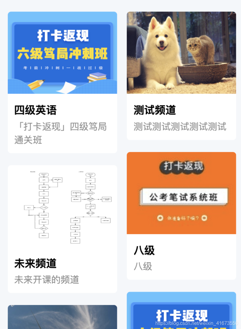
与纯CSS的区别就是,纯CSS是按顺序排列的,js的是随机按照位置大小排列的。
两个数组的方法 (百度用的)
<div class="item-box">
  <div class="item-left" ref="itemBox">
      <div class="more-subject-item"  v-for="(item,index) in levelListLeft" :key="index">
        <img :src="item.image" alt="">
        <div class="name">标题</div>
        <div class="desc">详情</div>
      </div>
  </div>
  <div class="item-right">
    <div class="more-subject-item"  v-for="(item,index) in levelListRight" :key="index">
      <img :src="item.image" alt="">
      <div class="name">标题</div>
      <div class="desc">详情</div>
    </div>
  </div>
</div>
css
.item-box {
    width: 690px;
    margin: 0 auto;
    display: flex;
    justify-content: space-between;;
}
.more-subject-item {
    width: 330px;
    border-radius: 10px;
    background-color: #fff;
    padding-bottom: 20px;
    margin-bottom: 30px;
}
.item-right,.item-left {
    display: flex;
    flex-direction: column;
}
js
levelListLeft () {
   return this.levelList.filter((item,index) => {
        return index % 2 == 0;
    })
},
levelListRight () {
    return this.levelList.filter((item,index) => {
        return index % 2 == 1;
    })
}
效果: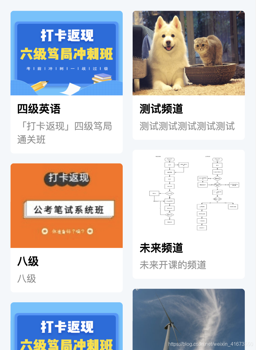
以上都是亲测有效的,移动端的方法,不喜勿喷,也欢迎指教
版权声明:本文为weixin_41673550原创文章,遵循CC 4.0 BY-SA版权协议,转载请附上原文出处链接和本声明。