因为还没学习JS,而且不会创建仓库,没办法生成.
目录
HTML部分
    <!DOCTYPE html>
<html lang="en">

<head>
    <meta charset="UTF-8">
    <meta http-equiv="X-UA-Compatible" content="IE=edge">
    <meta name="viewport" content="width=device-width, initial-scale=1.0">
    <!-- 引入css文件 -->
    <link rel="stylesheet" href="../m/css/normalize.css">
    <link rel="stylesheet" href="./lib/iconfont/iconfont.css">
    <link rel="stylesheet" href="./css/orders.css">
    <title>提交订单</title>
</head>

<body>
    <!--主体 start -->
    <div class="main">
        <!-- msg开始 -->
        <nav class="order-msg">
            <div class="location iconfont icon-location"></div>
            <div class="info">
                <div class="user-info">
                    <h3>林丽 <span>18500667882</span></h3>
                </div>
                <div class="address">
                    <p>北京市 海淀区 中关村软件园 信息科技大厦1号
                        楼410# </p>
                </div>
            </div>
            <div class="more "><a href="#" class="iconfont icon-more"></a></div>
        </nav>
        <!-- msg结束 -->
        <!-- goods开始 -->
        <div class="goods">
            <img src="./uploads/pic.png" alt="" class="pic">
            <div class="info">
                <h4>康尔贝 非接触式红外体温仪
                    领券立减30元 婴儿级材质 测温…</h4>
                <p>粉色 红外体温计</p>
                <div> <i>¥</i>266<span><s>¥299</s></span></div>
            </div>
            <div class="count "> <i class="iconfont icon-x"></i>1
            </div>
        </div>
        <!--  goods结束 -->
        <div class="rest-panel">
            <div class="express">
                <p>配送方式</p>
                <p>顺丰快递</p>
            </div>
            <div class="remark">
                <p>买家备注</p>
                <p>希望可以尽快发货,谢谢~</p>
            </div>
            <div class="payment">
                <p>支付方式</p>
                <p>支付宝 <i class="iconfont icon-more"></i></p>
            </div>
        </div>

        <div class="amount-panel">
            <div class="sum">
                <p>商品总价</p>
                <p>¥299.00</p>
            </div>
            <div class="freight">
                <p>运费</p>
                <p>¥0.00</p>
            </div>
            <div class="discount">
                <p>折扣</p>
                <p>-¥30.00</p>
            </div>
        </div>


    </div>
    <!--主体 end -->


    <!-- 底部支付 start -->
    <div class="pay-orders">
        <div class="sum">
            <p>合计:</p>
            <div>¥ <span>266.00</span></div>
        </div>
        <div class="pay"><a href="#">去支付</a></div>
    </div>
    <!-- 底部支付 end -->


</body>

</html>
CSS部分
* {
    margin: 0;
    padding: 0;
    box-sizing: border-box;
}

body {
    background-color: #f7f7f8;
}

* {
    margin: 0;
    padding: 0;
    box-sizing: border-box;
}

.main {

    padding: 12px 11px 81px;
}

.main>div {
    background-color: #fff;
    border-radius: 10px;
}

/* msg开始 */
.main .order-msg {
    padding: 15px 0 15px 10px;
    background-color: #fff;
    display: flex;
    justify-content: space-between;
    align-items: center;
    border-radius: 5px;

}

.location {
    width: 30px;
    height: 30px;
    text-align: center;
    line-height: 30px;
    background-image: linear-gradient(90deg,
            #6fc2aa 5%,
            #54b196 100%);
    border-radius: 50%;
}

.info {
    flex: 1;
    /* margin: 15px 0 14px 13px; */
    margin-left: 13px;
}

.info h3 {
    font-size: 15px;
    margin-bottom: 13px;
}

.info span {
    font-size: 13px;
}

.info p {
    font-size: 12px;
}

.more a {
    width: 44px;
    height: 44px;
    display: block;

    text-decoration: none;
    text-align: center;
    line-height: 44px;
    color: #808080;
}

/* msg结束   */

/* goods开始 */
.goods {
    display: flex;
    justify-content: space-between;
    margin-top: 10px;
    padding: 10px;
    background-color: #fff;
    border-radius: 5px;
}

.goods .pic {
    width: 85px;
    height: 85px;
    vertical-align: middle;
}

.goods .info {
    flex: 1;
}

.goods .info h4 {
    font-size: 13px;
    color: #262626;
    font-weight: 400;
    line-height: 19px;

}

.goods .info p {
    font-size: 11px;
    color: #888888;
    margin: 10px 0;
}

.goods .info div {
    color: #cf4444;
    font-size: 16;
}

.goods .info div i {
    font-size: 9px;
}

.goods .info span {
    font-size: 9px;
    color: #999999;
    margin-left: 14px;
    text-decoration: unset
}

.goods .count {

    padding-top: 16px;
}


.rest-panel {
    margin-top: 10px;
    padding: 10px;

}

.rest-panel p {
    font-size: 13px;
}

.rest-panel .express {
    display: flex;
    justify-content: space-between;
}


.rest-panel .remark {
    display: flex;
    /* justify-content: space-between; */
    margin: 29px 0;
}

.rest-panel .remark p:last-child {
    margin-left: 10px;
    font-size: 12px;
    color: #989898;
}


.rest-panel .payment {
    display: flex;
    justify-content: space-between;
}

.rest-panel .payment i {
    font-size: 13px;
}

/* jieshu */
/* 开始 */
.amount-panel {
    margin-top: 10px;
    padding: 10px;

}

.amount-panel p {
    font-size: 13px;
}

.amount-panel .sum {
    display: flex;
    justify-content: space-between;
    color: #262626;
}

.amount-panel .freight {
    display: flex;
    justify-content: space-between;
    margin: 20px 0 29px 0;
}

.discount {
    display: flex;
    justify-content: space-between;
}


.pay-orders {

    position: fixed;
    left: 0;
    bottom: 0;
    display: flex;
    justify-content: space-between;
    /* background-color: greenyellow; */
    padding: 20px 10px;
    width: 100%;
    height: 79px;

}

.sum {
    display: flex;
    font-size: 11px;
    line-height: 40px;
}

.sum p {
    color: #1e1e1e;
}

.sum div {
    color: #cf4444;
    margin-left: 10px;
}

.sum span {
    font-size: 20px;
    font-weight: 700;
}

.pay a {
    width: 91px;
    height: 35px;
    background-image: linear-gradient(90deg,
            #6fc2aa 5%,
            #54b196 100%);
    border-radius: 3px;
    display: block;
    text-align: center;
    line-height: 35px;
    text-decoration: none;
    color: #ffffff;
    font-size: 13px;
}
成品图
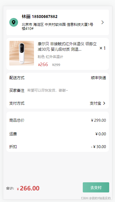
基本实现就是这样的模型了,移动端布局确实是要比PC简单许多.
学习新知识真是一件快乐的事情,学习路上,万事常青.明天见~
版权声明:本文为vip77778888原创文章,遵循CC 4.0 BY-SA版权协议,转载请附上原文出处链接和本声明。