前言
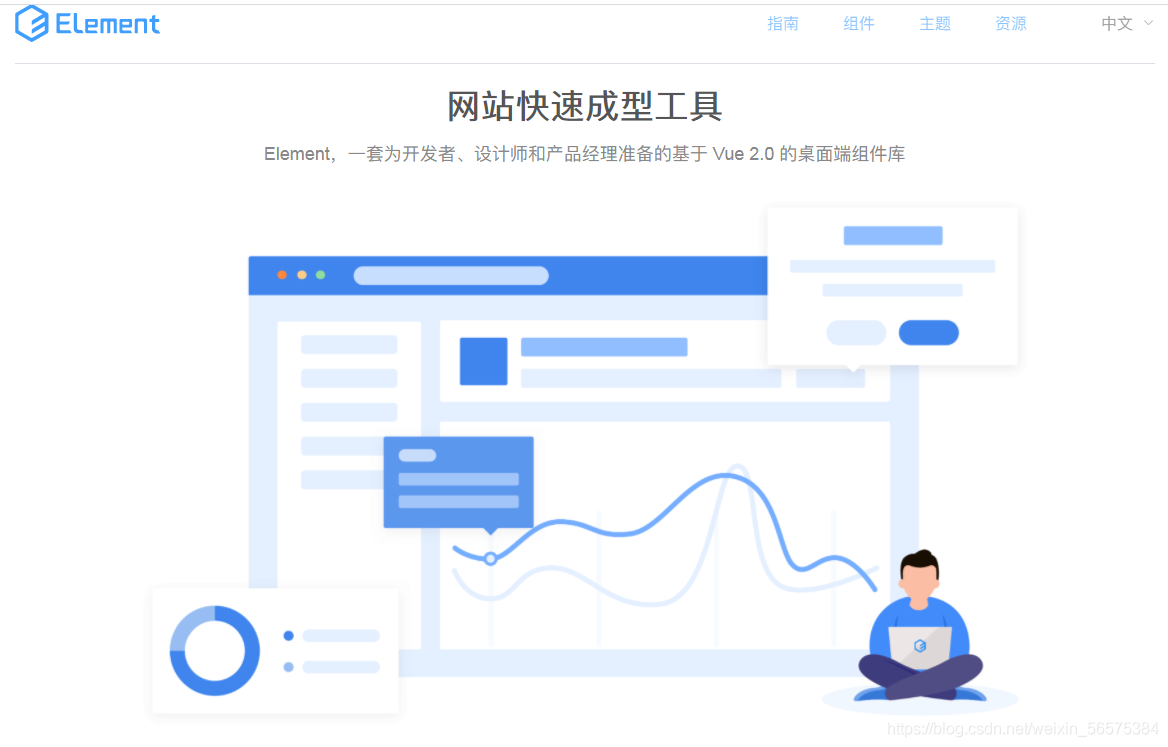
ElementUI是一套为开发者、设计师和产品经理准备的基于 Vue 2.0 的桌面端组件库。
是基于Vue的一个UI框架,该框架基于Vue开发了很多相关组件,方便我们快速开发页面。
一、ElementUI的下载
ElementUI可在官网进行下载:
官网地址:https://element.eleme.cn/#/zh-CN
当我们进行页面代码书写时可以直接参考ElementUI官网组件指南进行编写,在VSCode进行使用时需要导入三个包,一个是elementUI的index.css样式包,一个是index.js脚本包,还有就是Vue的js包。这三个包我会在下一期论坛给大家,下面是导包的流程。
注意:必须要按照顺序进行导包!
①<link rel="stylesheet" href="../element-ui-2.13.0/lib/theme-chalk/index.css">
②<script src="../js/vue-v2.6.10.js"></script>
③<script src="../element-ui-2.13.0/lib/index.js"></script
二、ElementUI的使用
2.1 Layout布局
| 参数 | 说明 | 类型 | 可选值 | 默认值 |
|---|---|---|---|---|
| gutter | 栅格间隔 | number | ------- | 0 |
| type | 布局默认,可选flex,现代浏览器下有效 | string | ------- | --- |
| justify | flex布局下的水平排列方式 | string | start/end/center... | start |
| align | flex布局下的垂直排列方式 | string | top/middle/bottom | top |
| tag | 自定义元素标签 | string | * | div |
| 参数 | 说明 | 类型 | 可选值 | 默认值 |
| span | 栅格占据的列数 | number | ------- | 24 |
| offset | 栅格左侧的间隔格数 | number | ------- | 0 |
| push | 栅格向右移动格数 | number | ------- | 0 |
| pull | 栅格向左移动格数 | number | ------- | 0 |
| xs | <768px响应式栅格数或栅格属性对象 | number/object | ------- | ------- |
参照了 Bootstrap 的 响应式设计,预设了五个响应尺寸:xs手机、sm平板 、md 桌面显示器 、lg 大桌面显示器和 xl超大桌面显示器。
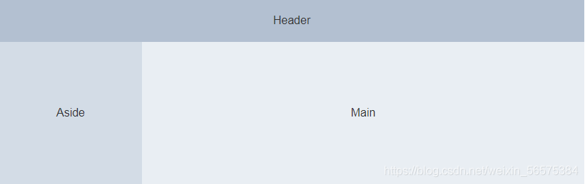
2.2 Container布局容器
常见标签:
<el-container>:外层容器。当子元素中包含 <el-header> 或 <el-footer> 时,全部子元素会垂直上下排列,否则会水平左右排列。
<el-header>:顶栏容器。
<el-aside>:侧边栏容器。
<el-main>:主要区域容器。
<el-footer>:底栏容器。
以上组件采用了 flex 布局,使用前请确定目标浏览器是否兼容。此外,<el-container> 的子元素只能是后四者,后四者的父元素也只能是 <el-container>
以下是container容器、header头部分、aside左侧部分、footer底部常用属性:
| 参数 | 说明 | 类型 | 可选值 | 默认值 |
| direction | 子元素的排列方向 | string | horizontal / vertical | 子元素中有 el-header 或 el-footer 时为 vertical,否则为 horizontal |
| 参数 | 说明 | 类型 | 可选值 | 默认值 |
| height | 顶栏高度 | string | -------- | 60p |
| 参数 | 说明 | 类型 | 可选值 | 默认值 |
| width | 侧边栏宽度 | string | -------- | 300px |
| 参数 | 说明 | 类型 | 可选值 | 默认值 |
| height | 底栏高度 | string | -------- | 60px |
2.3 按钮
以下是常见的几种按钮:
<el-row> <el-button>默认按钮</el-button> <el-button type="primary" disabled>主要按钮</el-button> <el-button type="success" size="mini">成功按钮</el-button> <el-button type="info">信息按钮</el-button> <el-button type="warning">警告按钮</el-button> <el-button type="danger">危险按钮</el-button> </el-row> <el-row> <el-button plain>朴素按钮</el-button> <el-button type="primary" plain>主要按钮</el-button> <el-button type="success" plain>成功按钮</el-button> <el-button type="info" plain>信息按钮</el-button> <el-button type="warning" plain>警告按钮</el-button> <el-button type="danger" plain>危险按钮</el-button> </el-row> <el-row> <el-button round>圆角按钮</el-button> <el-button type="primary" round>主要按钮</el-button> <el-button type="success" round>成功按钮</el-button> <el-button type="info" round>信息按钮</el-button> <el-button type="warning" round>警告按钮</el-button> <el-button type="danger" round>危险按钮</el-button> </el-row>
常见的按钮属性
| 参数 | 说明 | 类型 | 可选值 | 默认值 |
| size | 尺寸 | string | medium / small / mini | -------- |
| type | 类型 | string | primary / success / warning / danger / info / text | -------- |
| plain | 是否朴素按钮 | boolean | ------- | false |
| round | 是否圆角按钮 | boolean | ------- | false |
| circle | 是否圆形按钮 | boolean | ------- | false |
| loading | 是否加载中状态 | boolean | ------- | false |
| disabled | 是否禁用状态 | boolean | ------- | false |
| icon | 图标类名 | string | ------- | ------- |
| autofocus | 是否默认聚集 | boolean | ------- | false |
| native-type | 原生type属性 | string | button / submit / reset | button |
2.4 导航菜单
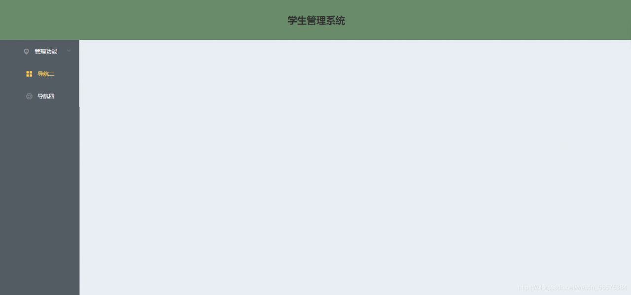
下面是我自己复制的导航菜单与container容器写出的后台系统主页,大家可以直接使用
<!DOCTYPE html>
<html lang="en">
<head>
    <meta charset="UTF-8">
    <meta http-equiv="X-UA-Compatible" content="IE=edge">
    <meta name="viewport" content="width=device-width, initial-scale=1.0">
    <title>学生管理系统</title>
    <link rel="stylesheet" href="../element-ui-2.13.0/lib/theme-chalk/index.css">
    <script src="../js/vue-v2.6.10.js"></script>
    <script src="../element-ui-2.13.0/lib/index.js"></script>
    <style>
        .el-header, .el-footer {
          background-color: rgb(105,139,105);
          color: #333;
          text-align: center;
          line-height: 60px;
        }

        .el-aside {
          background-color: rgb(84,92,100);
          color: #333;
          text-align: center;
          line-height: 200px;
          height: 640px;
        }

        .el-main {
          background-color: #E9EEF3;
          color: #333;
          text-align: center;
          line-height: 160px;
        }

        body > .el-container {
          margin-bottom: 40px;
        }

        .el-container:nth-child(5) .el-aside,
        .el-container:nth-child(6) .el-aside {
          line-height: 260px;
        }

        .el-container:nth-child(7) .el-aside {
          line-height: 320px;
        }
      </style>
</head>
<body>
    <div id="app">
        <el-container>
            <el-header height="100px">
                <h1>学生管理系统</h1>
            </el-header>
            <el-container>
              <el-aside width="200px">
                <el-col :span="24">
                    <el-menu
                      default-active="2"
                      class="el-menu-vertical-demo"
                      @open="handleOpen"
                      @close="handleClose"
                      background-color="#545c64"
                      text-color="#fff"
                      active-text-color="#ffd04b">
                      <el-submenu index="1">
                        <template slot="title">
                          <i class="el-icon-location"></i>
                          <span>管理功能</span>
                        </template>
                        <el-menu-item-group>
                          <el-menu-item index="1-1">学生管理</el-menu-item>
                          <el-menu-item index="1-2">选项2</el-menu-item>
                        </el-menu-item-group>
                          <el-menu-item index="1-3">选项3</el-menu-item>
                        </el-menu-item-group>

                      </el-submenu>
                      <el-menu-item index="2">
                        <i class="el-icon-menu"></i>
                        <span slot="title">导航二</span>
                      </el-menu-item>
                      <el-menu-item index="4">
                        <i class="el-icon-setting"></i>
                        <span slot="title">导航四</span>
                      </el-menu-item>
                    </el-menu>
                  </el-col>
                </el-row>
              </el-aside>
              <el-main height="400px">

              </el-main>
            </el-container>
          </el-container>
    </div>
</body>
<script>
    new Vue({
        el:"#app",
        data:{

        },
        methods:{
            handleOpen(key, keyPath) {
        console.log(key, keyPath);
        },
           handleClose(key, keyPath) {
        console.log(key, keyPath);
      }
        }
    })
</script>
</html>
页面效果
常用属性
Menu Attribute 参数 说明 类型 可选值 默认值 mode 模式 string horizontal / vertical vertical collapse 是否水平折叠收起菜单(仅在 mode 为 vertical 时可用) boolean ------- false background-color 菜单的背景色(仅支持hex格式) string ------- #ffffff text-color 菜单的文字颜色(仅支持hex格式) string ------- #303133 active-text-color 当前激活菜单的文字颜色(仅支持hex格式) string ------- #409EFF defalut-active 当前激活菜单的index string ------- -------- default-openeds 当前打开的 sub-menu 的 index 的数组 Array ------- -------- unique-opened 是否只保持一个子菜单的展开 boolean ------- false menu-trigger 子菜单打开的触发方式(只在 mode 为 horizontal 时有效) string hover / click hover router 是否使用 vue-router 的模式,启用该模式会在激活导航时以 index 作为 path 进行路由跳转 boolean ------- false collapse-transition 是否开启折叠动画 boolean ------- true 方法
Menu Methods 方法名称 说明 参数 open 展开指定的sub-menu index: 需要打开的 sub-menu 的 index close 收起指定的 sub-menu index: 需要收起的 sub-menu 的 index 事件
Menu Events 事件名称 说明 回调参数 select 菜单激活回调 index: 选中菜单项的 index, indexPath: 选中菜单项的 index path open sub-menu 展开的回调
index: 打开的 sub-menu 的 index, indexPath: 打开的 sub-menu 的 index path close sub-menu 收起的回调 index: 收起的 sub-menu 的 index, indexPath: 收起的 sub-menu 的 index path