前言
无论是做特征工程,还是展示最后的结果,可视化工具都是比不可少的,所以积累一些平时常用的可视化程序段。
散点图
工具
matplotlib
图例
代码
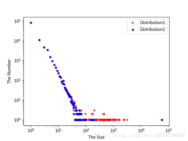
import matplotlib.pyplot as plt

size_num = countPartition(graph)
x1 = list(size_num.keys())
y1 = list(size_num.values())
# s=35为散点的大小
plt.scatter(x1, y1, marker='+', color='r', s=35, label='Distribution1')

size_num_ = ComponentAna.componentAll(graph)
x2 = list(size_num_.keys())
y2 = list(size_num_.values())
plt.scatter(x2, y2, marker='*', color='b', s=35, label='Distribution2')

plt.yscale('log') # 设置y轴为对数尺度
plt.xscale('log')
plt.xlabel("The Size")
plt.ylabel("The Number")
plt.legend(loc='upper right') # 设置曲线标签位置,右上角

plt.show()
散点图(变量为分类)
工具
seaborn
图例
代码
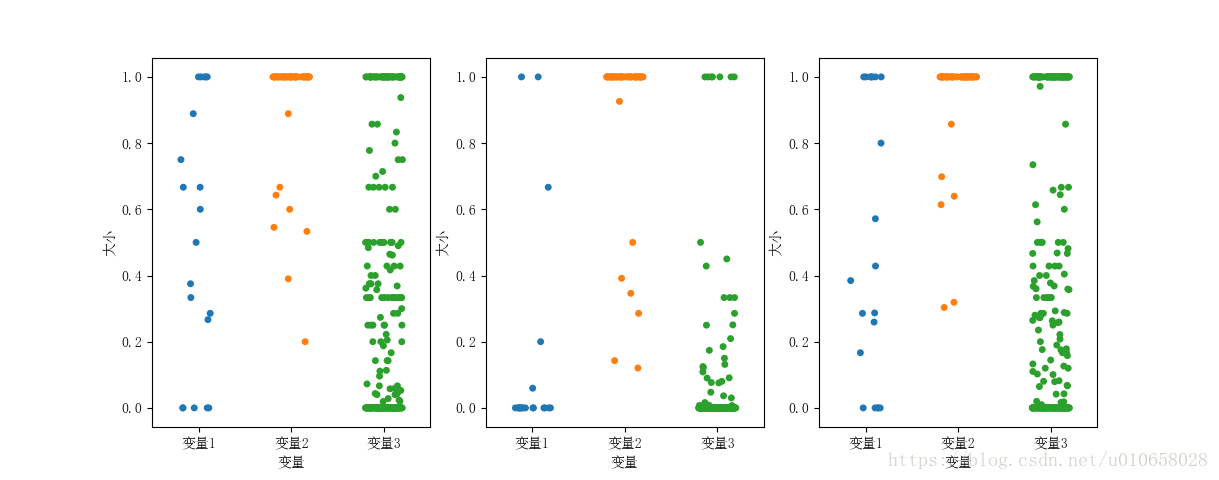
def illustration(graph):
    infer_dict_romantic = {}
    infer_dict_colleague = {}
    infer_dict_normal = {}
    data = open("./data/Partner1.csv")
    for line in data:
        strline = line.split(" ")
        infer_dict_romantic[strline[0]] = strline[1]

    data = open("./data/Partner2.csv")
    for line in data:
        strline = line.split(" ")
        infer_dict_colleague[strline[0]] = strline[1]

    data = open("./data/Partner3.csv")
    for line in data:
        strline = line.split(" ")
        infer_dict_normal[strline[0]] = strline[1]

    labels = []
    embeddedness = []
    dispersion = []
    norm_dispersion = []
    rec_dispersion = []

    for k, v in infer_dict_colleague.items():
        labels.append(u'变量1')
        embeddedness.append(emb(graph, k, v))
        dispersion.append(disp(graph, k, v))
        norm_dispersion.append(norm_disp(graph, k, v))

    remove_list = []
    for k, v in infer_dict_romantic.items():
        if disp(graph, k, v) < 0.1:
            remove_list.append(k)
    for k in remove_list:
        if len(infer_dict_romantic) < 42:
            break
        else:
            infer_dict_romantic.pop(k)

    for k, v in infer_dict_romantic.items():
        labels.append(u'变量2')
        embeddedness.append(emb(graph, k, v))
        dispersion.append(disp(graph, k, v))
        norm_dispersion.append(norm_disp(graph, k, v))
    for k, v in infer_dict_normal.items():
        labels.append(u'变量3')
        embeddedness.append(emb(graph, k, v))
        dispersion.append(disp(graph, k, v))
        norm_dispersion.append(norm_disp(graph, k, v))

    labels_ = pd.Series(labels)
    embeddedness_ = pd.Series(embeddedness)
    dispersion_ = pd.Series(dispersion)
    norm_dispersion_ = pd.Series(norm_dispersion)
    rec_dispersion_ = pd.Series(rec_dispersion)

    data = pd.DataFrame({'labels':labels_, 'embeddedness':embeddedness_, 'dispersion': dispersion_,
                         'norm_dispersion':norm_dispersion_, 'rec_dispersion':rec_dispersion_})

    plt.rcParams['font.sans-serif'] = ['SimSun']
    ax = plt.subplot(131)
    # jitter用于调节柱状散点的宽度
    sns.stripplot(x="labels", y="embeddedness", data=data, jitter=0.2)
    plt.xlabel(u'变量')
    plt.ylabel(u'大小')
    ax = plt.subplot(132)
    sns.stripplot(x="labels", y="dispersion", data=data, jitter=0.2)
    plt.xlabel(u'变量')
    plt.ylabel(u'大小')
    ax = plt.subplot(133)
    sns.stripplot(x="labels", y="norm_dispersion", data=data, jitter=0.2)
    plt.xlabel(u'变量')
    plt.ylabel(u'大小')
    plt.show()
热点图
工具
matplotlib
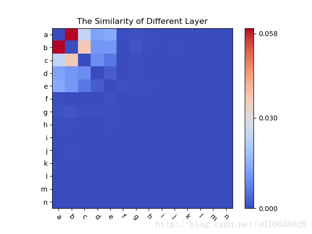
数据组织
待可视化的数据需要首先保存在一个二维数组table中,table中的每一行对应于热点图中的每一行。
图例
代码
from matplotlib import pyplot as plt
from matplotlib import cm as cm

fig, ax = plt.subplots()

label = ['050000', '060000', '040000', '020000', '030000', '080000', '200000', '070000', '010000', 'NULL', '000000', '090000', '990000', '230000']

# table为待可视化的数据;cmap设置热点图的配色
cax = ax.imshow(table, interpolation='nearest', cmap=cm.coolwarm)

ax.set_title('The Similarity')
plt.xticks(range(14), label, rotation=-45) # 设置x轴标签;rotation=-45将标签顺时针旋转45度
plt.yticks(range(14), label)

cbar = fig.colorbar(cax, ticks=[0, 0.03, 0.058])
cbar.ax.set_xticklabels(['Low', 'Medium', 'High'])  # horizontal colorbar

plt.show()
弦图(Chord Diagram)
弦图一般使用R的circlize库,或者D3.js画,目前python好像还没有广泛使用的可以画弦图的包。这里使用的是R语言的circlize库,比较好用
参考资料
http://zuguang.de/circlize_book/book/the-chorddiagram-function.html
数据
| 类型 | type1 | type2 | type3 | type4 | type5 |
|---|---|---|---|---|---|
| type1 | 0 | 10546 | 2768 | 1382 | 1592 |
| type2 | 10546 | 0 | 4297 | 1210 | 1308 |
| type3 | 2768 | 4297 | 0 | 401 | 306 |
| type4 | 1382 | 1210 | 401 | 0 | 306 |
| type5 | 1592 | 1308 | 306 | 102 | 0 |
图例
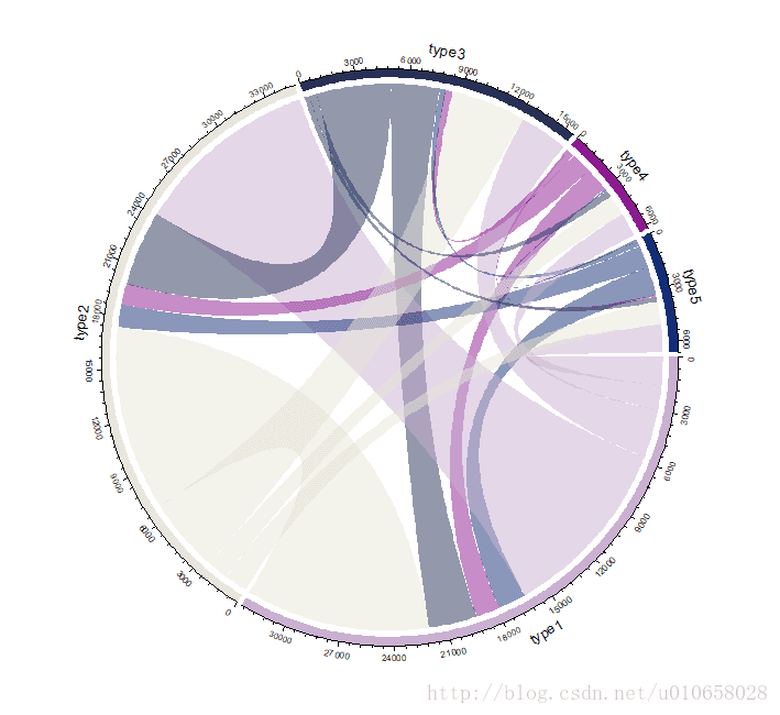
代码
library(circlize)
mat = c(0, 10546, 2768, 1382, 1592, 10546, 0, 4297, 1210, 1308, 2768, 4297, 0, 401, 306, 1382, 1210, 401, 0, 102, 1592, 1308, 306, 102, 0)
rnames = c("type1", "type2", "type3", "type4", "type5") # 横轴标签
cname = c("type1", "type2", "type3", "type4", "type5") # 纵轴标签
mymatrix = matrix(mat , nrow=5, ncol=5, byrow=TRUE, dimnames=list(rnames,cname)) # 生成5*5矩阵

df = data.frame(from = rep(rownames(mymatrix), times = ncol(mymatrix)),
                to = rep(colnames(mymatrix), each = nrow(mymatrix)),
                value = as.vector(mymatrix),
                stringsAsFactors = FALSE) #生成chord diagram中的边数据
chordDiagram(df)顾名思义,弦图更像一种真正意义上的图(graph),有节点也有边,可以是有向的也可以是无向的。所以,代码在将数据组织为矩阵mymatrix后,又将其转化为边列表df,最终将边列表输入到chordDiagram中,df的形式如下: 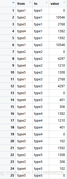
版权声明:本文为u010658028原创文章,遵循CC 4.0 BY-SA版权协议,转载请附上原文出处链接和本声明。