运行以下代码:
import csv
from matplotlib import pyplot as plt
from datetime import datetime
# 从文件中获取最高气温
filename = 'sitka_weather_07-2014.csv'
with open(filename) as f:
reader = csv.reader(f)
header_row = next(reader)
highs = []
dates = []
for row in reader:
current_date = datetime.strptime(row[0], '%Y-%m-%d')
dates.append(current_date)
high = int(row[1])
highs.append(high)
print(highs)
# 根据数据绘制图形
fig = plt.figure(dpi=64, figsize=(10,6))
plt.plot(dates, highs, c='red')
# 设置图形的格式
plt.title('Daily high temperatures, July 2014', fontsize=24)
plt.xlabel('', fontsize=16)
plt.ylabel('Temperature (F)', fontsize=16)
plt.tick_params(axis='both', which='major', labelsize=16)
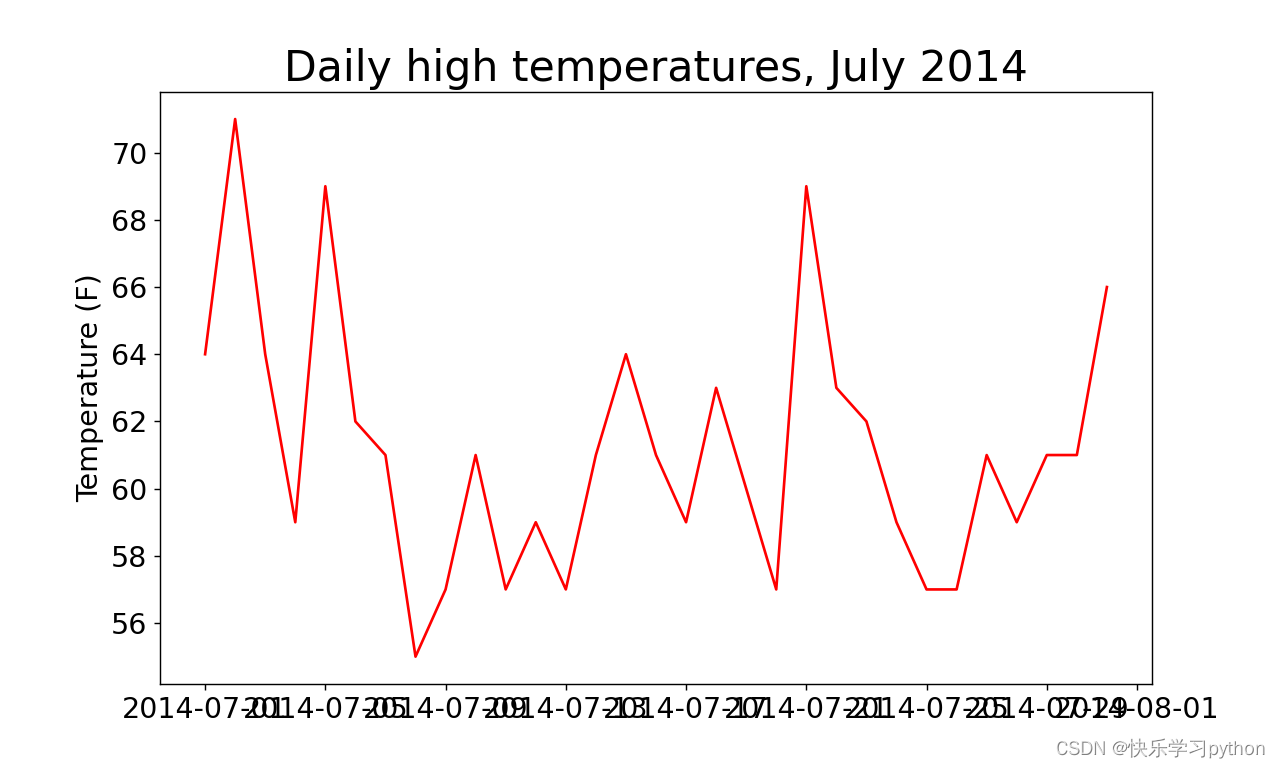
plt.show()输出的图形如下:
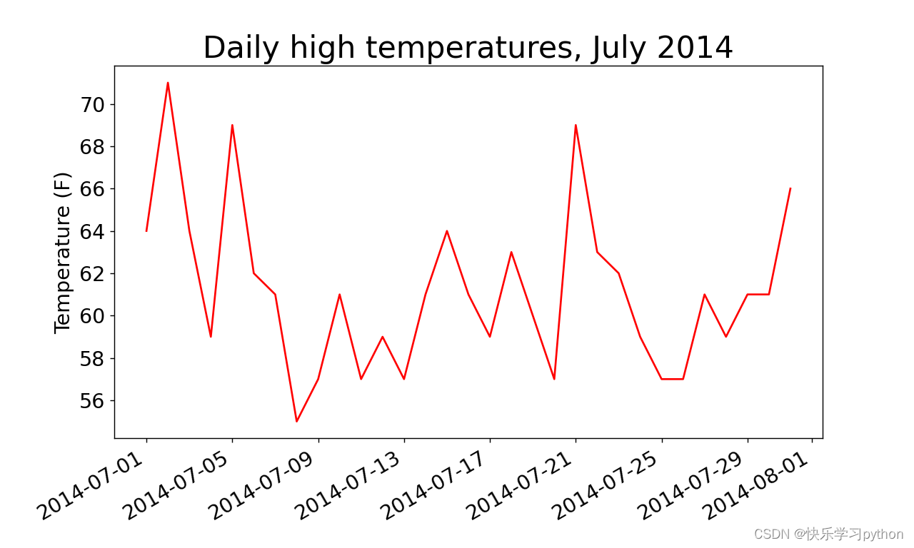
横坐标名称由于太长出现了重叠,这时可以通过旋转横坐标名称达到展示横坐标的效果。
通过以下函数均可实现:
(1)plt.xticks(rotation=30) # 横坐标名称旋转30度
(2)fig.autofmt_xdate() # 绘制斜的日期标签
添加了fig.autofmt_xdate()代码后,达到的效果如下:

版权声明:本文为m0_60649037原创文章,遵循CC 4.0 BY-SA版权协议,转载请附上原文出处链接和本声明。